Website Redesign For an IoT Industry Leader
PROBLEM
The Wiliot team aimed to promote their product and connect with numerous potential partners. Central to this project were the goals of effective educational outreach and streamlined lead generation. To achieve this, they required a contemporary and captivating website that employed the latest user experience and user interface design innovations, thus placing the brand at the leading edge of Internet of Things advancements.
SOLUTION
After in-depth research into Wiliot's specific requirements, we developed an extensive plan for the website's redesign, focusing primarily on a smooth user experience and an attractive user interface. New contact forms were integrated to ease the process of attracting potential partners. We simplified the presentation of Wiliot's offerings and incorporated engaging animated illustrations to make the website more inviting.
VALUE DELIVERED
Our team revitalized Wiliot's website by introducing innovative interface solutions, captivating illustrations, and high-quality, user experience-centric features. As a result, Wiliot now boasts a contemporary and welcoming website. This transformation has simplified lead generation and significantly bolstered the brand's digital footprint.
Our work in numbers
The Internet of Things revolution is here!
Wiliot, a leader in the Internet of Things sector, is on a mission to transform global product tracking and storage practices. Their groundbreaking offerings, the Wiliot Pixel tags and the Wiliot Cloud Internet of Things connectivity network, have the potential to radically change several key aspects of a broad range of industries.

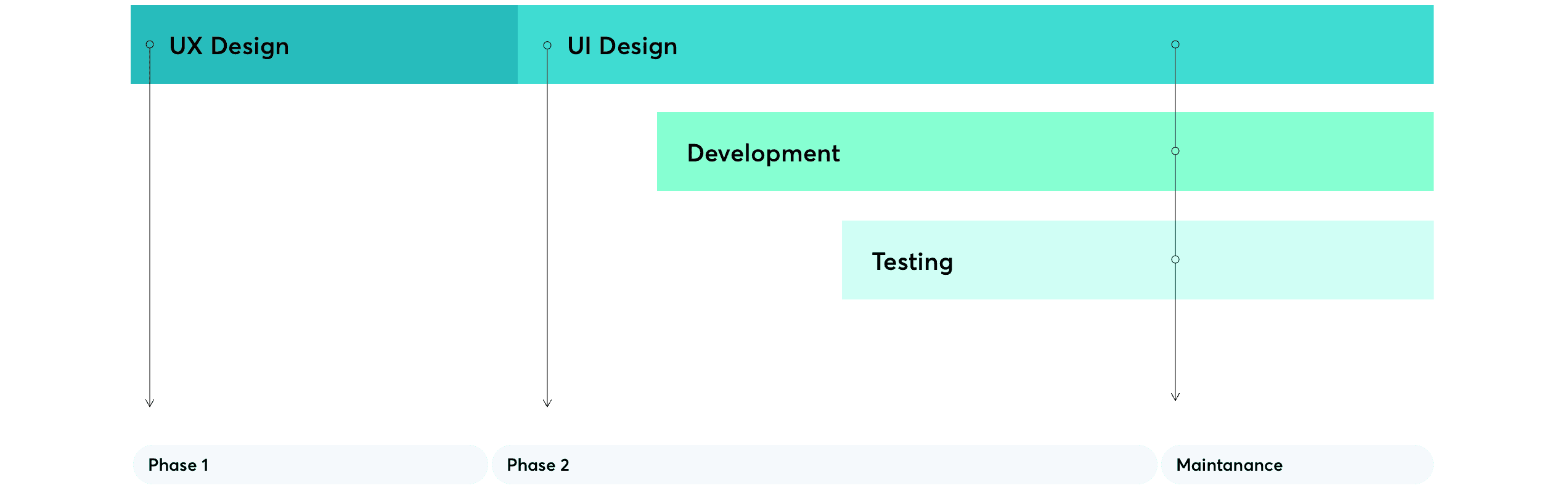
Design, development, and testing
We adhered to a traditional project timeline, known for its effectiveness and successful application in past projects. Priority was given to crucial aspects of the website's design, including information architecture, prototyping, and user flow mapping. Next, the project moved on to the interface design phase, focusing on style elements, responsiveness, and asset creation. Development commenced around the project's midpoint, with testers providing support throughout, leading up to the final hand-off.
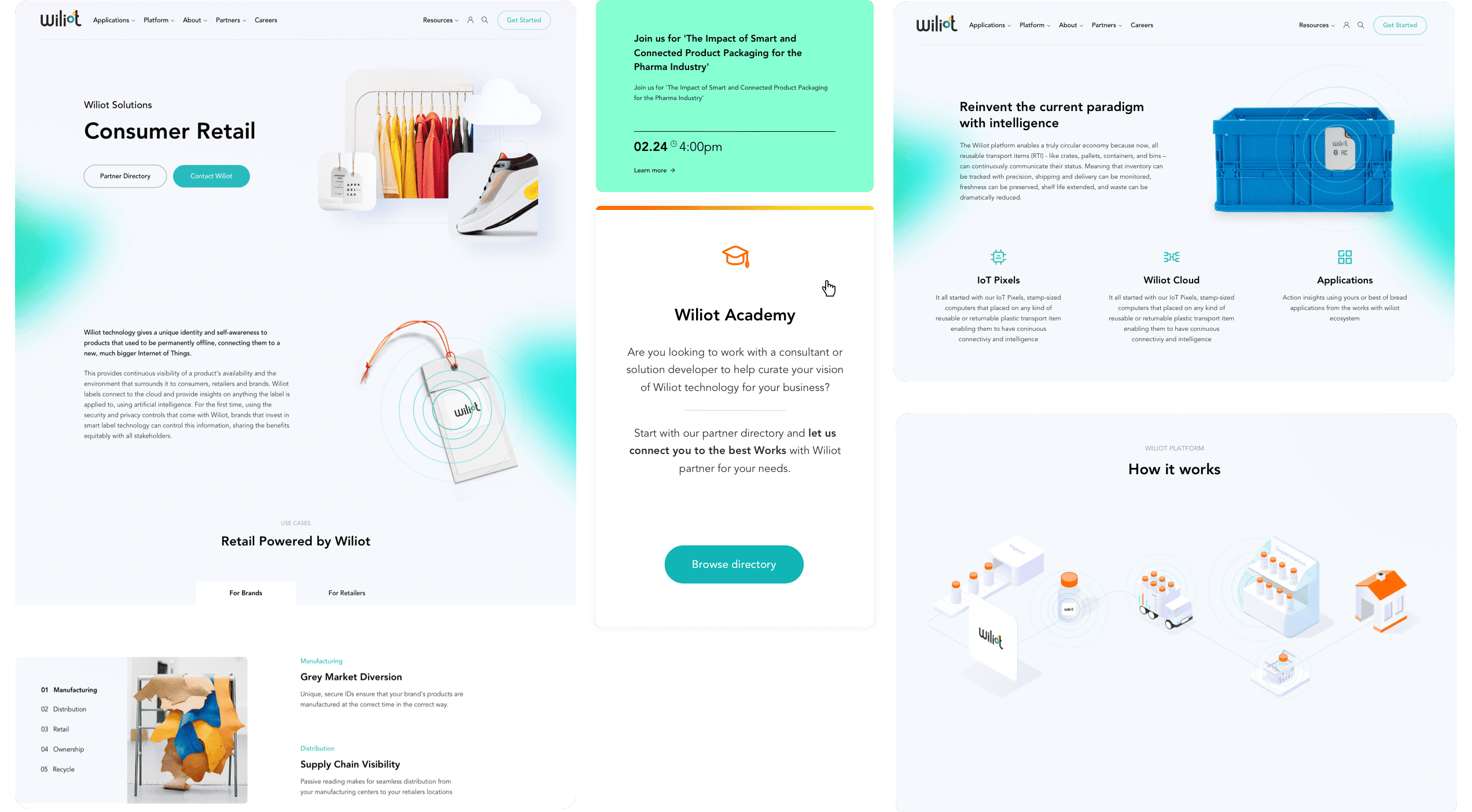
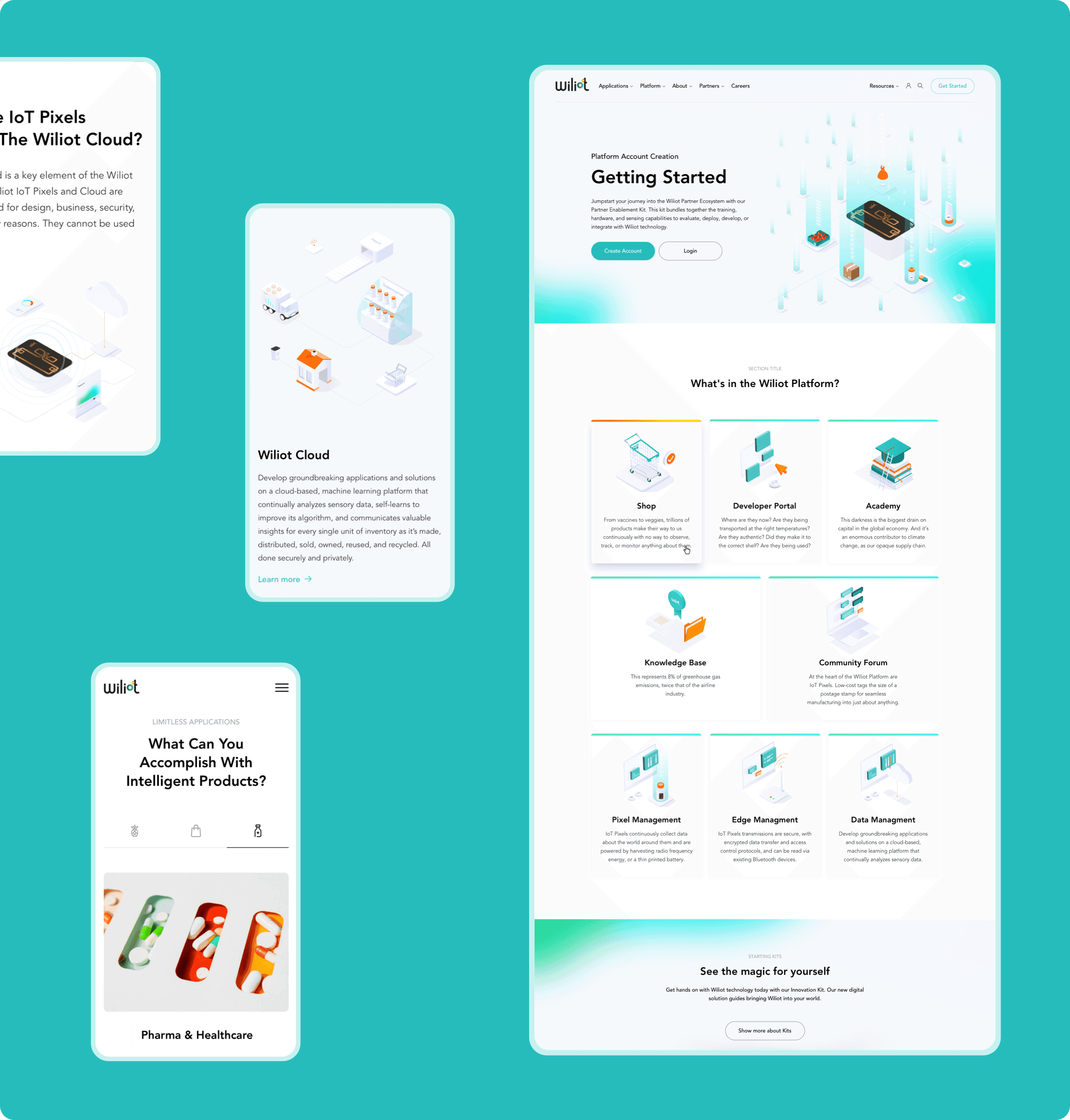
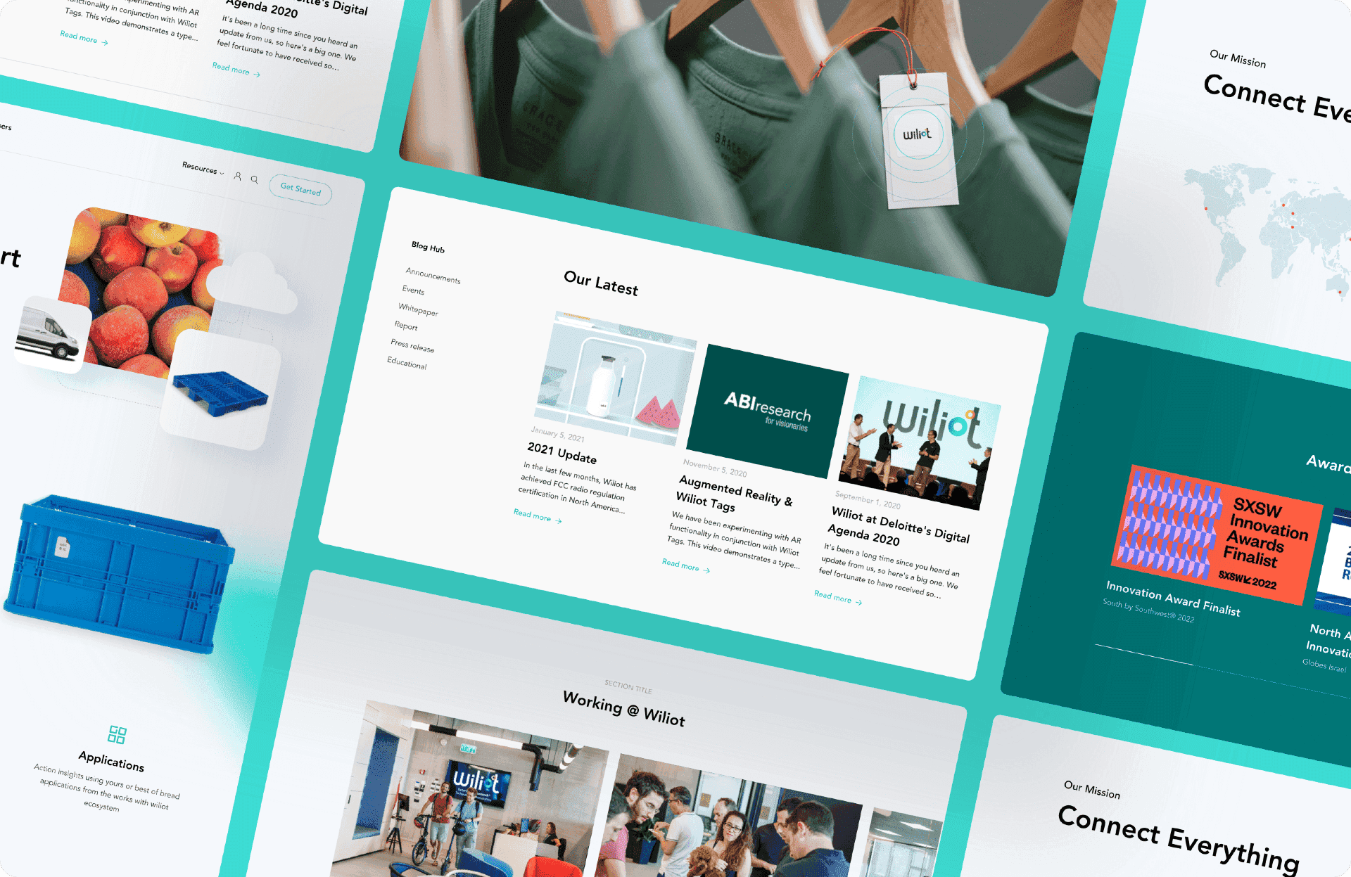
Bringing clarity to complexity
One of the major visual tasks in this project involved illustrating and animating the various stages of a product’s life cycle, along with Wiliot's involvement in each phase. The stages included manufacturing, distribution, retail, ownership, and recycling. At every stage, Wiliot Pixel gathers data and relays it to Wiliot Cloud, a complex process that we clarified through detailed drawings and animations.
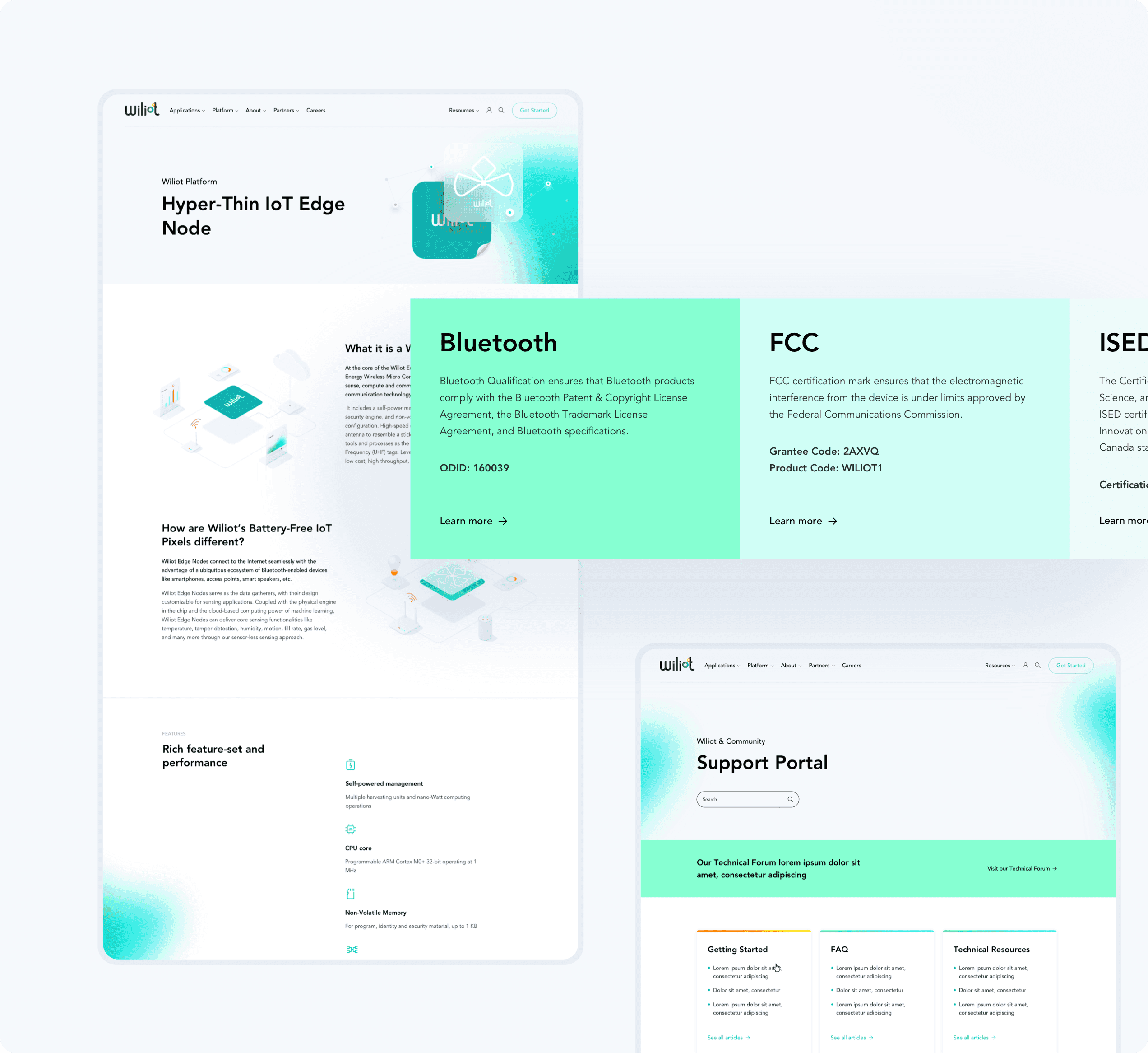
Facilitating user engagement
A key objective was to make the company's content easily approachable. Wiliot provides a wealth of resources, including a comprehensive knowledge base, community interactions, and various events. With that in mind, we developed a user-friendly platform that offers straightforward access to Wiliot's materials.
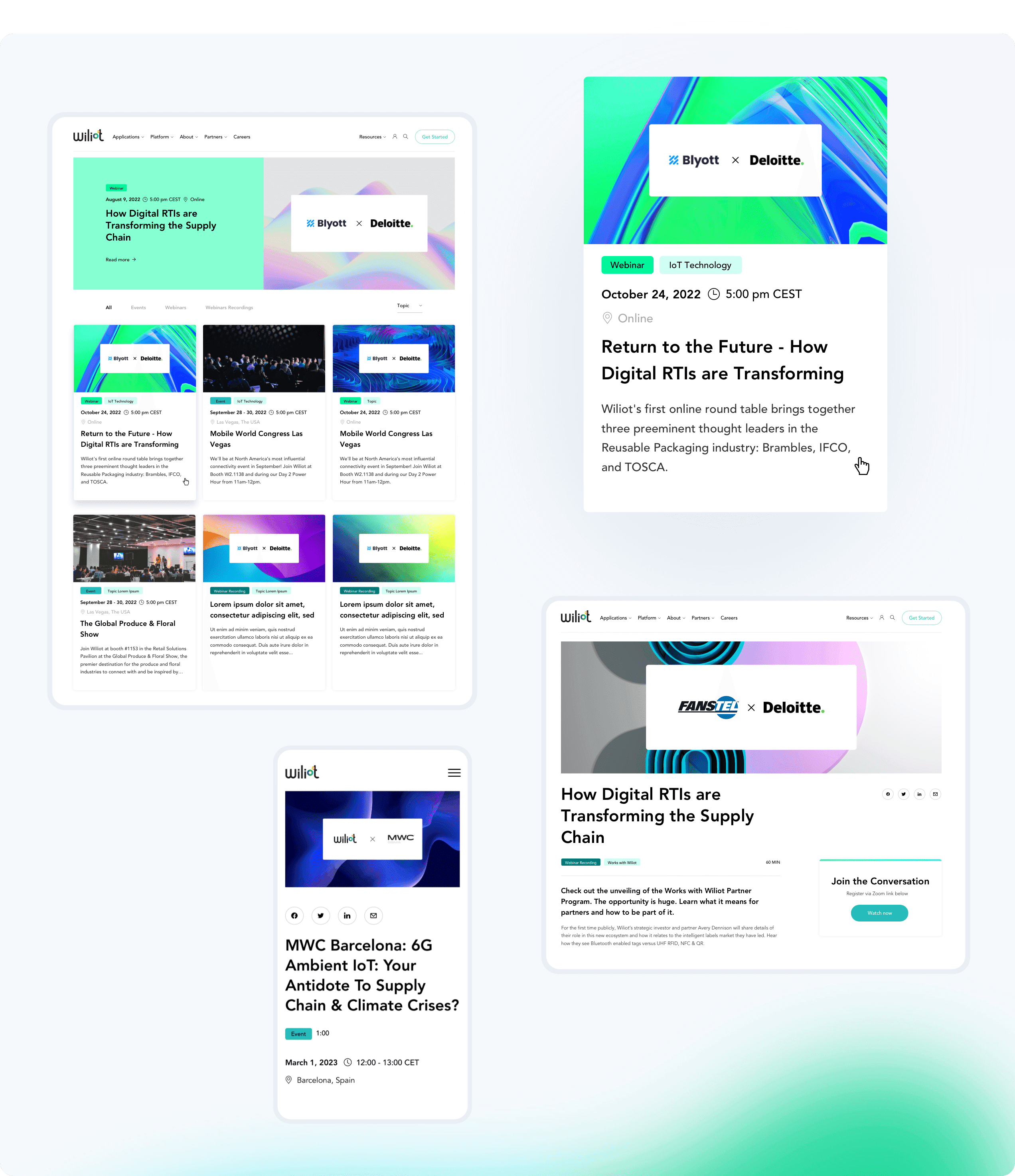
Streamlined access
Wiliot goes beyond merely hosting webinars and events. The company created a comprehensive media library encompassing podcasts, reports, white papers, and articles. Users can easily navigate this wealth of information in a dedicated listing, which is equipped with practical filters for efficient searching.
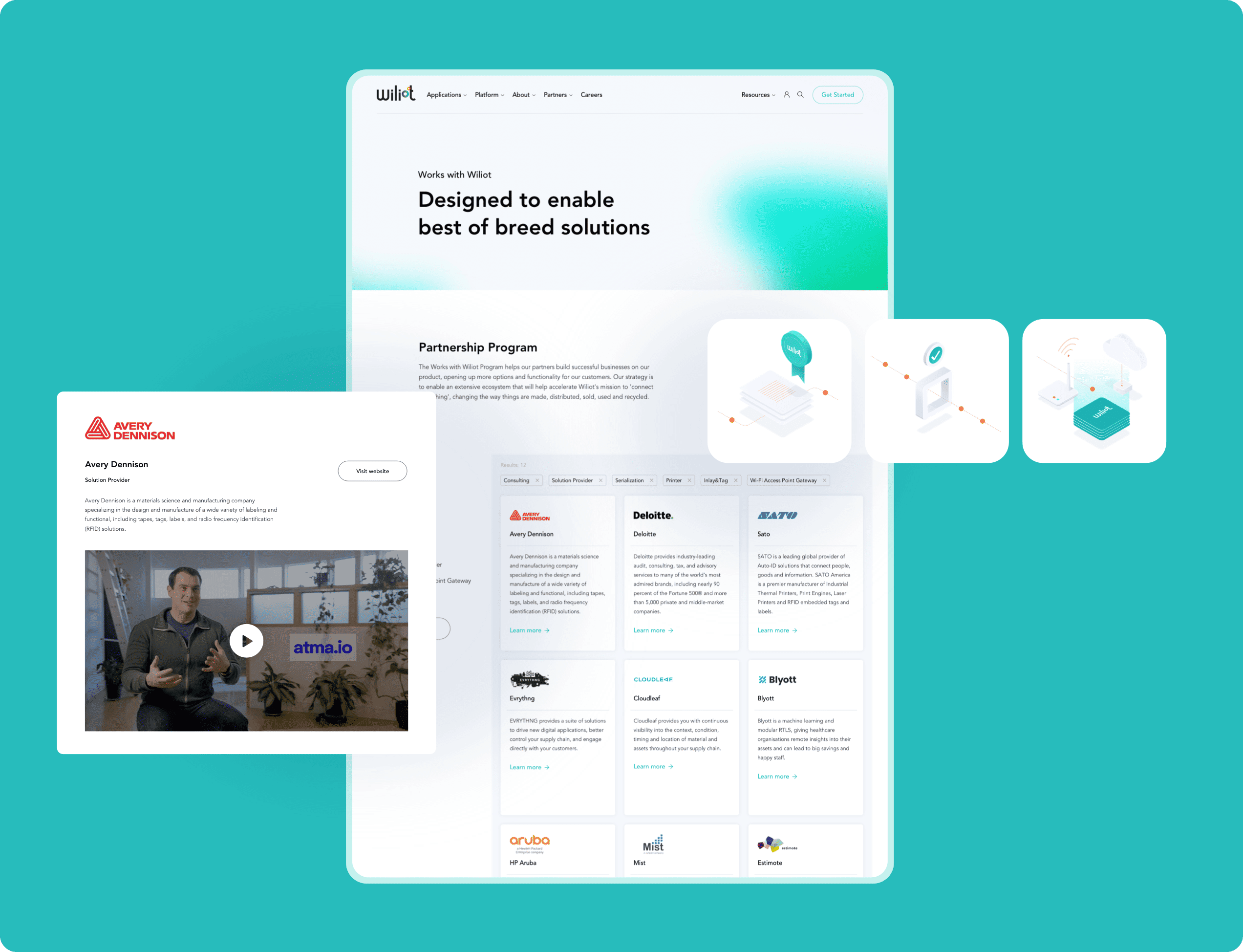
Showcasing partners effectively
Highlighting its partners is essential for any prospering business, and for Wiliot, we crafted a partner directory that displays detailed company information. Recognizing Wiliot's rapid growth, we incorporated filtering options in this subsection to facilitate easy navigation.
Crafting a cohesive brand identity
In our work for Wiliot, we went beyond crafting features that enhance user experience. We also established a fresh visual identity for the company. This new aesthetic was achieved using vibrant digital colors, harmonious illustrations, and modern blurring effects.
Total brand alignment
To maintain a cohesive brand identity for Wiliot, we focused on ensuring that every aspect of their website, from the main pages down to the sub-pages, aligned seamlessly with their unique brand aesthetic. This holistic approach was pivotal in achieving a consistent, on-brand look across their entire online presence.
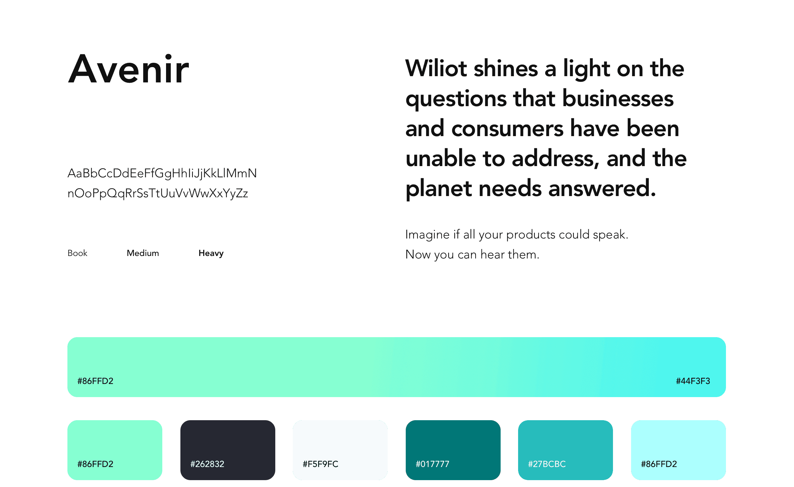
The most digital of colors
To capture Wiliot's dedication to digital and Internet of Things advancements, our design prominently featured cyan tones, echoing the essence of digital innovation. This palette of vibrant greens and blues was chosen to give the website a cutting-edge, technology-oriented look. Complementing this modern aesthetic, we selected the elegant Avenir sans-serif typeface for its striking appearance and exceptional readability, enhancing the overall design.