Vibrant and Modern Look for an Innovative Self-Checkout Solution
PROBLEM
TAGR needed a website that was characterized by accessibility and readability. In addition, it was to provide potential customers with a smooth introduction to TAGR's innovative self-checkout solution. The entire project was aimed at people who are adventurous and innovative, so the site needed to match that optimistic and cheerful sentiment.
SOLUTION
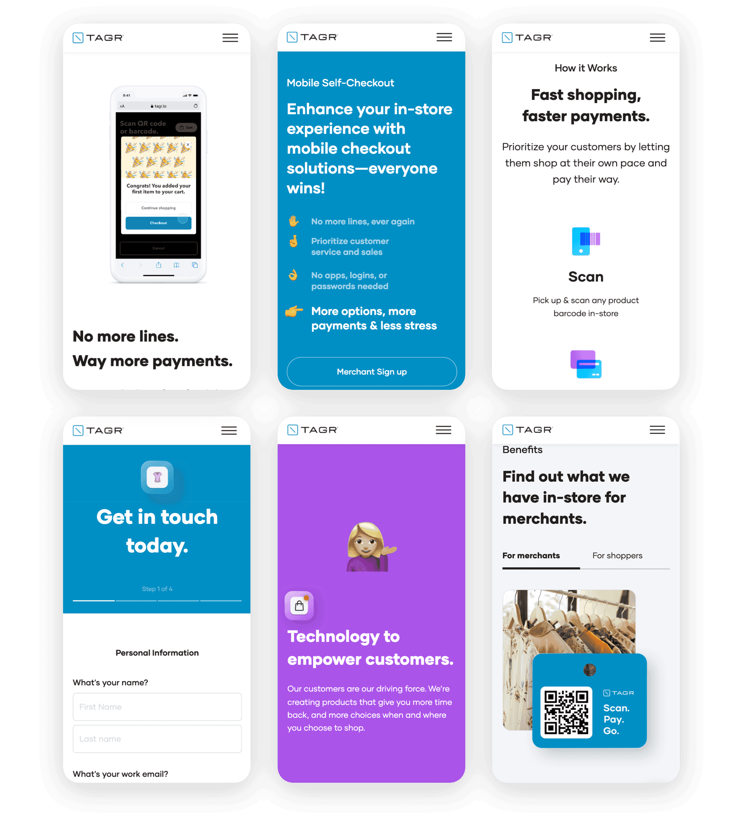
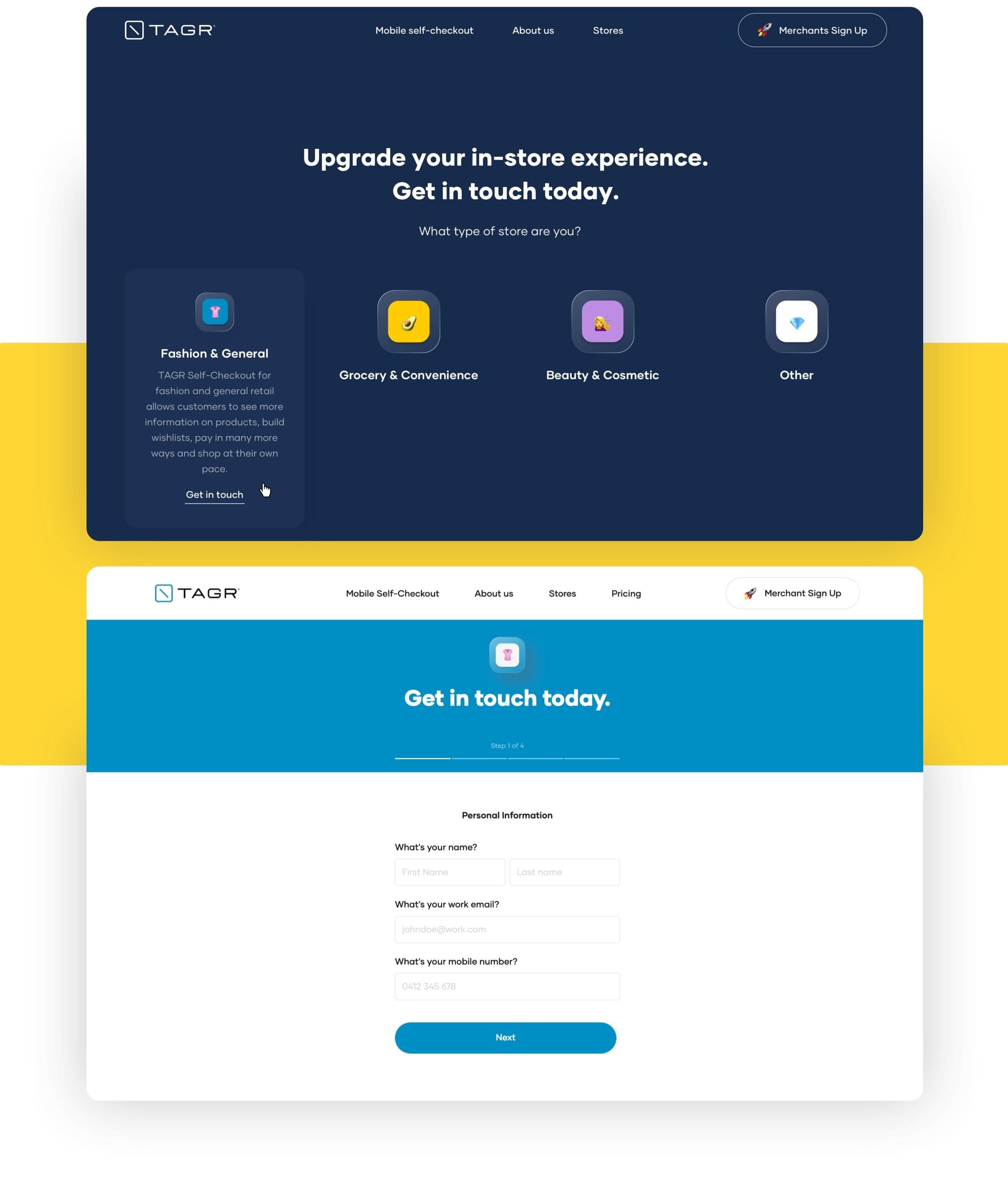
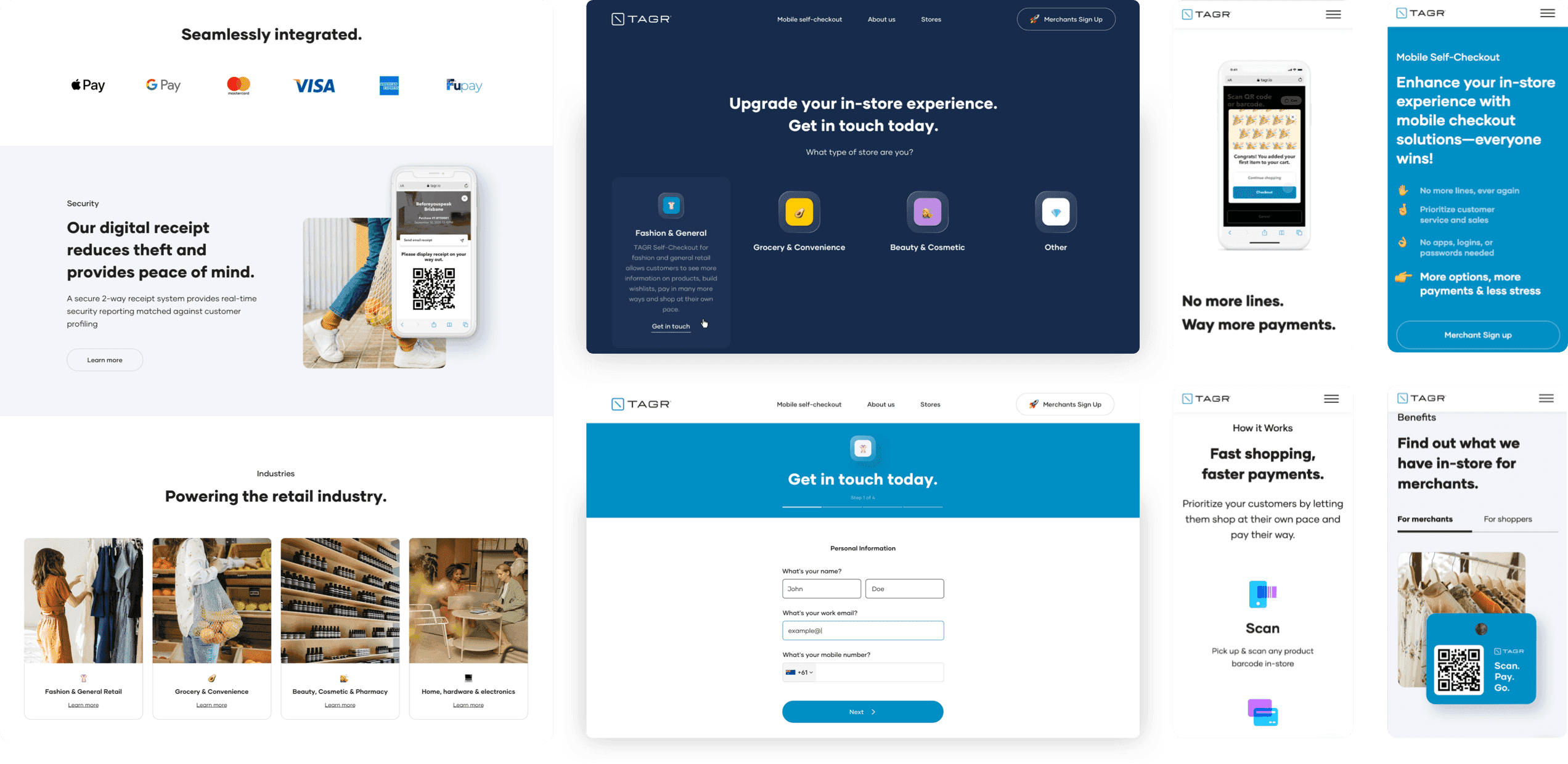
Ensuring a flawless mobile user experience was crucial. With that in mind, we created a responsive website with a straightforward design and plenty of features aimed at meeting the needs of shoppers and e-commerce business owners alike. To add visual appeal, the website's design was enriched with vibrant colors and changing backgrounds.
VALUE DELIVERED
We developed a fresh website for TAGR that embodies trust, clarity, and confidence, striking a perfect balance between professionalism and joyful optimism. It reinforces TAGR's reputation as a dependable and innovative leader in the mobile self-checkout sector, showcasing the team's expertise and forward-thinking approach.
Scan, shop, go
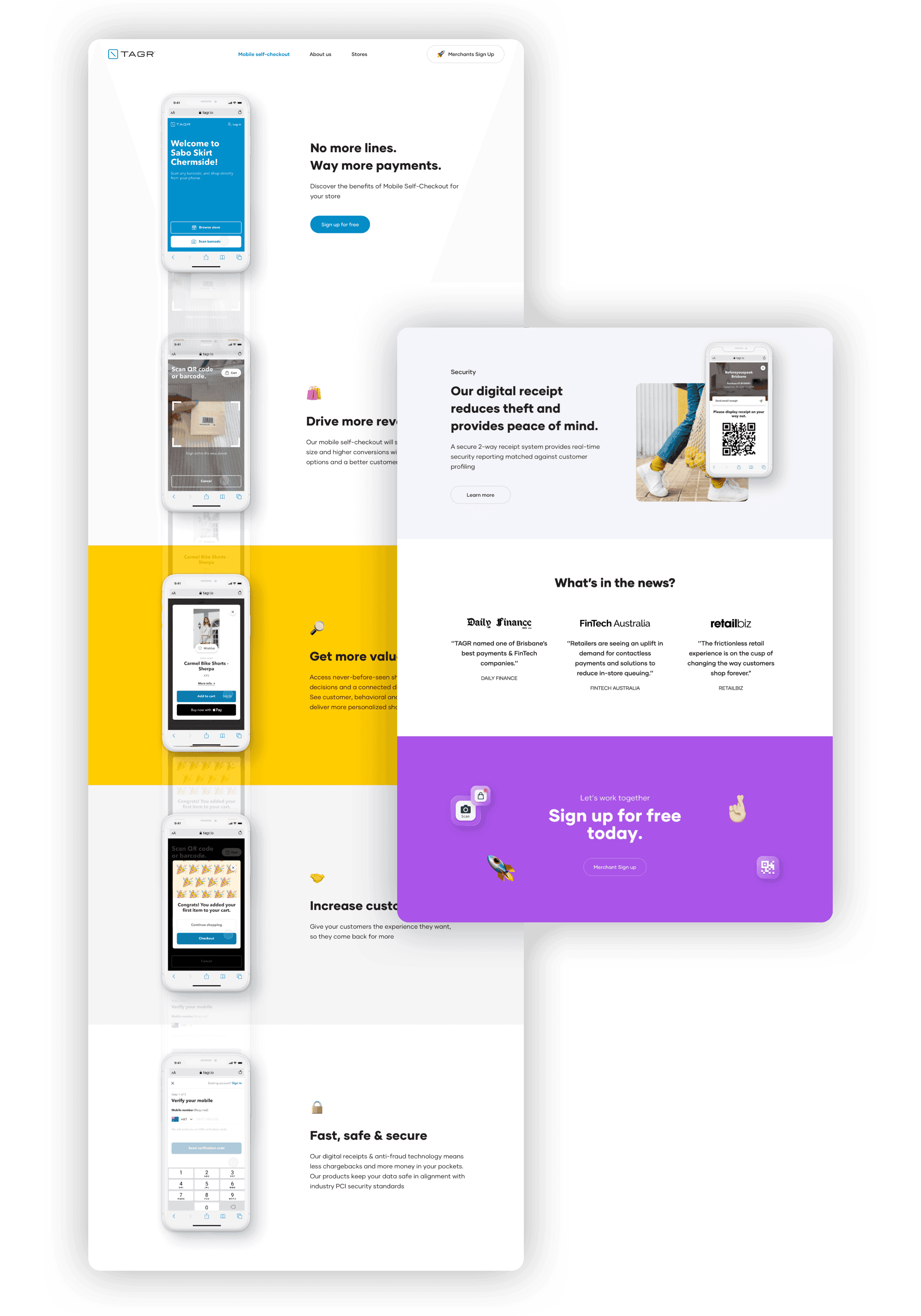
TAGR is on a mission to transform the retail shopping experience with its innovative self-checkout platform. It allows users to make purchases on the go by scanning item barcodes. Then, the item is paid for using a digital payment platform. As a result, TAGR effectively eliminates waiting lines, which is a crucial advantage in the competitive, post-pandemic retail landscape.
Shopping 2.0
TAGR aims to bridge the best aspects of physical and digital shopping experiences, creating a pioneering digital product designed for the future. It's a goal that necessitates the creation of cutting-edge design solutions that will cater to both technology novices, by providing an enjoyable learning experience, and tech-savvy users, who appreciate clarity and innovation.
Colorful innovation
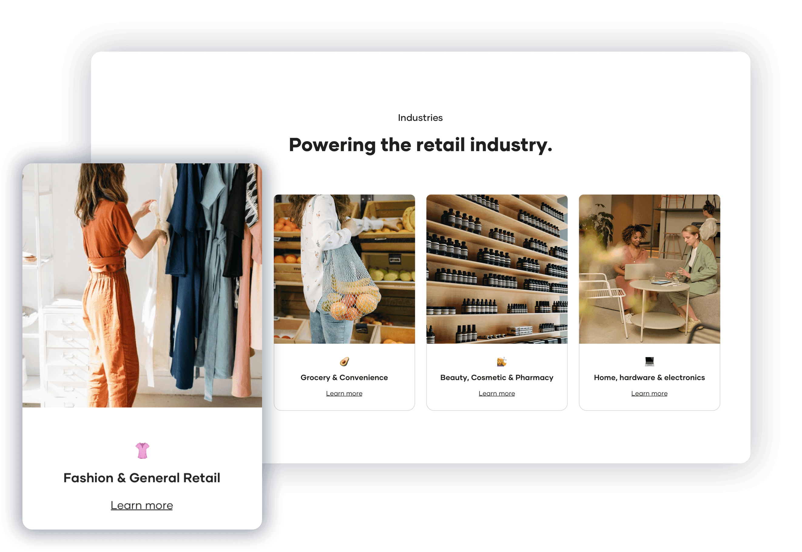
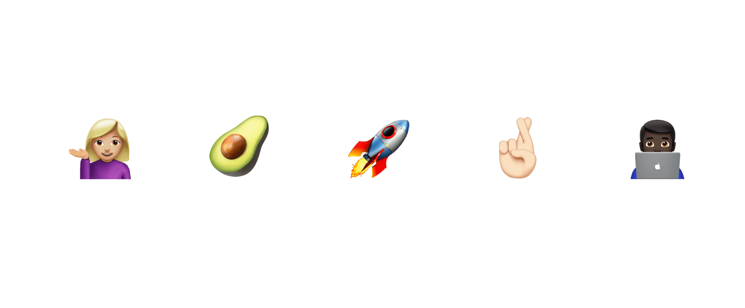
We crafted a fresh visual identity for TAGR. It encapsulates the brand's spirit of enthusiasm and optimism. The use of deep, dark blues creates a striking contrast against the vibrant shades of light blue, yellow, and purple. For typography, we selected a sans-serif font that's pleasant to read, and for the icons, we embraced emojis to inject a youthful and lively vibe into the design.

Simplicity speaks volumes
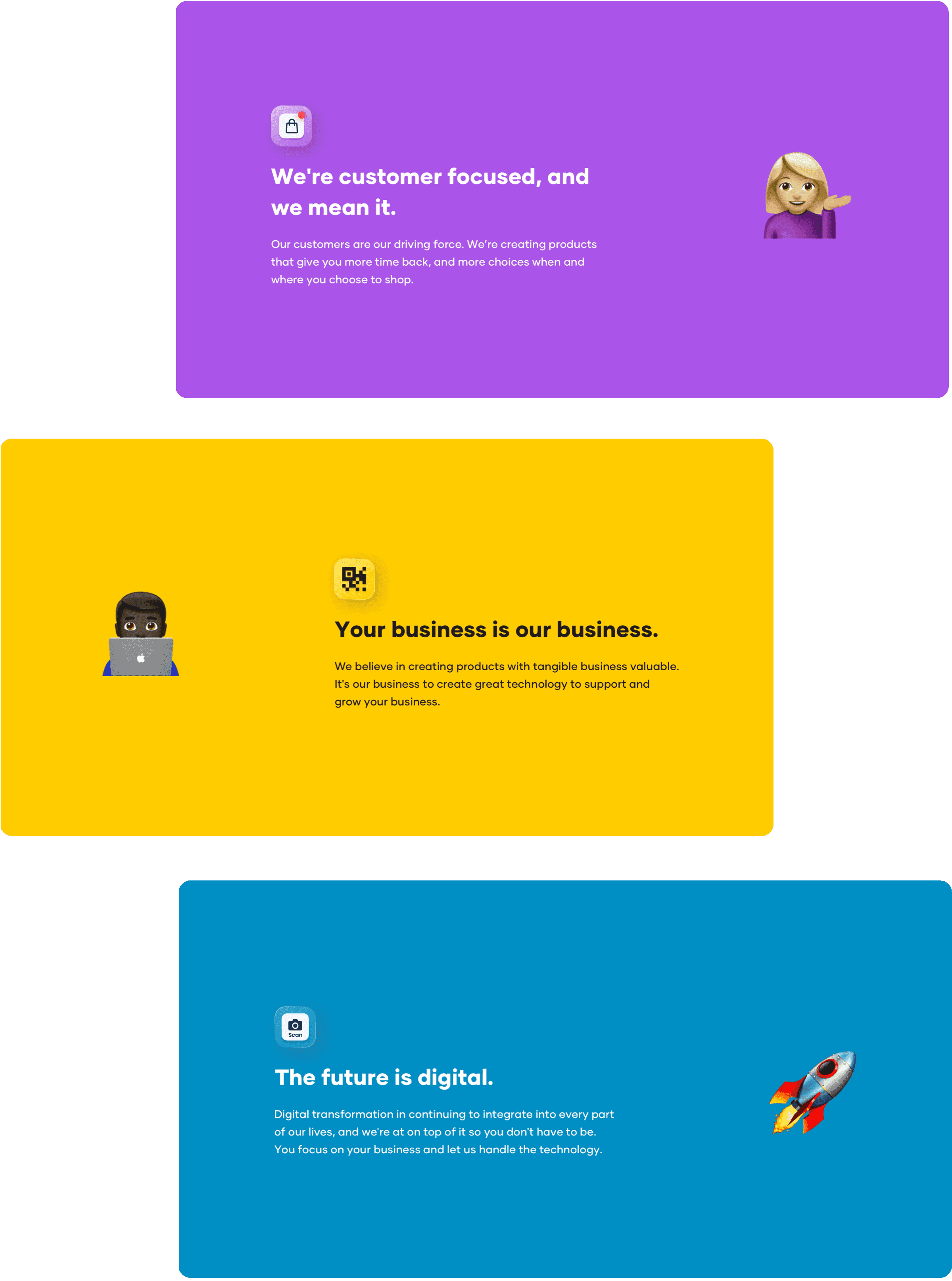
From the get-go, it was clear from our discussions with TAGR that our mission was to craft a website that would not only be straightforward to navigate, but would also smoothly introduce users to TAGR's innovative retail shopping experience. Our strategy emphasized the power of simplicity. In many cases, the combination of a solid color background, a brief caption, and a single emoji is enough to convey complex concepts with clarity and impact.
Mobile-first design
TAGR aspires to attract merchants and shoppers alike, both of whom will be experiencing TAGR's product through mobile devices. So, our team made sure that the company's website has a mobile version that is intuitive, readable, and aesthetically pleasing.
