Lightweight Web App Dedicated to Women to Share Their Feelings Online

BRAND
Speaktacular
location
Andermatt, CH
Client
Speaktacular
Stack
WordPress / Next.js
Budget
Confidential
PROBLEM
The team behind Speaktacular wished to create a widely accessible, publicly available anonymous social media platform that would let women talk, vent, and exchange opinions about their lives and experiences. They needed a well-structured platform that would empower and encourage women from different backgrounds to connect with one another.
SOLUTION
We created a responsive website that incorporated Speaktacular’s unique branding and style. In order to make it more intuitive, our team implemented a set of comprehensive and accessible interface solutions. In addition, you don't need to create an account to take part in discussions, which makes Speaktacular’s platform more inviting.
VALUE DELIVERED
We equipped Speaktacular with an innovative and intuitive social media platform. A set of user-friendly functionalities, paired with Speaktacular's unique emotion-based branding, come together to create a safe space that's both engaging and inviting.
Our work in numbers
Speaktacular is a platform that aims to provide women with a safe space where they can speak their mind without fear of judgment. It's a simple and accessible way for women to support each other in a positive environment.

Speaking your mind
Speaktacular is a unique idea for a social media platform that's based around total anonymity. It allows women to connect and share their thoughts and feelings on any topic. No matter where you're from, what you believe in, and what your problems are, Speaktacular is here to give you the space you need to speak your mind.

Mood-based content
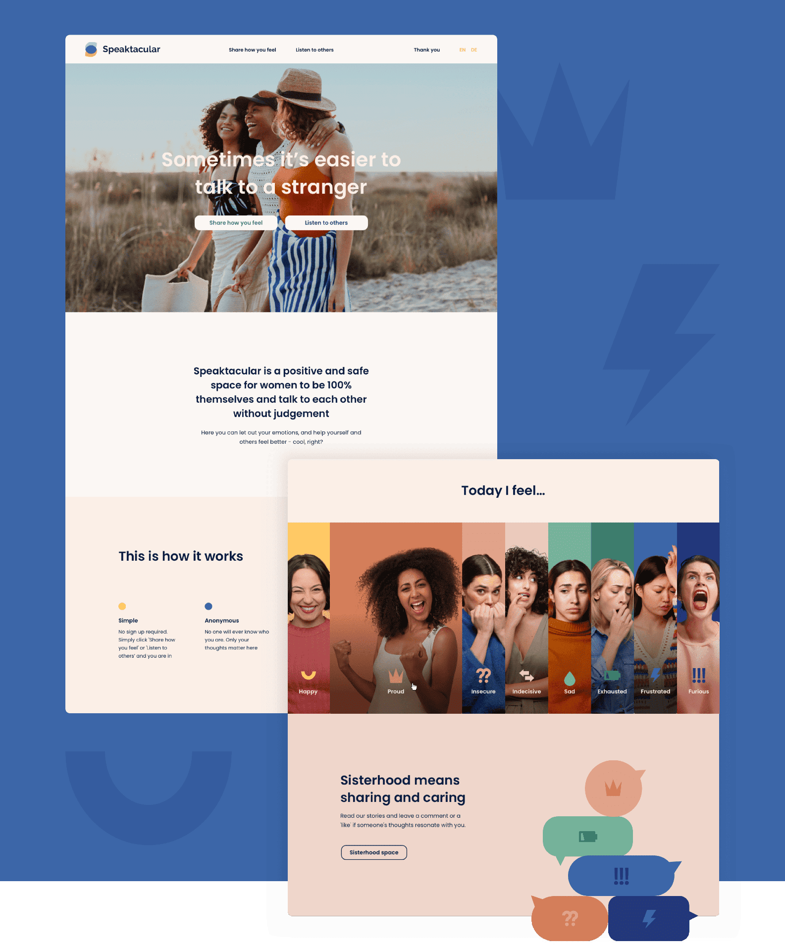
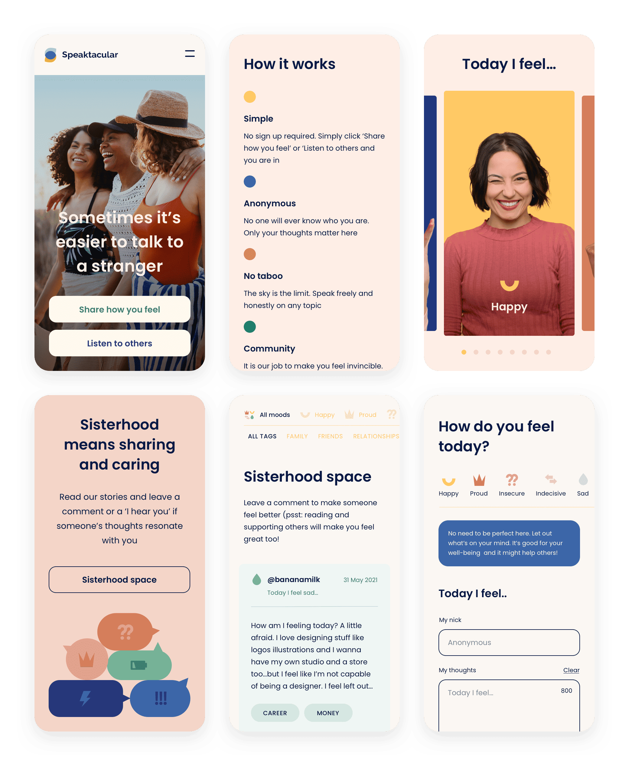
Speaktacular’s home page was meant to emphasize the platform's core values of anonymity and positivity. One of the site's key features allows users to choose their current mood. Then, they can create a new post based on that mood. This functionality is aimed at bridging the gap between written words and perceived emotions, boosting authenticity and empathy.
A thought-sharing platform
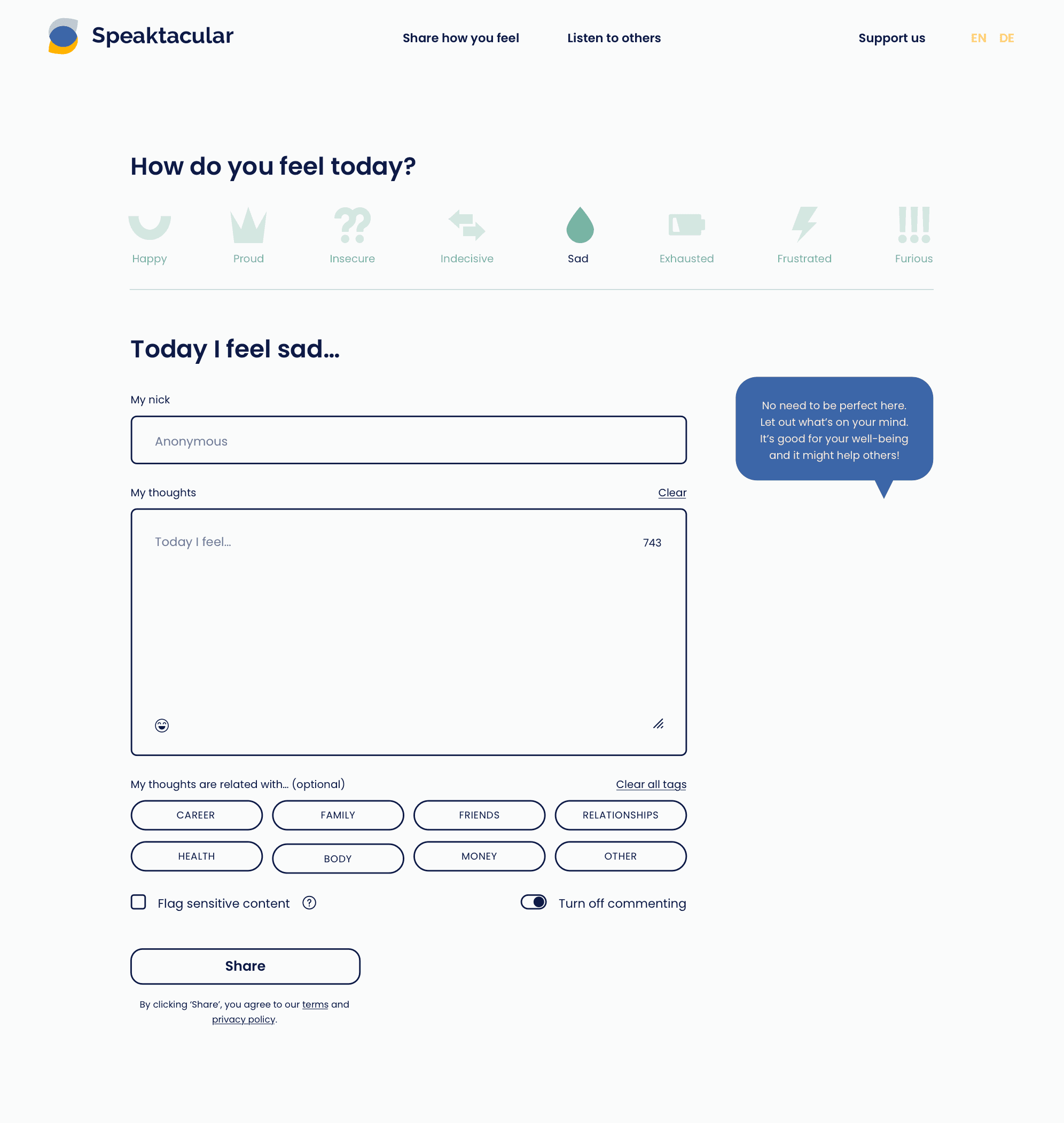
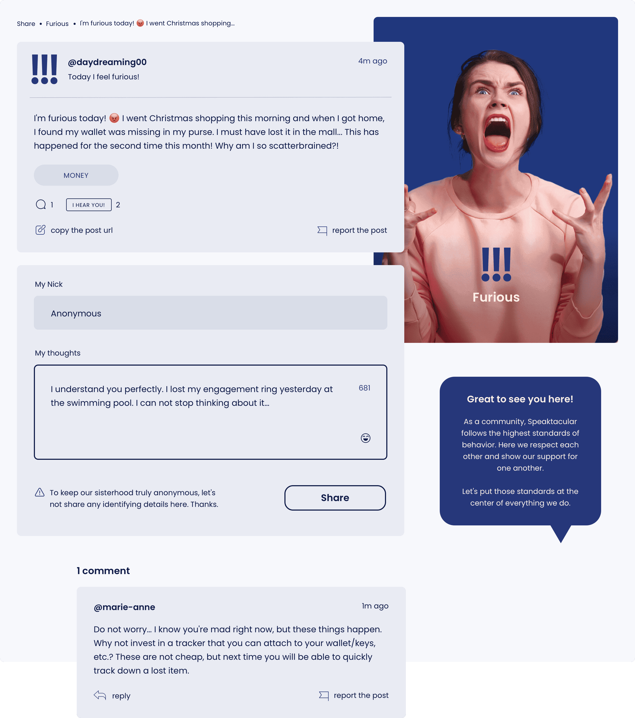
Expressing one's thoughts on Speaktacular’s platform is simple and intuitive. You can pick what mood you're in, as well as pair the post with a relevant tag, such as family or health. It's a great feature if you're not ready to post yet. Instead, you can first look through posts about problems that are similar to what you're dealing with.
Making users feel safe
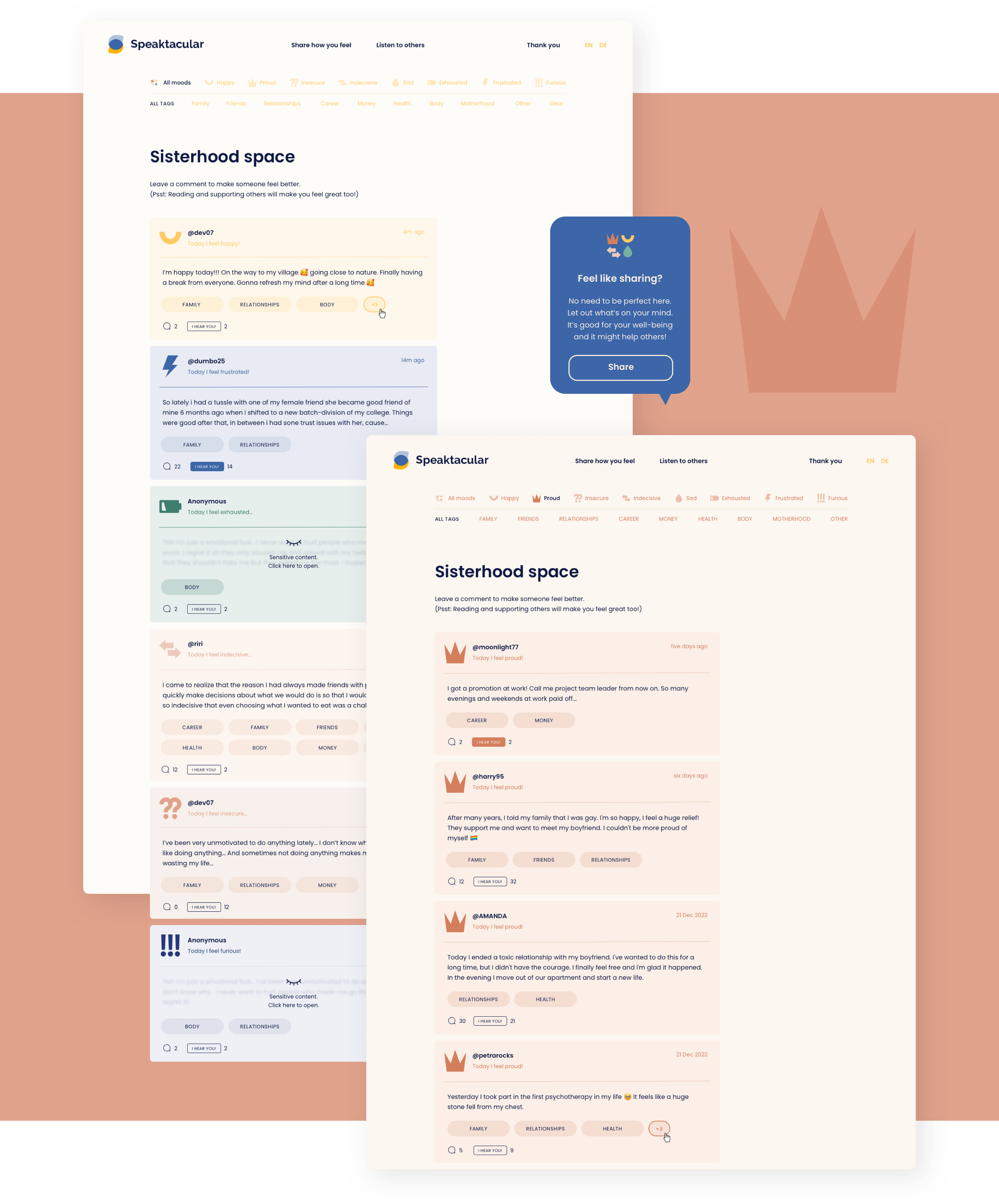
If a post is about a sensitive topic, it will automatically get blurred out. It works as a trigger warning, which turns it into an incredibly important feature. It helps protect the emotional well-being of users. At the same time, it allows users who might want to discuss sensitive topics to connect with other like-minded people.
Building a community
Users can react to a post by clicking on a button underneath it. It's an easy way to let the poster know that they're heard. Obviously, each post also has a comment section. In it, users can provide a post's author with their opinions, offer their support, or shere their own experiences. It creates a sense of community and allows users to build genuinely meaningful relationships with others.
Support made accessible
Ease of use is paramount to the success of any social media platform, especially if we're talking about its mobile version. For that reason, our team put a lot of effort into providing Speaktacular with an interface that will look great on any mobile device. It ensures that the platform remains readable and functional, regardless of whether you're using it on a desktop computer or on a tablet.
Values matter
Speaktacular's branding has been carefully crafted to convey the feelings of warmth and friendliness. Simple icons paired with pictures of women of different ages and in different moods further emphasize the platform's inclusiveness and diversity, while reinforcing Speaktacular’s core values of positivity and empathy. The overall effect is a brand that feels approachable and relatable while still maintaining a professional and credible image.

Making a connection
The logotype we created for Speaktacular is a simple yet effective representation of the platform's brand identity. The emblem in the logotype features various colors, and each one represents a different mood, further emphasizing the brand's welcoming and inclusive feel. Additionally, the logotype makes use of the simple icons we implemented throughout the platform's interface design, further reinforcing the consistent and cohesive branding of Speaktacular.

Colors that tell a story
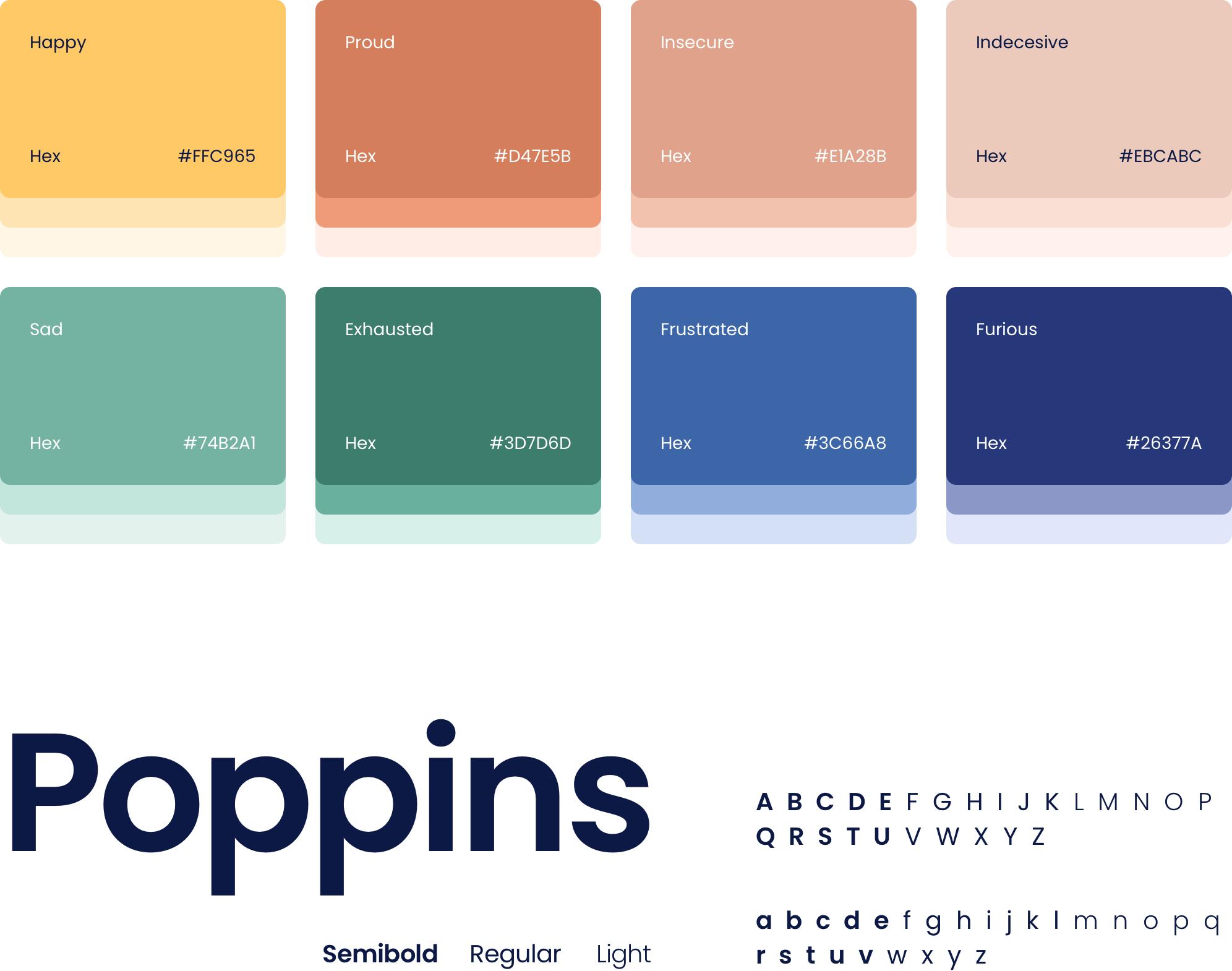
Speaktacular’s color palette has been thoughtfully designed to reflect the platform's values. The shades of yellow, blue, green, and brown are warm and inviting, creating a friendly and approachable atmosphere. Each mood on the platform has been assigned a specific color, making it easy for users to identify and navigate content that is relevant to their current emotional state. Typography-wise, Poppins, a modern and clean font that’s easy to read, was been selected to complement the friendliness and approachability of Speaktacular's branding.
