Elevating Website Presence of The Product Performance Management Platform
BRAND
ROI Hunter
location
Brno, CZ
Client
ROI Hunter
Stack
HubSpot
Budget
$15,000 - $50,000
PROBLEM
ROI Hunter sought assistance in enhancing their market presence. Due to recent changes made to their branding and value proposition, they sought assistance in realigning their website with their updated corporate identity and messaging. In addition, they wanted to improve the information flow on their website, enabling their website visitors to understand what ROI Hunter is about with ease.
SOLUTION
Following a thorough user experience analysis that highlighted potential issues with the current website's usability, such as cluttered design and visual overcrowding, we focused on optimizing user experience. We wanted to make the entire website more user-friendly, intuitive, and satisfying to navigate.
VALUE DELIVERED
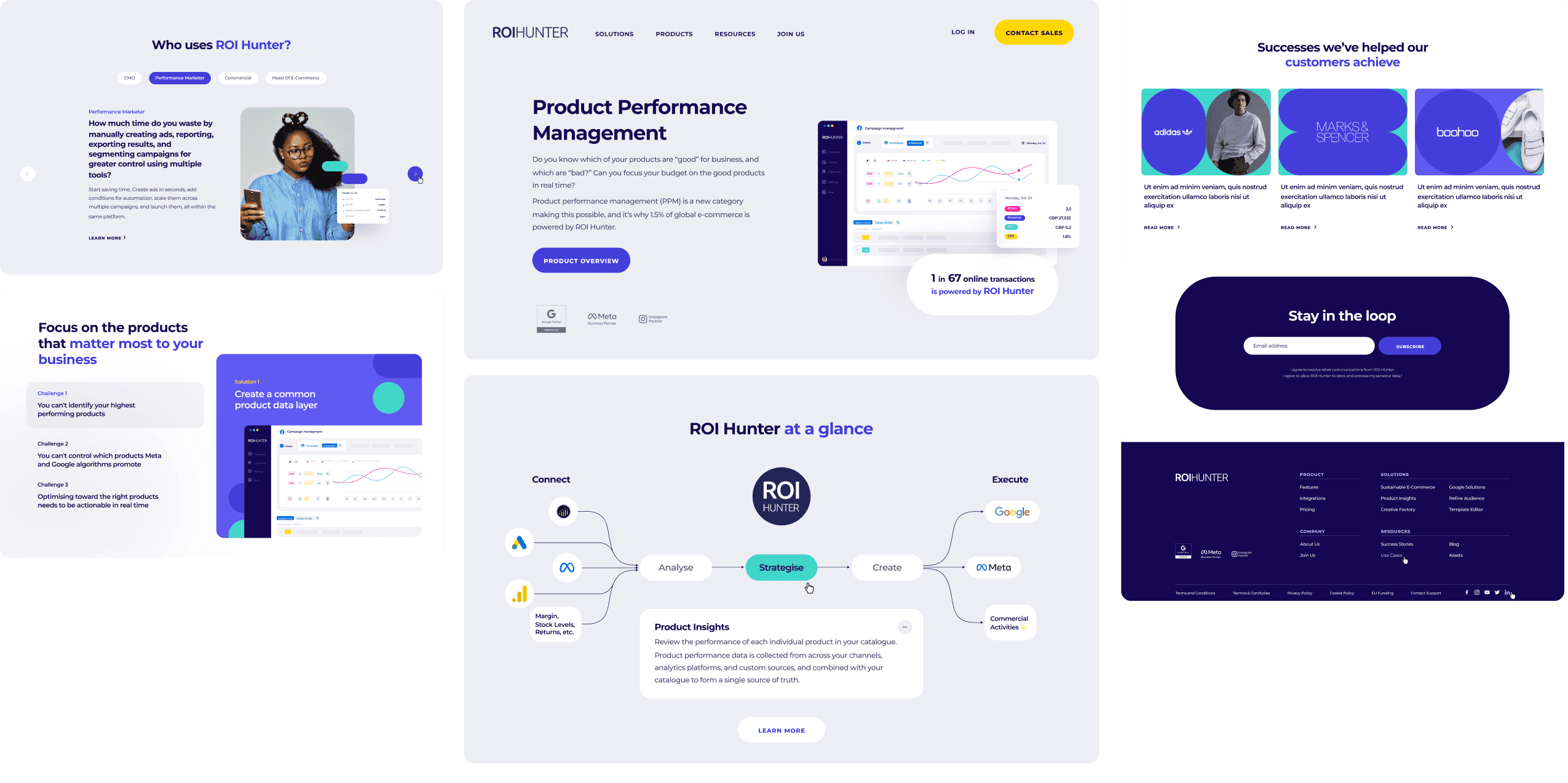
We implemented a visually cohesive homepage design, aligning it with the company's new brand identity. To achieve a modern look, we simplified the color palette, replaced stock photos with authentic real-life images, and eliminated shadows, resulting in a clean and contemporary aesthetic.
Optimizing e-commerce
ROI Hunter is renowned for its product performance management platform. It's an advanced tool that seamlessly collects product data from a wide range of sources. As a result, it allows retailers to gain insight into the performance of individual products and identify the best ways to make them as profitable as possible.
Making use of our expertise
We came up with a new home page structure and crafted a design that adheres to the best industry practices. The outcome was a remarkable improvement in visual hierarchy, content legibility, and interactivity.

Improving usability with data
We conducted in-depth user experience research. It included the analysis of data gathered from various website monitoring tools. We also took care of a very thorough competitor analysis. Doing so made it possible for us to significantly improve the website's usability.

Refreshing and readable
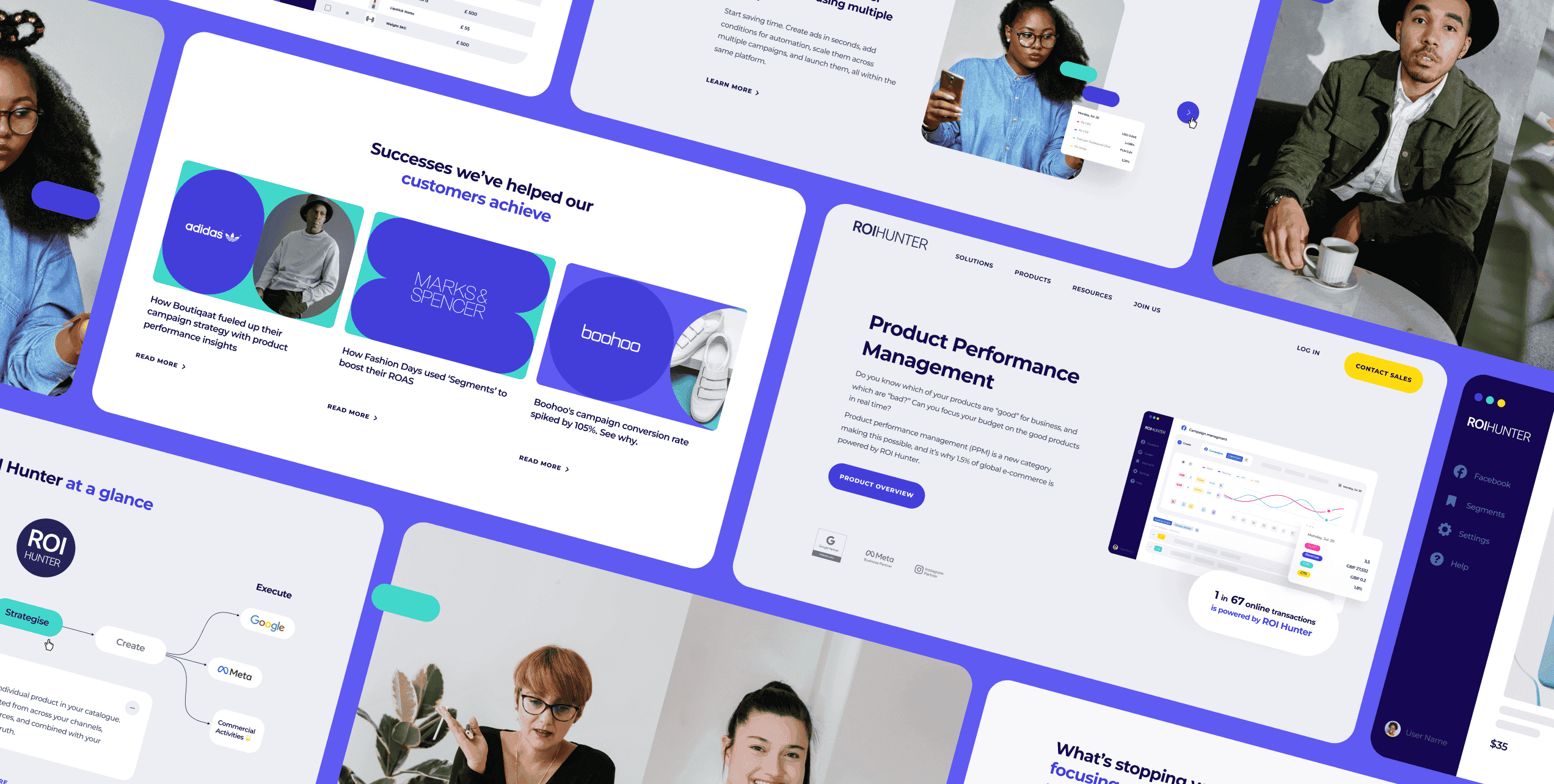
Our designers came up with a different website structure that prioritizes readability. On top of that, we prepared a new typography hierarchy and made calls-to-action stand out. Later on, we got rid of shadows and gradients that were present throughout the website. They made it appear outdated and crowded.
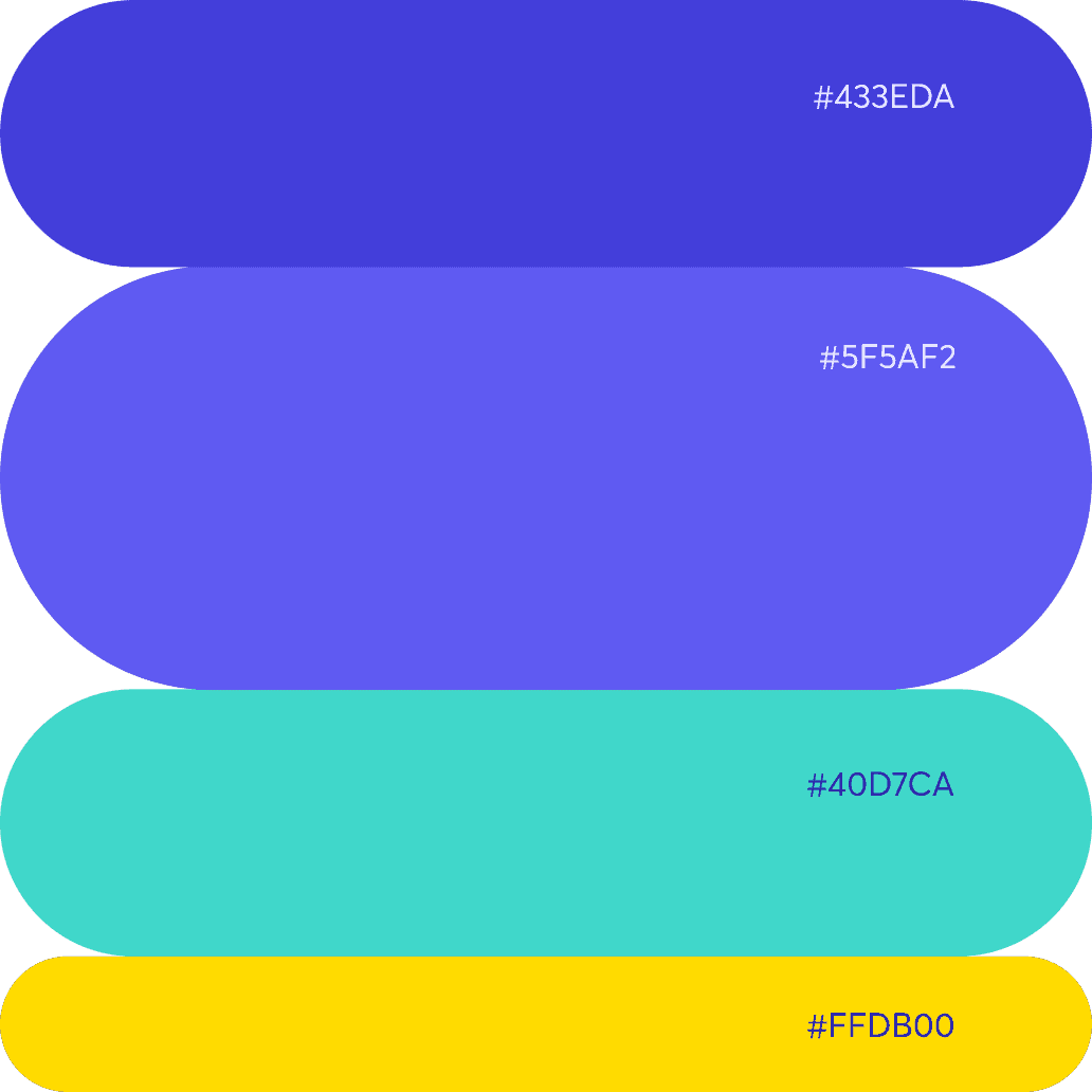
We also revitalised the color scheme and reduced the number of columns from ten to four. Purples are dominant, while turquoise and yellow serve as accent colors. What's more, we designed a number of custom-made digital assets, including covers for case studies.`
Engaging and high-converting
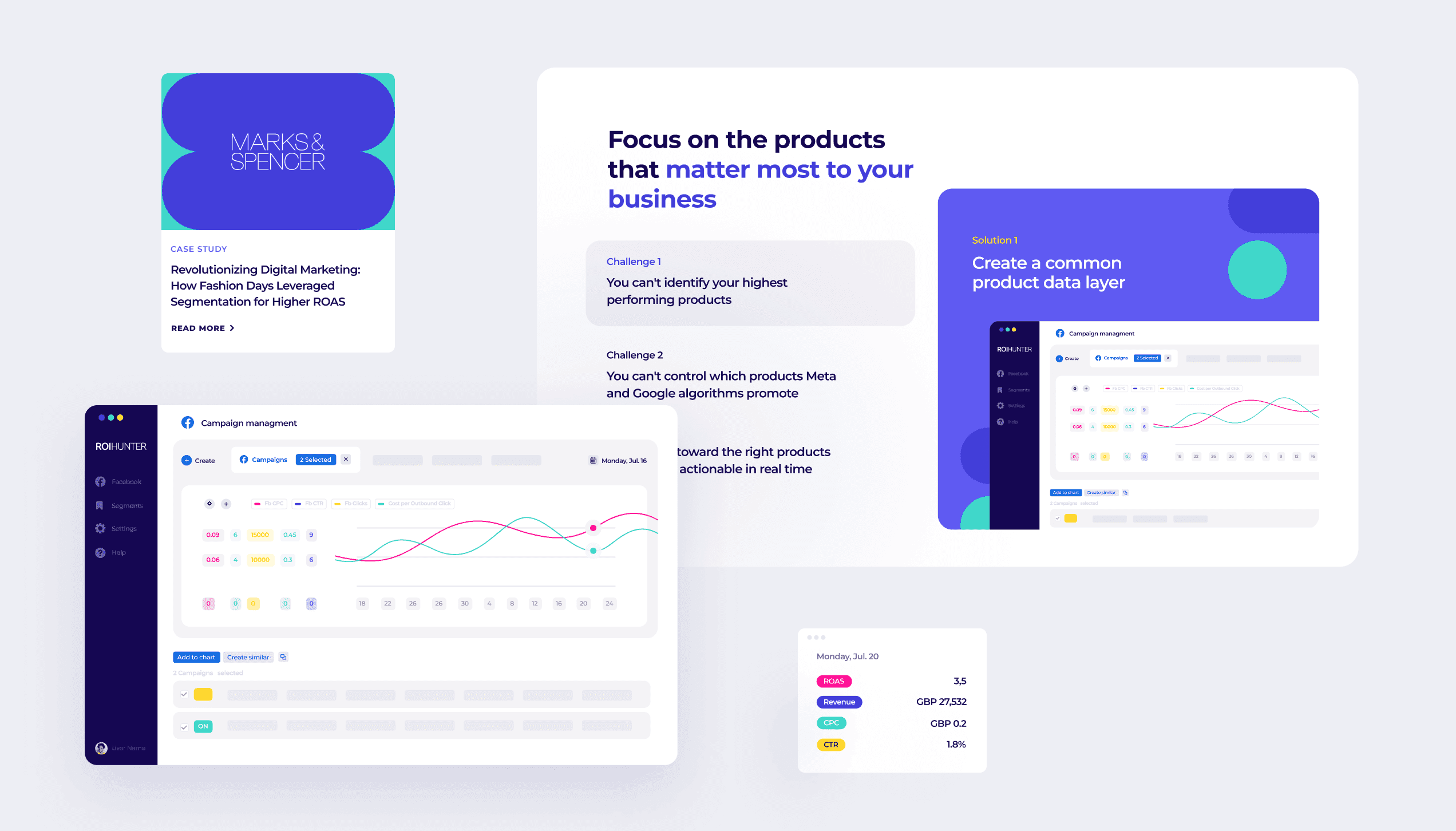
By showcasing the unique selling points of ROI Hunter in an interactive chart format, we enable users to grasp the complete process of using ROI Hunter. In addition, it makes it easier to comprehend the diverse range of solutions the company has to offer. It enhances user engagement and facilitates a deeper understanding of the company's offerings, leading to a higher conversion rate.
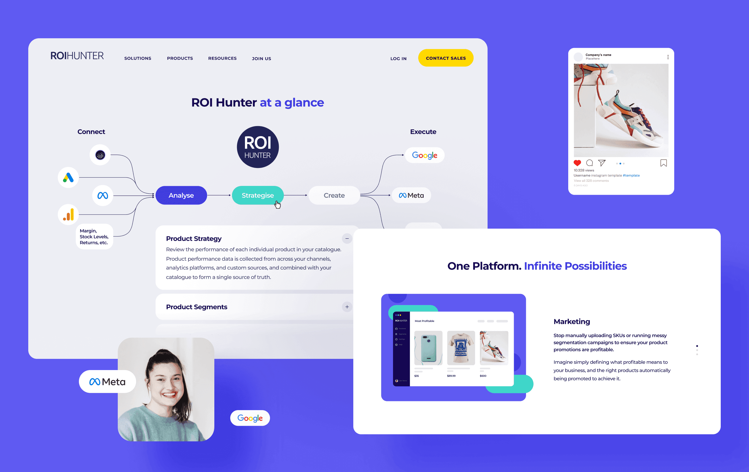
Attracting clients, adding trustworthiness
First, we created a number of ideal client profiles. Based on that, we designed a website section that explains why one might need ROI Hunter's offering. We also added a testimonials section to make the entire website more convincing. Our main goal was to enhance ROI Hunter's credibility through the use of real customer feedback.
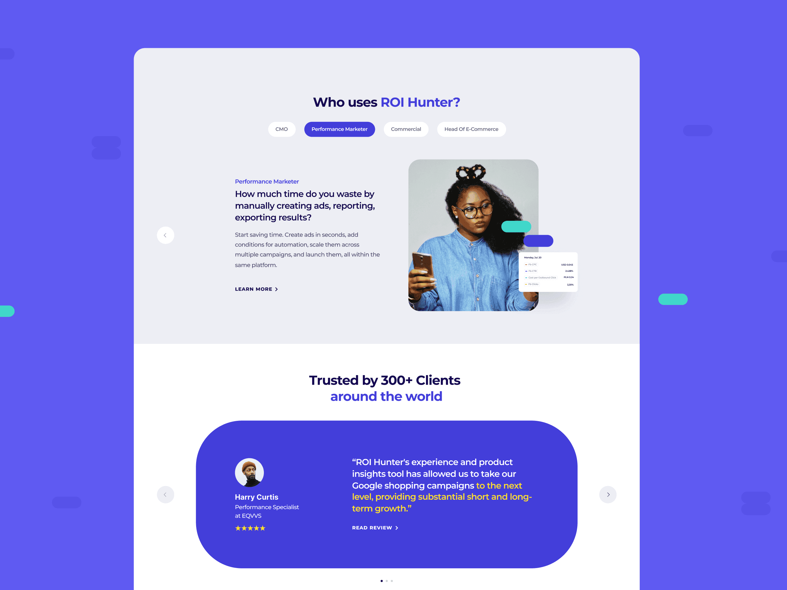
Responsive design
Our responsive design approach ensures that ROI Hunter's website seamlessly adapts to various mobile devices, delivering a consistent experience on the go. Whether it's a smartphone, a tablet, or a laptop, users get to experience the same aesthetic charm and intuitive navigation.
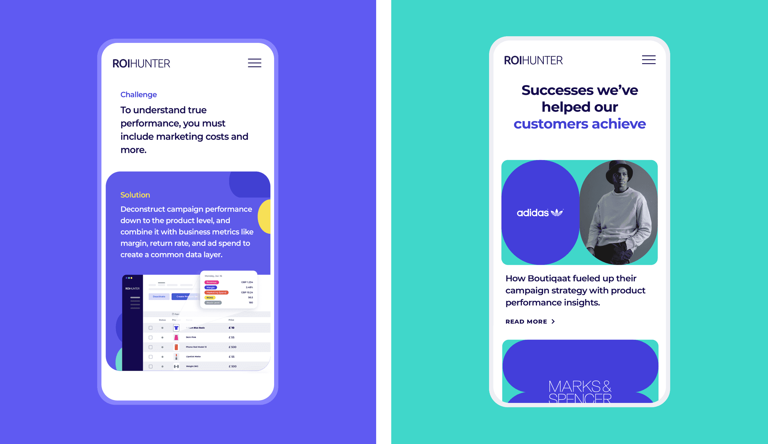
First impressions matter
The redesigned home page boasts a cohesive appearance, with the creative utilization of the capsule motif lending it an exceptional and distinctive style. By making purple the dominant color, we helped ROI Hunter establish a strong visual identity and boost brand recognition.
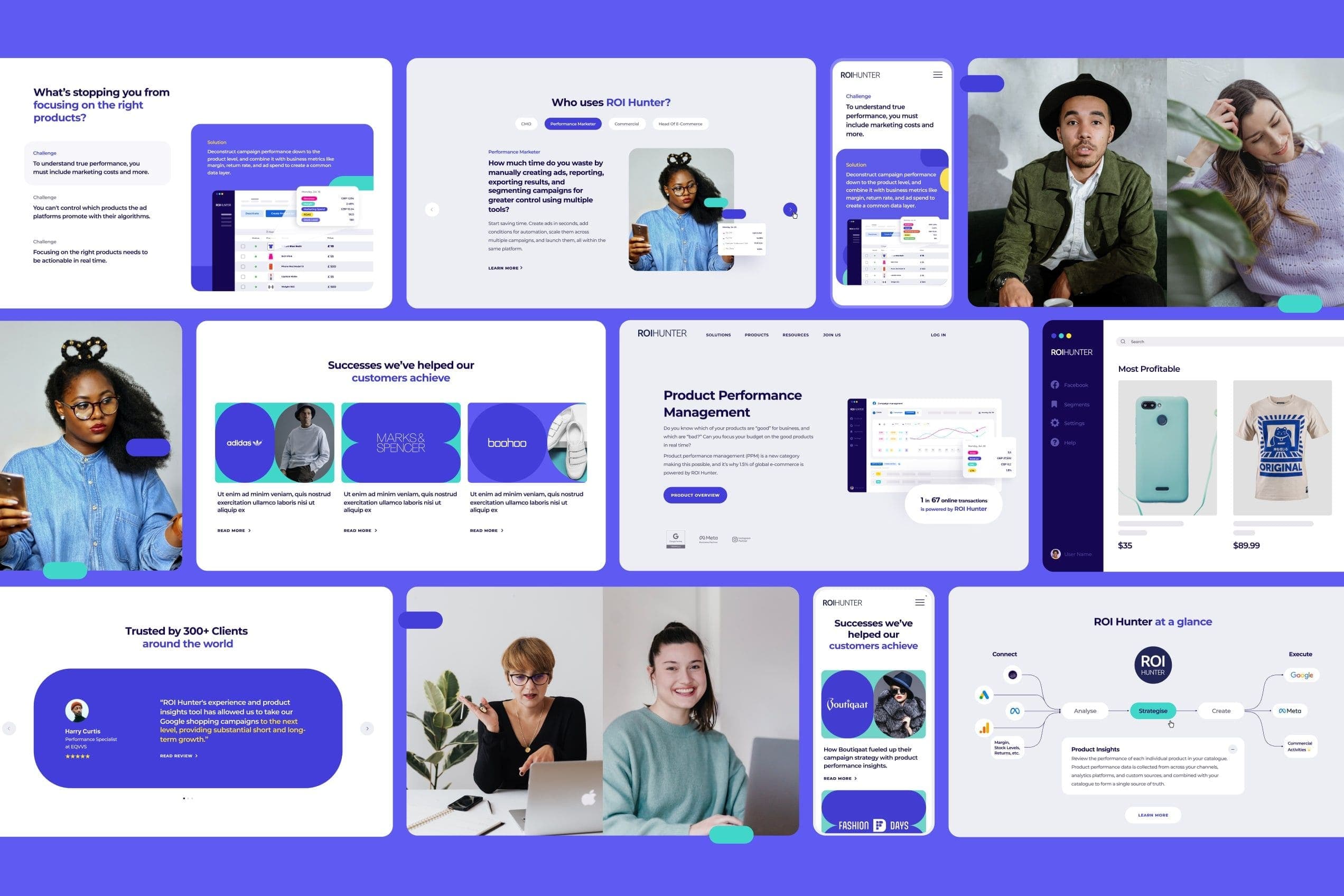
Innovation, modernity, and freshness
The color palette we went with consists of shades of blue, as well as turquoise and yellow. It gives the entire website a fresh and modern look. It's quite unique and memorable, too!
Clear and readable
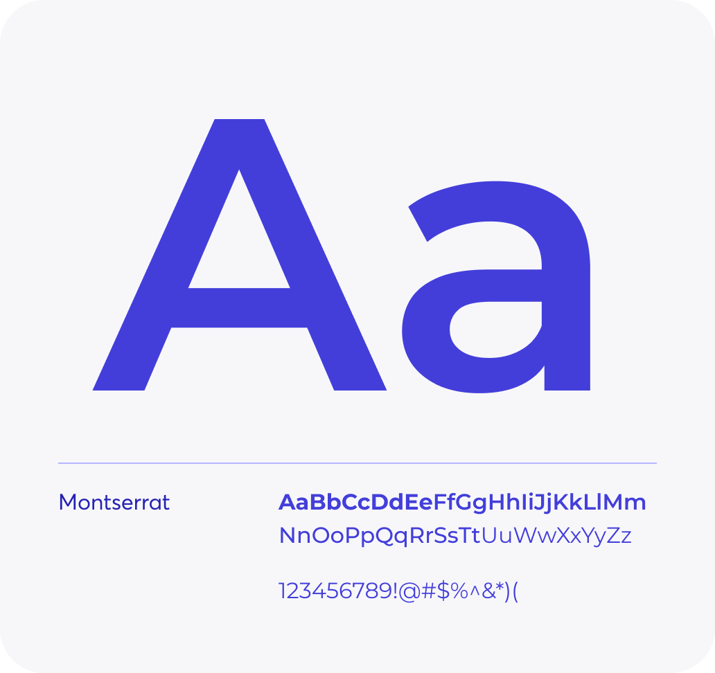
Montserrat is a widely recognized and commonly used font in both branding and website design. As an integral part of ROI Hunter's visual identity, it is extensively employed across the company's brand materials.
