A futuristic WordPress design for a biotechnology innovator
Brand
Location
Client
Budget
Industry
- Biotech
Environment
- WordPress
Release
PROBLEM
SOLUTION
VALUE DELIVERED
ABOUT SEQUINS
The future of genomics data quality
Sequins is a technological platform that's meant to improve the accuracy and usefulness of genomic data by enhancing the efficacy of genetic sequencing. It's responsible for developing and manufacturing synthetic genetic material controls, also known as Sequins, as well as a number of other bioinformatic tools.
SCOPE OF WORK
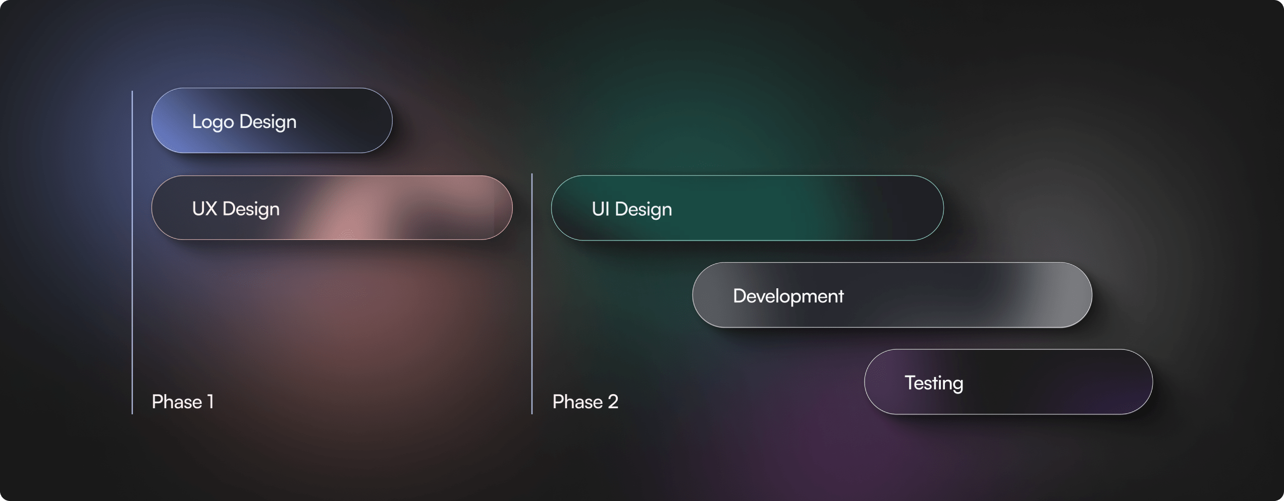
Prioritizing client expectations
Before we started working on the project, we conducted a series of user experience and user interface workshops with Sequins. It allowed us to assess their needs, identify their target audience, and organize the content that's already present on their website. This helped ensure that the Sequins website is easy to navigate and meets the key requirements set out by the Sequins team.
VISUAL IDENTITY
Brand identity with a contemporary touch
The new Sequins logo builds upon the old logo. The key difference between the two is a fresh, modern feel that better aligns with current trends. What's more, it's easy to implement and reflects the company's connection to the biotechnology industry, which is commonly associated with genomes.
WIREFRAMES
From the big picture to the details
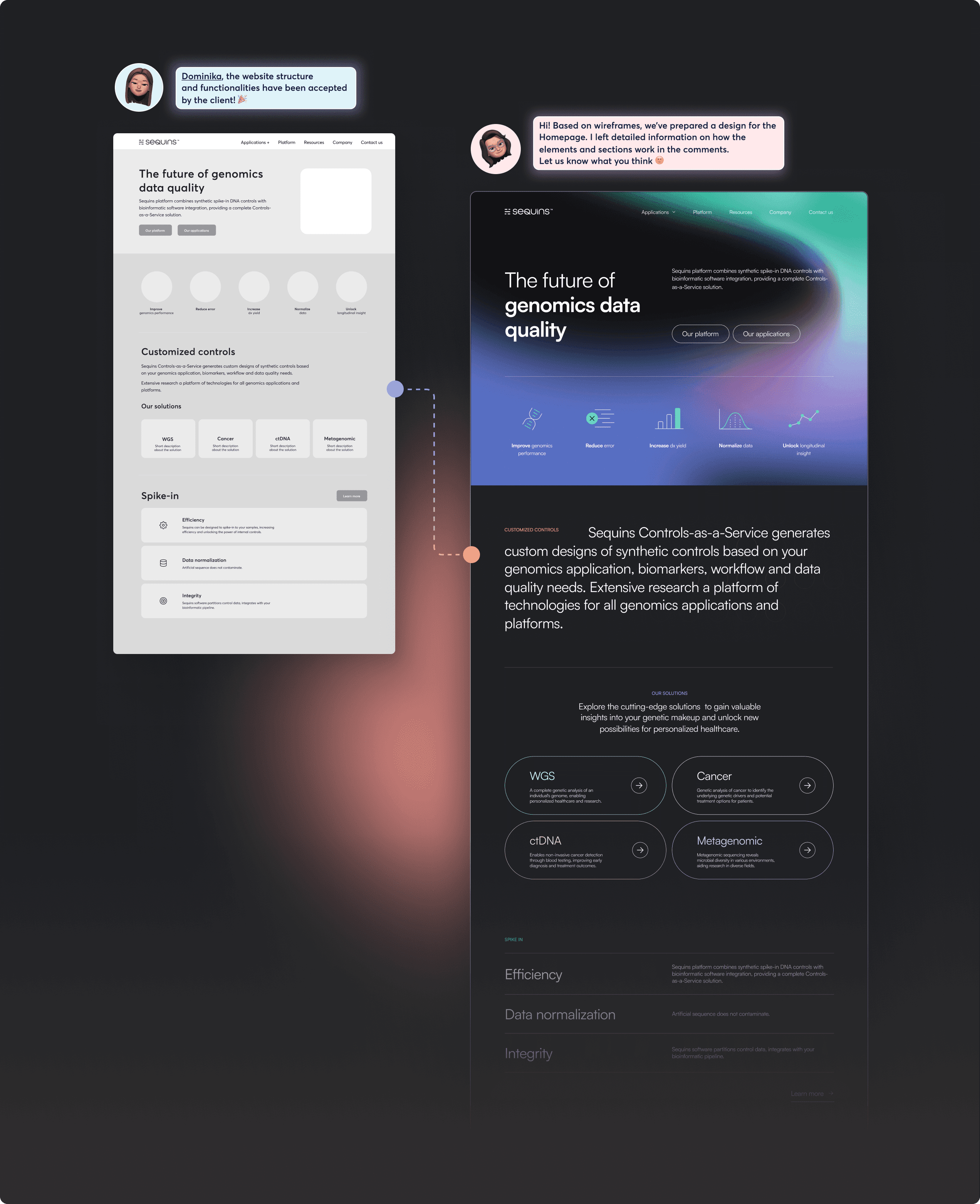
Wireframes provide a valuable tool for structuring websites, determining hierarchy, and testing a wide range of different solutions before the design process begins. This approach saves both time and money. The collaboration between designers, as well as clear communication at every stage of the project, allows for joint problem-solving and achieving the best results possible.
DESIGN
Impactful user experience
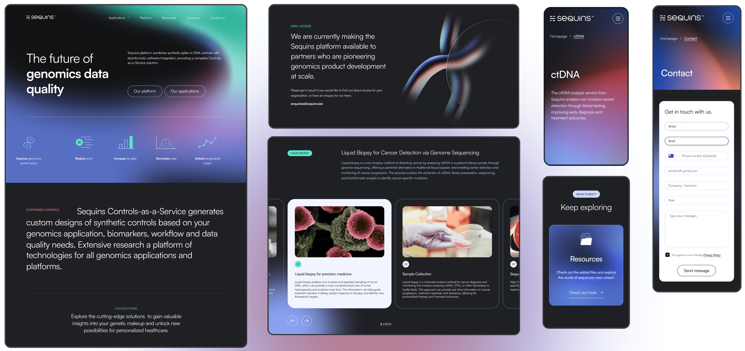
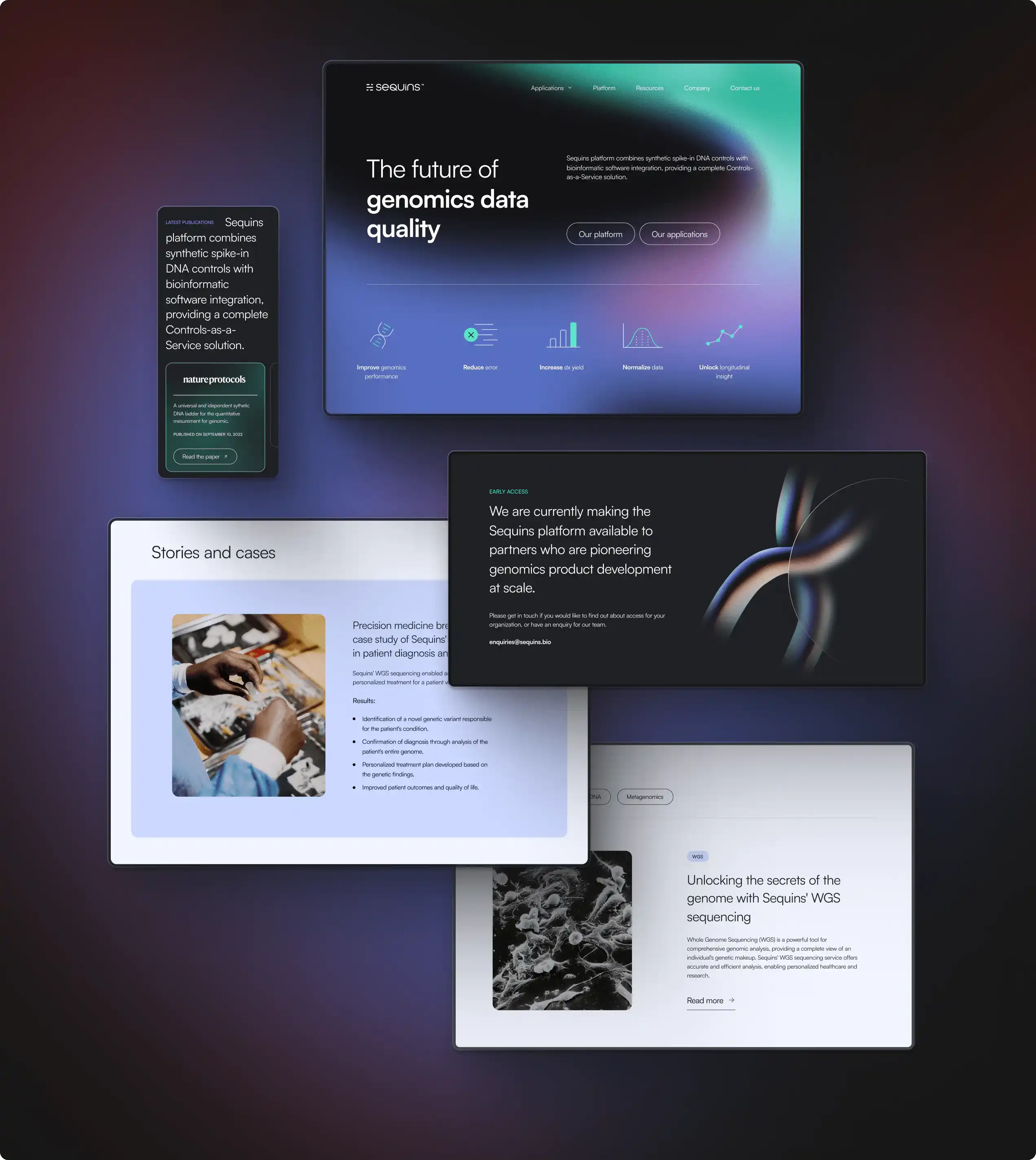
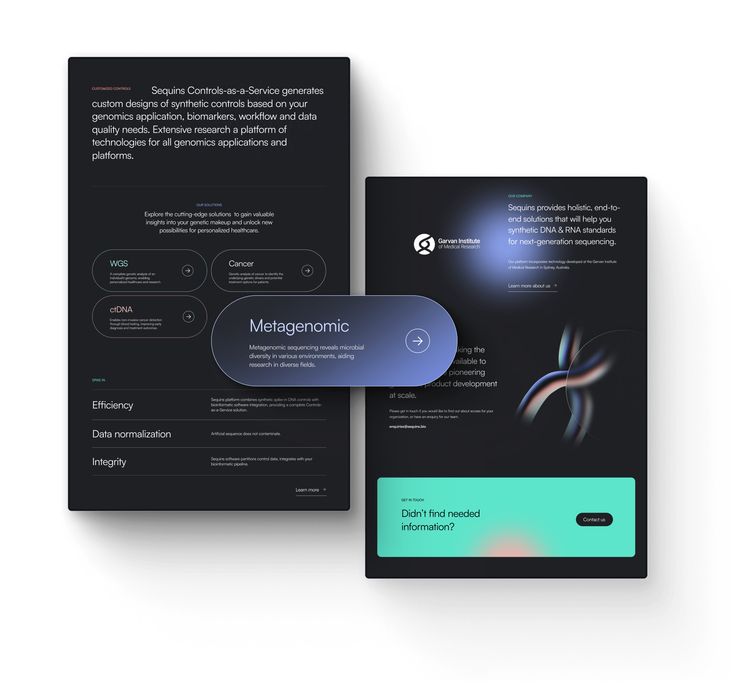
The design of the Sequins website incorporates modern and subtle gradient usage, evocative illustrations, and a non-standard yet clear typographical composition. The contrastive CTA further enhances the layout, resulting in an impactful and compelling user experience. The overall effect is a sleek layout with a touch of intrigue and mystique.
MOBILE APPROACH
Keeping mobile users engaged
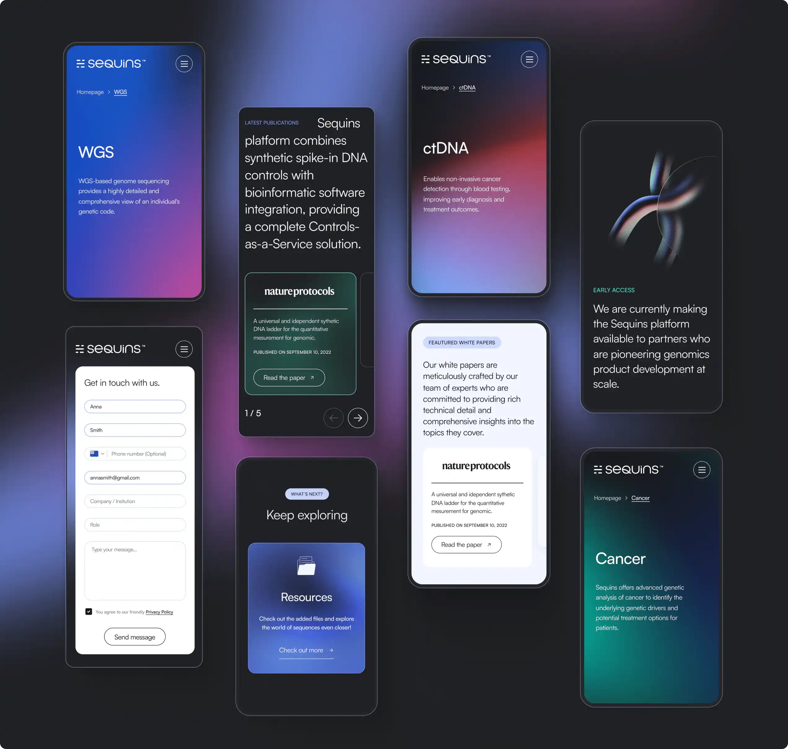
The mobile version of the Sequins website offers easy access to essential information and a clear and simple way to get to the most important applications. To put it simply, this user-friendly mobile design ensures a seamless and engaging browsing experience.
APPLICATIONS
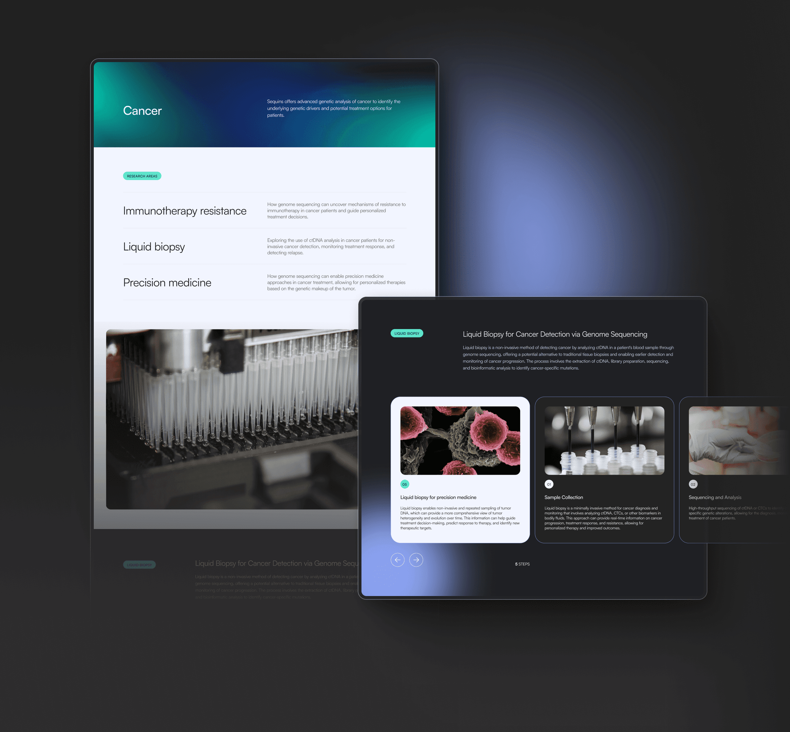
Highlighting the benefits
The subpage related to the Sequins application boasts a clear and clean layout. It presents all the essential information that the client might need in an engaging and orderly manner. Detailed descriptions of the application's features and processes are provided, making it easy for users to understand the benefits of using the application.
RESOURCES
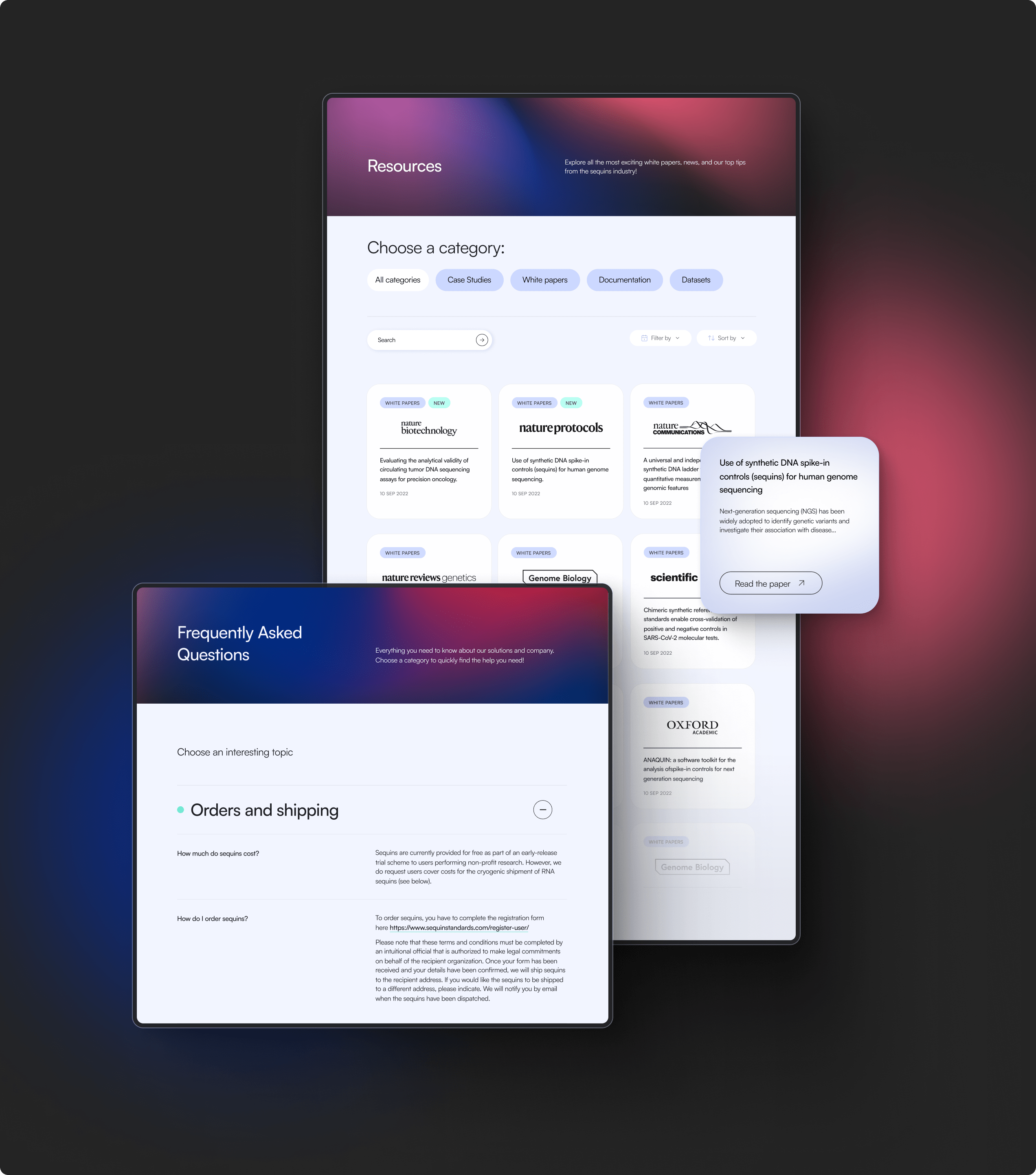
Making essential information easy to find
The design of the subpages with key resources and frequently asked questions offers easy access to the most important information about Sequins. This ensures that website users can easily find the information they need before contacting the company, saving time for both parties.
TEAM
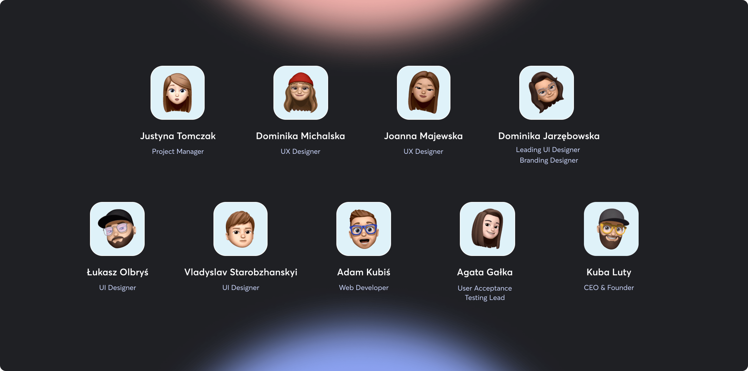
A symbiotic and supportive team
The new Sequins website was created by a cohesive team of designers and developers. They worked in close collaboration with a project manager, a quality assurance specialist, and the CEO of Adchitects to ensure that the project met client expectations.
BRANDING
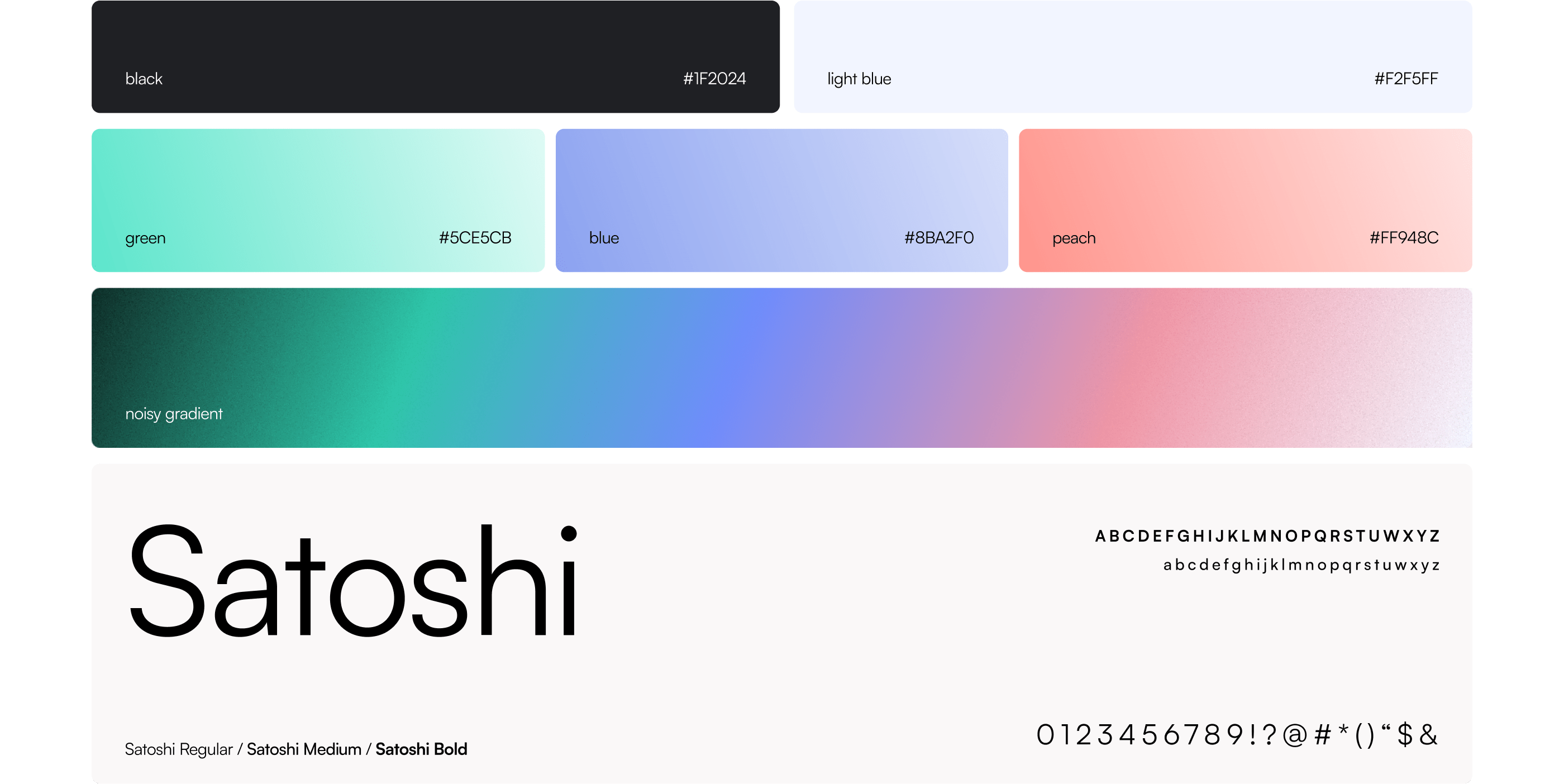
Colors and typography
The Sequins home page features a dark color scheme. It goes well with lighter subpages that contain scientific data, giving the entire website a modern and professional look. The subtle grain added to the gradients ensures a unique and slightly organic appearance. To top it all off, the use of the modernist sans-serif Satoshi typeface results in an innovative and distinctive typography.
ARE YOU READY?
Let’s build your next digital product


