New brand identity and website for a niche business financing firm
Brand
Location
Client
Budget
Industry
- Fintech
Environment
- WordPress
Release
Live
Check livePROBLEM
SOLUTION
VALUE DELIVERED
ABOUT SBG FUNDING
Clear, quick financing
SBG Funding, a specialized business financing firm, boasts extensive experience in the financial sector. Offering an alternative to traditional lending institutions, they provide small and medium-sized enterprises with swift and secure financing options, free of hidden conditions.
PROJECT SCOPE
User-centric design
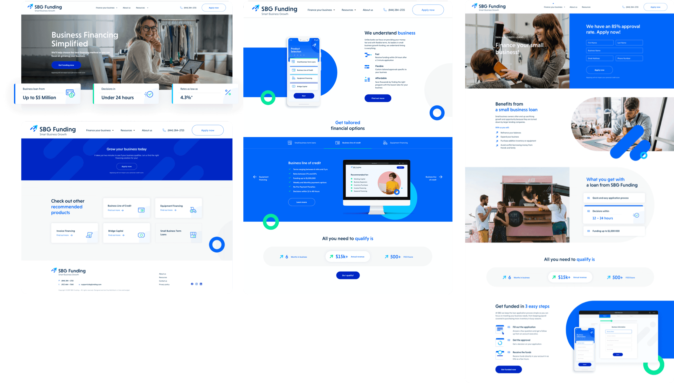
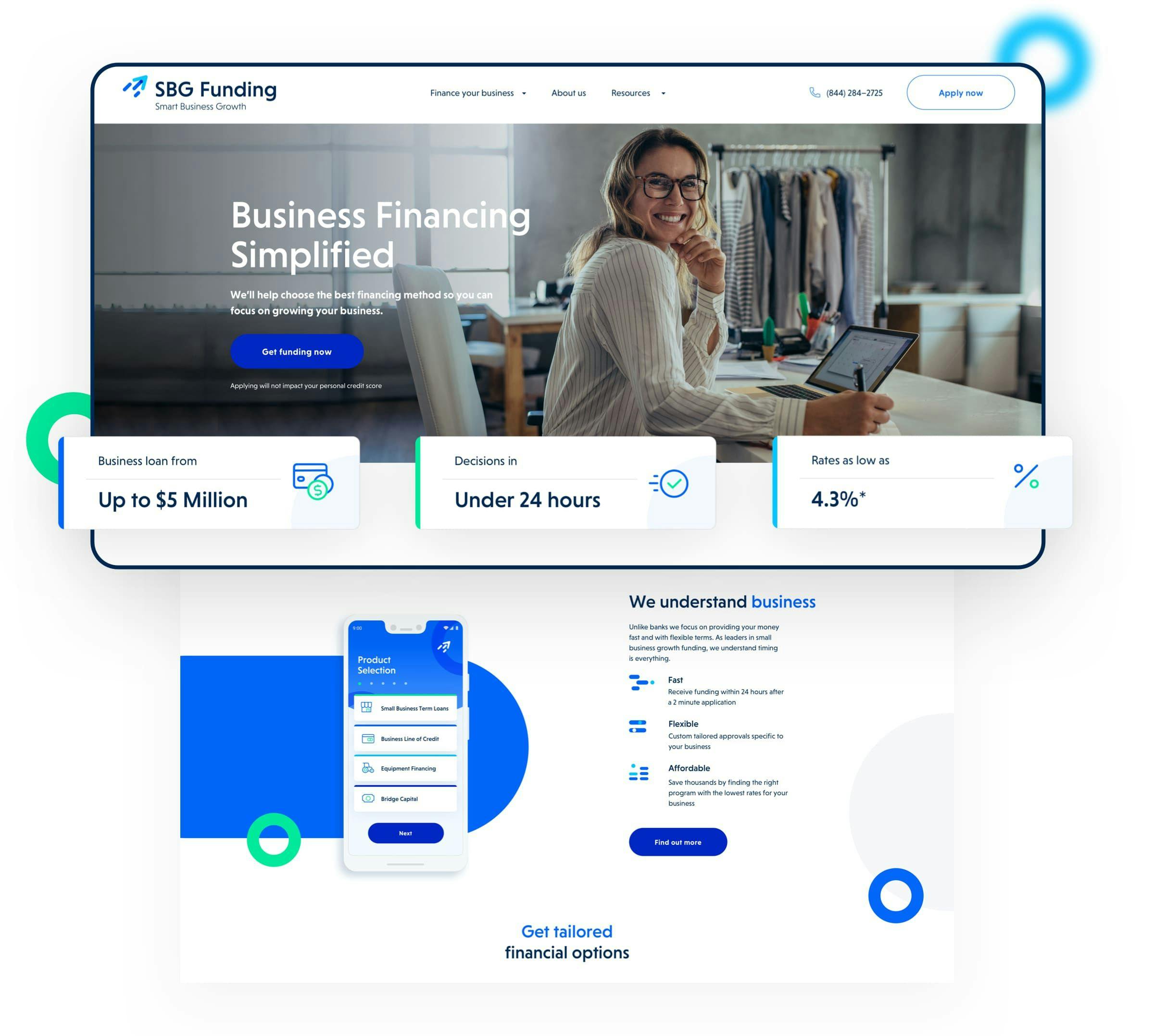
Our focus was on creating a smooth and intuitive user experience to streamline the application process for potential clients. This user-friendly approach was consistently applied across the website. Then, by using animations and illustrations, we effectively showcased SBG Funding's services, complemented by a clean layout for easy information navigation. The outcome was a contemporary platform that distinctly positions SBG Funding ahead of its competitors.
LOGOTYPE
Modern twist on classic symbolism
Drawing inspiration from its predecessor, a rocket symbolizing growth, the new arrow-shaped logo retains this meaningful imagery. We've successfully slimmed down the design while preserving alignment with the brand's well-established image.

BRAND IDENTITY
Designing for confidence
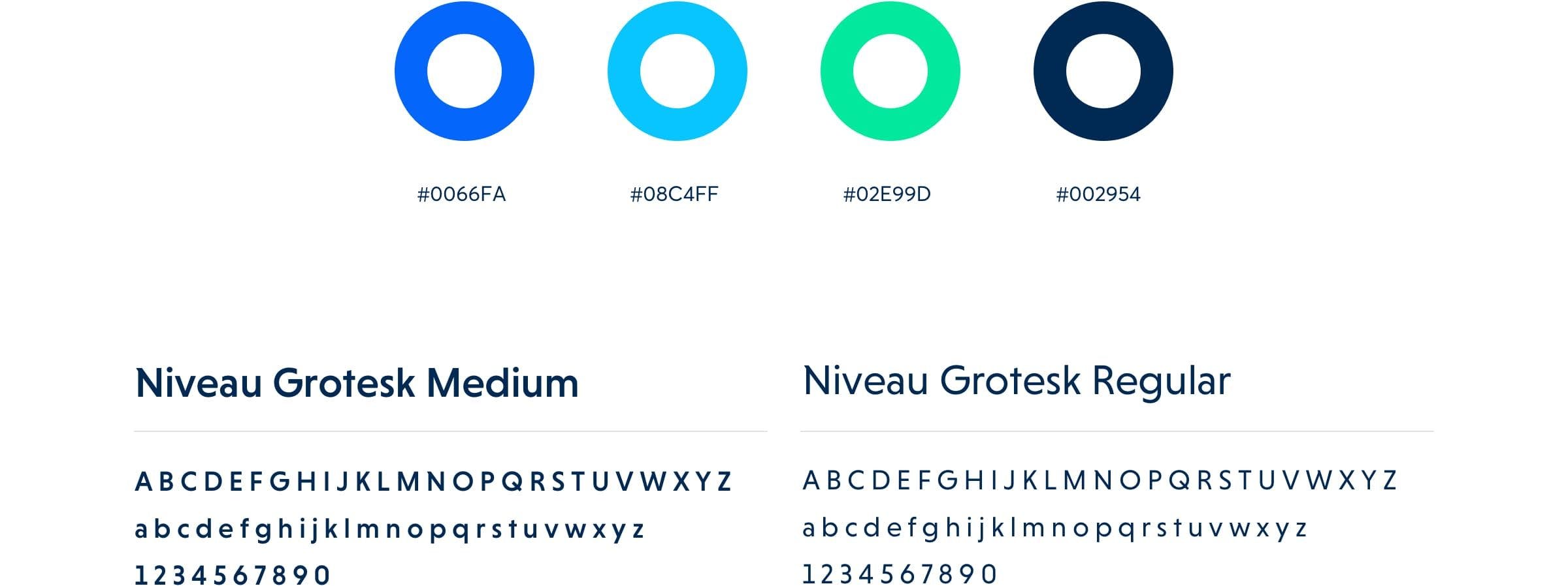
In choosing colors, we aimed for hues that evoke trust and stability, essential traits for a financial firm. Blue and green, symbolizing these values, were our obvious picks. The use of a sans serif typeface brings a contemporary and inviting feel to the design.
BRAND IDENTITY
Visual consistency
To finalize SBG Funding's branding, we employed a diverse array of visual elements including icons, pictograms, and small, repetitive motifs rooted in key visuals. Once these were crafted, the client skillfully matched each element with visual descriptions that seamlessly complemented the new branding style.
FINANCING MADE SIMPLE
Tailored funding paths
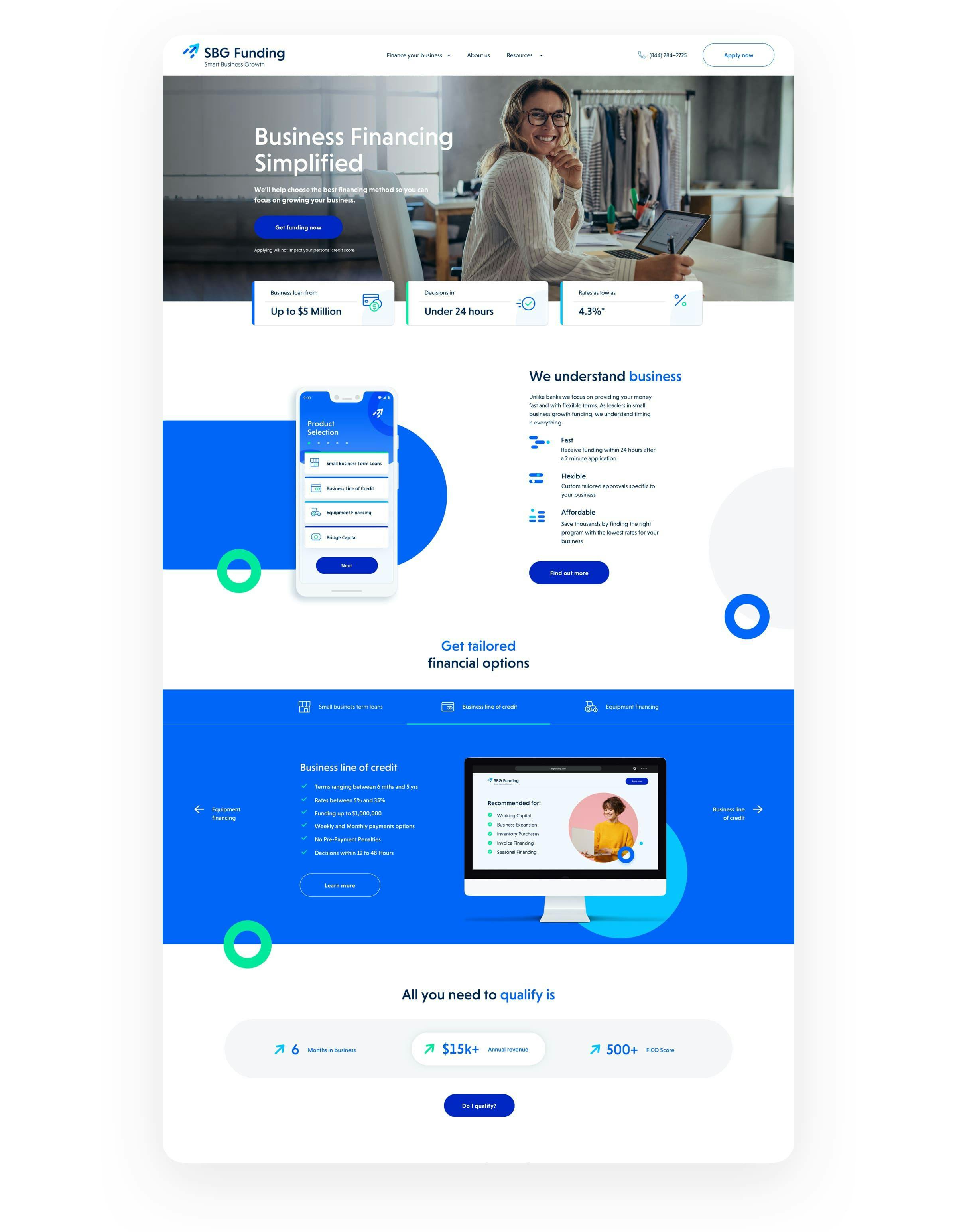
SBG Funding is dedicated to accelerating small business development through quick, secure, and readily available financing solutions. It was crucial for their website to reflect this commitment. Recognizing the diversity in user preferences and the availability of five distinct funding options, visitors are now able to effortlessly explore these options based on their industry or specific financing needs. This approach ensures a user-centric experience that aligns with their individual requirements.
EASE OF UNDERSTANDING
Engage and educate
The use of animations and interactive slides has transformed the website into a more dynamic and engaging platform, capturing the attention of visitors effectively. Animations help break down complex information into easily understandable segments, which is particularly beneficial for new users. A prime example of this is the use of animations to demonstrate the swift and straightforward application process.
COMMUNICATION
Client-centric language
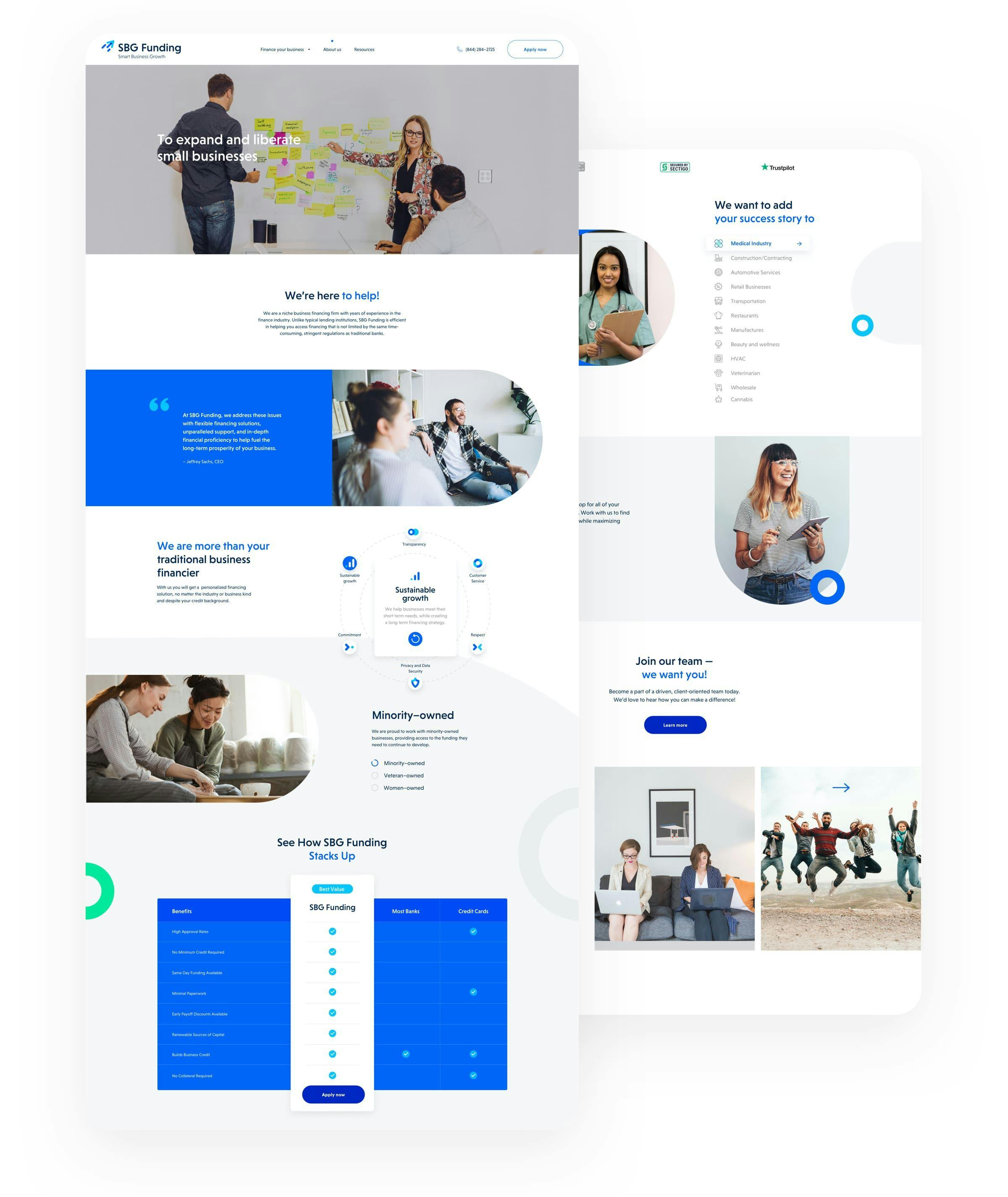
Moving away from the rigid norms of traditional financial institutions, FinTech brands like SBG Funding are at the forefront of embracing innovation. Catering to its clientele of small, ambitious, and forward-thinking businesses, SBG Funding ensures its communication is clear and direct.
EFFORTLESS PROCESS
Finance made easy
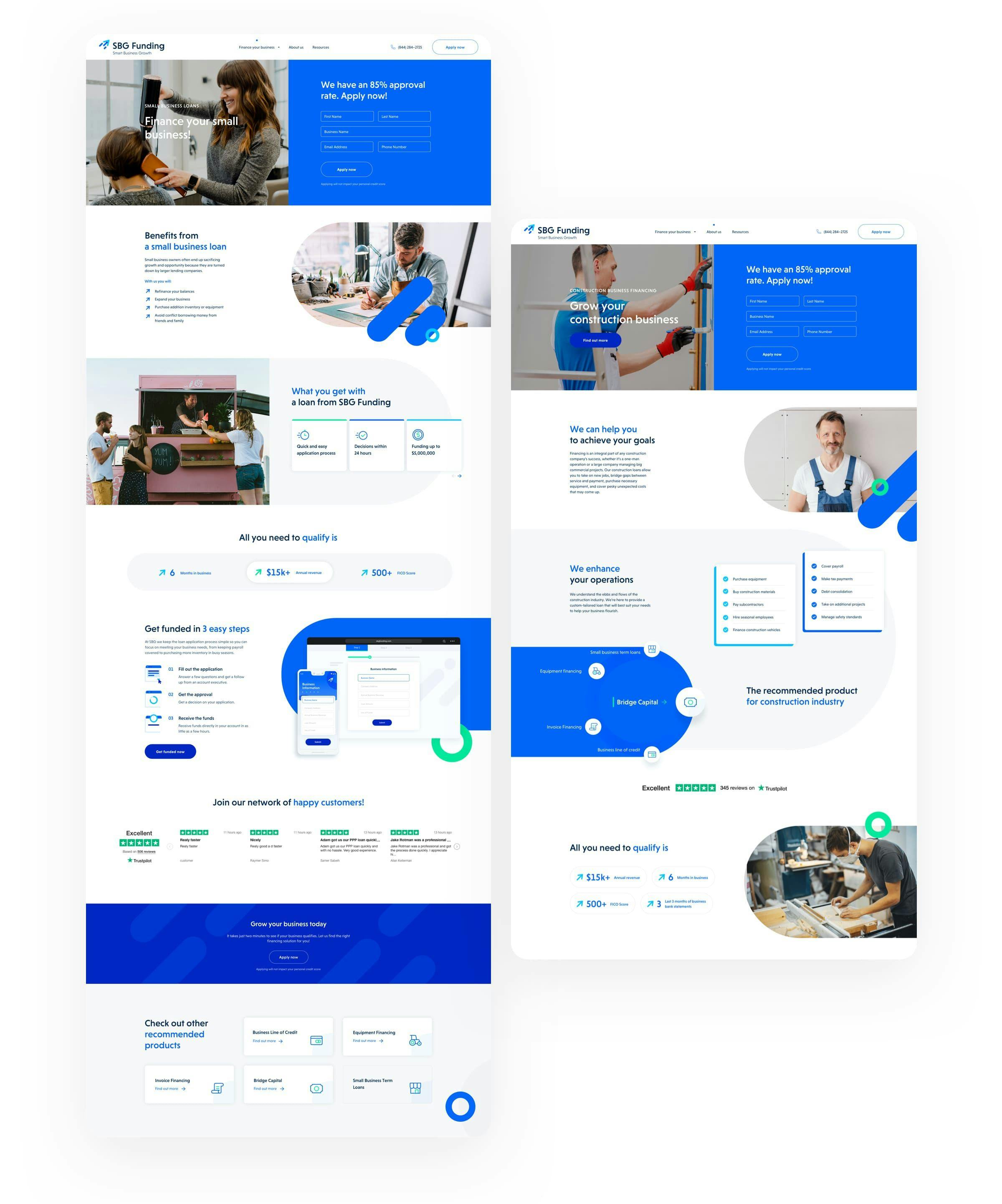
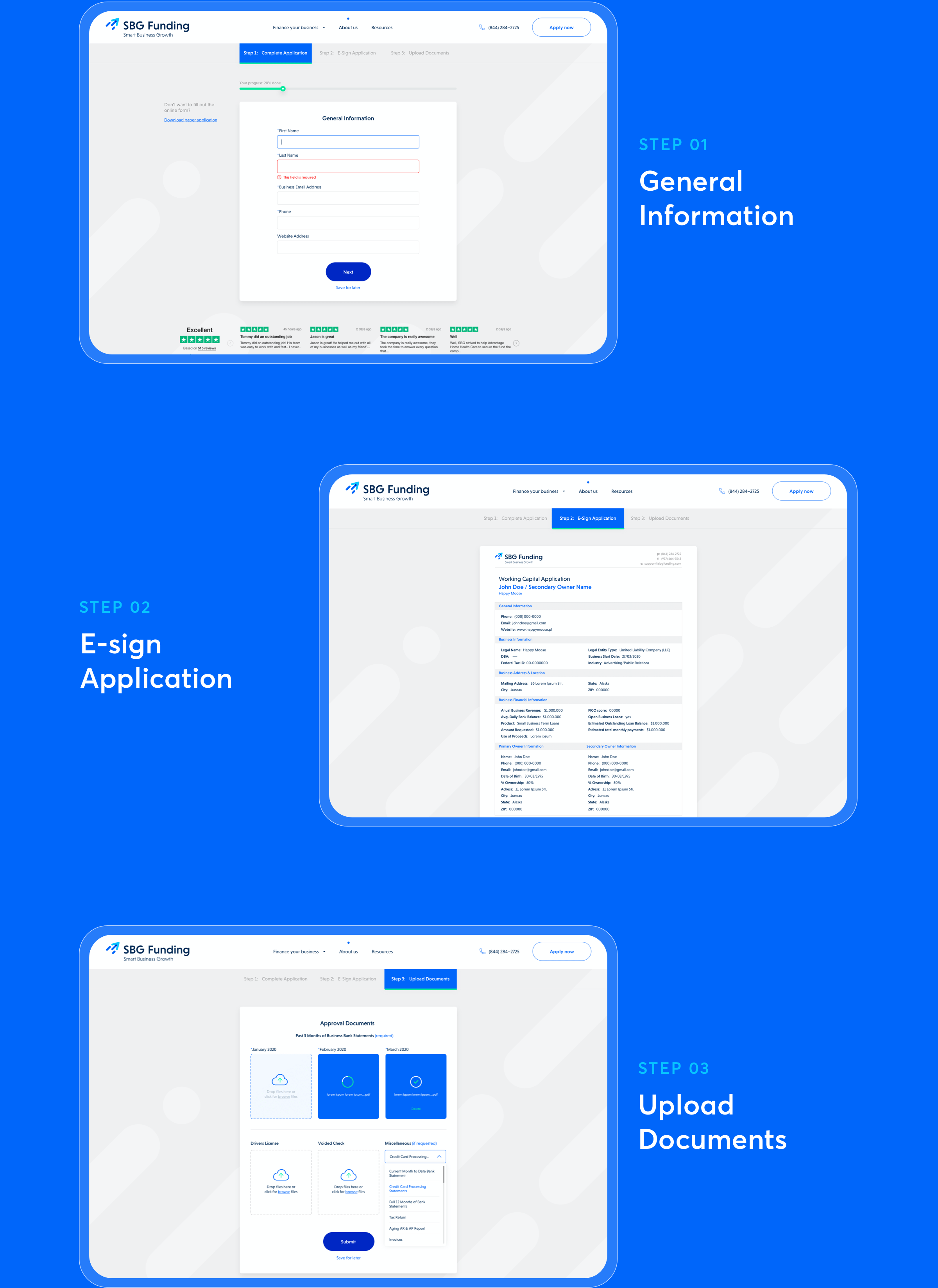
SBG Funding is renowned for its straightforward approach to business financing, as they are able to provide their clients with financing in just three easy steps. This clarity is showcased throughout their website, ensuring new users immediately recognize SBG Funding as a supportive and easy-to-partner-with entity from their very first interaction.
BLOG SECTION
Attract and educate
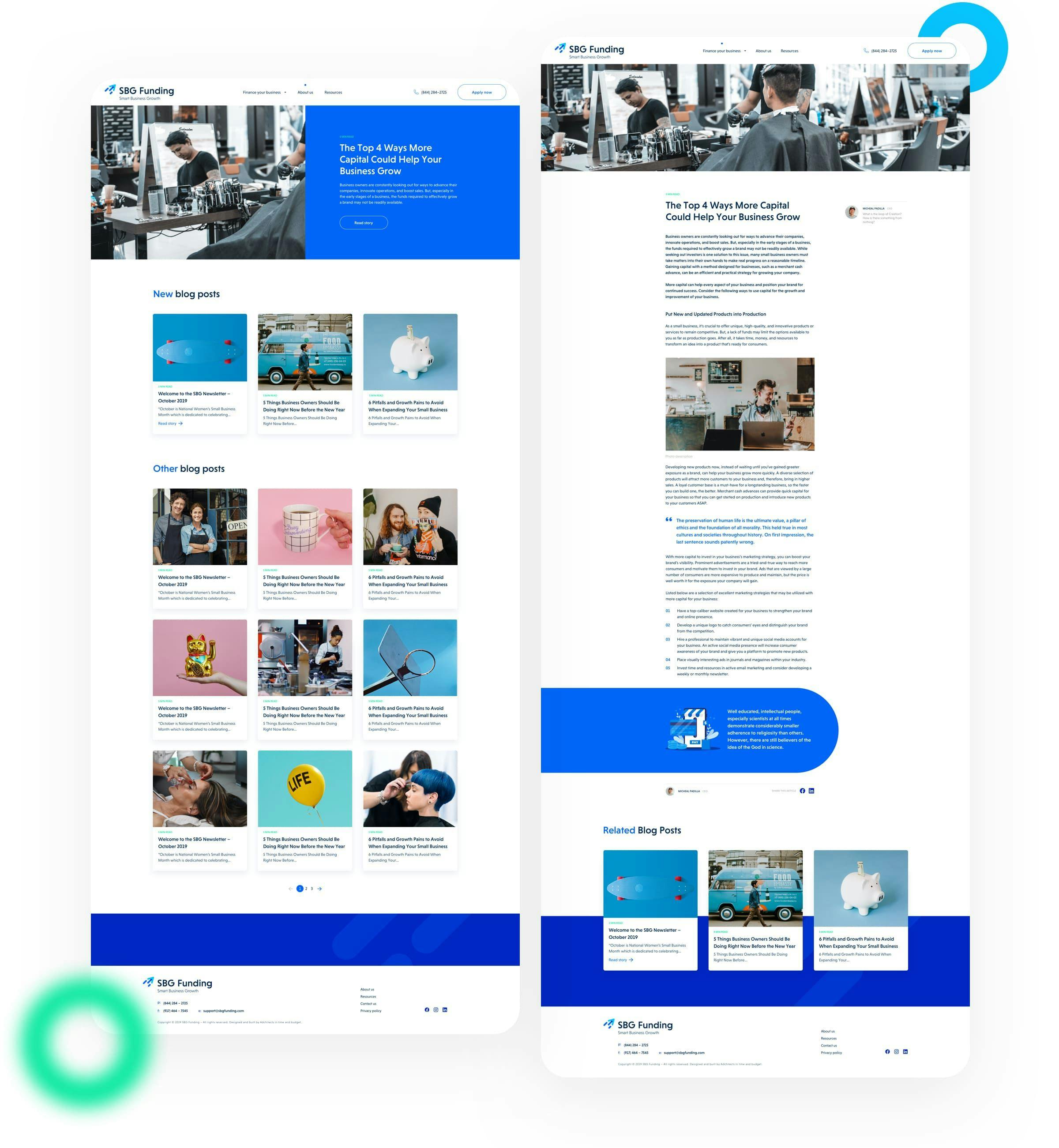
The inclusion of a corporate blog is a crucial element in many marketing strategies, functioning as an effective means to attract and educate potential clients. Recognizing its importance, we incorporated a dedicated blog section on SBG Funding's website. This platform not only establishes them as industry experts, but also creates opportunities to build meaningful connections with their target audience.
SIMPLIFYING THROUGH ART
Animated application process
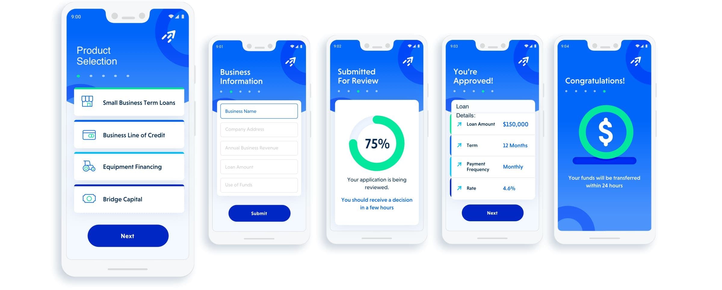
The mobile illustrations section provides an animated, visual depiction of the application process. Instead of mirroring the application's actual appearance, it creatively demonstrates its simplicity and ease of use. What's more, the entire section utilizes design elements and assets that are consistent with those found in the application form, ensuring a cohesive visual experience.
REDUCED BOUNCE RATE
User-friendly application process
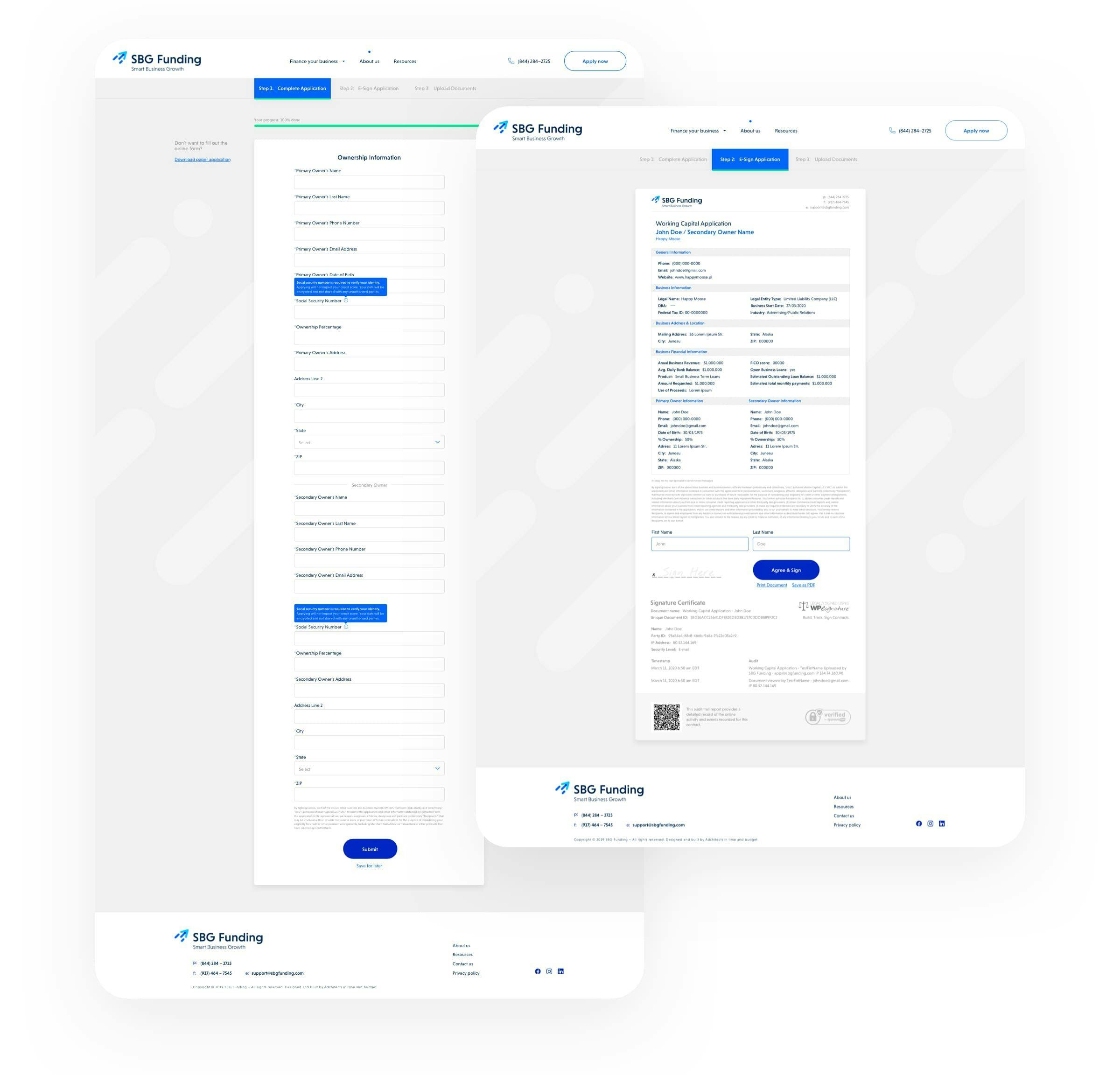
Creating a user-friendly, five-step application form was crucial in reducing the bounce rate during this pivotal phase of the customer journey. Once applicants complete the form, they can seamlessly upload the required documents and sign them using a digital signature. The process is designed to be as straightforward and efficient as possible.
ILLUSTRATIONS
Emails can be pretty, too!
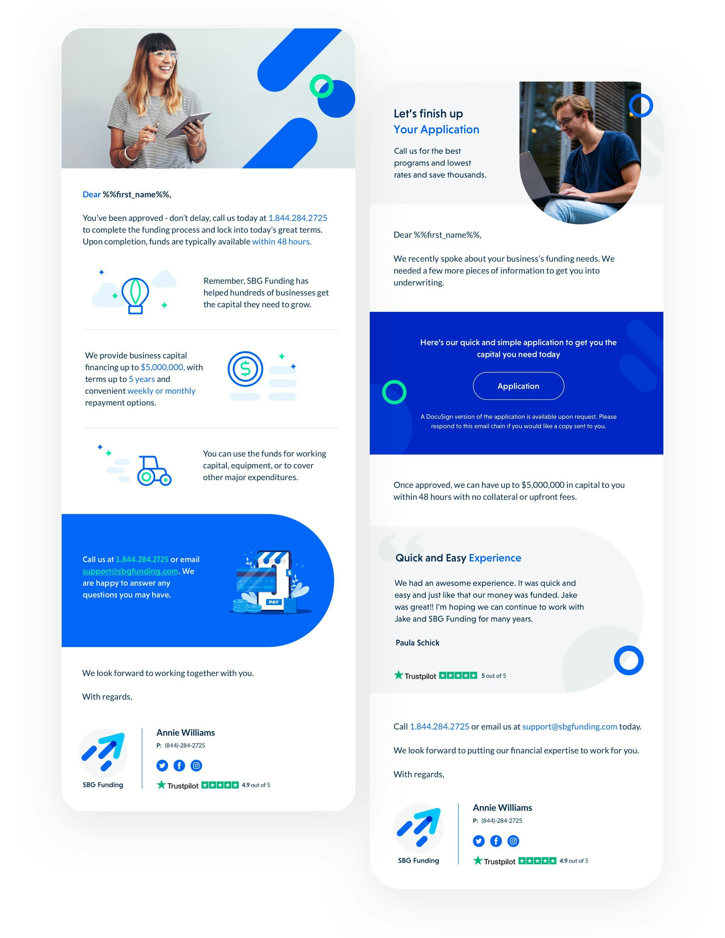
The new branding extends beyond the website. It also encompasses a series of illustrations designed for use in client emails. This approach challenges the notion that email communication must be dull, showcasing our commitment to designing engaging and vibrant interactions.
TECHNOLOGY
Seamless integrations
The seamless user experience on SBG Funding's website is powered by a few key plugins. We integrated Gravity Forms, enhanced with add-ons, to provide their clients with an effective application form. It was coupled with WP-E-Signature for efficient electronic signature collection.
ARE YOU READY?
Let’s build your next digital product


