+38% Organic Traffic For a Corporate-Level Cybersecurity Software Company
BRAND
Pathlock
location
California, US
Client
Pathlock
Stack
WordPress
Industry
Technology
Budget
$15,000 - $50,000
Live
PROBLEM
Pathlock, a key player in the cybersecurity sector, recognized the need to upgrade their digital platform to better reflect their market position. Their aim was to create a website that reflects their professionalism, highlights their esteemed partnerships, and provides insight into their innovative approaches within the industry.
SOLUTION
We designed a sophisticated corporate website featuring deep blue hues, complemented by vibrant, digital-inspired green accents. The site's user experience is enhanced with smooth animations, an efficient mega menu, a dedicated integrations page, and a special section highlighting Pathlock's valued partnerships.
VALUE DELIVERED
The final product is a lightweight, reader-friendly website. It's a content-rich platform enhanced with an intuitive menu, elegant animations, and state-of-the-art UX/UI solutions. The perfect reflection of Pathlock’s forward-thinking ethos.
Our work in numbers
Simplicity and minimalism
The power of simplicity and minimalism in web design is undeniable. Pathlock's new website stands as a testament to this, embodying a contemporary and professional aesthetic we meticulously crafted and developed. Let's delve into how we achieved this.
Data protection pioneers
Pathlock is a cybersecurity company that provides data safety measures to businesses around the globe. Their offerings include access orchestration, application security, and control automation through high-end IT solutions. Trusted by numerous Fortune 500 companies, Pathlock was a tremendous partner to work with.
Minimalism and simplicity
Pathlock holds a prominent position in the cybersecurity industry. Our initial aim was to create a responsive website that mirrors the company's professional stature. Despite the allure of going for a more lavish design to meet high expectations, we opted for minimalism. The result was a straightforward and nimble website, underscoring the notion that simplicity often proves to be the most impactful strategy.

Sending a clear message
The website's home page is characterized by its calm and straightforward design. The call-to-action and service descriptions immediately present the company and its objectives. Without unnecessary embellishments, the core message stands out, becoming clearer as the user navigates deeper into the site.
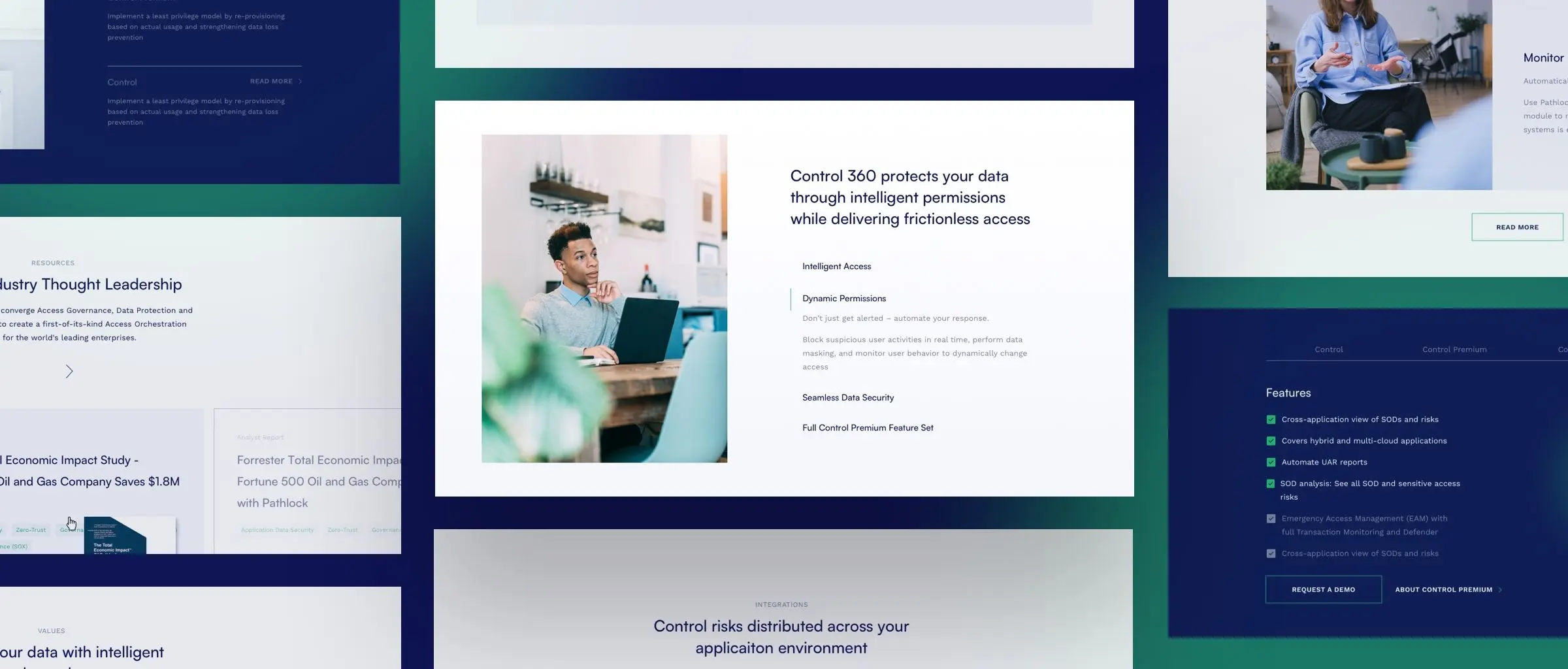
Subtle animations
Explaining Pathlock's operations in simple terms can be challenging, which might make the home page seem dense with information. To maintain user engagement, we added in a few subtle animations that mimic electricity flowing through a wire.
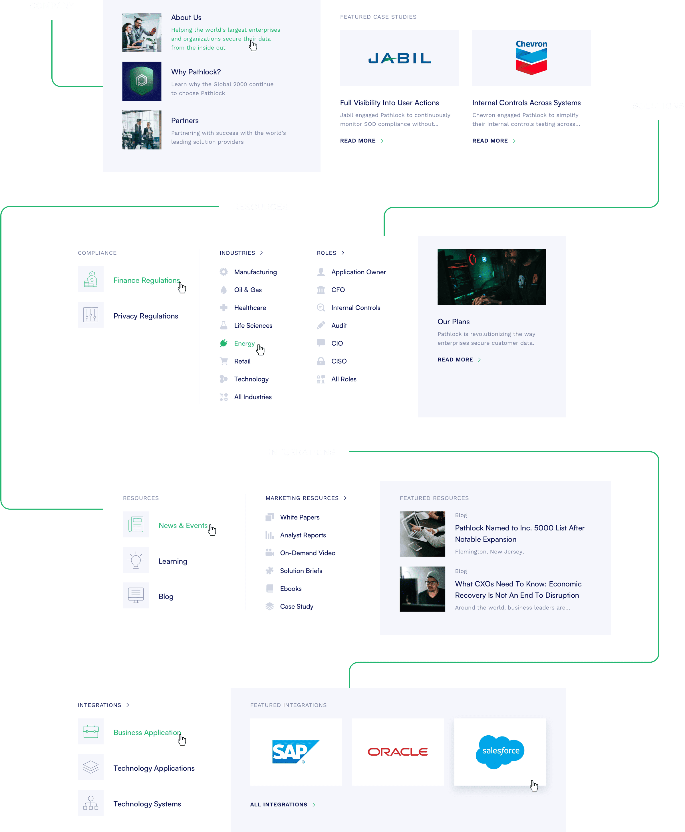
More than meets the eye
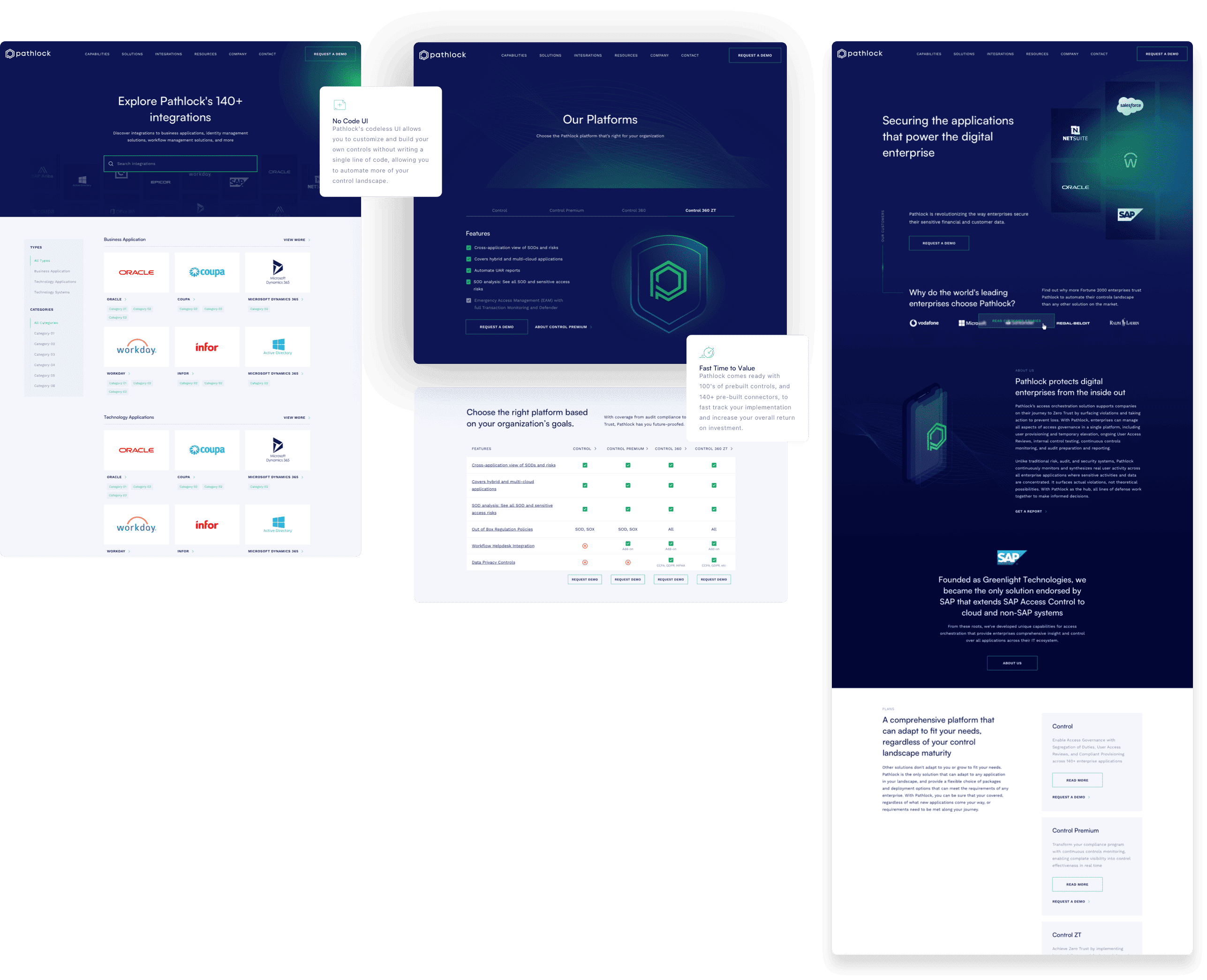
At first glance, the Pathlock website might seem like a one-page site, but its expansive content is easily accessible through our well-structured menu. This menu effectively directs users to various subpages. Additionally, we've allocated space specifically for partner company logos. It adds to Pathlock's credibility.
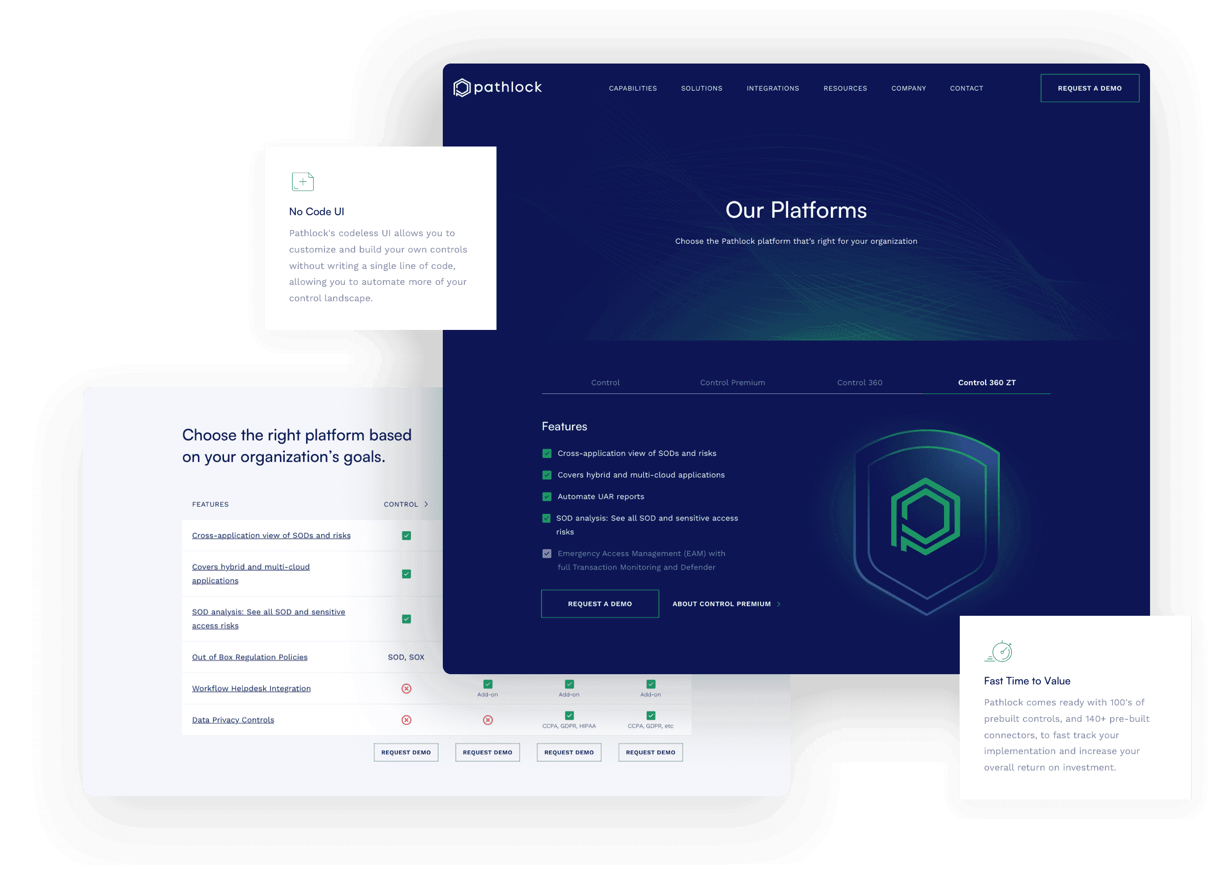
Finding the perfect plan
Like many IT service providers, Pathlock’s website features a responsive plan comparison page. To ensure clarity and focus for decision-making users, this subpage has a plain white background with minimal distractions.
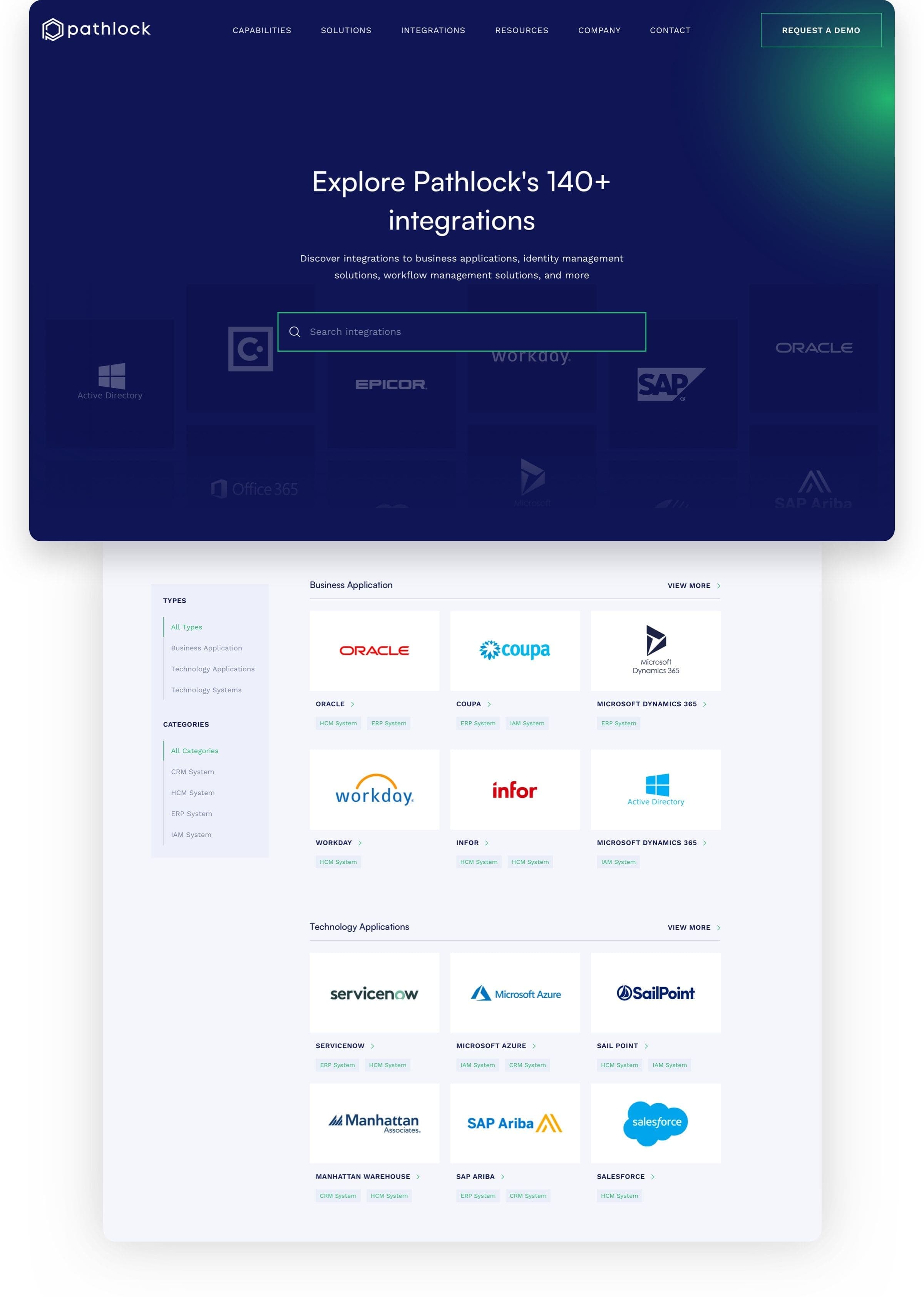
Effortless integration
The inclusion of a straightforward search bar effectively aids in finding Pathlock's numerous integrations. Their commitment to meeting and setting new cybersecurity standards is evident in their extensive list of over 140 searchable integrations.
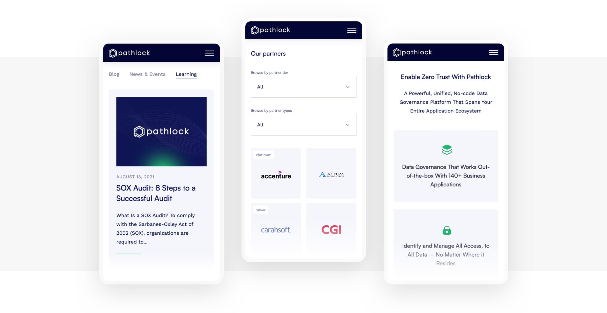
Top-quality mobile experience
In its mobile version, the website embraces minimalism, featuring uncluttered white backgrounds and subtle color highlights. This crisp, clean design effectively communicates Pathlock's image as a reliable and professional business partner.
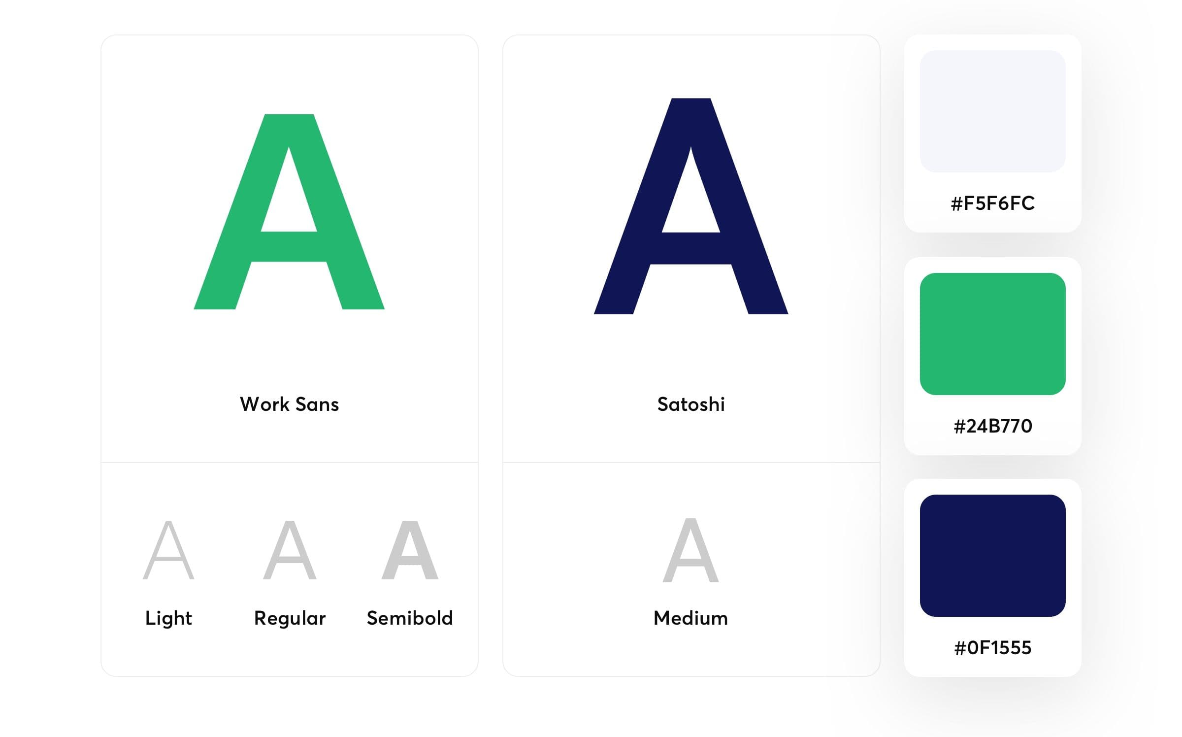
Elegant design choices
While the sans-serif typefaces Work Sans and Satoshi appear similar at first glance, their nuanced distinctions contribute significantly to the contemporary, high-quality look of Pathlock's website. The carefully chosen typography, with its mild weight, skillfully accentuates key slogans and headings. Regarding the color scheme, we selected Pathlock's signature deep blue, a lively green, and a gentle white tinged with blue. The deliberate choice of these colors not only complements the modern typography, but also reinforces Pathlock's brand identity, creating a visually cohesive and striking online presence.