Supercharge your digital presence with our website design services.


Appealing website for a global crypto liquidity provider
Brand
Location
Client
Budget
Industry
- Fintech
- Web3
Environment
- WordPress
Release
Live
Check livePROBLEM
SOLUTION
VALUE DELIVERED
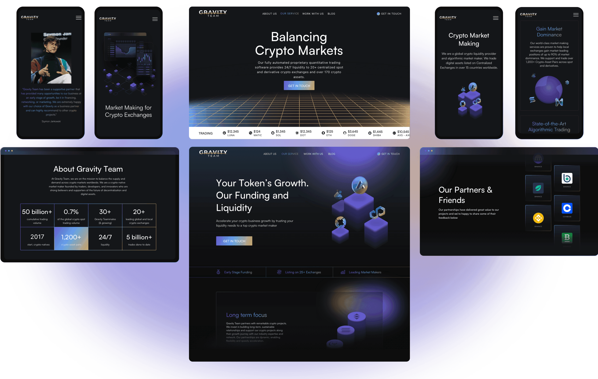
ABOUT GRAVITY TEAM
Blockchain pioneers
Gravity Team is a quantitative cryptocurrency trading firm that started in 2017, offering trading opportunities, exchanges, and liquidity services. Seeing blockchain technology evolve, they knew they had to improve their online presence to spread their new ideas.
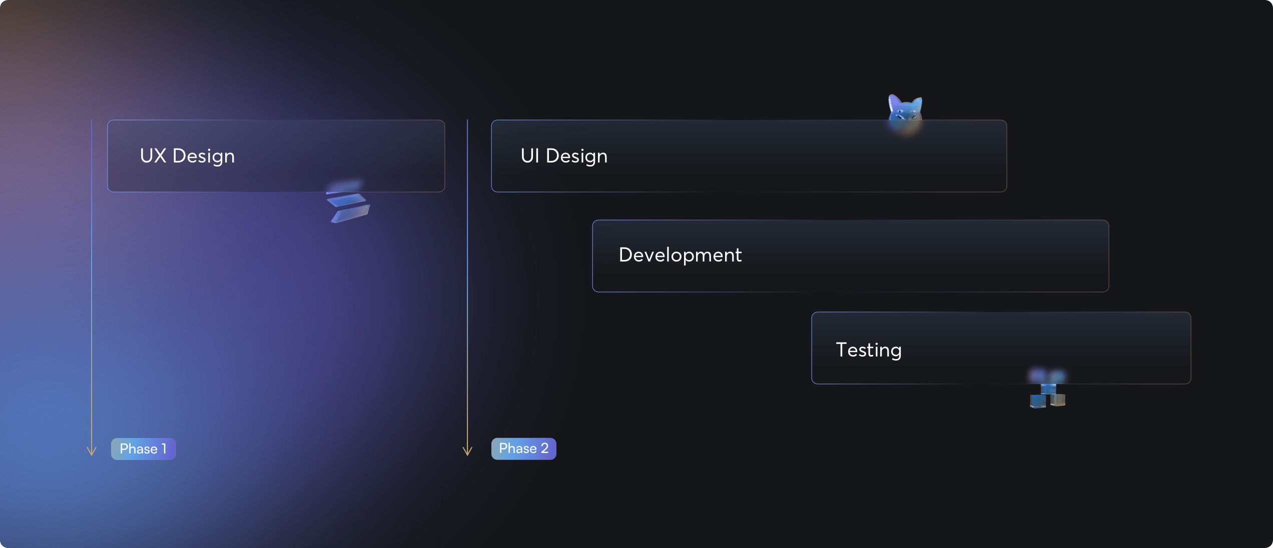
PROJECT TIMELINE
Collaborative development
Our approach was simple yet effective, focusing on both user experience and interface design while fostering collaboration between designers and developers for maximum efficiency. Prior to delivering the website to Gravity Team, we meticulously conducted quality checks to ensure a flawless launch.
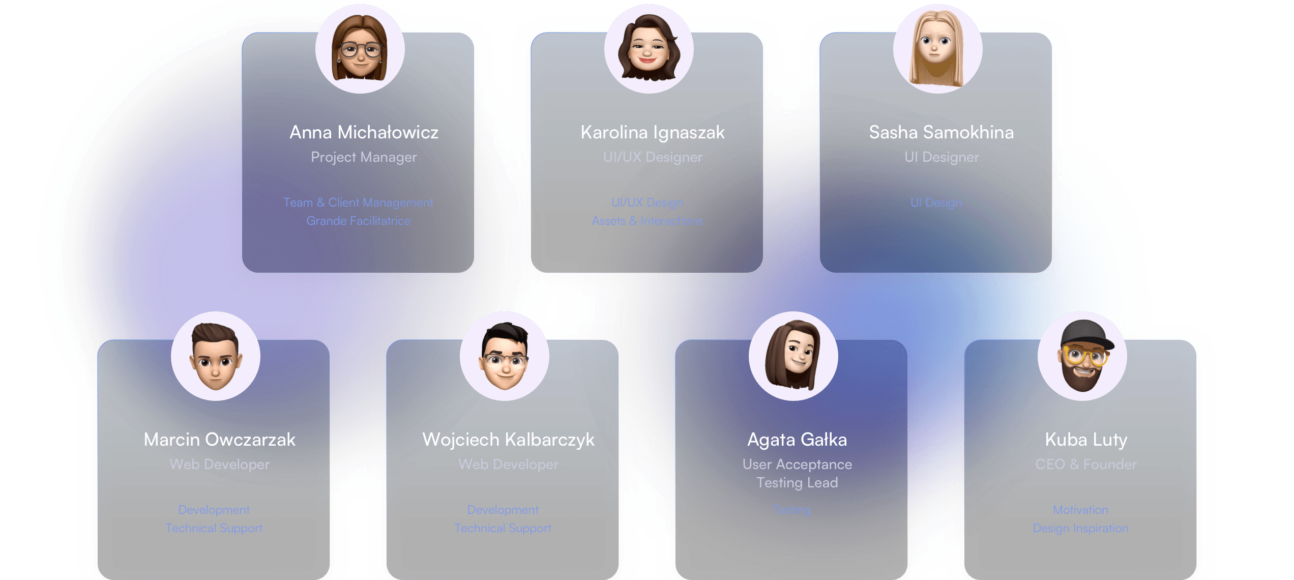
TEAMWORK
Achieving excellence through cooperation
When it comes to projects involving modern, responsive websites, successful outcomes hinge on collaboration. And when it comes to competence and cooperation, the team below exemplifies excellence.
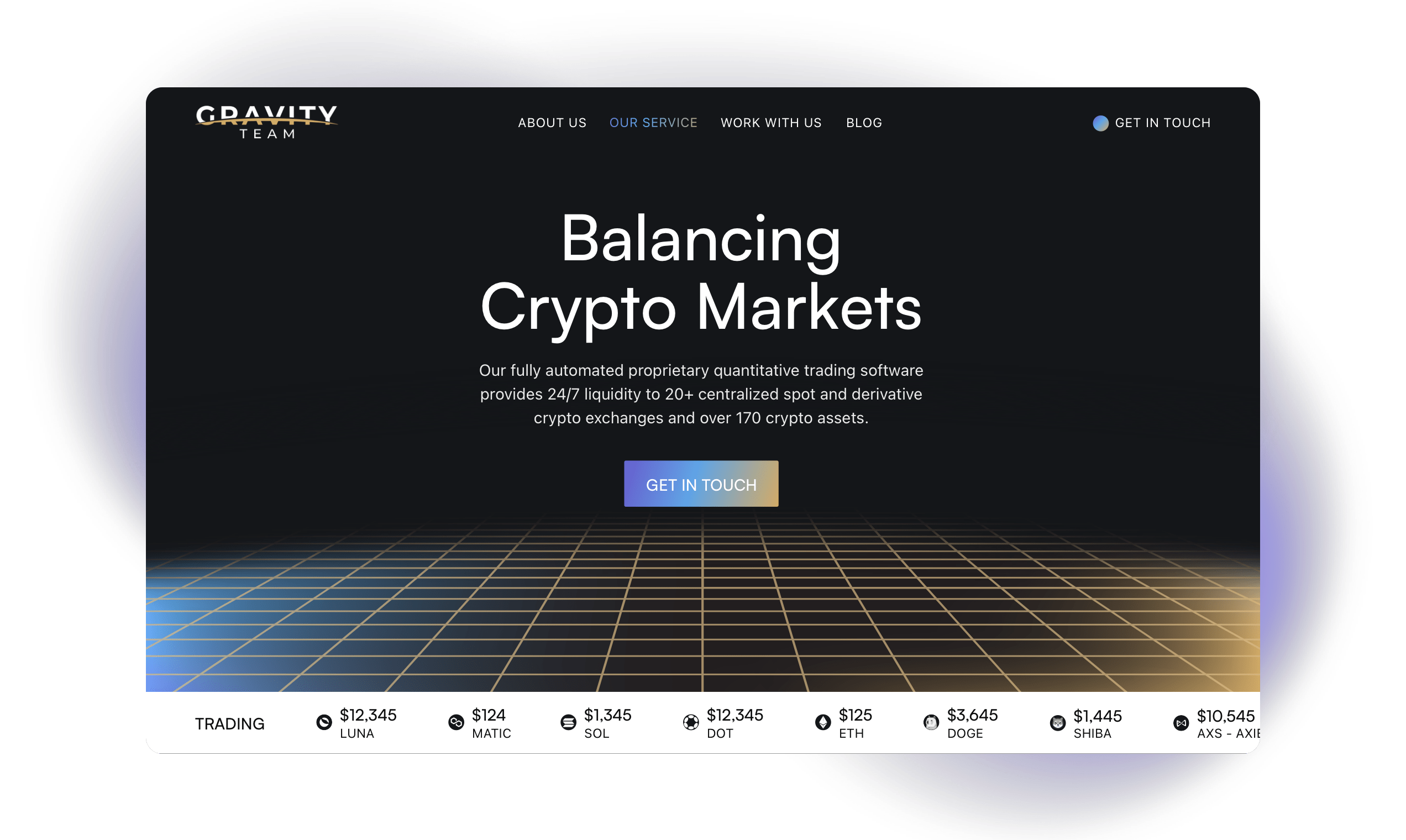
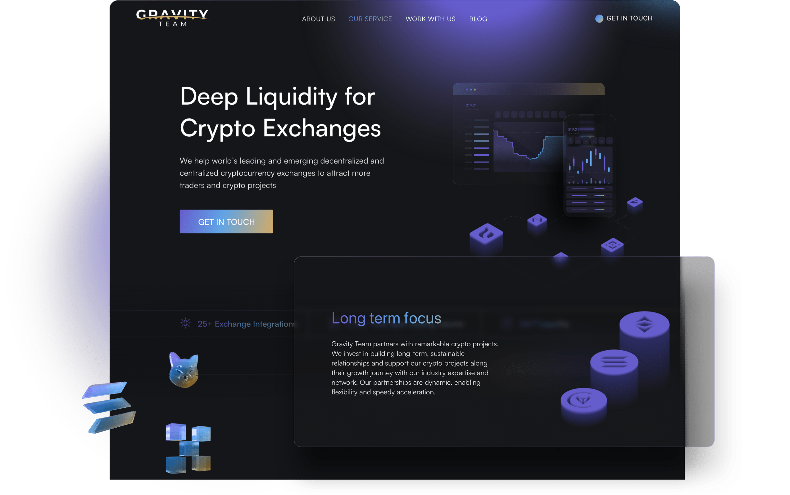
HOME PAGE
Innovative design
Gravity Team's home page stands out with its dark tones, featuring a sliding bar displaying current exchange rates and a gridded, virtual floor reminiscent of a stock exchange's trading floor. Our goal was to create something that aligns seamlessly with the brand identity of a cryptocurrency company. Mixing dark colors, typical of the industry, with modern gradients and animations, we aimed for an on-brand aesthetic that's going to resonate with potential visitors.
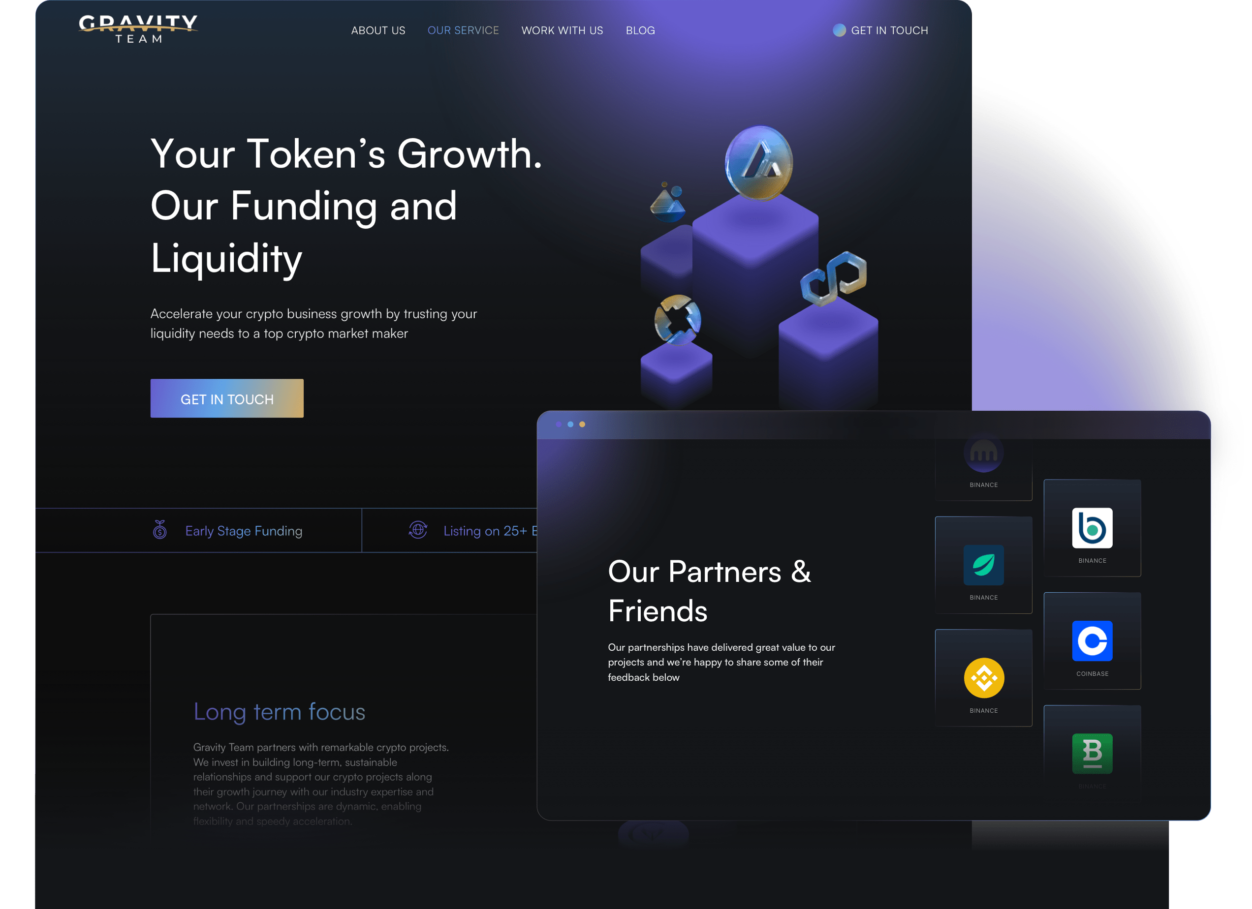
BUSINESS OPPORTUNITY
Fueling growth
The Gravity Team offers specialized assistance designed to propel the cryptocurrency market forward. To highlight this service, we incorporated dynamic elements into the website's design, including eye-catching animations, an animated graph demonstrating the journey of a typical cryptocurrency company, and a display highlighting the team's most distinguished partners.
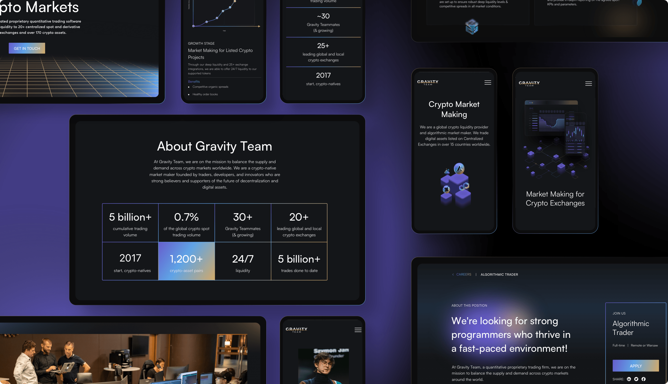
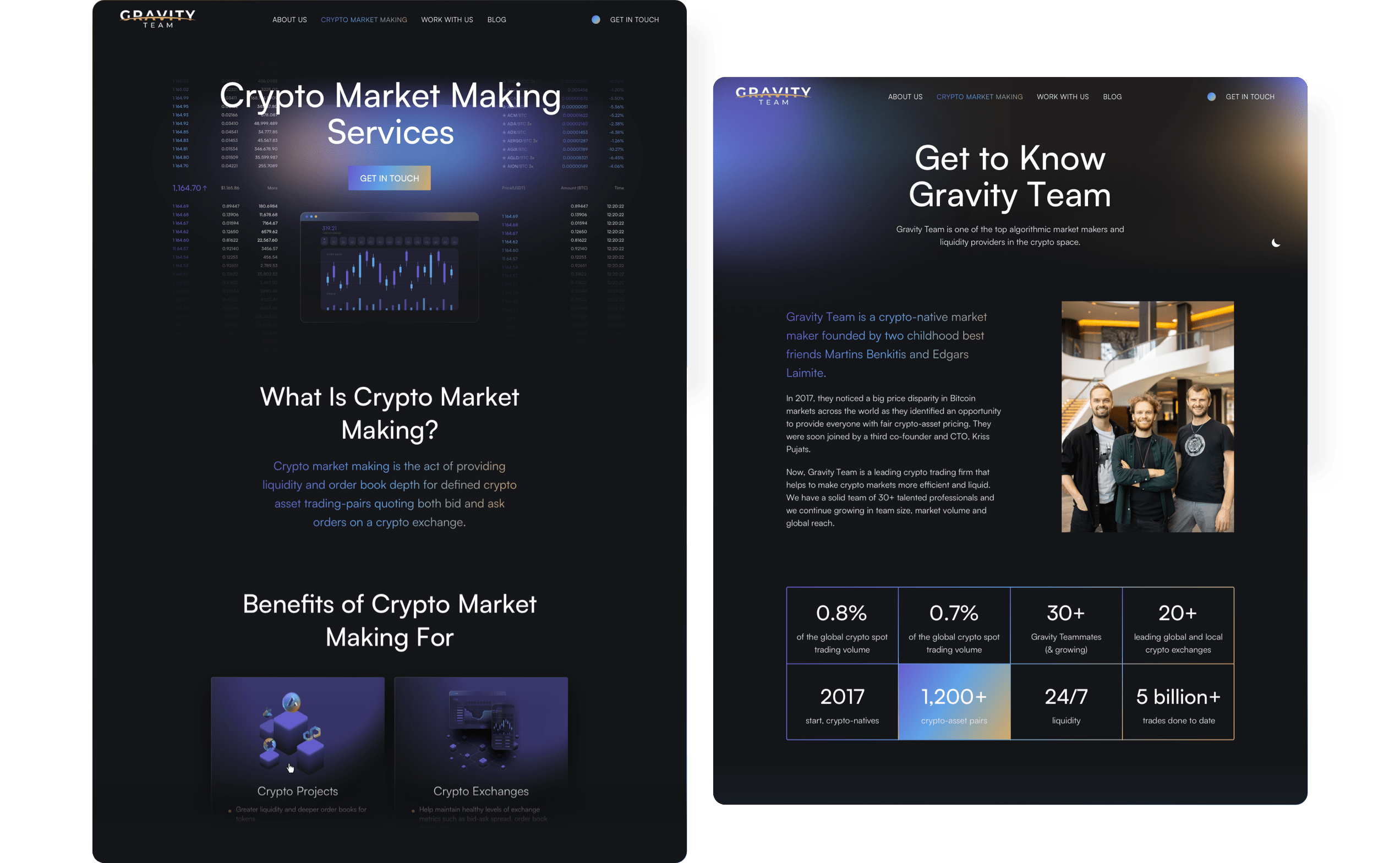
EXCHANGE
Liquidity boost
In our collaboration with Gravity Team, our primary goal was to enhance their digital presence by imbuing it with a sense of professionalism and trustworthiness. By integrating a visually captivating animation to emphasize liquidity for cryptocurrency exchanges and curating a section dedicated to partner testimonials, we aimed to illustrate the breadth and depth of Gravity Team's contributions to the industry.
SEARCH ENGINE OPTIMIZATION
Discoverability enhanced
The services page, designed as a central hub, effectively showcases Gravity Team's offerings, consolidating their services into a single, user-friendly interface. This approach not only streamlines the user experience, but also significantly enhances the site's search engine rankings. In a complementary fashion, the about page stands out due to its deliberate use of on-brand gradients and blurs. These design choices are essential elements that are integral to the brand identity we crafted, further reinforcing Gravity Team's market presence.
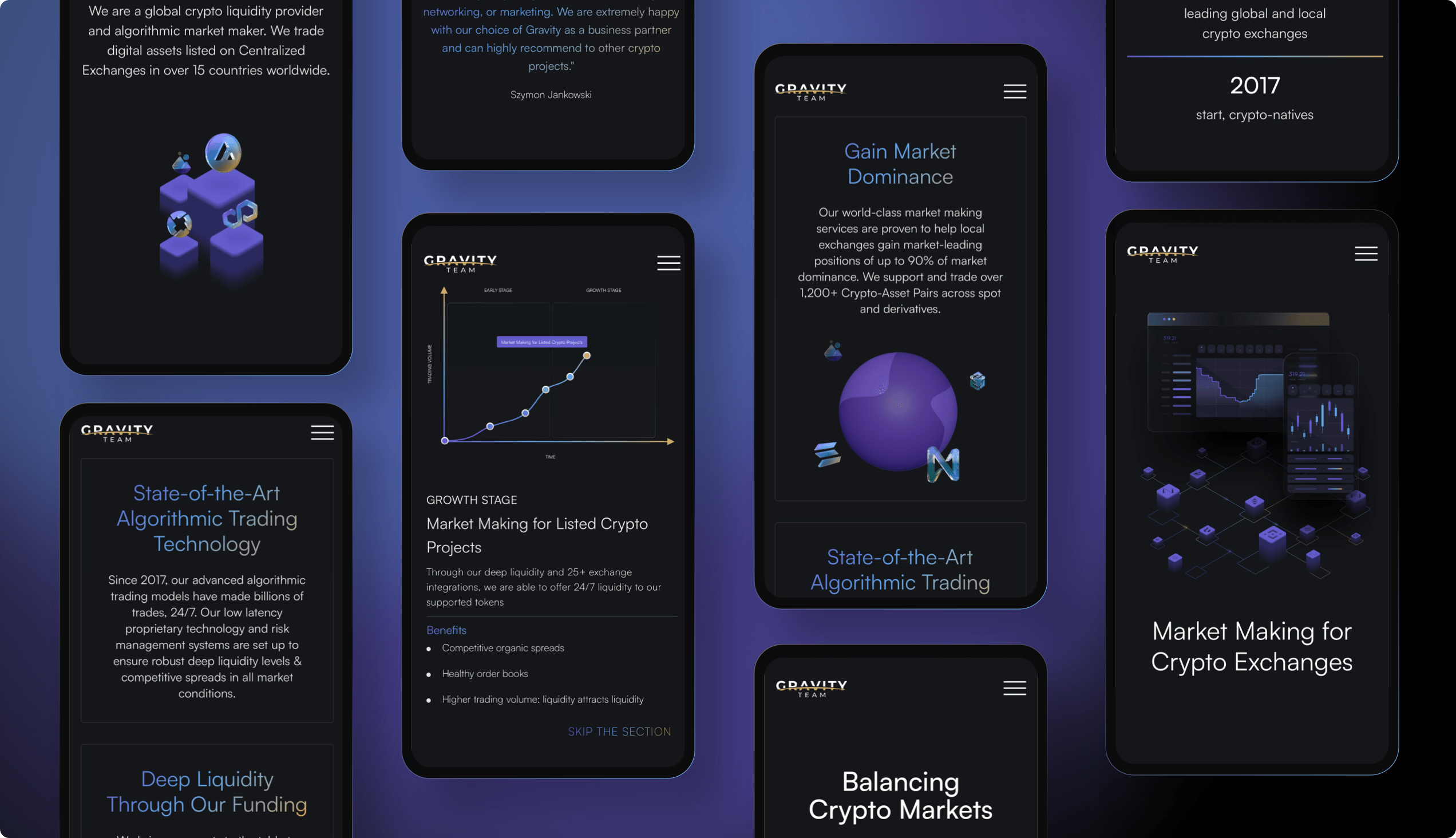
MOBILE DESIGN
Enhanced readability
Gravity Team's website boasts a sleek and straightforward design that translates beautifully across mobile devices. The site was meticulously engineered to ensure swift navigation and optimal responsiveness. Special attention was paid to readability and accessibility, ensuring that interactive elements like buttons, charts, and animations are not only easily legible, but also strategically placed to enhance user experience without causing distraction.
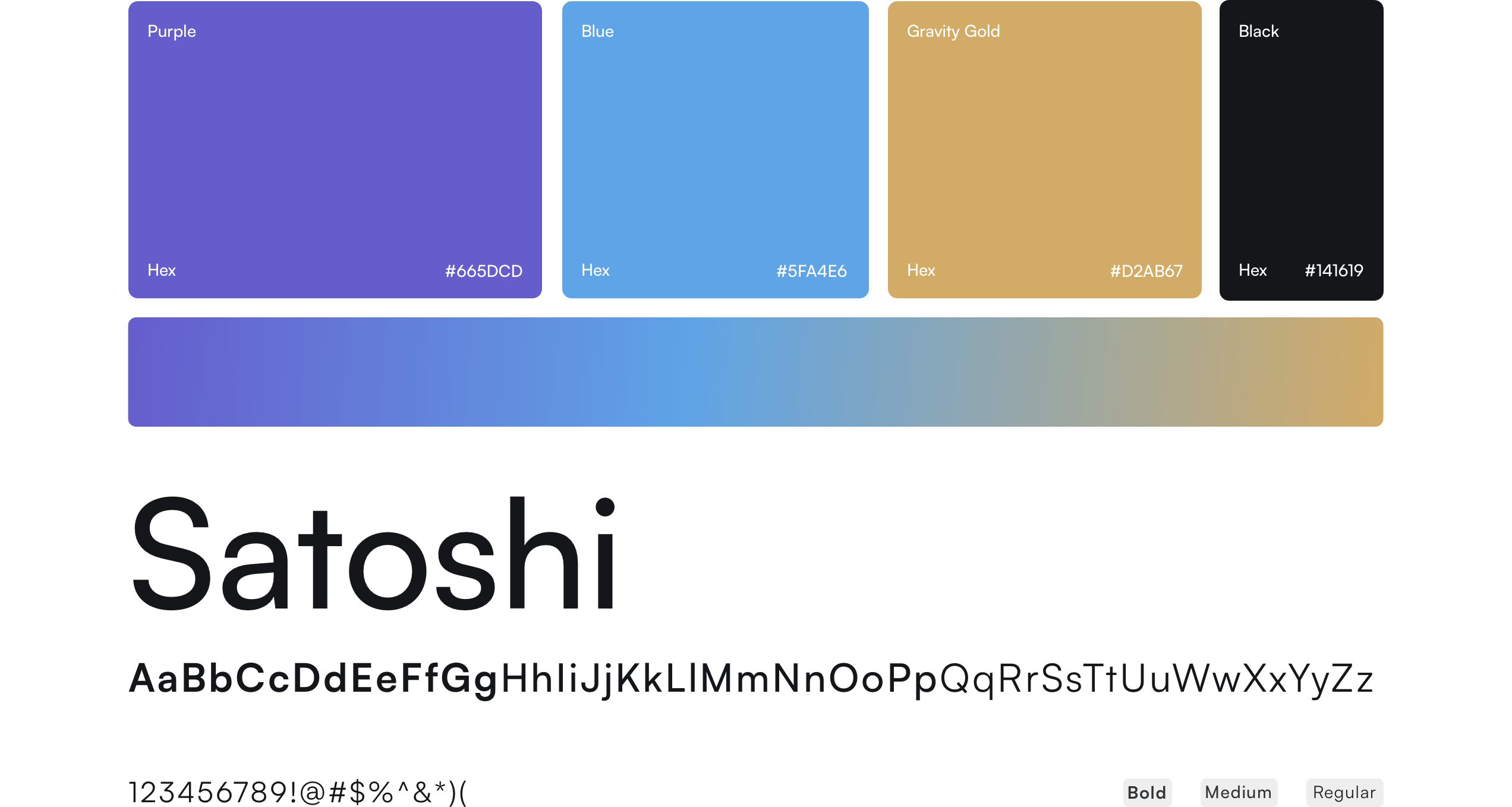
BRANDING
Geometric elegance
The website's predominantly dark theme is effectively counterbalanced with the use of blue and gold gradients and blurs, aligning perfectly with the aesthetic often associated with contemporary and forward-thinking websites. In keeping with the cryptocurrency market theme, the website employs the Satoshi font, a clean and almost geometric sans-serif typeface.
as an honorable mention by awwwards.
ARE YOU READY?
Let’s build your next digital product