Supercharge your digital presence with our website design services.


Website design concept for an e-commerce solutions provider
Brand
Location
Client
Budget
Industry
- SaaS
Environment
- Figma
Release
Live
Check livePROBLEM
SOLUTION
VALUE DELIVERED
ABOUT MERCE
Innovative e-commerce
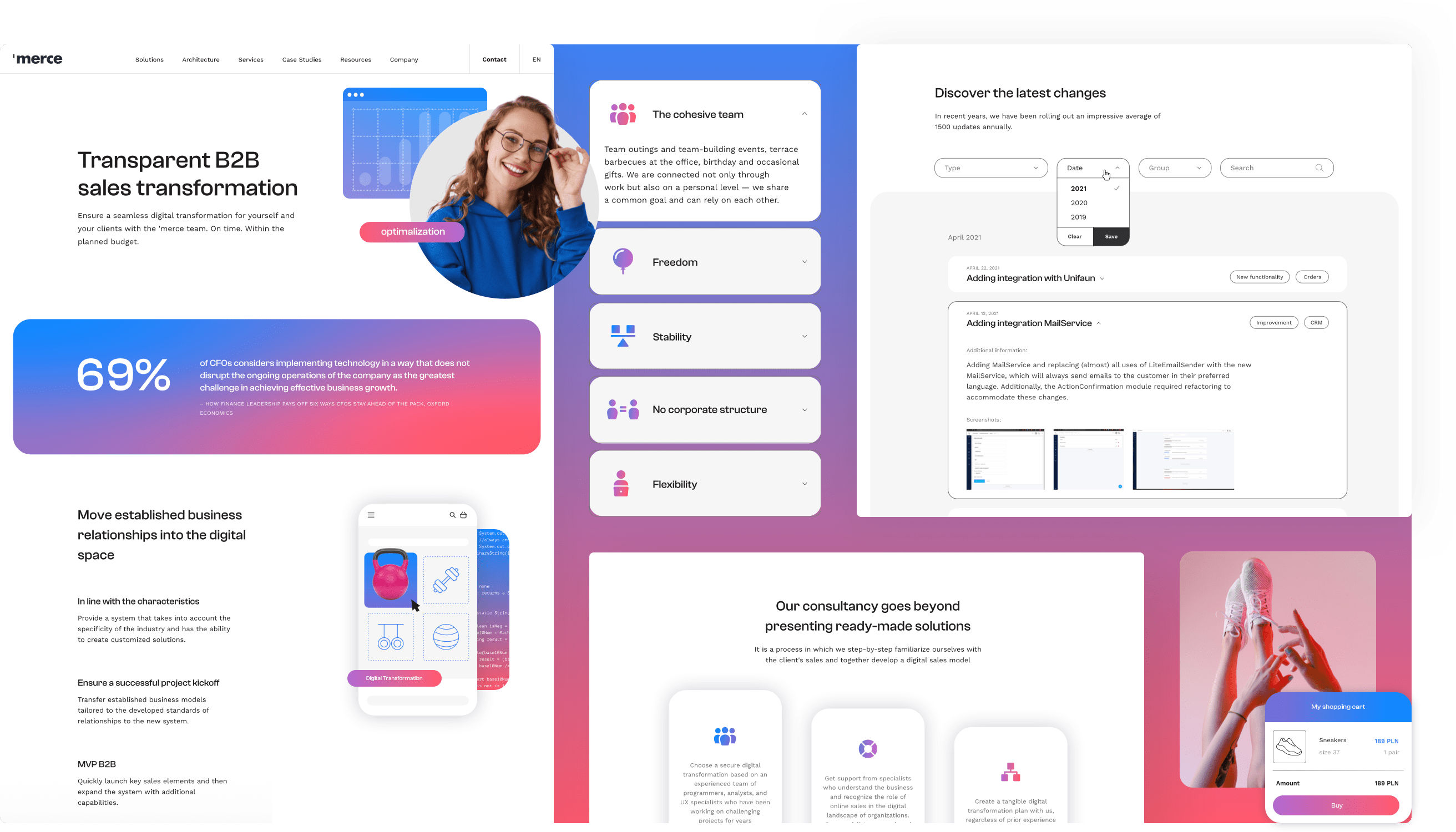
Merce sought to enhance their website's look and the user experience it offered. With that in mind, our team provided them with a new website design concept. It aimed to make Merce's brand identity more memorable and unique. Unfortunately, in the end, the design was not published. Still, it remains a testament to Merce's dedication to redefining the digital commerce landscape.
HOME PAGE
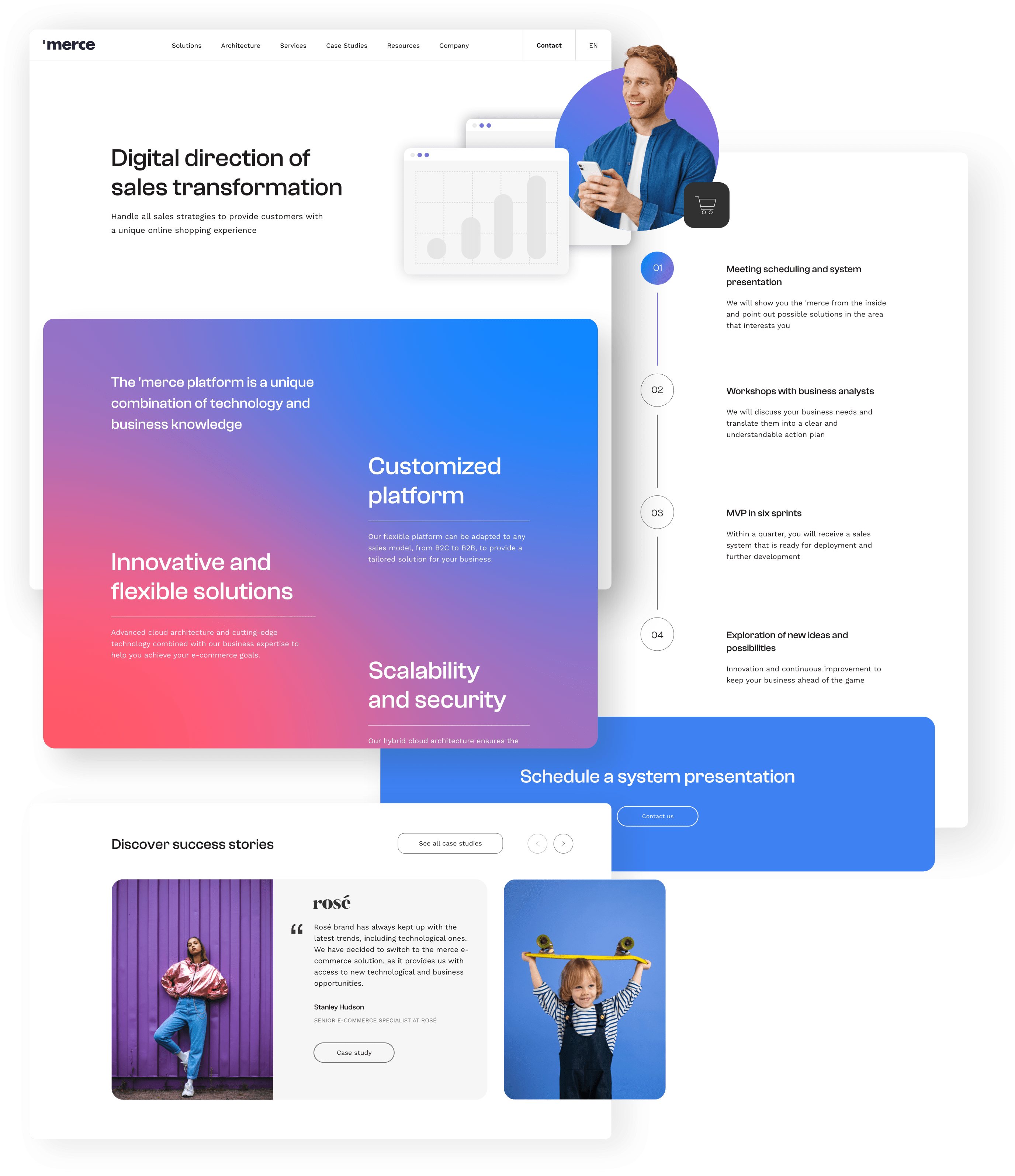
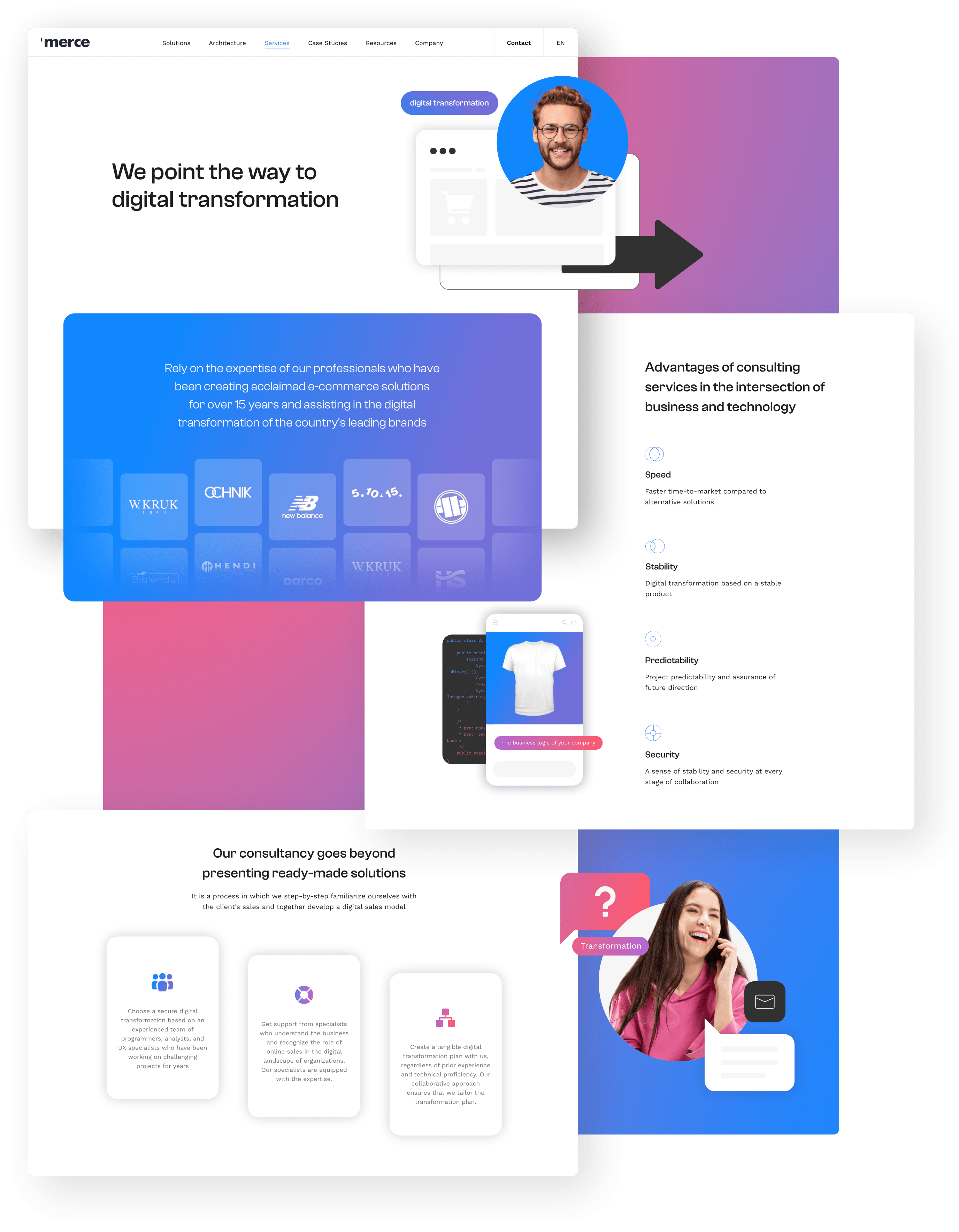
First impressions matter
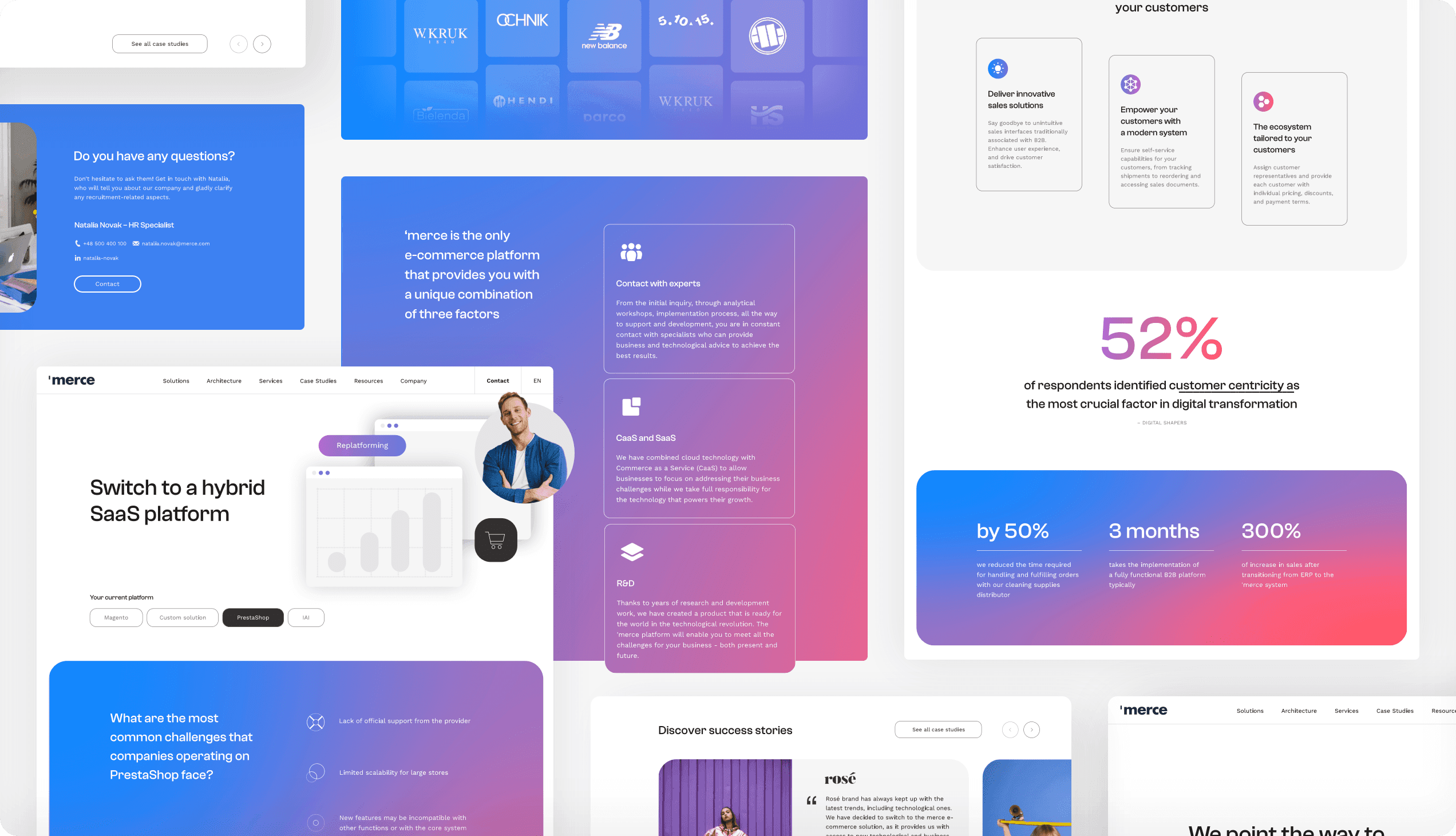
The website's design focused on a balance of aesthetics and user-friendliness, leaving a positive impression and setting the stage for an enjoyable browsing experience across the entire site. At the top of the page, a section featuring a custom image greeted visitors, representing Merce's innovative approach to doing business.
The design seamlessly incorporated a section outlining Merce's streamlined process, offering valuable insights into their methodologies and instilling confidence in their collaborative approach. To put an emphasis on their expertise and proven track record, a selection of success stories was also presented, highlighting the positive impact of Merce's solutions on various businesses.
SOLUTIONS
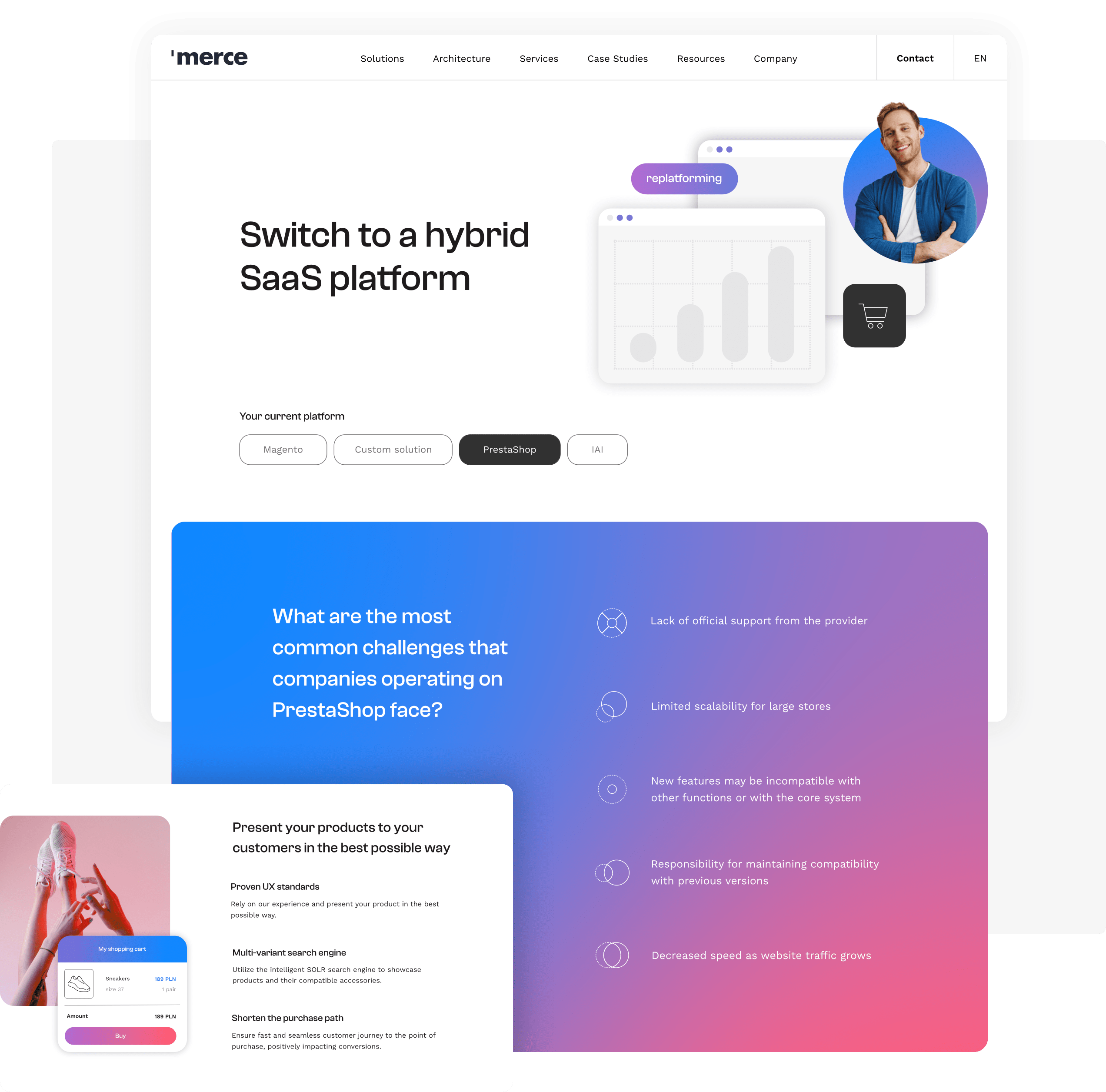
Seamless navigation
We used templates to make the website's design consistent across different subpages. It allows for a cohesive browsing experience, enabling visitors to explore Merce's various e-commerce solutions with ease. It also makes it easier for developers to implement the design.
SERVICES
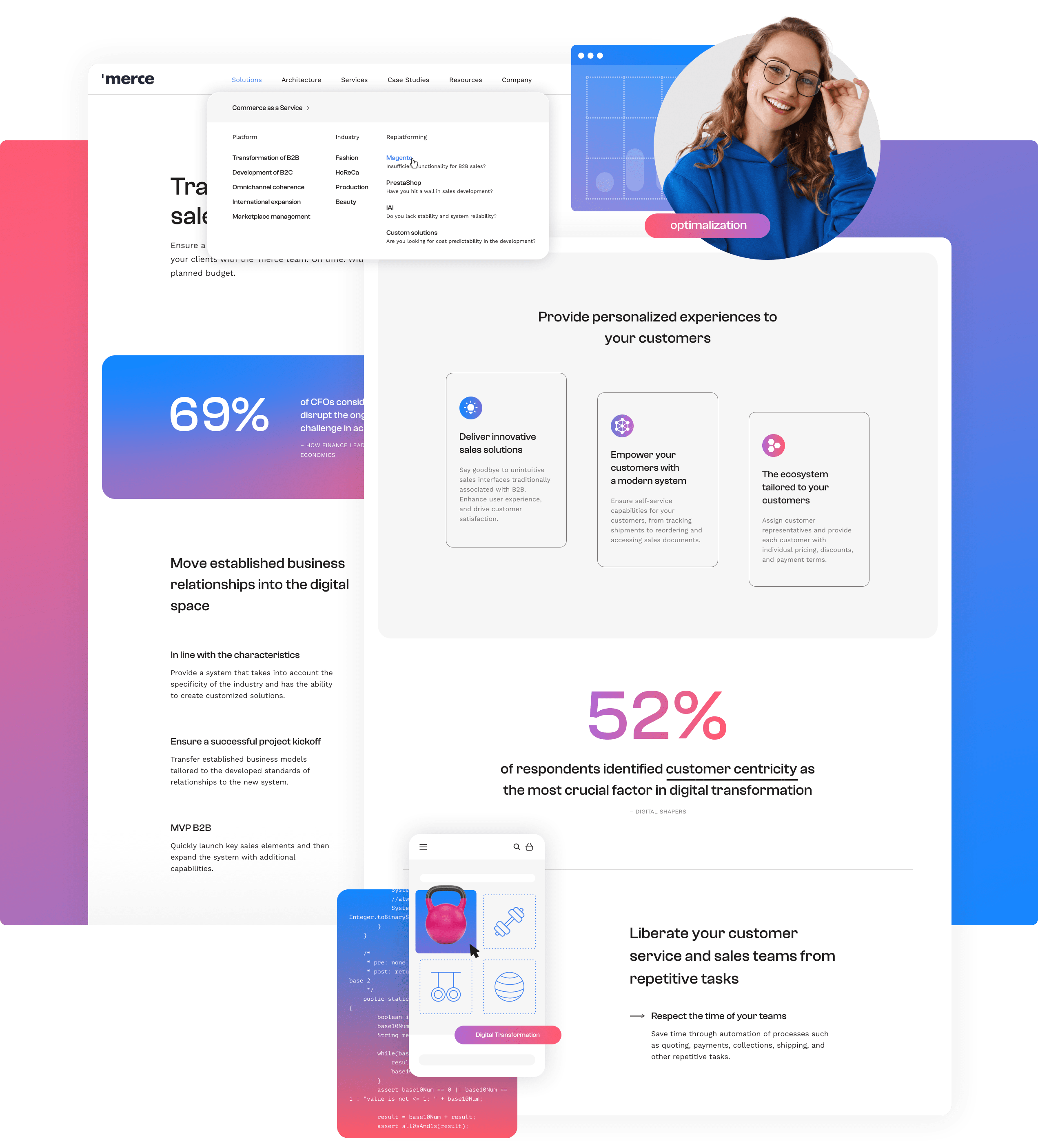
Visual appeal
The subpage with services is designed to offer a comprehensive overview of Merce's diverse e-commerce solutions. It features a cohesive layout that aligns with Merce's brand identity, presenting various service offerings in a user-friendly manner.
CHANGE LOGS
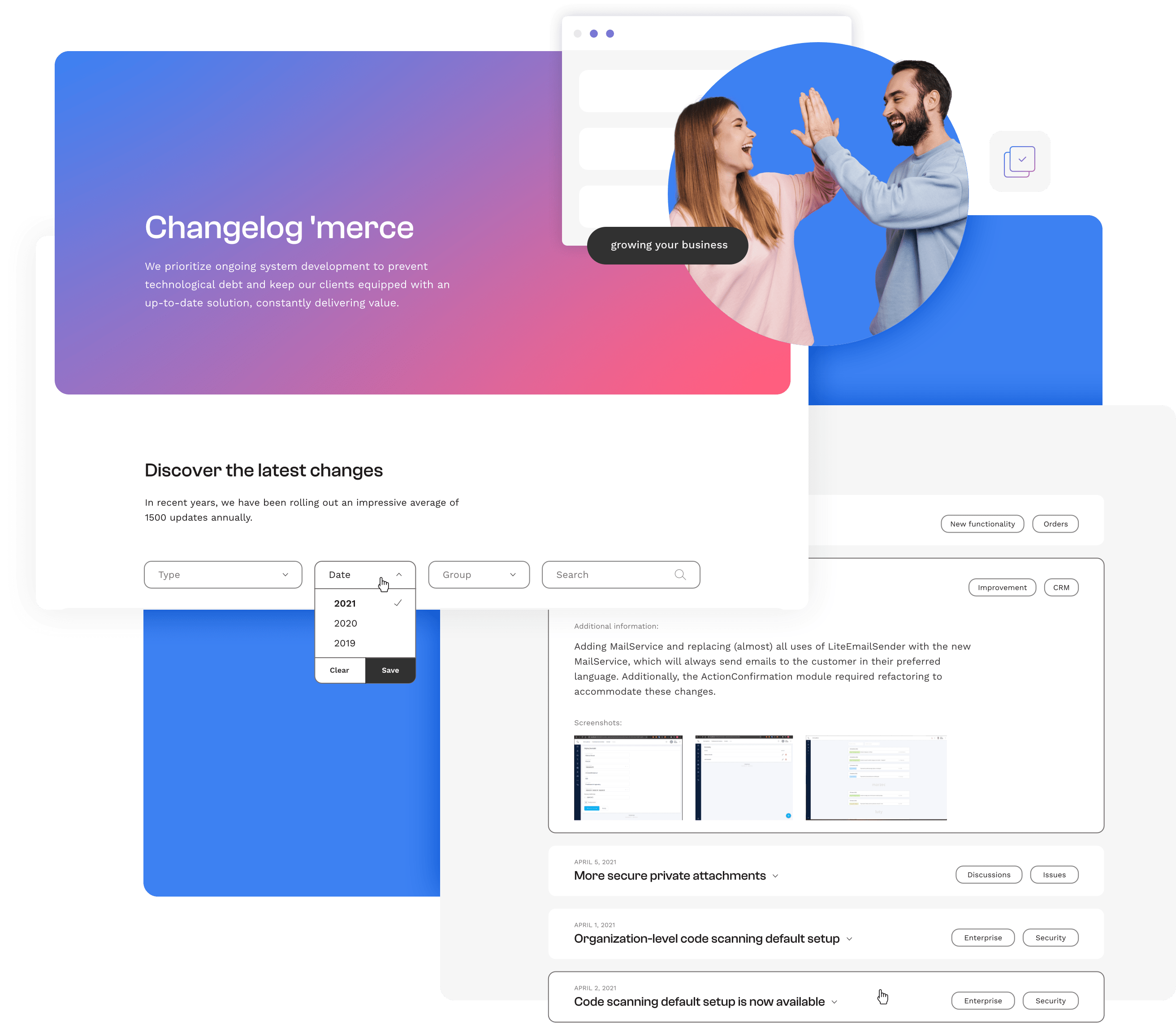
Keeping users updated
While designing a new website concept for Merce, the Adchitects team wanted to make sure that the section with change logs is clear and organized. Each entry is presented using a simple and cohesive design, making it simple for website visitors to understand the latest modifications and enhancements made to the platform.
CASE STUDIES
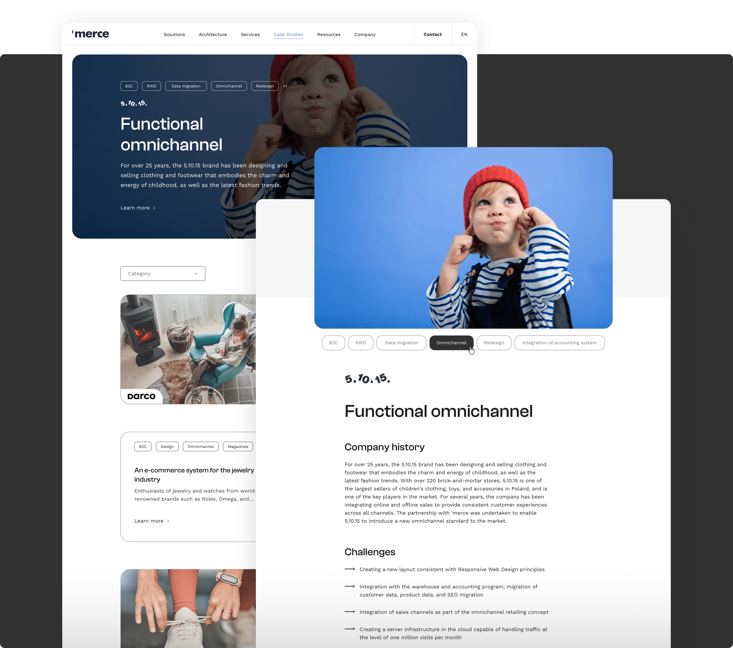
Demonstrating expertise
It's worth noting that Merce's website contains a separate section that presents the success stories of their diverse clientele. Each case study is presented using engaging visuals and compelling narratives. It's a great way to encourage potential clients to give Merce a try and experience similar results for themselves.
CAREERS AND ABOUT US
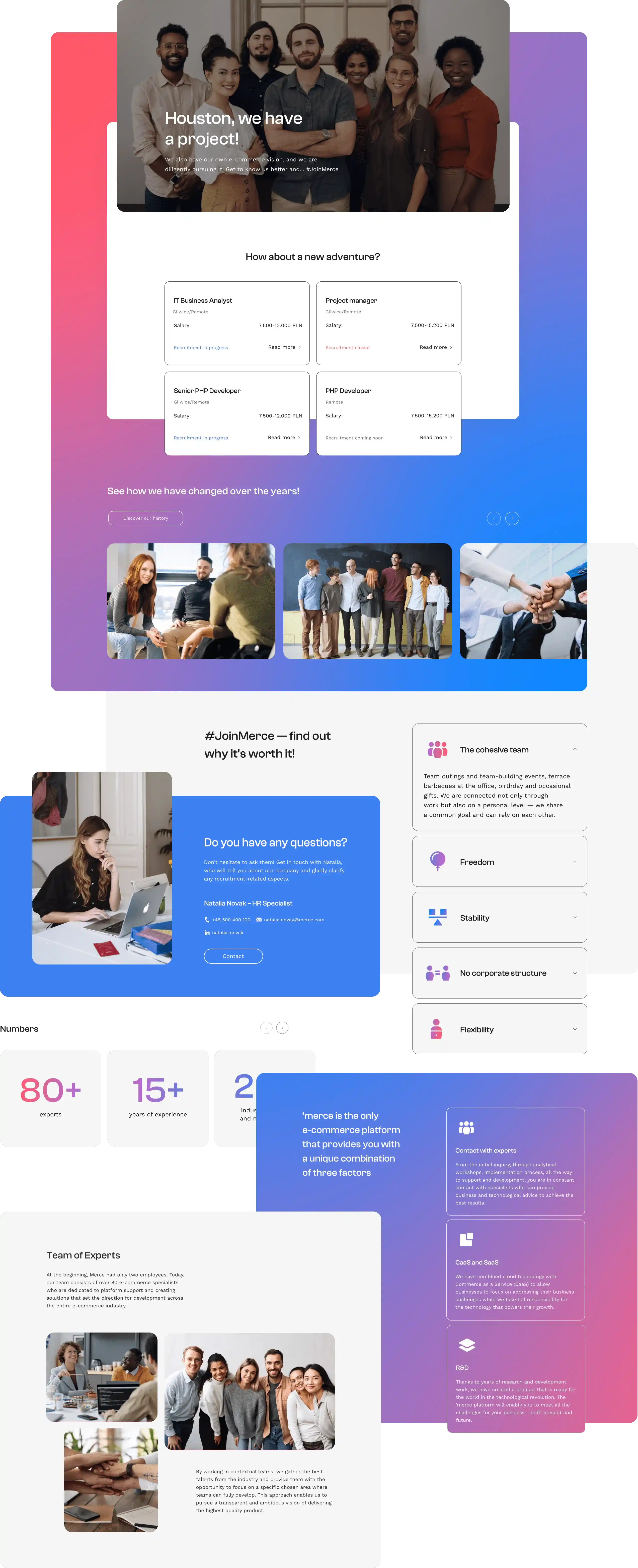
Connecting with the user
The careers page features a user-friendly layout, showcasing open positions and emphasizing the company's commitment to nurturing a vibrant work environment. As for the page about the company itself, it outlines Merce's journey, values, and industry expertise. It conveys a strong brand identity and fosters a connection with visitors seeking to learn more about the company.
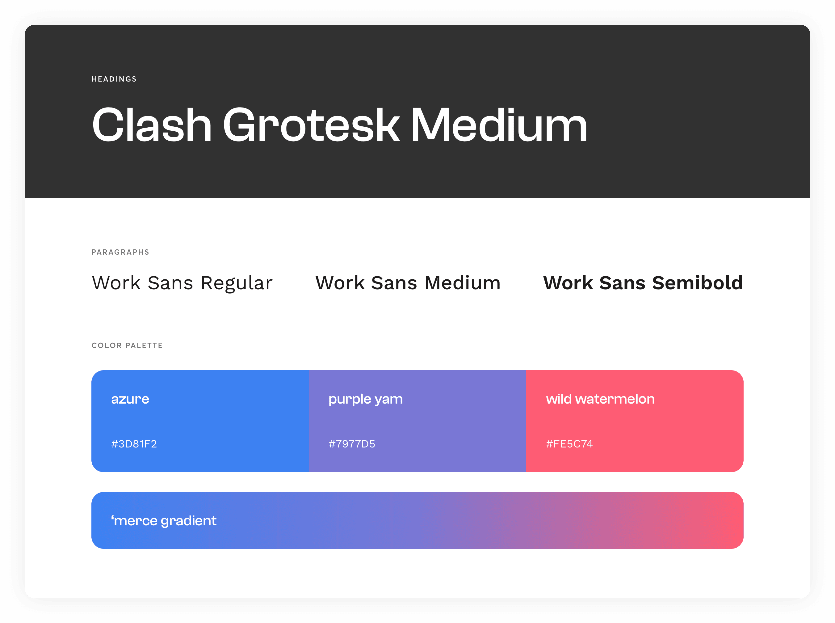
TYPOGRAPHY AND COLORS
Revitalized brand identity
As part of our rebranding efforts, Merce underwent a revitalizing transformation. A fresh typography selection was made, with Clash Grotesk Medium commanding attention for headings, and Work Sans for paragraphs, ensuring a harmonious blend of style and readability. However, it was the vibrant color palette that truly set the stage for the brand's new identity. Intense shades of bright pink, purple, and blue infused it with energy and creativity.
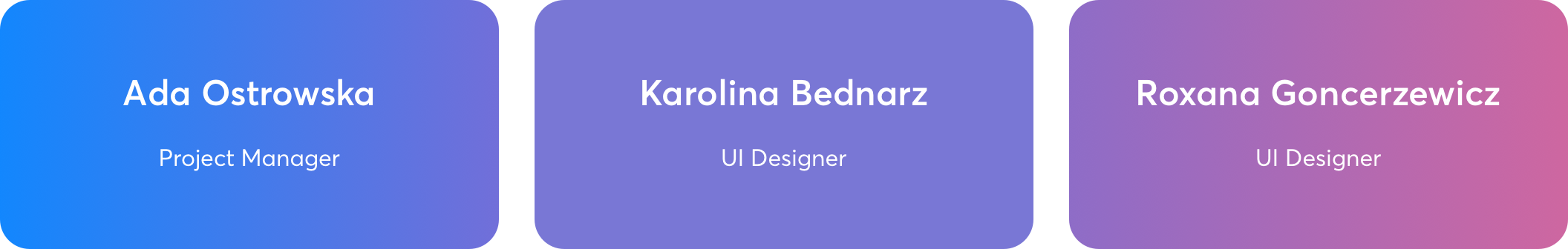
TEAM
At your service
For this design-only project, we assembled a highly proficient team. It consisted of a dedicated project manager and two skilled user interface designers. The project manager played a pivotal role in coordinating the entire undertaking. She ensured seamless collaboration and kept the project on track.
Working in tandem with the project manager, the user interface designers brought their creative expertise to the table, crafting captivating visual elements and user-friendly interfaces. In the end, it allowed for efficient decision-making, smooth communication, and a streamlined workflow.
ARE YOU READY?
Let’s build your next digital product