Ecommerce Shopify Store with +42% Conversion Rate for Electric Scooters
BRAND
Apollo Scooters
location
Montreal, CA
Client
Apollo Scooters
Stack
Shopify
Industry
Retail / Electric Mobility
Budget
Confidential
PROBLEM
After our involvement in enhancing their mobile application, Apollo Scooters recognized a pressing problem with their e-commerce website. There was a significant drop in both engagement and sales. This decline was traced back to the website's inadequate mobile functionality, highlighting the need for improvements in this area.
SOLUTION
We conducted a thorough cognitive walkthrough and employed Hotjar to analyze Apollo's online store. It allowed us to identify which parts of the website were attracting the most and least interaction from users. Based on these insights, we advised a total overhaul of the website, prioritizing mobile device optimization. Additionally, we suggested adopting a more visually driven method to effectively present their products.
VALUE DELIVERED
Our redesign of Apollo's website not only achieved their goals but also surpassed them. The improvements we made significantly enhanced the mobile user experience, engagement, and conversion rates. We focused on key e-commerce features, reducing excess text and improving the visual appeal with large, prominent images and product photos. The redesigned website is now more mobile-friendly, enabling customers to effortlessly browse and make purchases on any device.
Our work in numbers
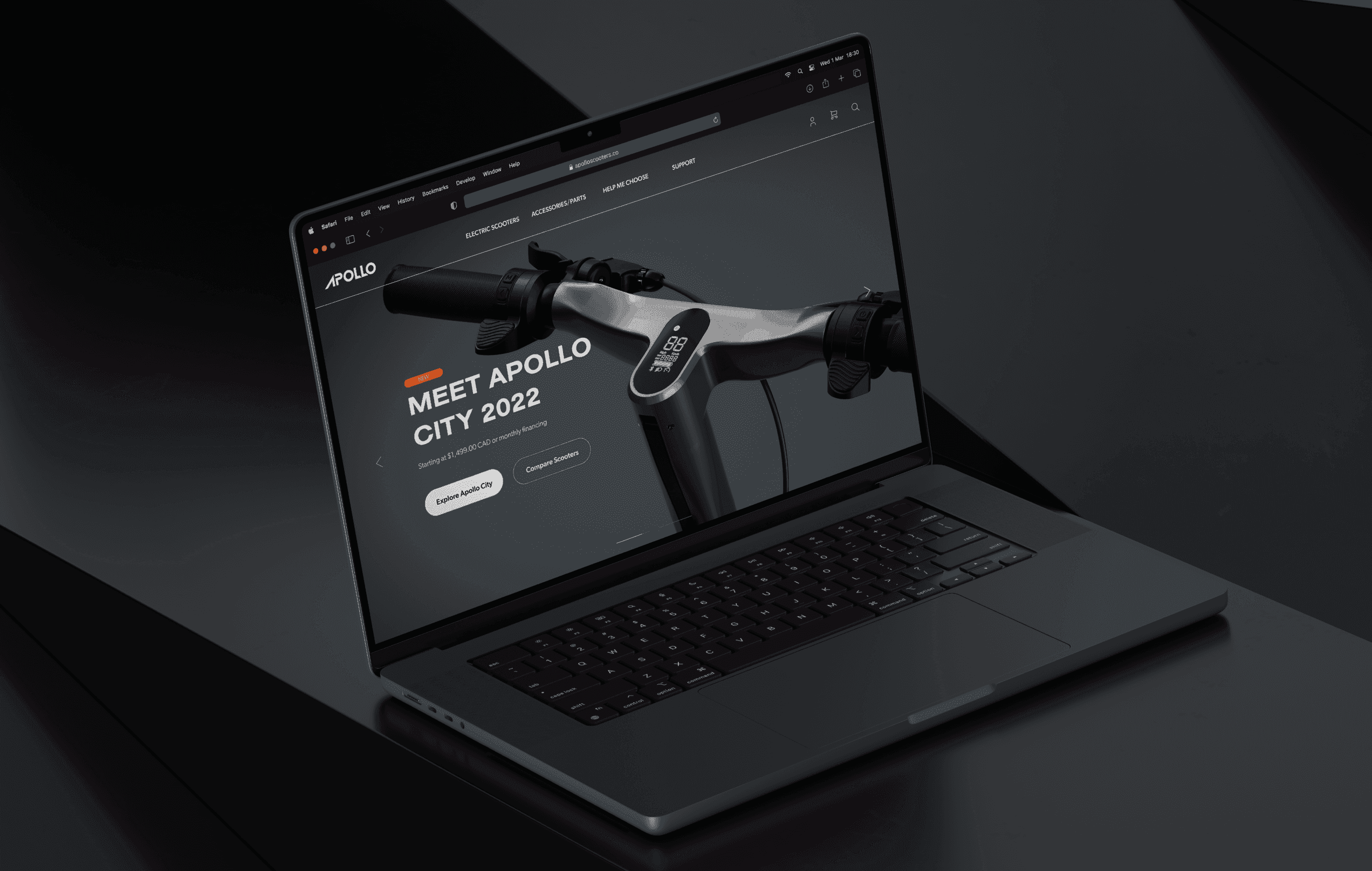
Mobile-first approach
Our collaboration with Apollo Scooters came about naturally, as we’ve previously worked on their mobile application’s interface and usability. This time, the Canadian electric scooter manufacturer needed a mobile-first redesign of their e-commerce store. We worked closely with the client to understand their needs and objectives, which allowed us to develop a solution that went beyond what they had envisioned.
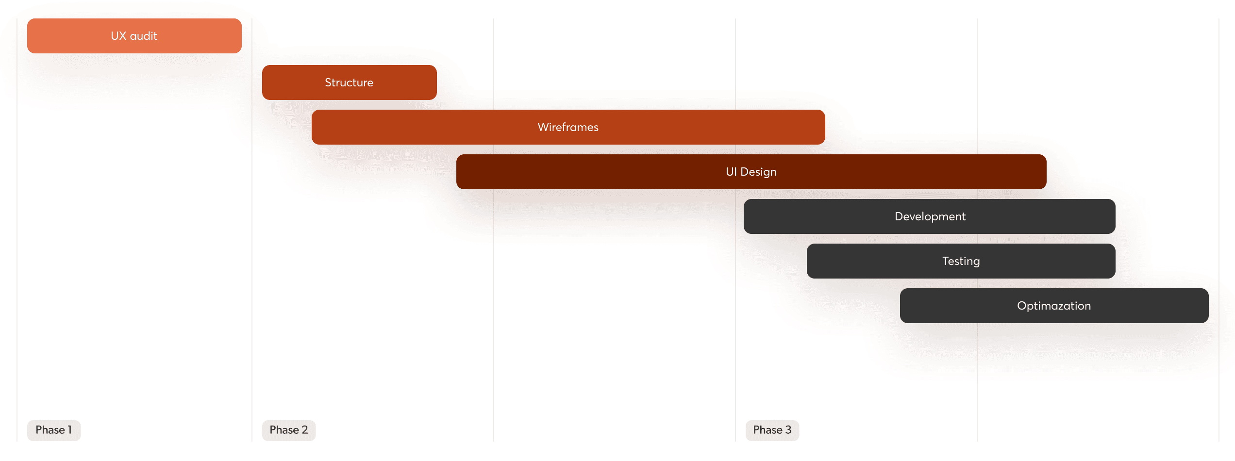
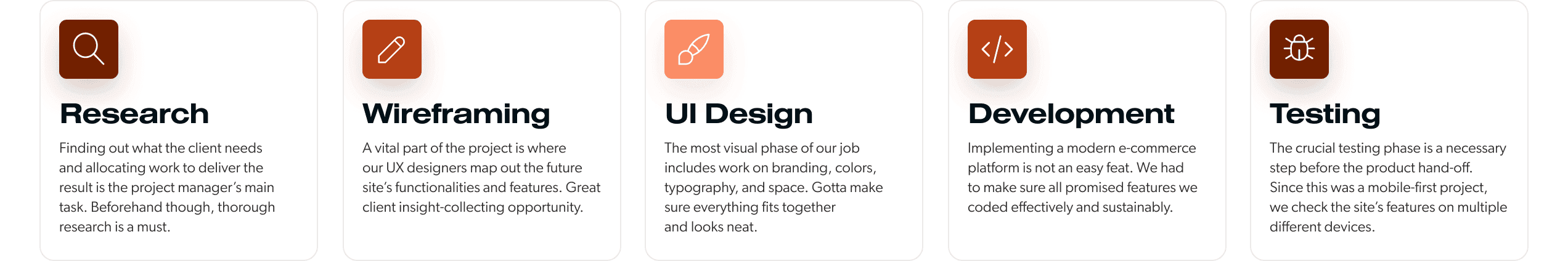
Phase-by-phase execution
We broke down the project into several stages to ensure a systematic and efficient execution. We started by analyzing the existing website and then moved on to propose new design ideas. Before finalizing the visual design, we shared preliminary design concepts with the client to understand their preferences and feedback.
Mobile-centric redesign
Our project scope covered a website redesign, focusing primarily on mobile device compatibility. Our work included optimizing the site for better performance and user experience. This meant increasing page speed, adding new features, and guaranteeing smooth operation on various devices and browsers.
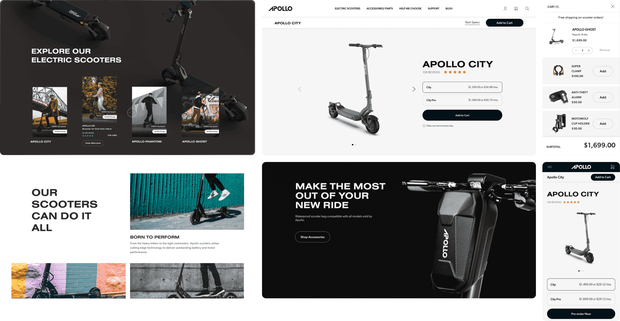
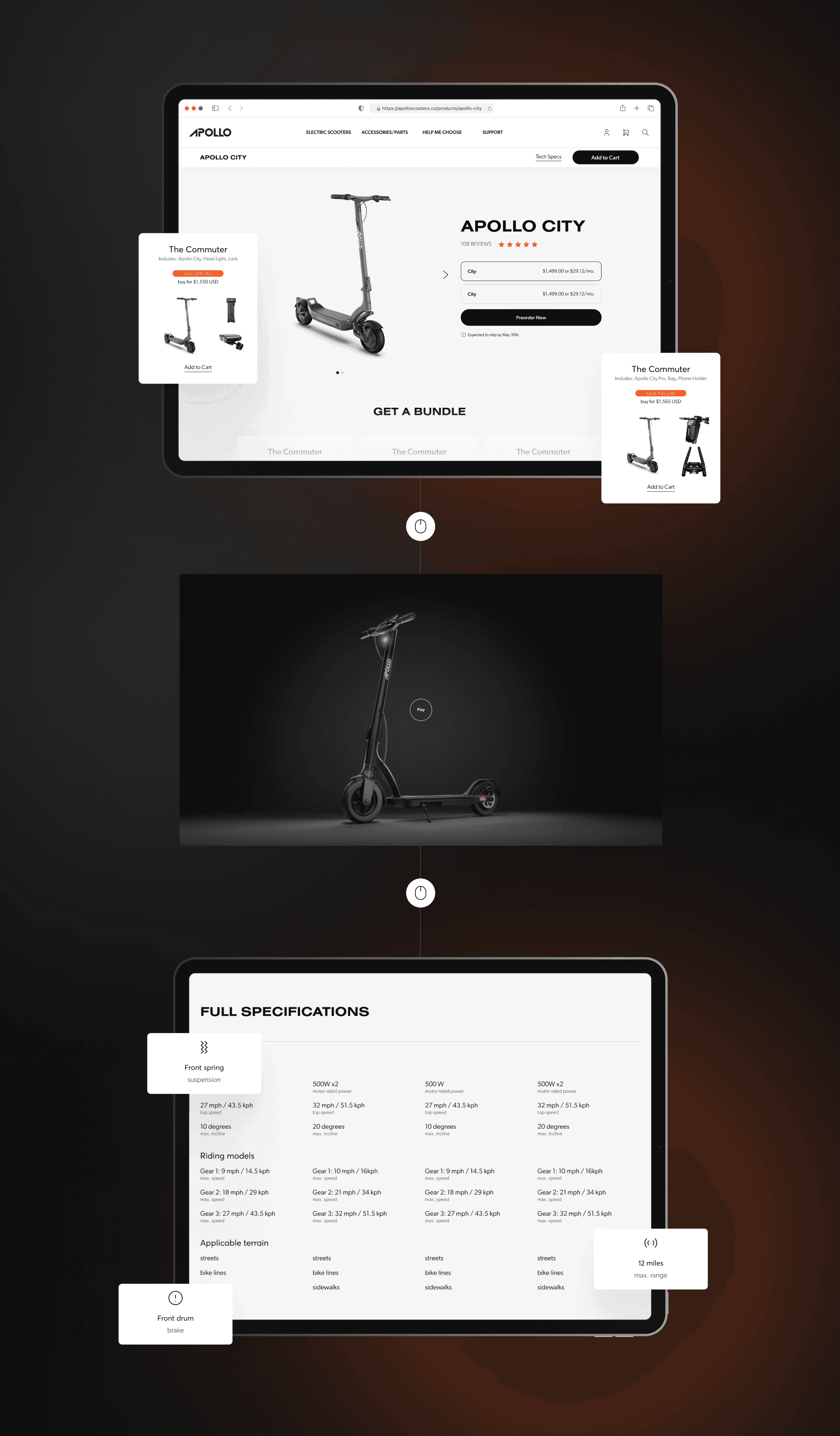
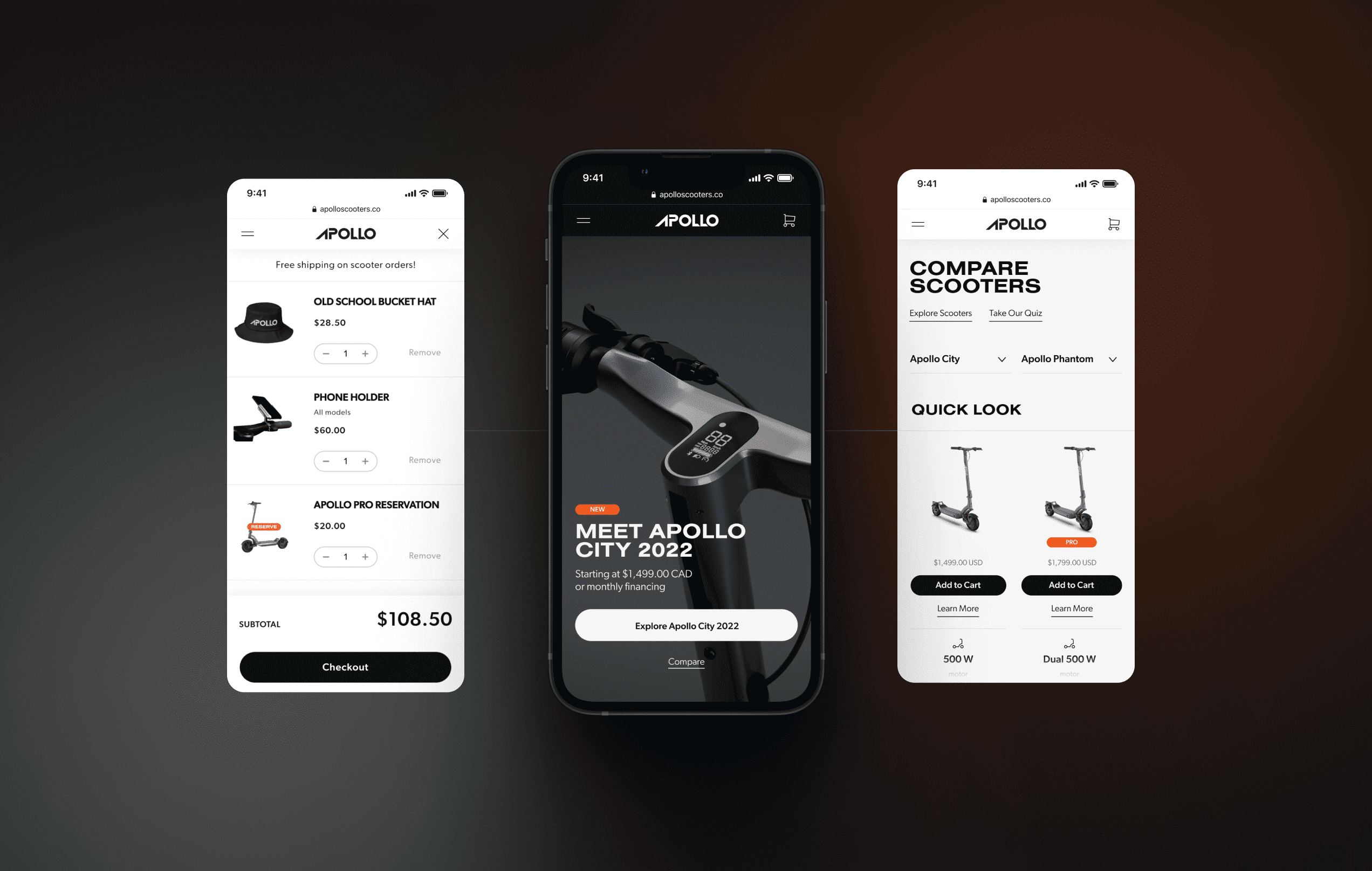
Streamlined browsing
The goal of the reimagined product page was to improve the user's experience. We did so by showcasing various scooter types and models, offering a smooth and intuitive browsing experience tailored to help users find the ideal scooter. A clear and accessible table displaying detailed technical specifications for each model was also introduced, aiding users in making well-informed choices and effortlessly comparing different models.
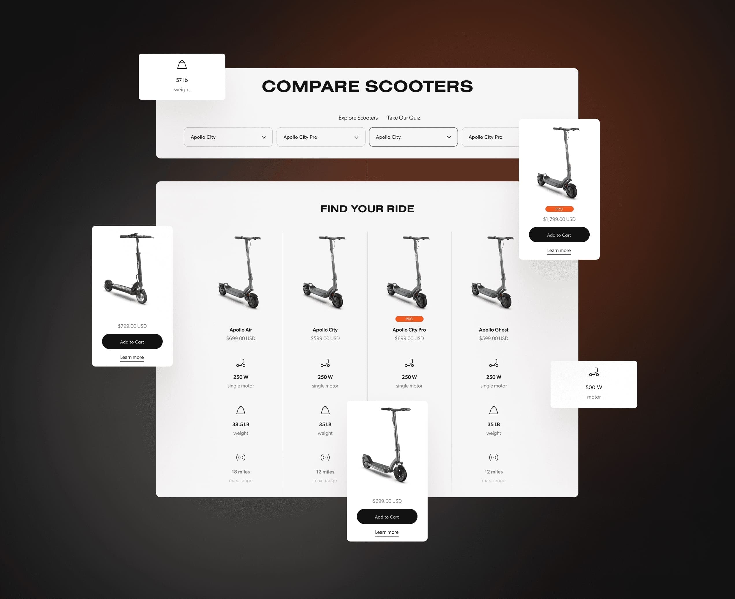
Choosing the right scooter
We aimed to streamline the process of comparing scooters for convenience. By introducing an easy-to-use table featuring drop-down selections, users could effortlessly compare different models. Every scooter's features were displayed with unique icons, allowing for fast identification. This design helped customers quickly find the scooter that matched their specific preferences.
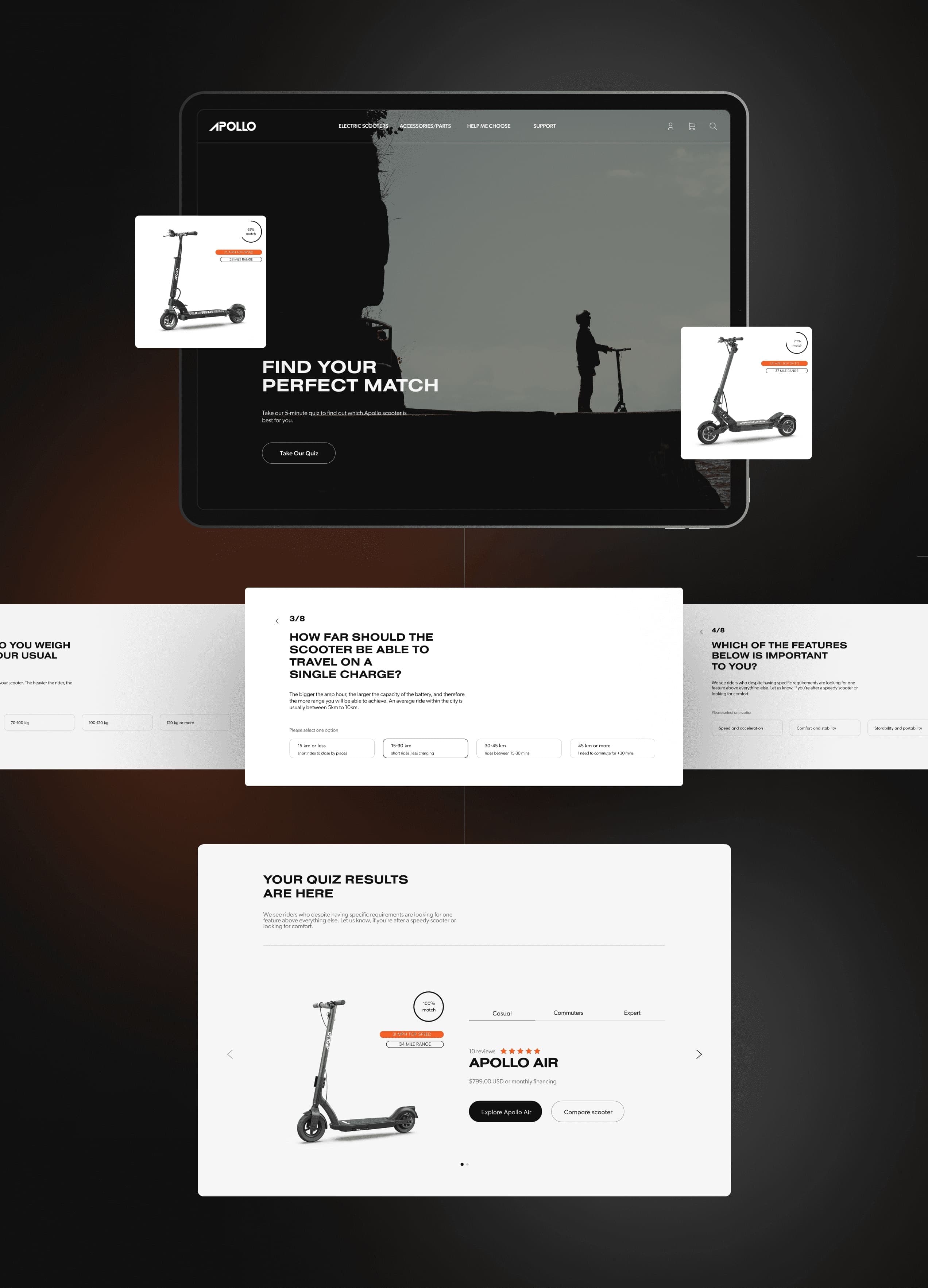
Engaging user experience
We developed an interactive quiz tailored to guide users to their ideal scooter. By responding to personalized questions, the results generated included a compatibility percentage alongside a suggested model that best fits their preferences.
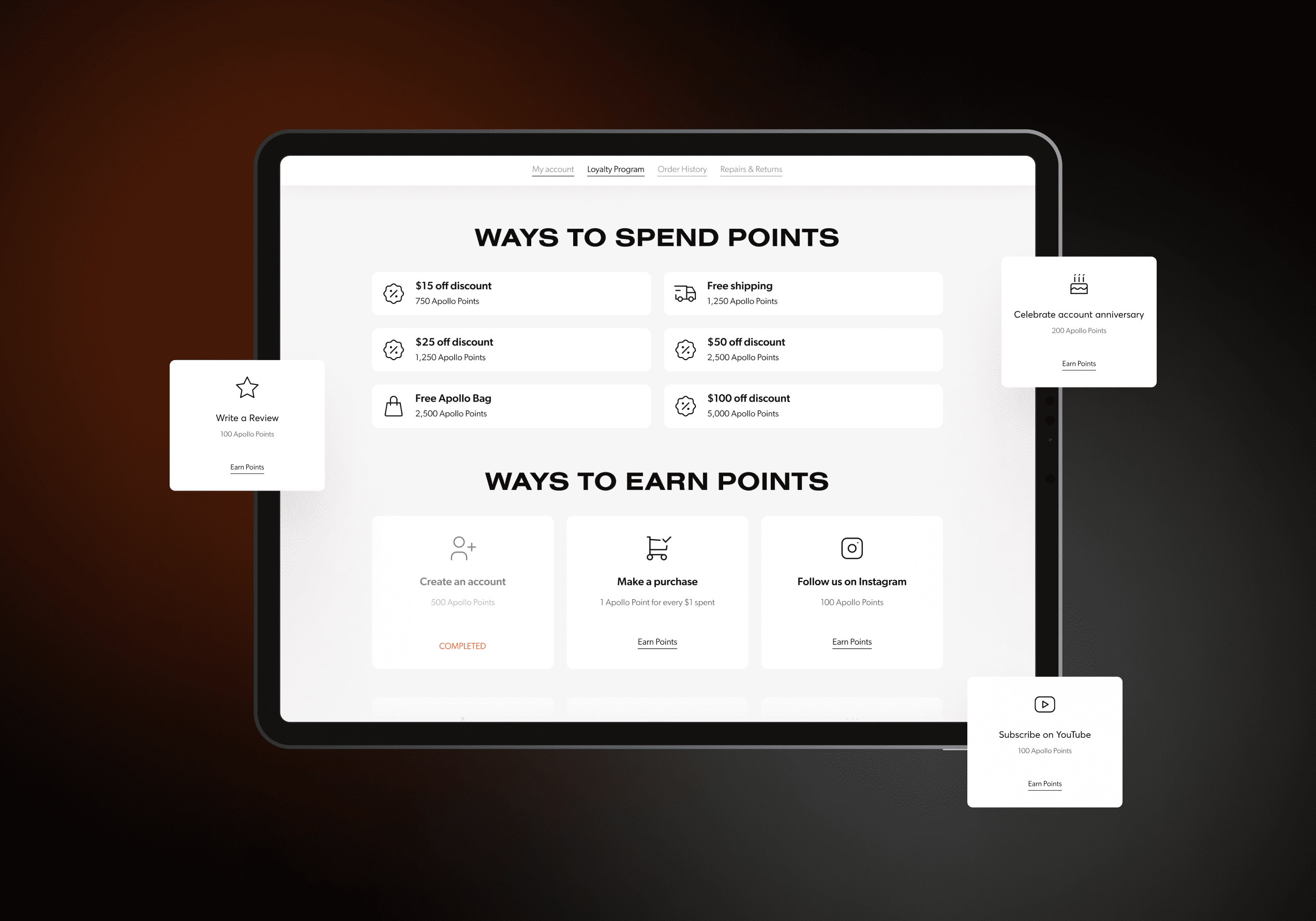
Points-based reward system
We introduced a points-based feature aimed at enhancing customer loyalty. This new system allows Apollo's customers to accumulate points through various interactions with the brand. Points are awarded for several activities, including making purchases and engaging with Apollo Scooters on social platforms, such as Instagram. A key benefit of this system is that it enables customers to exchange their points for appealing rewards, such as discounts and free shipping. It serves to enrich the user experience, while at the same time nurturing a deeper connection between customers and the brand.
Enhanced browsing
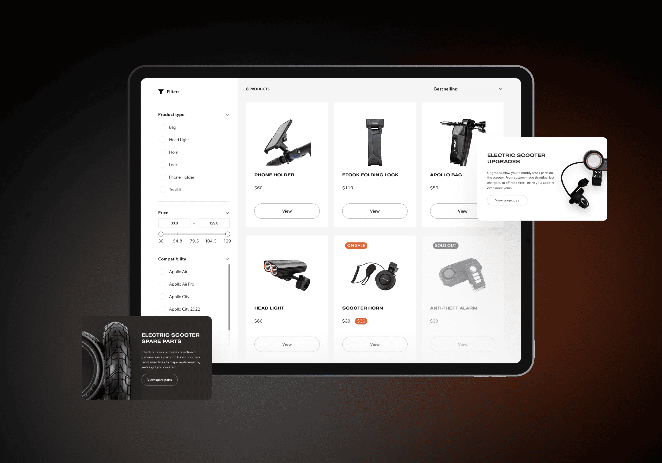
A specialized page was developed to highlight scooter-related accessories. Included on this page are user-friendly filters, enabling customers to narrow down their search by criteria, such as compatibility with specific scooter models, price range, and the type of product they're interested in. This streamlined approach to browsing simplifies the process for users to locate and purchase accessories, thereby augmenting their overall experience with the scooter products.
User-friendly interface
Embracing a mobile-first strategy, our design process prioritized the mobile user experience. Our focus was on developing mobile interfaces that were intuitive and aesthetically pleasing, ensuring a seamless and satisfying user experience on various mobile devices, regardless of their screen sizes.
Modern and memorable
In establishing the visual identity for the initial version of the website, our team chose two typefaces that pair well together. Nimbus was selected for headlines, offering a bold and substantial presence, which effectively captures the attention of users with its strong, contemporary feel. For the main text, we opted for Gimbus, a typeface designed to complement Nimbus in the headlines. Its primary role is to ensure readability and maintain visual balance across the website, making the content both engaging and easy to follow.

Distinct and trustworthy
We decided to improve the brand's visual appeal and make it more distinctive. The deliberate selection of different hues of blue and brown communicated innovation, trustworthiness, and dependability. To inject a lively and playful element into Apollo’s aesthetic, a vibrant orange accent color was introduced. It serves to capture the attention of users, adding an energetic and appealing aspect to the overall design.
5.0
5.0