Headless Website For an Australian-Based Leading Voice AI Technology Company
BRAND
Curious Thing
location
Sydney, AU
Client
Curious Thing
Stack
React
Budget
$15,000 - $50,000
PROBLEM
One of the key challenges was effectively communicating the distinct capabilities of Curious Things' AI voice interviewer. Our primary focus was on highlighting its selling points, such as time-efficiency and better candidate experience. They are crucial for recruiters seeking to streamline their hiring processes.
SOLUTION
The aim of the project was to create an immersive and appealing website that places a high priority on user experience, ensuring that visitors are engaged and well-informed about Curious Thing's mission, technology, and products. In addition, we were asked to develop unique assets that would set Curious Thing apart from their competition.
VALUE DELIVERED
Our team successfully enhanced Curious Thing's online presence by designing a unified and unique online experience. The inclusion of a captivating illustration on the home page played a pivotal role in the entire endeavor. It served to welcome visitors into the world of artificial intelligence with a friendly and approachable vibe.
Innovating the interview process
Curious Thing is a company that built a voice interviewer powered by artificial intelligence. It's eager to ask open-ended questions and get insights from people. In other words, it's actually curious.
Project timeline
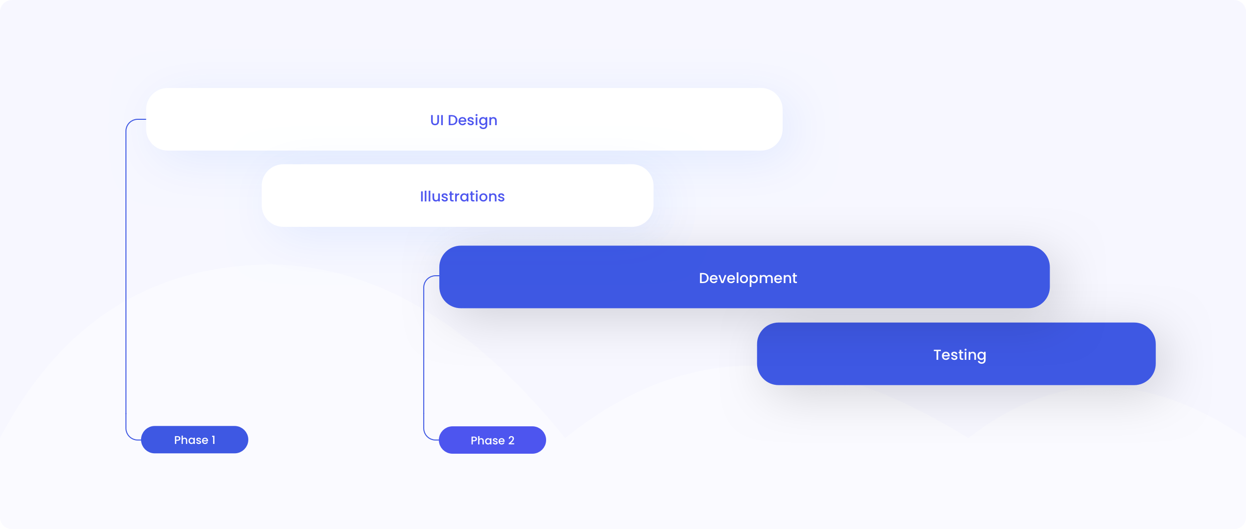
Our team meticulously crafted a visually appealing and user-friendly interface. We also created colorful and modern illustrations to make the Curious Thing website stand out from the crowd. Later on, developers and a quality assurance specialist stepped in to take care of the technical side of the project.
Modern and captivating
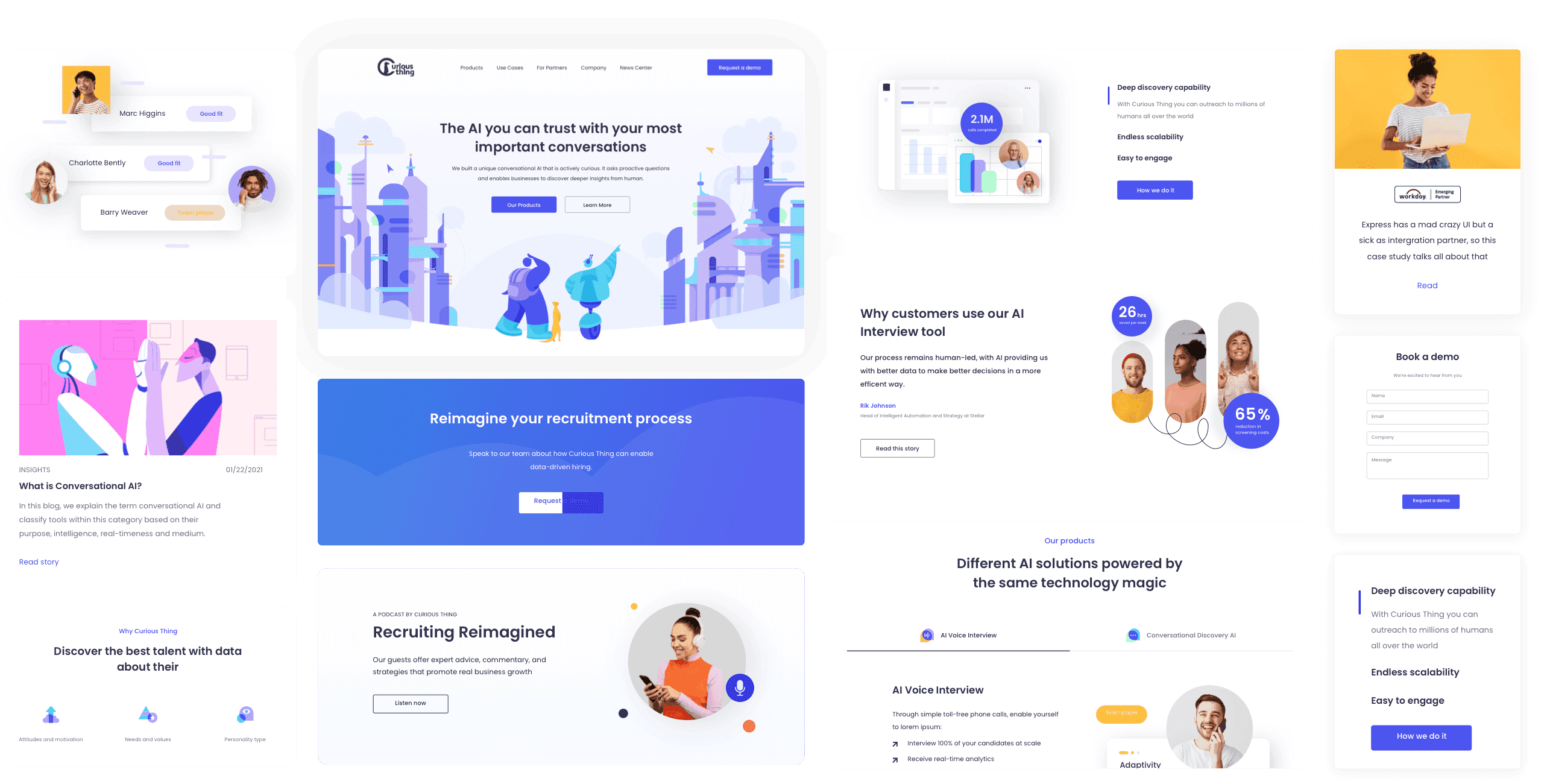
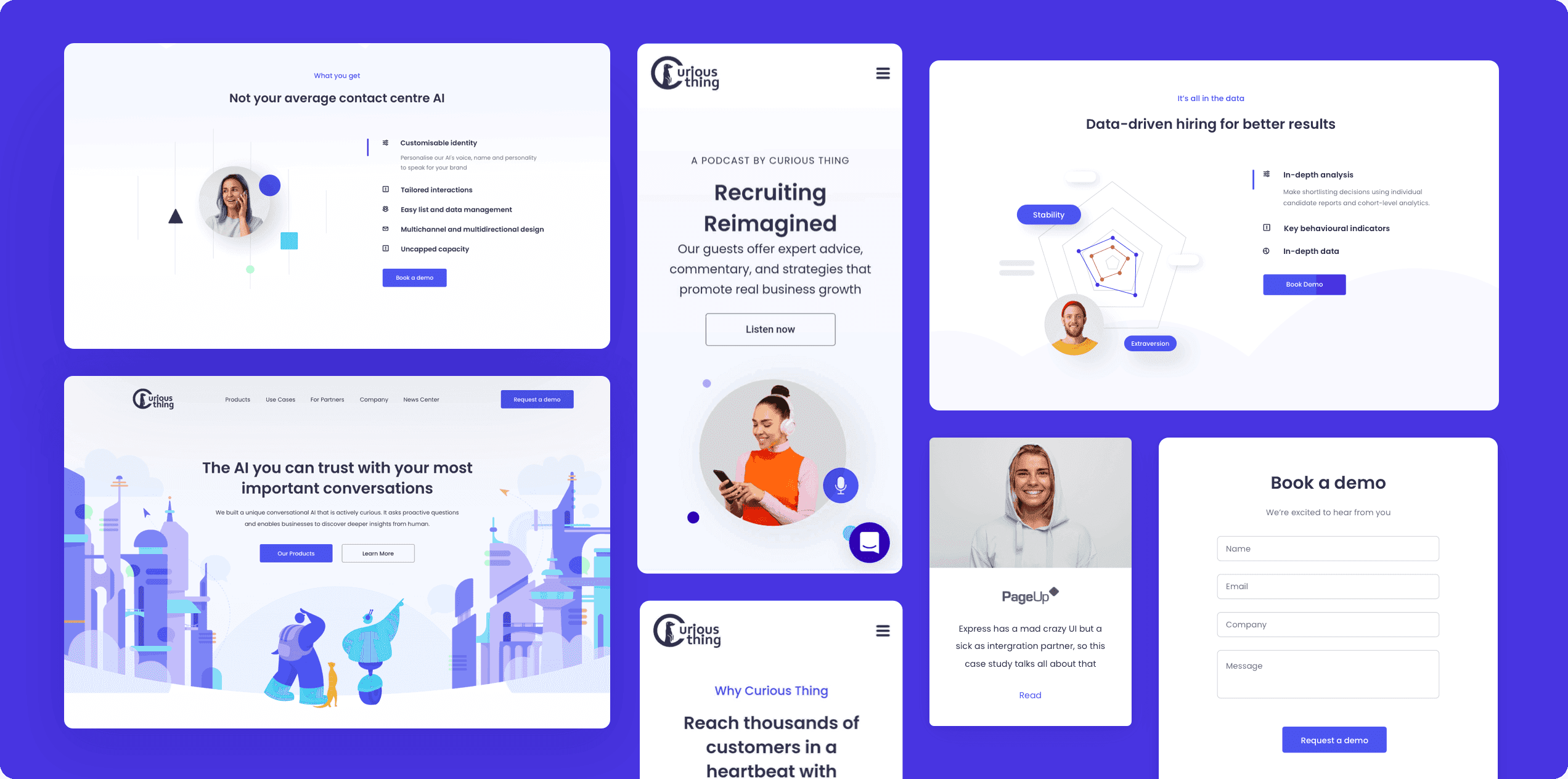
The home page boasts a modern and visually captivating design that effortlessly captures the user's interest with its playful and tech-savvy aesthetic. The hero illustration narrates a tale of a futuristic encounter between a human and a robot.
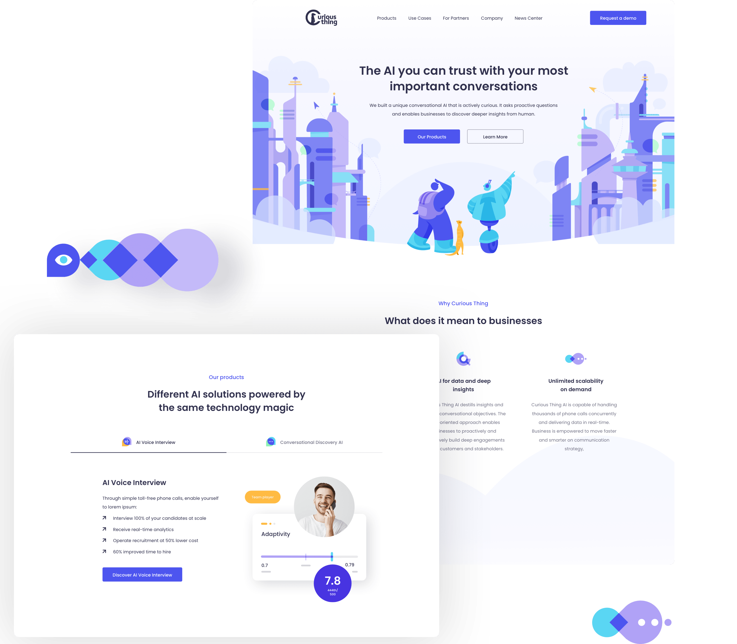
Showcasing innovative products
The Curious Thing website includes product pages which showcase the company's main offerings. They are simple and modern, yet visually pleasing and engaging.
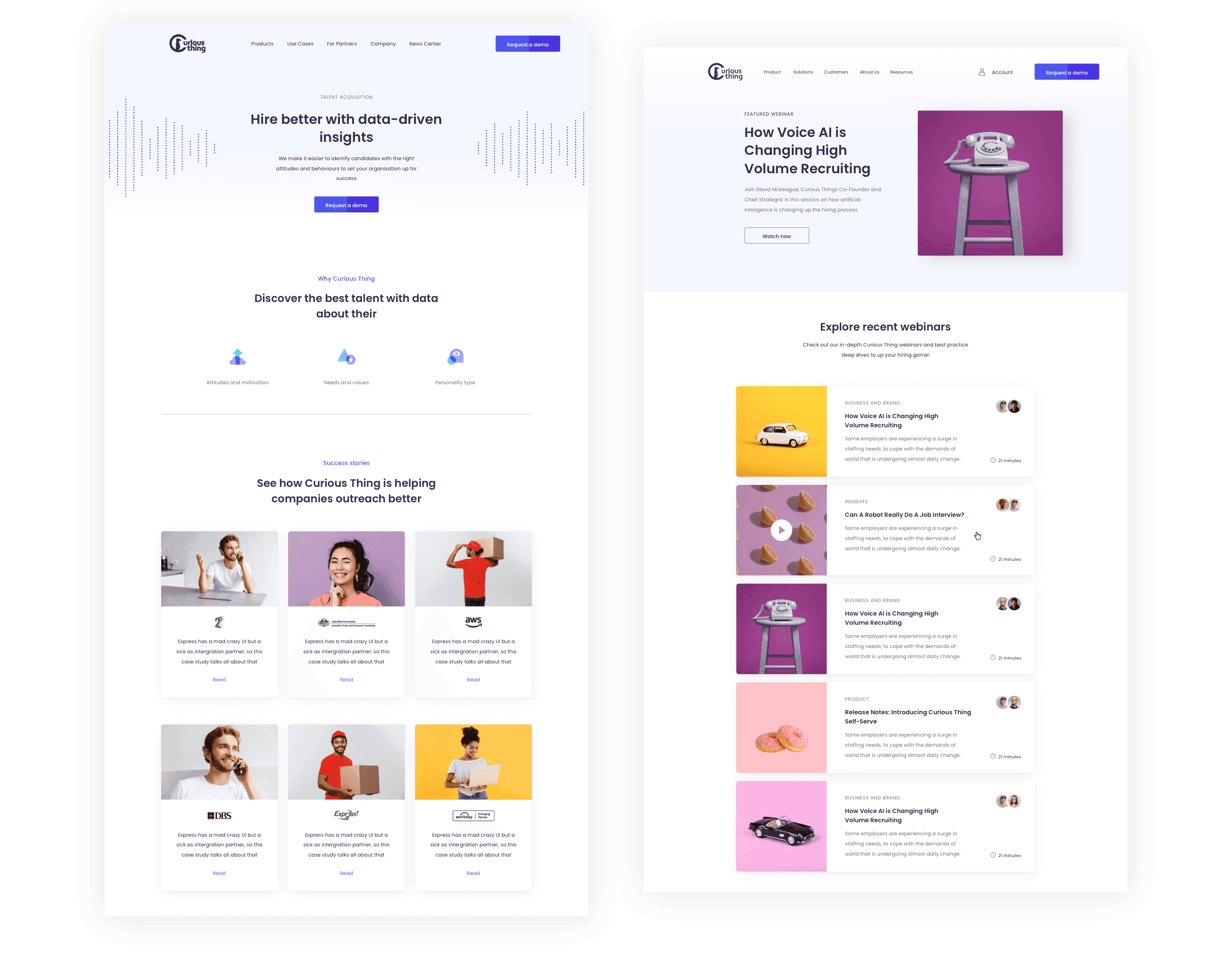
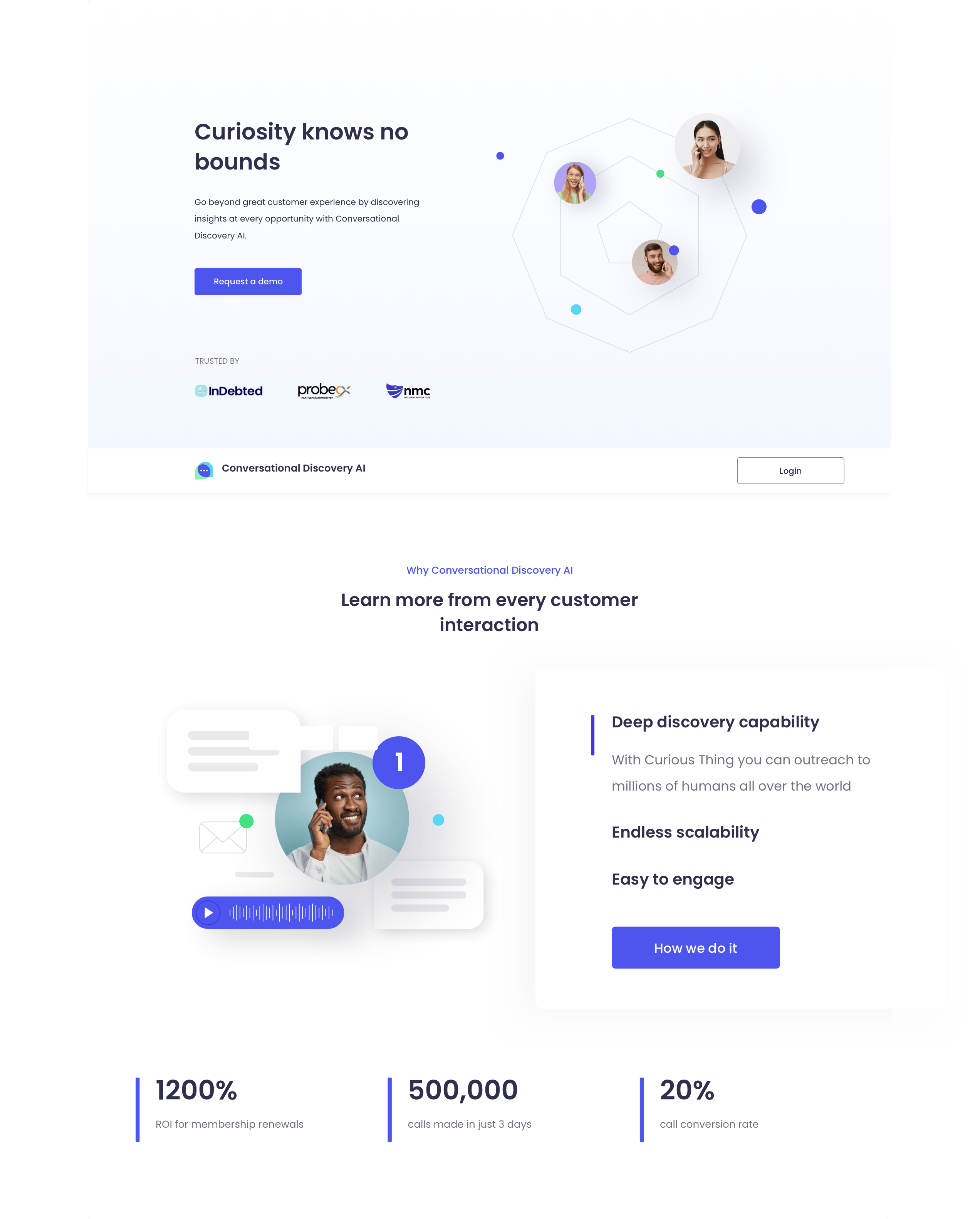
Convincing and practical
The aforementioned product pages put an emphasis on product benefits. What's more, they do so in an engaging and convincing way. Potential customers are greeted by fresh colors, a memorable color palette, and an easy-to-read font.
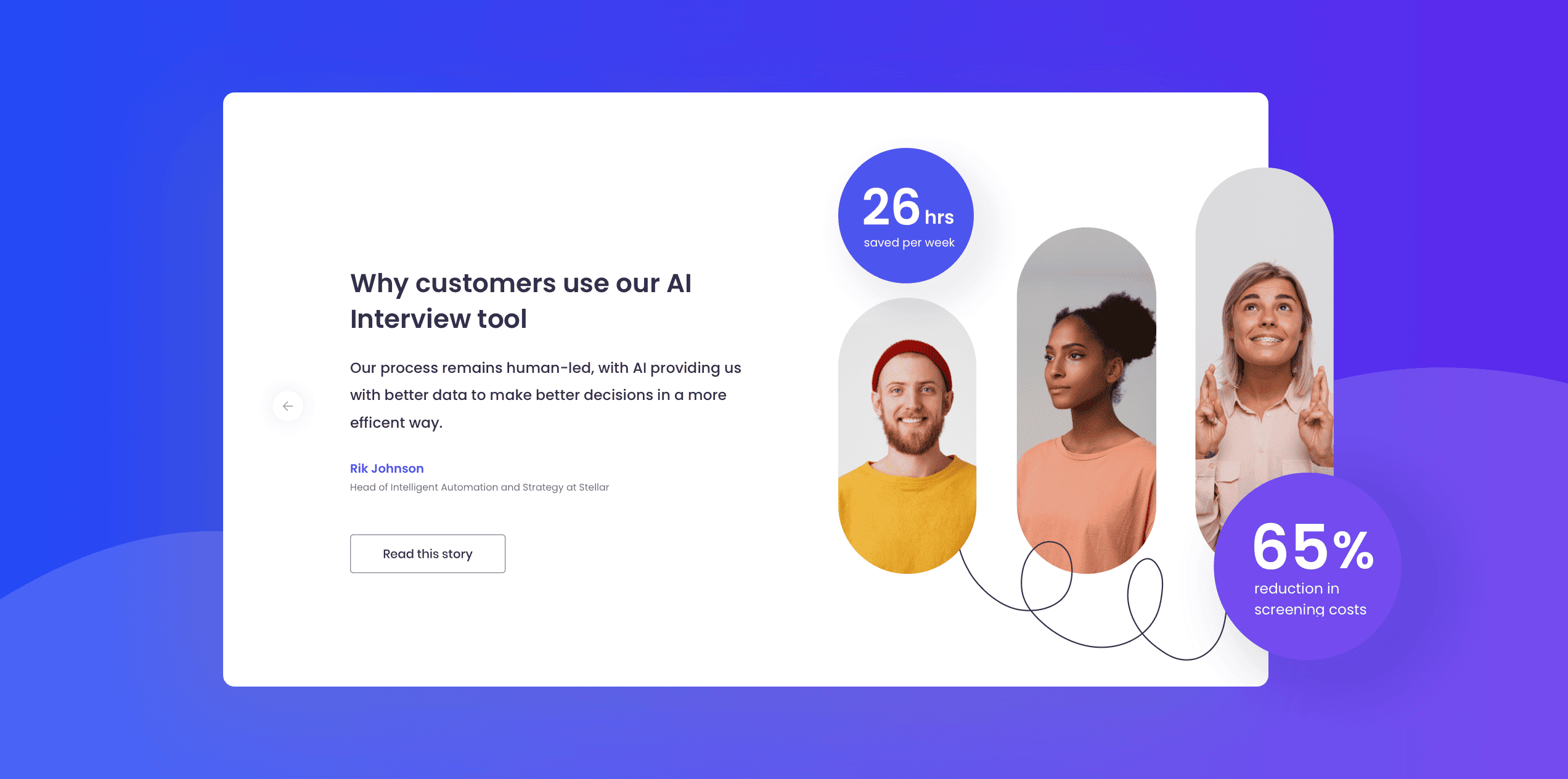
Social proof
We wanted to help Curious Thing convert website visitors into loyal customers. For that reason, we created a distinct testimonial section. It adds to the company's credibility and trustworthiness.
Mobile-friendly design
While working on the project, we made sure to adhere to mobile design best practices. Consequently, the Curious Thing website is pleasant to use regardless of whether you're using a tablet or a desktop computer.
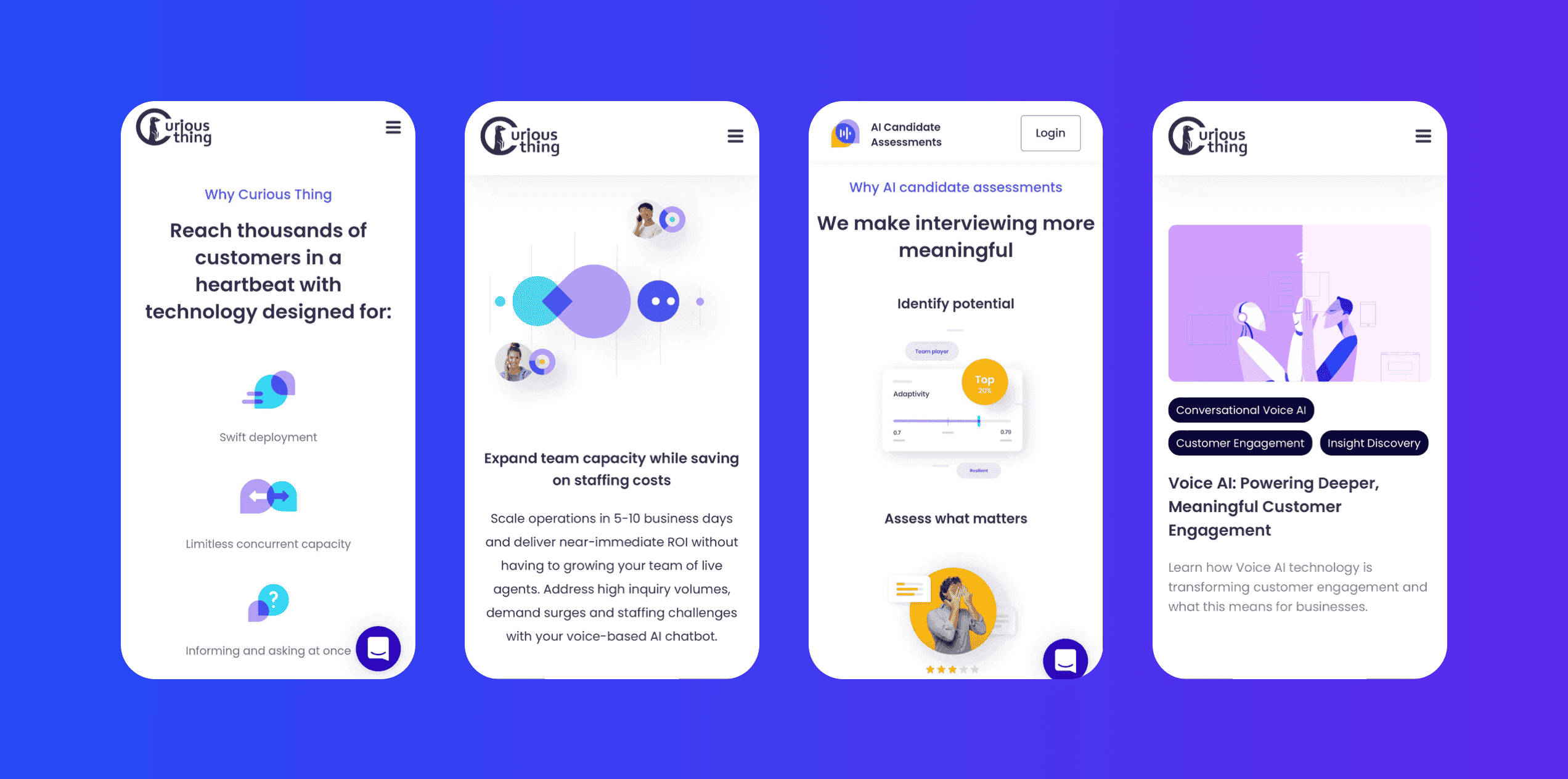
Variety in shapes and colors
In any graphic design project, the use of shapes and colors plays a pivotal role in ensuring the brand's message resonates with its target audience. For Curious Thing, this aspect was especially critical given their ethos of curiosity and innovation.
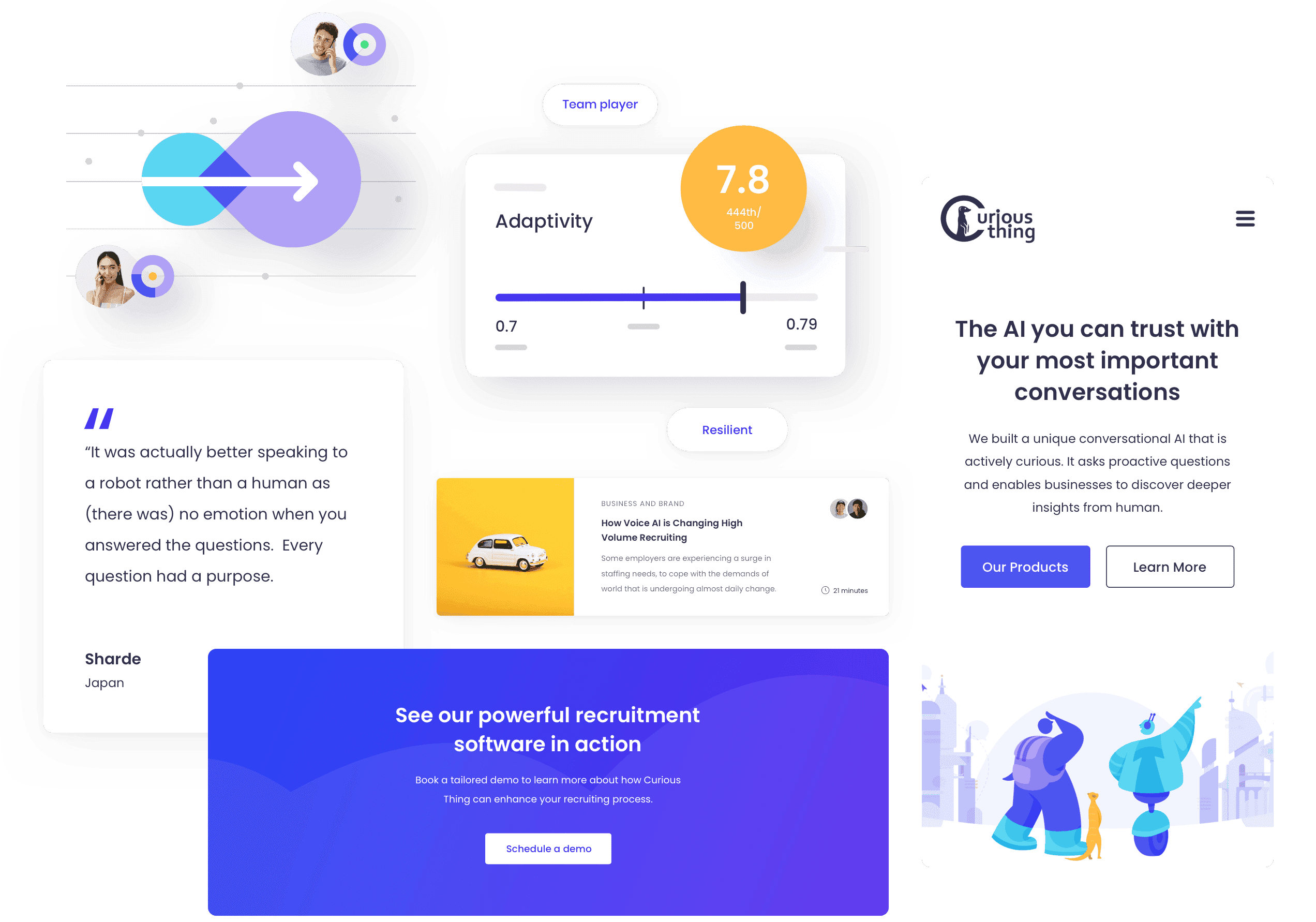
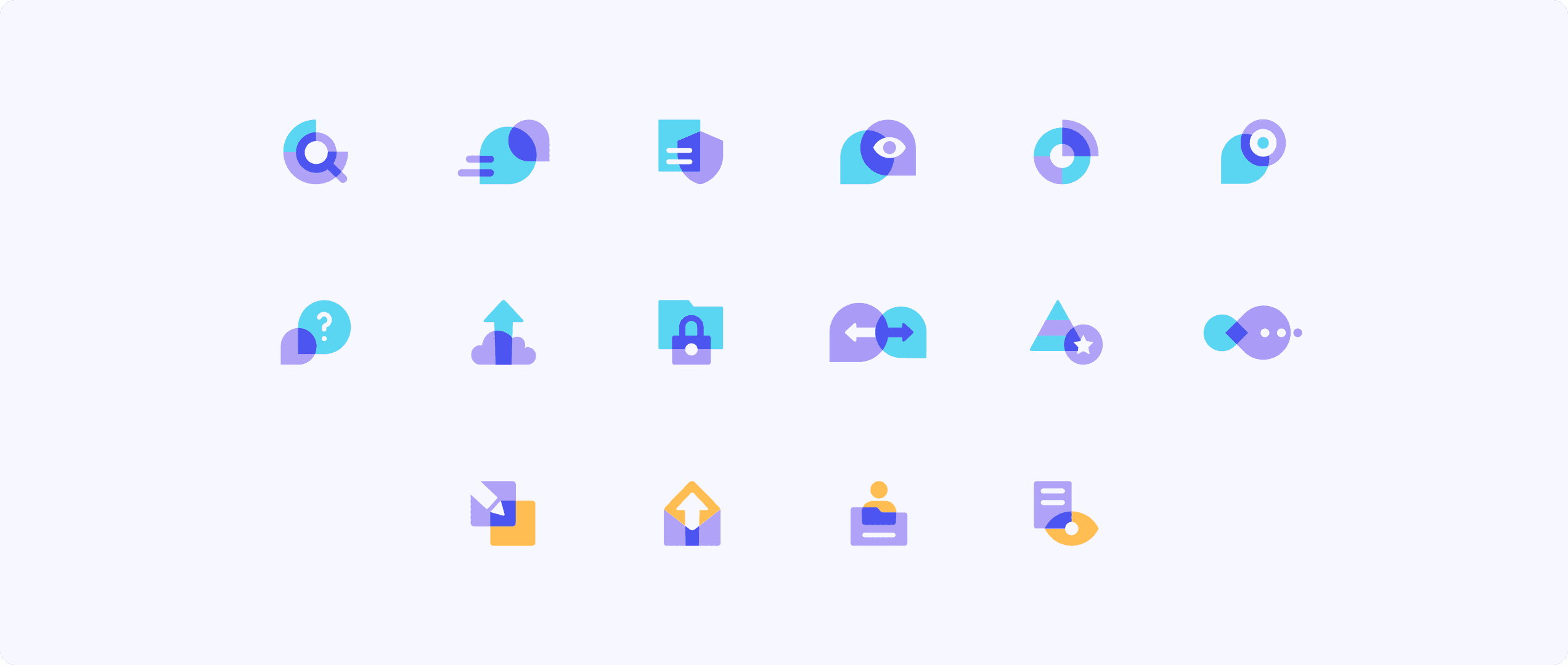
Minimalist and pretty
Our graphic designer made sure to make the website visually attractive. It features a number of custom-designed icons, the addition of which resulted in a visually coherent and distinctive brand identity.
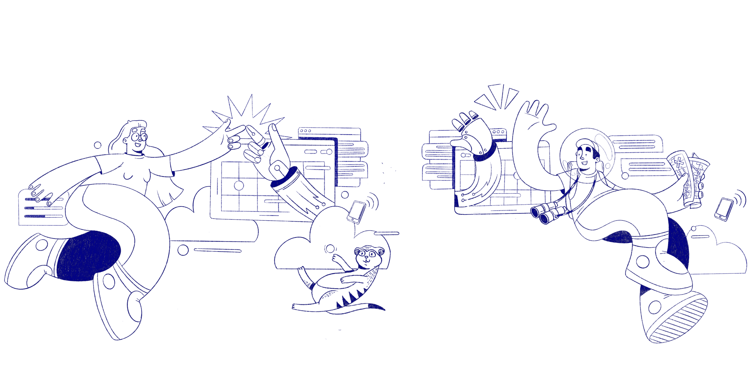
Attention-grabbing illustrations
The website features a number of custom-made illustrations. The inclusion of such digital assets showcases the brand's identity and helps keep visitors engaged.
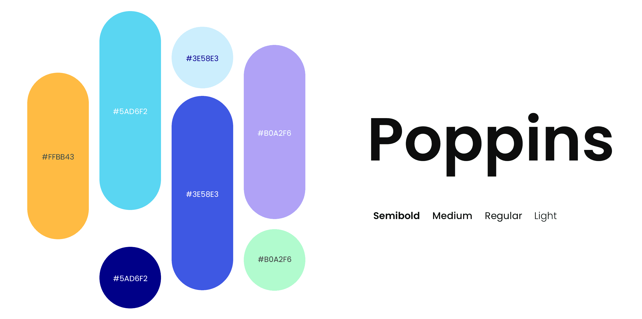
Colors and typography
The colour palette, consisting of purple and its shades, nicely contrasts with yellow and turquoise, adding vibrancy and freshness to the brand's image. When it comes to typography, we decided to go with a font called Poppins, which further adds to Curious Thing's modern aesthetic.
