Custom-Built E-Commerce Solution for an Online Store Selling Ceramic Tiles

BRAND
Field Tiles
location
Miami, Florida, US
Client
Field Tiles
Stack
Woo Commerce / WordPress
Budget
$15,000 - $50,000
PROBLEM
Field Tiles focused on creating an exceptionally accessible online store, complete with a sophisticated product configurator designed to manage diverse product combinations. The primary goal was to provide customers with a range of tile customization choices, while carefully avoiding the complication of too many options.
SOLUTION
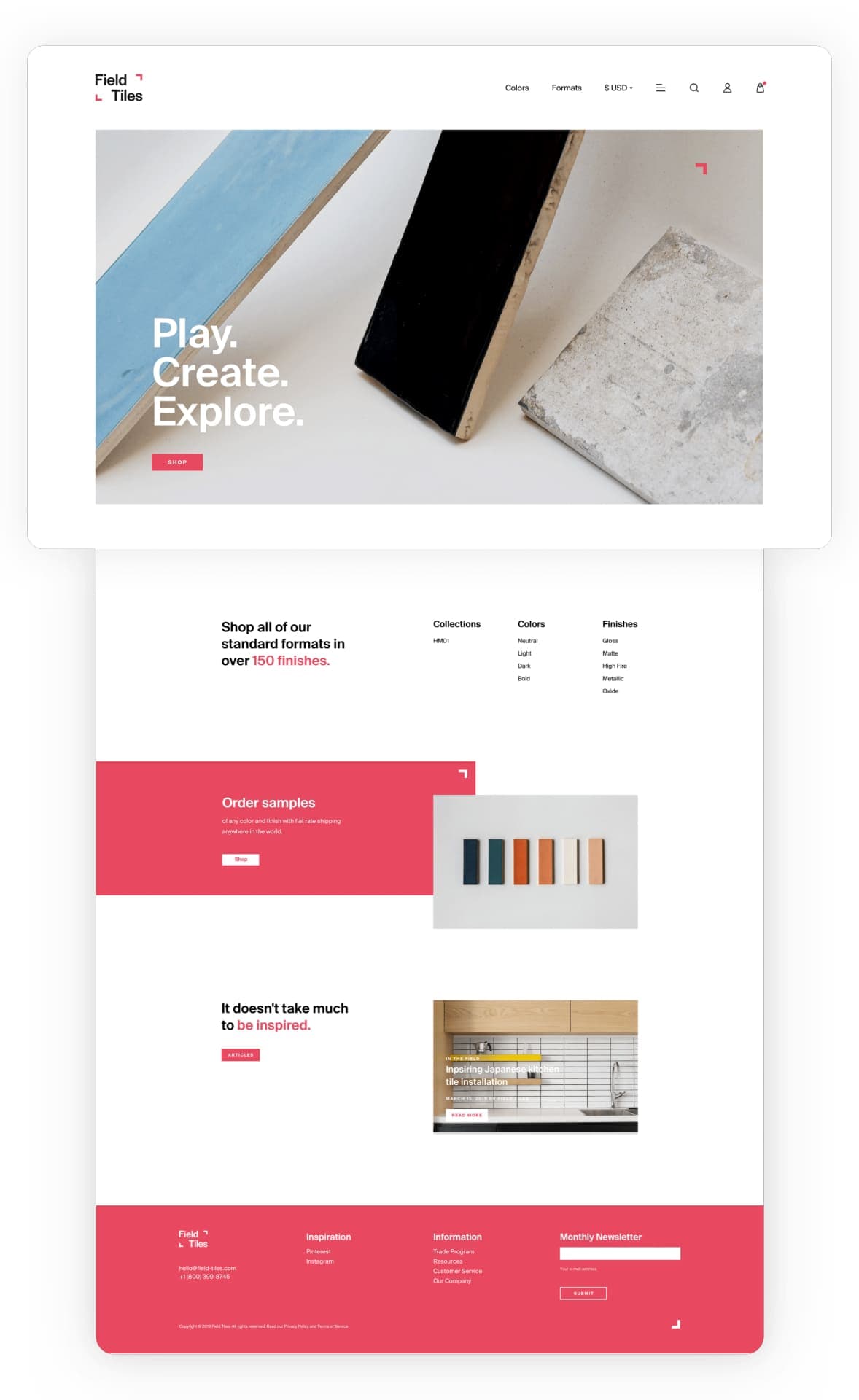
The revamped homepage of Field Tiles is now dominated by vibrant tiles, complemented by a series of new features designed to enhance sales. These include a consolidated one-page product listing, engaging call-to-action buttons, and mobile device compatibility, contributing to a streamlined and accessible shopping experience.
VALUE DELIVERED
We engineered a unique e-commerce platform for Field Tiles, focusing on a user experience design that not only highlights their products, but also aims to inspire customers. Furthermore, we revitalized the client-facing aspects of the website, ensuring Field Tiles' alignment with contemporary technological advancements.
Where world craftsmanship meets artistic design
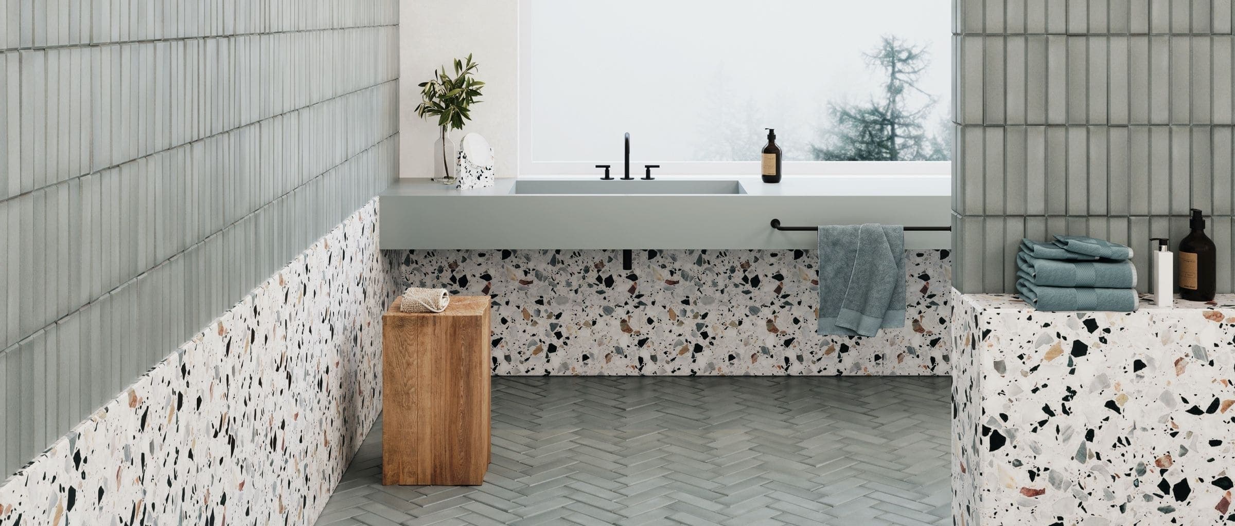
Field Tiles operates an online ceramic tile store featuring a diverse range of handmade products created by skilled artisans from around the world. Their commitment extends beyond mere aesthetics, elevating tiles to the status of functional art pieces. The striking beauty of these tiles often demands a presentation akin to that found in an art gallery, showcasing their unique place in interior design and architecture.
Balancing customization and simplicity
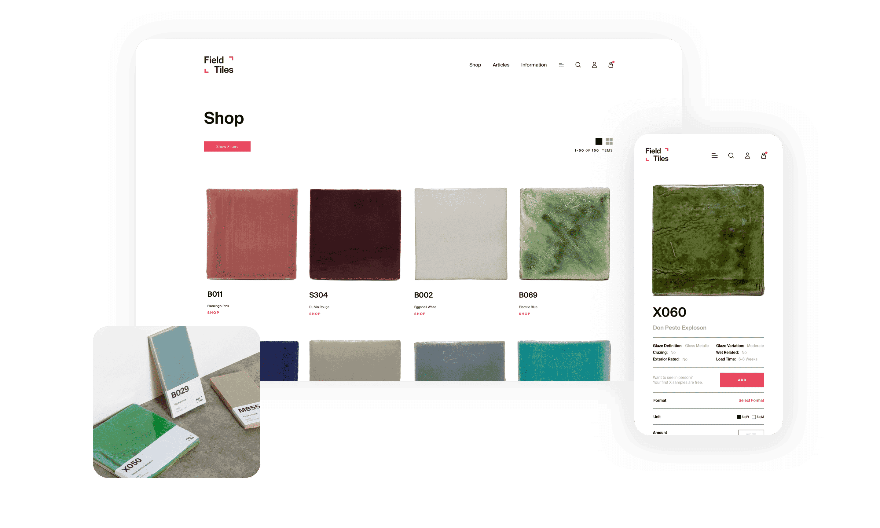
Field Tiles entrusted us with developing an online store that included intricate product configuration capabilities. Our primary challenge involved offering customers a broad spectrum of tile customization options. At the same time, it was crucial to ensure that these options didn't overwhelm them with too many choices.
Simplicity meets elegance
The website's design is clean and straightforward, placing the spotlight on the vibrant tiles. Customers are greeted by these eye-catching, handmade products right from the home page. Distinct and visually appealing call-to-action buttons also help visitors easily navigate to different sections of the store.
Easy comparison and selection
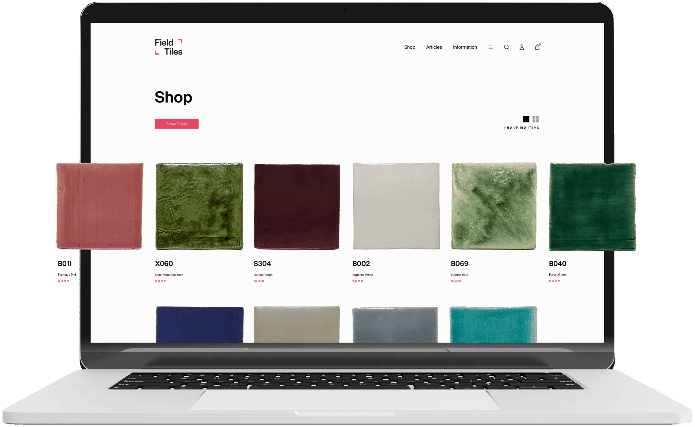
A major feature of the online store is the ability to view the entire product catalog on one page, using long scrolling instead of traditional pagination. This approach allows buyers to see each and every available color at a glance, making it easier to compare and decide. Additionally, the store offers convenient filters to help customers quickly find products in their preferred color or finish.
Detailed imagery and simple configuration
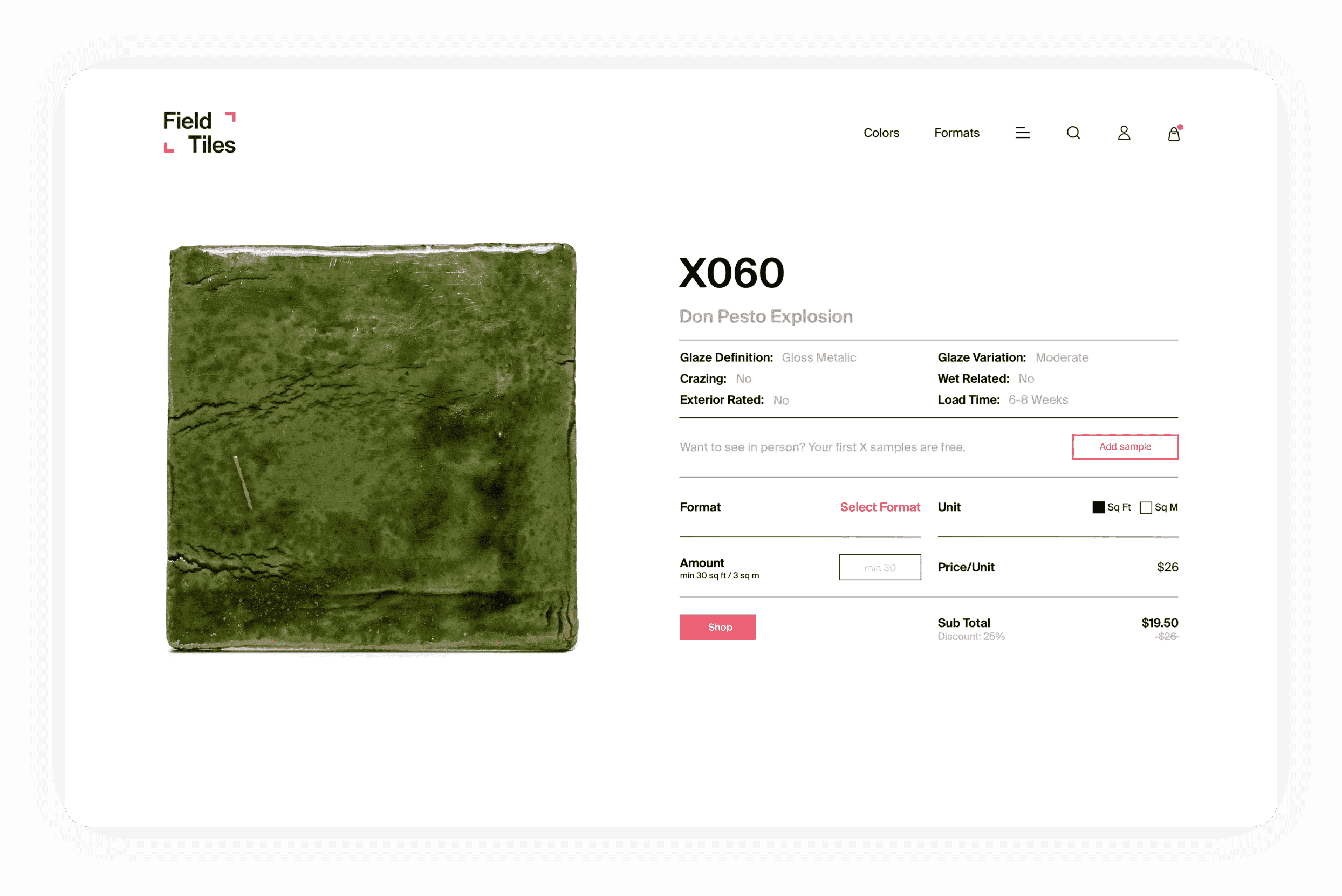
In interior design, how products are showcased is vital. For the product card, the most important feature is the close-up photo, allowing customers to fully appreciate the unique characteristics of each tile, from its color variations to its texture and crazing. Here, customers can also select from a wide range of tile formats, calculate the cost per square foot or meter, and add their choice to the cart. Despite the numerous product configuration options available at this stage, the entire process is designed to be seamless and user-friendly.
Wealth of knowledge
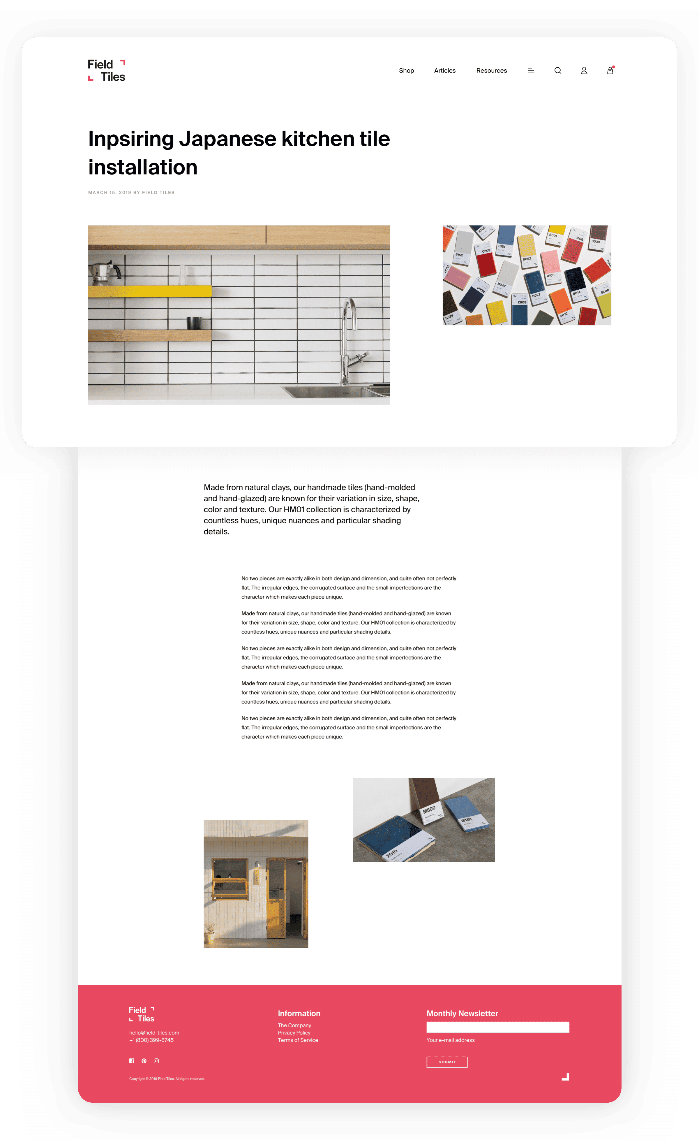
Field Tiles studio is passionate about sharing its expertise in design and tile craftsmanship, along with practical advice for both residential and commercial construction projects. We enhanced their website by adding a new section filled with informative articles. This section is filled with helpful tips and industry insights, tailored to assist a wide range of buyers in making informed tile choices.
Mobile-first design
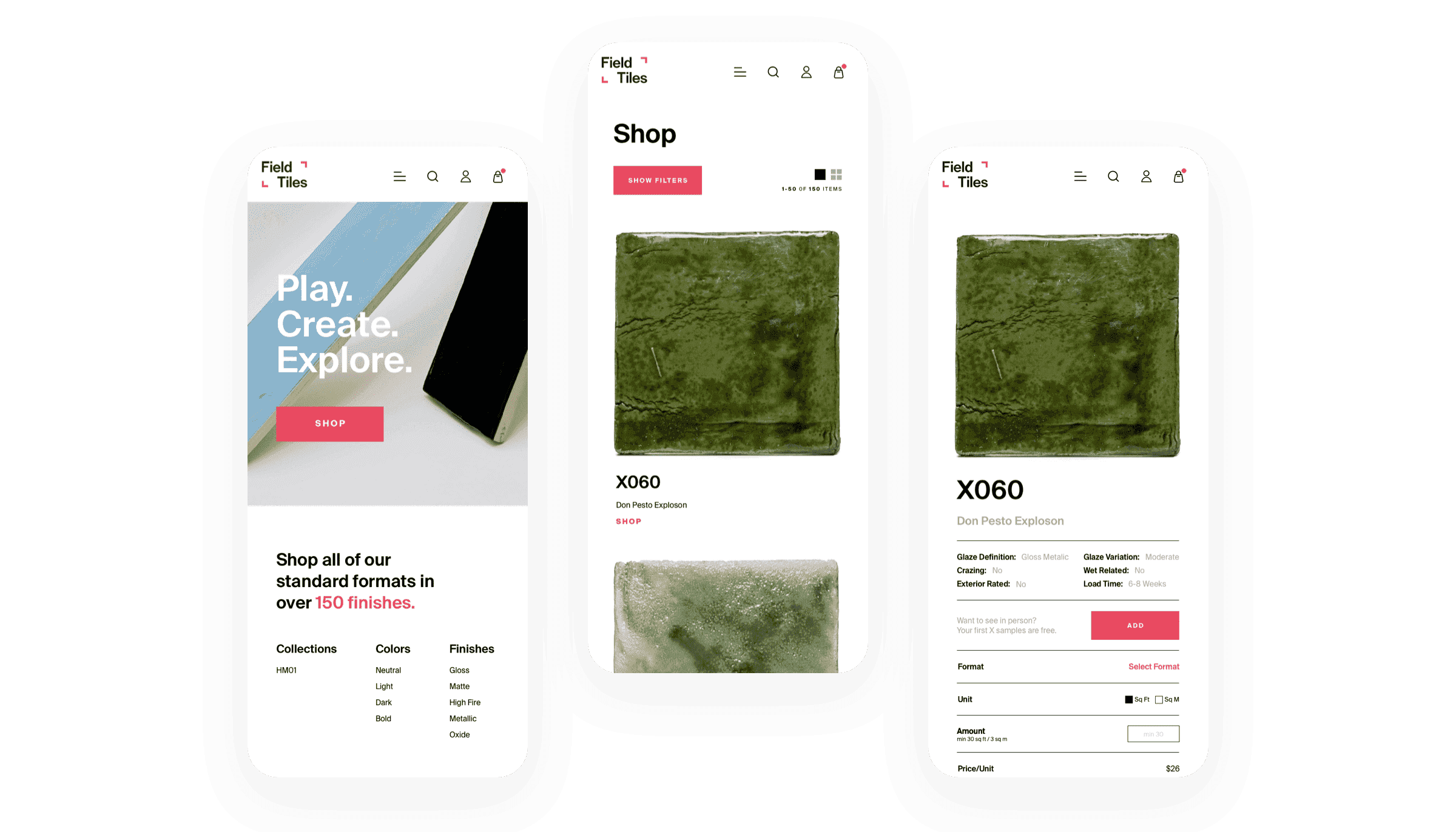
We adopted a mobile-first design philosophy, recognizing the increasing prevalence of mobile internet users. By prioritizing mobile optimization, we ensured a smooth, engaging user experience across different devices, setting a high standard for accessibility and usability.
Less is more
We used only three colors combined with a harmonious and clean design, effectively showcasing the brand's commitment to elegance and minimalism. The choice of a limited color palette emphasized the brand's focus on understated sophistication.

