Complete Digital Experience For a Prestigious International Society
BRAND
The Explorers Club
location
New York, US
Client
The Explorers Club
Stack
WordPress / Salesforce
Industry
NGO & Non-Profit
Budget
Confidential
Live
PROBLEM
The prestigious Explorers Club, based in New York City, sought to rejuvenate its online presence. As a community of scientists and scholars, it was essential to create a digital space where club members could engage with one another and stay informed about the club's events and activities.
SOLUTION
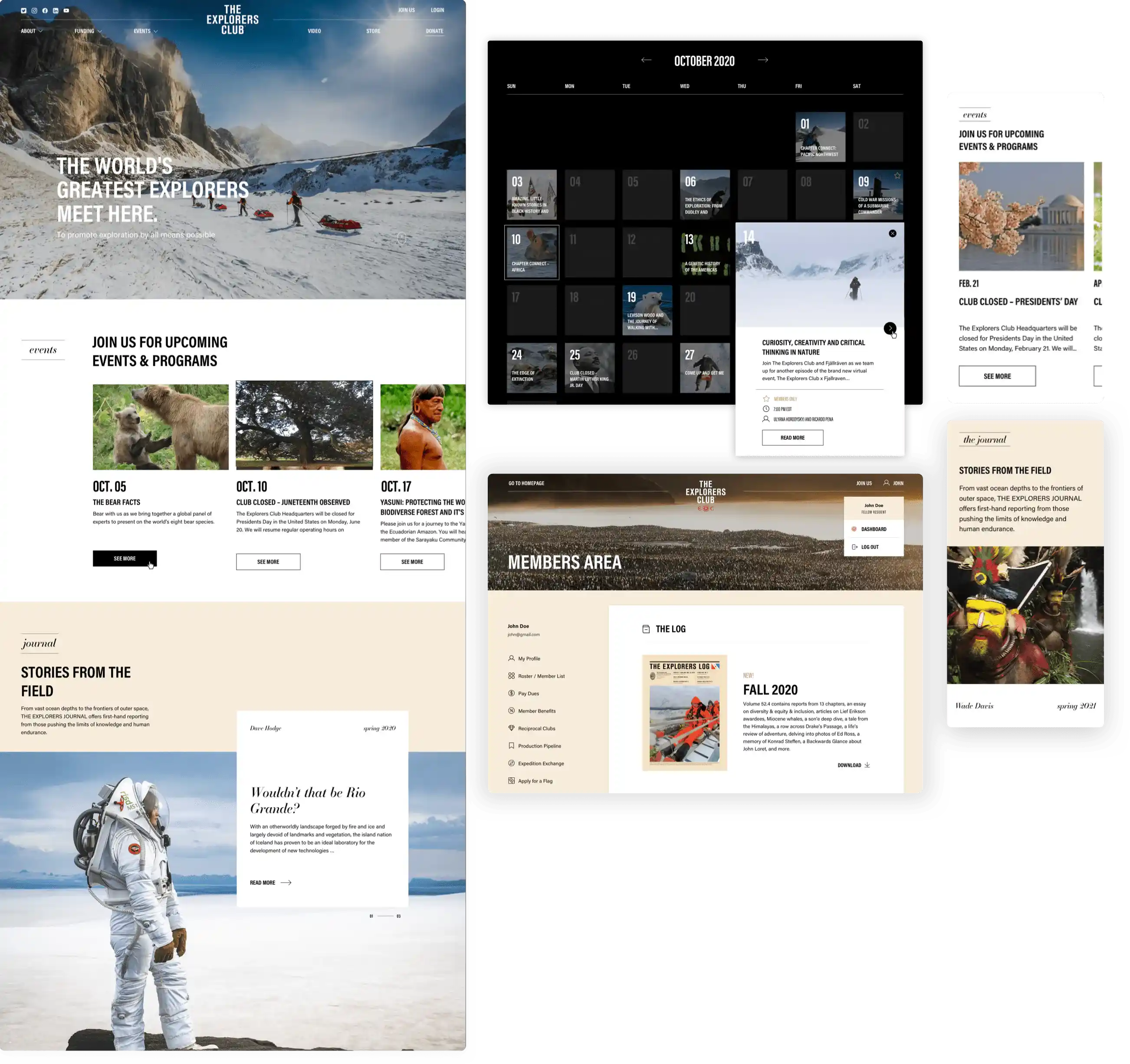
Our team crafted a compelling website enriched with historical imagery for The Explorers Club. It's equipped with numerous features, including a calendar, an events page, a members' area, and a travel map, among other things. Each element was meticulously aligned with the club's distinct style and branding guidelines.
VALUE DELIVERED
Our team delivered a state-of-the-art website for The Explorers Club, showcasing the club's rich history, the remarkable achievements of its members, and the core values they uphold. This new digital platform offers a professional and functional space tailored for explorers, scientists, and educators across a broad spectrum of scientific fields and professions.
By professionals, for professionals
Founded in 1904, The Explorers Club stands as a multidisciplinary hub for numerous scientists, explorers, and professionals, including renowned figures like Neil Armstrong and Sir Edmund Hillary. Collaborating with them was not only a tremendous honor, but also presented an extraordinary chance for creative innovation.
Streamlined planning
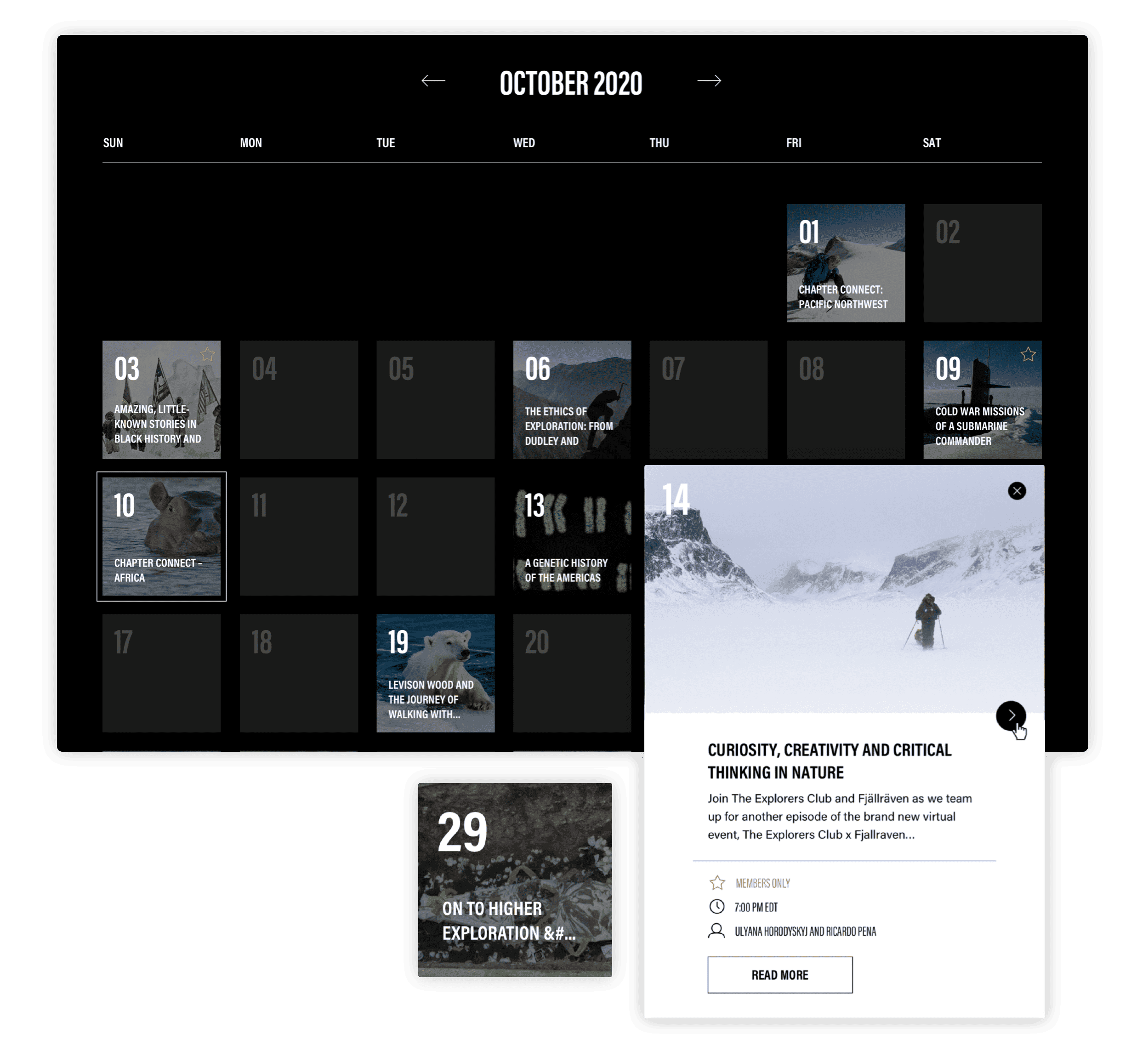
Every journey begins with a glance at the calendar, a crucial tool in the life of every explorer. The Explorers Club is no exception. We crafted a custom, elegantly minimalist calendar for them, detailing their wide array of events and activities. This includes everything from lectures and meetings to summits and adventurous trips.
A journey through time and space
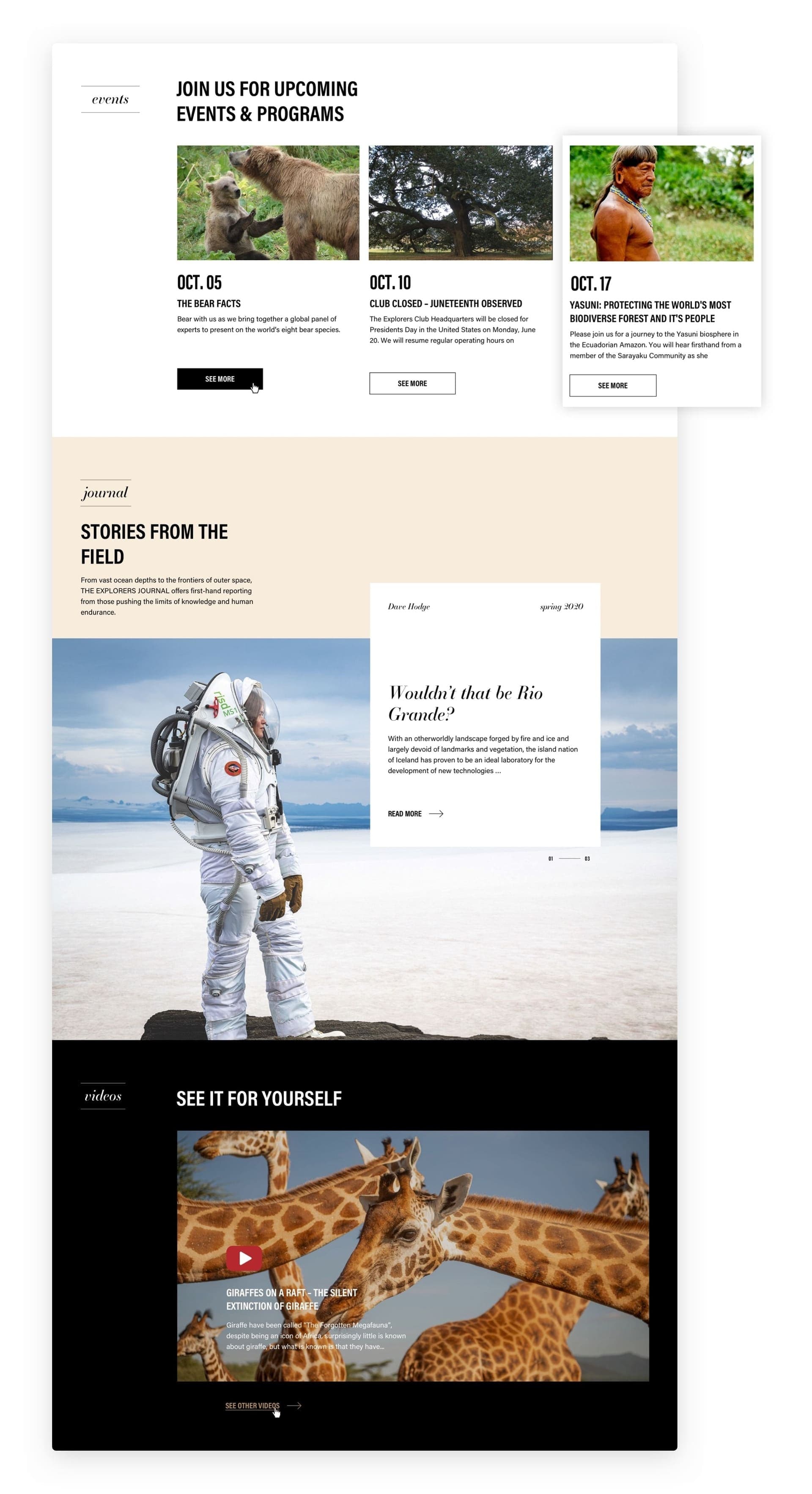
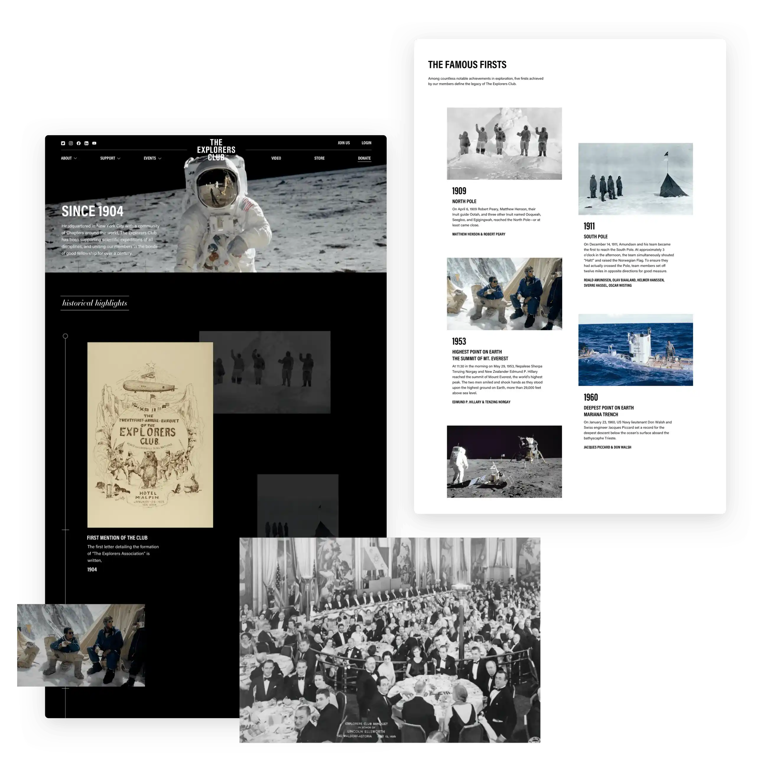
The section detailing the origins of the club is arguably the most crucial, providing insight into over a century of rich history. This history includes tales of its members reaching the world's most remote corners and even journeying to the Moon itself. The club's distinguished reputation is a source of immense pride, and we poured our hearts into showcasing this illustrious heritage with the utmost attention and enthusiasm.
Mapping historic achievements
Presenting explorers with a map is an unmatched method to garner their interest. The world map we designed showcases the remarkable accomplishments of The Explorers Club members, such as expeditions to the Titanic wreck and dives into the Mariana Trench. The flags depicted are the official flags of The Explorers Club, and earning the right to carry one represents a significant honor for any explorer.

Simplicity in design
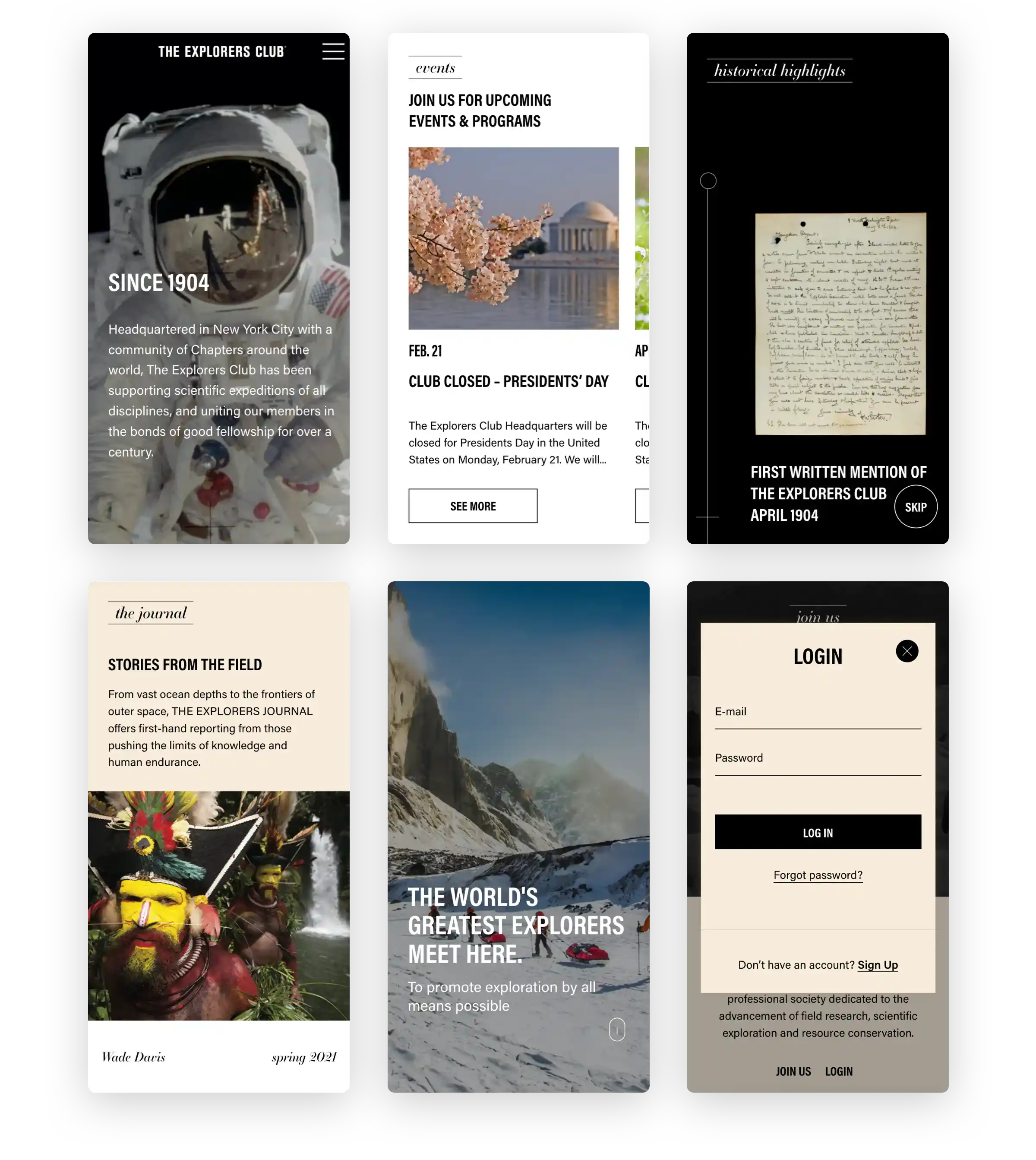
In the mobile adaptation of The Explorers Club's website, photographs take center stage. Unique images captured by Buzz Aldrin on the moon provide an unparalleled backdrop for the website's content. From a design perspective, the consistent use of white and beige backgrounds complements a minimalist, text-focused layout, ensuring that nothing detracts from the narratives and navigation options presented to the user.
Exclusive access
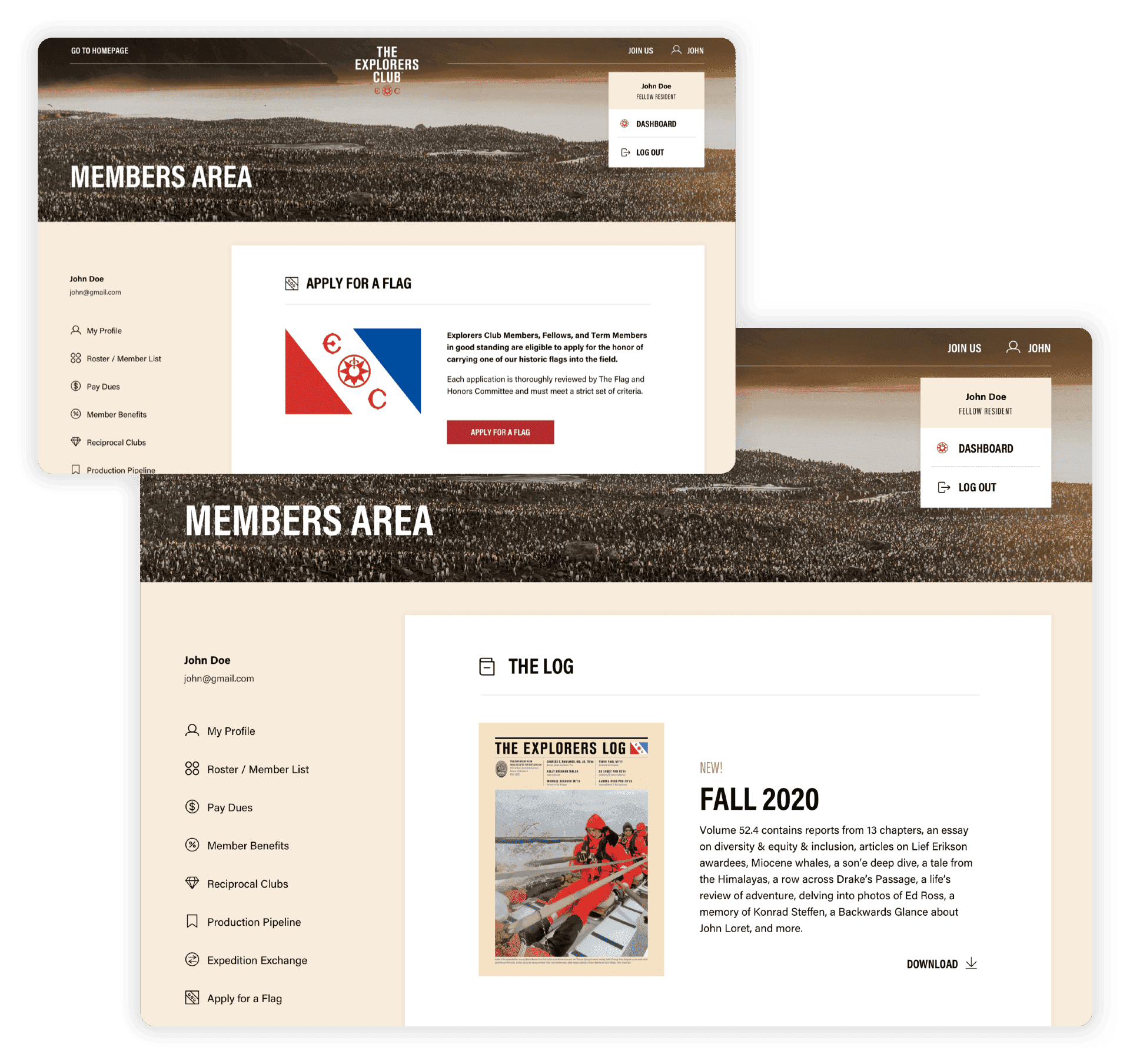
The members' area is a critical component of the club, functioning as a highly efficient space tailored to the needs of its members. It offers exclusive access to a range of benefits and customizable profiles. This section also provides detailed information on expeditions and allows members to manage various lists, subscriptions, and bookmarks, making it the cornerstone of the club's digital experience.
BRANDING
The design of the website prioritized accessibility for individuals across different age groups, emphasizing the importance of inclusivity for the elderly members of The Explorer's Club. This inclusivity ensures their active participation within the Club's community.
Our task involved integrating the Club's established color schemes, palettes, and typography into the website's design. The primary objective was to encapsulate The Explorer's Club's ethos and values into functional and cohesive designs.
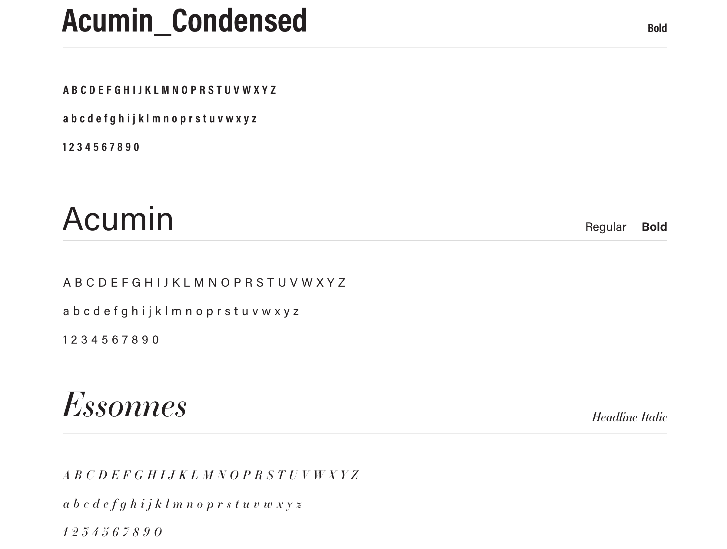
In terms of typography, the website features a harmonious combination of the Acumin sans-serif and the strikingly sophisticated Essones serif fonts. This pairing contributed to the site's elegant and accessible aesthetic, enhancing the overall user experience.

