Branding And Website For a Marketplace Designed to Liberate Tied-Up Home Equity
BRAND
Reblocs
location
Stockholm, SE
Client
Reblocs
Stack
React / WordPress
Budget
$15,000 - $50,000
Live
PROBLEM
Reblocs, hailing from Stockholm, is on a mission to revolutionize the traditional perception of real estate investment. Recognizing the need for their digital presence and branding to match the innovation of their business concept, they turned to us.
SOLUTION
Our project encompassed an extensive scope of website design and development, with the primary goal of enhancing the end-user experience through strategic, data-driven design choices. By streamlining the website's layout, we managed to accentuate its content. Additionally, we simplified user forms and several key pages, further refining user interactions with the site.
VALUE DELIVERED
We provided Reblocs with a revamped website that boasts, enhaced readability and accessibility, straightforward content management, and superior speed. Aside from that, the addition of modern, dynamic illustrations helped infuse the brand with a fresh, relaxed vibe.
Revolutionizing real estate
Reblocs is revolutionizing the traditional concept of real estate investment by introducing a service that facilitates investment in the housing market. Given the innovative nature of their platform, it was essential for their digital presence and branding to reflect the quality and ingenuity of their business model. Recognizing the need for a strong online identity that matched their groundbreaking service, Reblocs decided to work with our team.
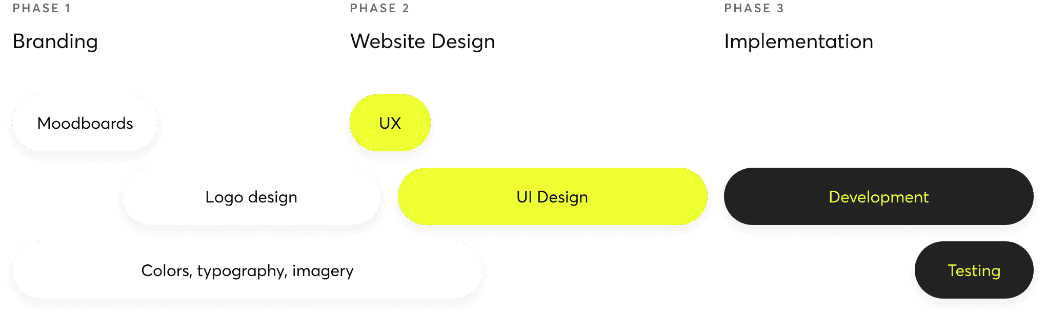
Strategic timeline execution
As we commenced our collaboration with Reblocs, we meticulously organized the project's timeline to ensure the efficient delivery of user interface designs, branding materials, and efficient code. Throughout our workflow, we put meeting the client's needs above everything else.
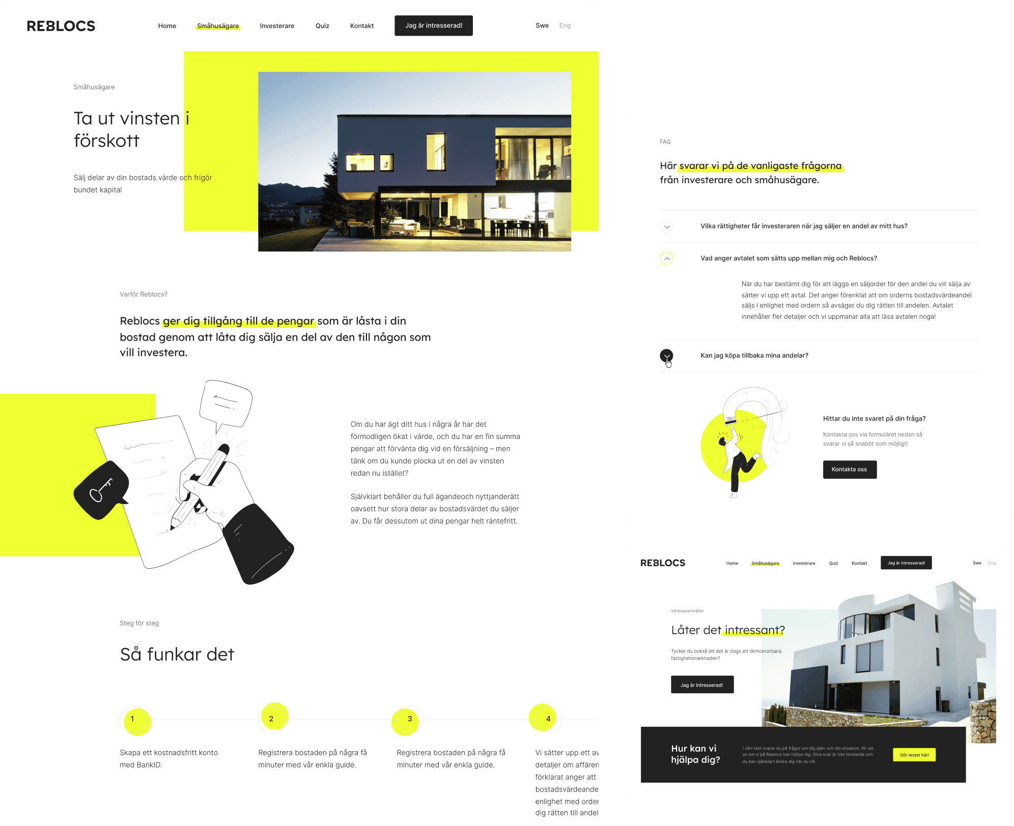
Clean and distinctive
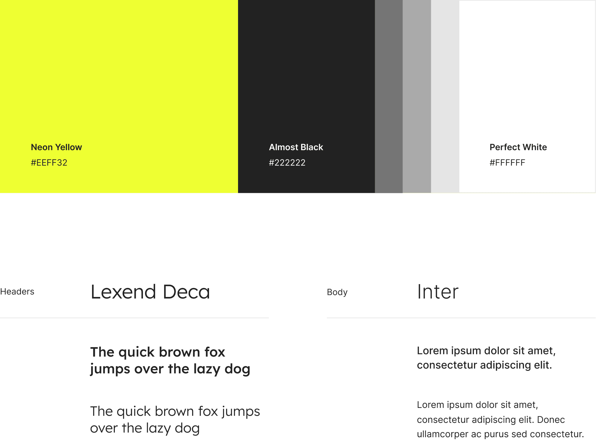
Reblocs desired a branding approach that embodied both cleanliness and modernity. A distinctive flair was added to the logotype to set it apart, while the favicon was designed to be bold, straightforward, and memorable, effectively capturing the essence of the brand in a way that resonates with its audience.
Vibrant contrast
For the color scheme, we chose simple white backgrounds, sharp black contrasts, and a striking, fluorescent yellow-green to add emphasis and a dash of excitement. Subtle grey tones were also incorporated, lending the project a sophisticated, professional vibe. When it comes to typography, we went with two refined sans-serif fonts. The first one is called Lexend Deca, and we think it's perfect for headings. The second one, Inter, was chosen for longer paragraphs.
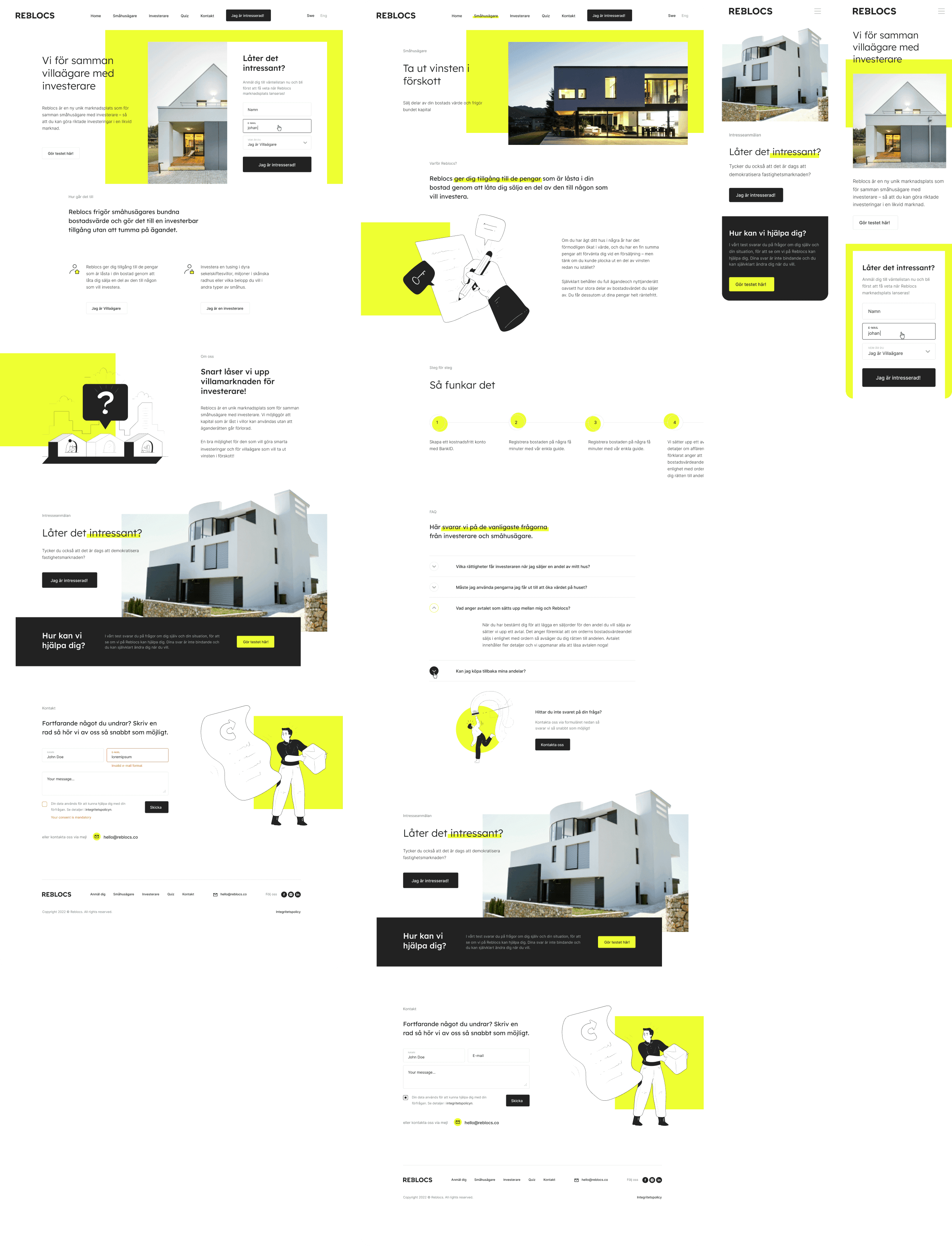
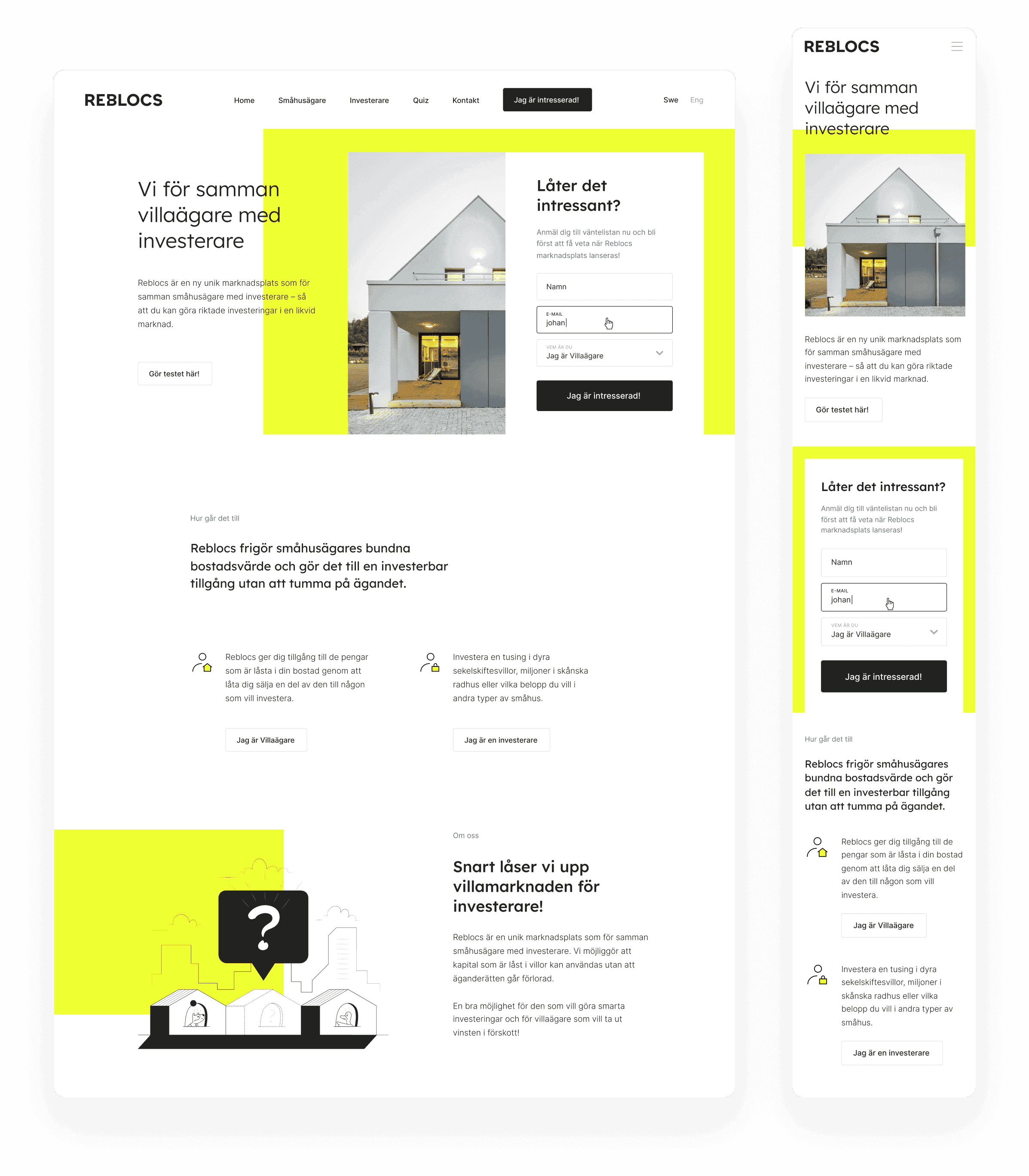
Inviting user interaction
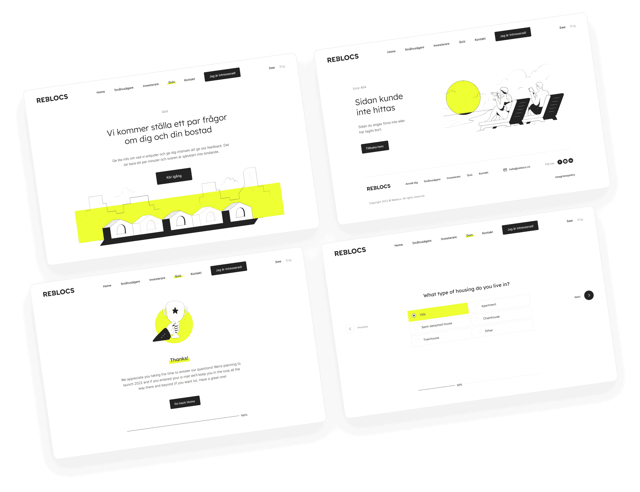
The home page serves as a digital business card, warmly inviting users to delve deeper into understanding Reblocs. Adopting a novel strategy, we equipped it with two different contact forms. The first one allows website visitors to join the waiting list, while the second one is meant for general questions and support requests. It's a design choice that, while unusual, fosters a sense of accessibility and readiness to assist. Additionally, we introduced client-focused quizzes, enabling the company to provide potential clients with personalized offers, further emphasizing their commitment to meeting individual client needs.
Uncluttered elegance
The Reblocs website project stands out for its remarkable cleanliness and uncluttered design. We successfully reduced communication noise by allocating sufficient space to each element, thereby enhancing both accessibility and readability. On top of that, the website features a curated selection of illustrations, each embodying a distinct style with diverse outlines. It's a consistent aesthetic that makes the brand appear more approachable and laid-back, inviting users into a friendly and easy-to-navigate digital environment.
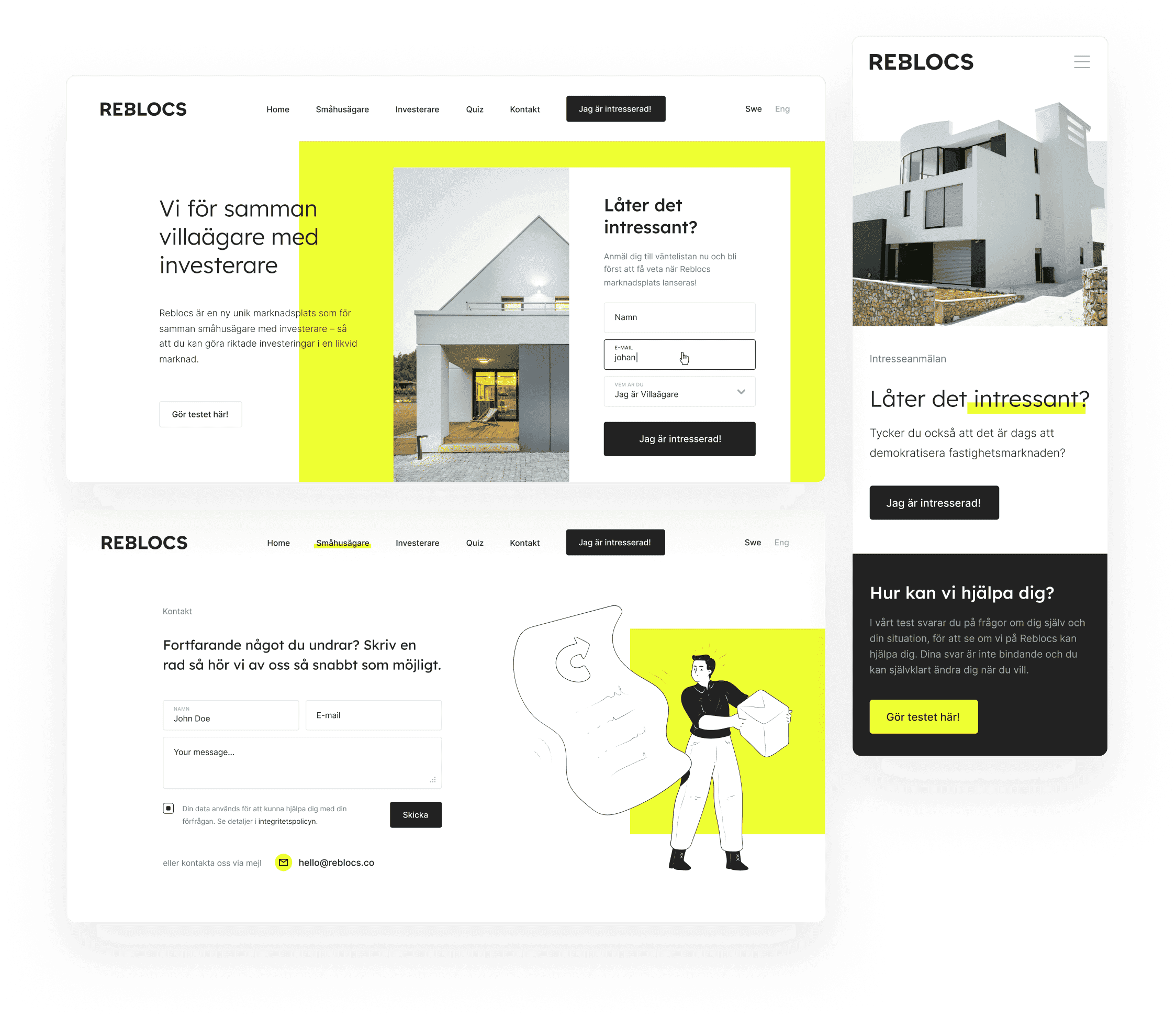
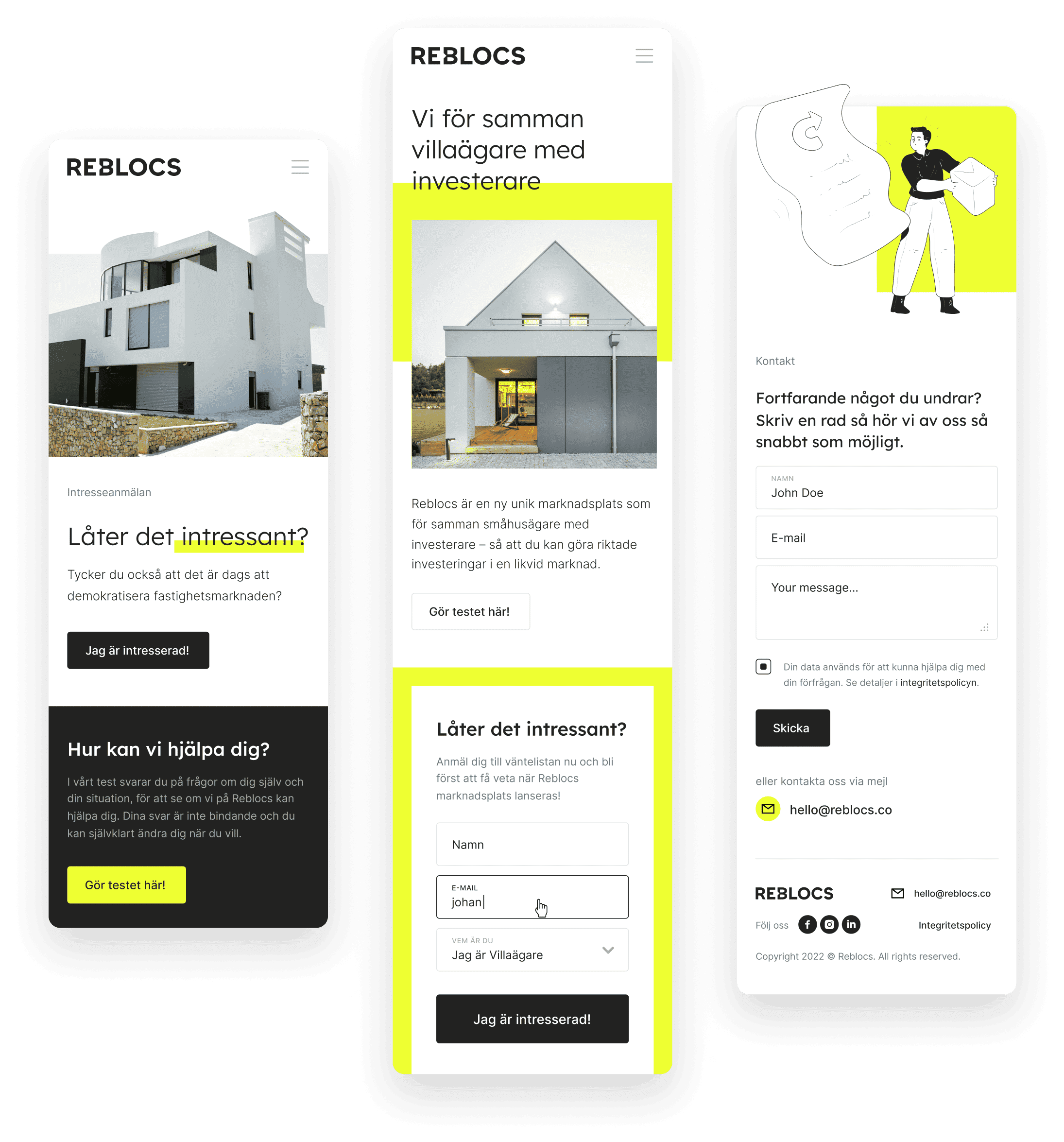
Enhanced mobile viewing
The mobile version of Reblocs' new website boasts quick loading speeds and a streamlined user experience. To accommodate the smaller screen sizes, we've condensed the text blocks and enlarged the buttons and forms for easier interaction. Additionally, we placed a strong emphasis on enhancing the visibility and impact of the architecture-related photos, ensuring they are prominently displayed and effectively capture the user's attention.
Engagement through motion
The website thoughtfully unveils the intricacies of Reblocs' real estate investment opportunity as users scroll through. To counteract the perception of the site being a mere one-pager and to minimize bounce rates, we introduced various unique, scroll-triggered interactive elements. These dynamic features are designed to captivate users, maintaining their engagement and curiosity about the site's offerings.