Starting your first digital project may feel like an adventure to an unknown universe. Suddenly, you are surrounded by the creative team speaking their own language. One of the things that you may hear about in such a situation is wireframing. What do UX designers mean when they speak about wireframes and wireframing? And why is it important not to skip this step?
In the following article, we will go over everything you need to know about wireframes. First, we will explain what wireframes are and what wireframes can be used for, as well as show you a few wireframing examples. Next, we are going to outline how to create wireframes, how to use them, and which wireframing tools are worth checking out.
What Are Wireframes?
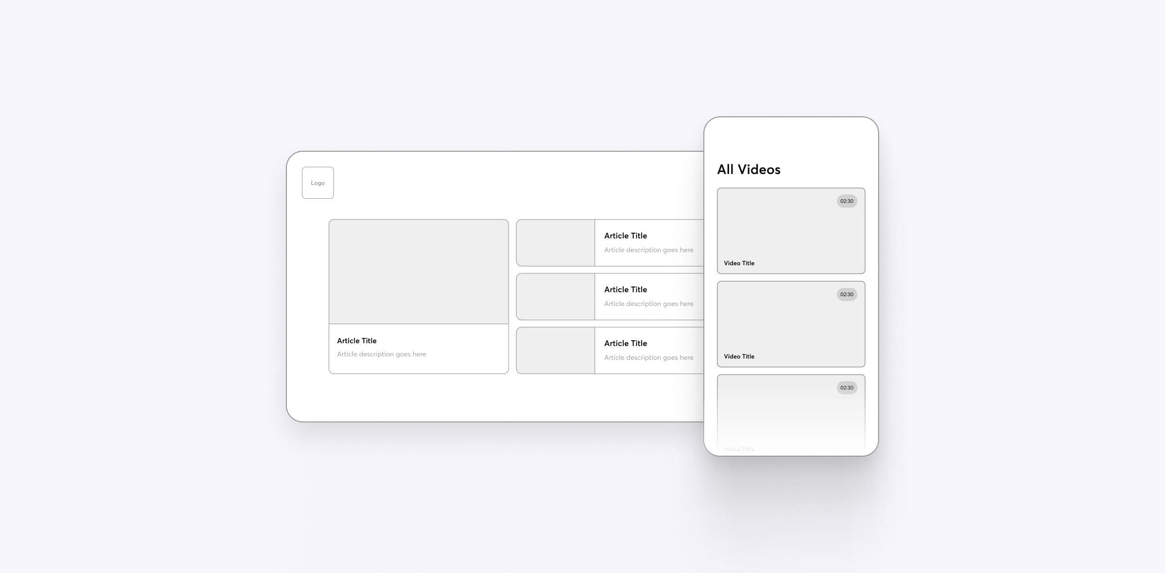
Basically, a wireframe is a two-dimensional skeletal outline of an application or a website. It provides UX design and UI design specialists with a clear overview of the information architecture and the general structure of a given digital product. Its complexity depends on the project, the design phase at which it's used, and the project team, specifically the designers.
In some cases, a UX designer might use wireframes that are very general and cover just the basics, such as general page structure and placement of specific components of its user interface. In others, wireframes can be very complex and cover everything from user flow and interface elements of key pages to vector design shapes. They might also be used to present how certain website elements are going to move around when a user interacts with them.
It's worth noting that a UX designer can draw wireframes on paper or create them using UI and UX tools. Obviously, paper wireframes are not as convenient as digital wireframes. After all, digital wireframing tools have the drag-and-drop feature, as well as built-in UI components. As a result, they allow for the creation of pixel-specific layouts in a matter of minutes.
In case you'd like to learn more about UX and UI tools, read our article about using AI for graphic design.
Keep in mind that different designers have different ideas for what wireframes are and what they should look like. So, if you're about to start working with a new UX design team, it's best to check what its members mean when talking about wireframes and their specific types. Better yet, ask for examples! Many people have various things in mind when using these terms.

Here's an example of what a typical wireframe looks like.
What Is a Website Wireframe For?
Wireframes clarify how page content is going to be positioned correctly based on user needs. It makes the development process much easier to get through, as it shows both UX designers and developers exactly what they want the end result of the entire project to look like. In addition, wireframes make it easier for UX designers to communicate with developers. They give them an opportunity to present their ideas visually and discuss their technical implications in more detail.

Aside from the things listed above, wireframes can be used to gain user and client approval. For instance, you could have users review them as a part of an early feedback mechanism for prototype user testing. You could also bring wireframes to a meeting with a client. Having an early visual on hand could aid you in explaining complex concepts related to UX design and UI design. In addition to that, it's the perfect opportunity to make sure that your ideas align with client expectations and business requirements.
What Are Wireframes in Web Design?
Now, what is a wireframe in web design? Website wireframes are blueprints for what a website is supposed to look like and how it's supposed to function. They are typically used early on in the product life cycle. Their main purpose is to verify whether designers' ideas are realistic and whether they are good enough to be implemented in the upcoming iterations of the website they're working on.
What Are Wireframes for Apps?
Wireframes for applications are just like wireframes in website design. Used early on in the design process, they allow both designers and developers working on an application to illustrate what its final form is supposed to look like. The only difference here tends to be the size. A wireframe created with mobile products in mind is likely to be smaller than a wireframe meant for websites.
Why Are Wireframes Important?
As we have already mentioned, investing time and effort into a wireframe is highly beneficial for designers and developers alike. It prevents them from investing in ideas that are simply not good. As a consequence, it can save them plenty of time and energy. In addition to that, it makes convincing a client that a given design choice makes sense a whole lot easier.

A set of wireframes we prepared for Apollo Scooters.
Types of Wireframes
There are three different types of wireframes, namely low-fidelity, mid-fidelity, and high-fidelity. They serve as the building blocks of the entire wireframing process. Each one builds upon the one that came before it. It's perfectly fine to start with mid-fidelity or high-fidelity wireframes, though. It all depends on the complexity and time constraints of the project you're working on.

Low-Fidelity Wireframes
Low-fidelity wireframes are the simplest type of wireframes. The main idea here is to be as minimal as possible. For that reason, you should only be using greyscale and a generic font, as well as refrain from using images or design effects.
Mid-Fidelity Wireframes
Mid-fidelity wireframes are more elaborate in comparison to low-fidelity wireframes. They might contain images and precise visualizations of what the final product is supposed to be like. The interactions between different pages might also be clearer than in a low-fidelity wireframe.
High-Fidelity wireframes
High-fidelity wireframes, also known as hi-fi wireframes, are the closest to how the finished product is going to look like. For that reason, a high-fidelity wireframe is best used for designs that have already been tested for usability and iterated upon.
How Do Wireframes Fit Into the Visual Design Process?
The design process is about quickly creating multiple iterations of the same application or website structure and quickly verifying its feasibility and attractiveness. Whether it be a user interface for mobile devices, a navigation layout for a website, or a menu system for a government application, a wireframe is going to help you visualize it.
Then, you can discuss it with your clients or potential users and implement their feedback immediately. This way, you save considerable time and increase the quality of the final design in an easy and organized way. You no longer have to waste hours on implementing and polishing up bad ideas. Instead, you can easily create wireframes based on these ideas and reject them during the design phase.
Is Wireframing Part of UX or UI?
Wireframing has been around for a very long time. Since the early days of computer design, it has been used by tens of thousands of developers. It gave them an opportunity to understand what user interfaces should look like and how they are meant to work before they were made available to real users. Right now, wireframing tools are used by UX designers and UI designers alike.
If you'd like to learn more about user experience, check out our article about user experience research in product development.
What Can You Achieve if You Use Wireframes?
Most importantly, working with a wireframe allows you to save a significant amount of time. It gives you the time and space you need to verify design concepts at the very early stage of the entire project. After all, creating a wireframe can take as little as just a few minutes with proper UI kits, team libraries, and a high-quality wireframing tool.
Now, it's important to note that you shouldn't stick to rough wireframes at all times. Sure, it's useful at the very beginning of the user experience and interaction design process, but it won't be enough in the long run. While creating a complex wireframe might take some time, it's definitely worth it. With it, you can get the client to review and accept key mechanics and elements of website structure. Once that's signed off on, you can focus on polishing up the aesthetic side of the project.
Why Are Some Wireframes Sketches When Others Are Complicated Prototypes?
It's because a wireframe can be used for various reasons and at different stages of the development process. Rough paper wireframes are great when you are about to begin laying the foundation for a specific design. They're also good for trying to find a UX design idea to lean on or verifying what needs to be placed on the screen. Of course, they will eventually get thrown away. You could keep them useful for longer by converting them into paper prototypes and making use of them while gathering user feedback.
Later, mid-fidelity and high-fidelity wireframes appear on stage. They are meant to help designers explain their ideas, verify whether they're logically sound, and check what text will be needed to bring the project to life. However, no photos are used and the wireframe isn't colorful. Instead, it's monochromatic.
Static wireframes might then be used to create a working prototype of the product. In other words, they will be made to show how the elements of a given website or product are going to behave when users interact with them. This way, developers can join the discussion and, with their practical perspective and insights, verify whether designers' ideas are feasible.
How to Create Wireframes
Creating wireframes is an essential step in the design process, allowing you to visually outline the structure and functionality of a digital product. Follow the steps listed below to create effective wireframes that communicate design ideas clearly and efficiently.
-
1. Start with a clear objective. Understand the purpose of your wireframe and what you want to achieve with it. Define the key elements and features you want to include.
-
2. Identify the target audience. Determine who will be using the product or interface you're wireframing. Think about their needs, preferences, and expectations to create a user-centered design.
-
3. Gather requirements and content. Collect all the necessary information, such as project requirements, user stories, and available content. This will help you structure your wireframe effectively.
-
4. Sketch rough layouts. Begin by sketching low-fidelity layouts on paper or using a digital tool. Focus on basic shapes and key components like headers, navigation menus, and content sections.
-
5. Define the page structure. Map out the hierarchy of information and determine how different elements will be organized on the page. Consider visual hierarchy, logical flow, and user interactions.
-
6. Add placeholders for content. Use simple placeholders like boxes, dummy text, or icons to represent various content elements such as images, text blocks, and buttons. Doing so helps visualize the overall structure and layout.
-
7. Design navigation and interactions. Figure out how users will navigate through the wireframe and interact with different elements. Include buttons, links, menus, and interactive components to showcase functionality.
-
8. Keep it simple and minimalistic. Focus on the core elements and avoid adding unnecessary details or visual distractions. Wireframes should be easy to understand and iterate upon.
-
9. Seek feedback and iterate. Share your wireframe with stakeholders, clients, or team members to gather feedback. Use their input to refine and improve the design iteratively.
-
10. Consider usability and accessibility. Ensure your wireframe is user-friendly and accessible. Pay attention to readability, contrast, and intuitive interactions to create a positive user experience.
-
11. Document annotations and notes. Add explanatory notes and annotations to clarify specific functionalities, user interactions, or design decisions. This helps others understand your wireframe better.
-
12. Test and validate. Conduct usability tests or user interviews to validate the effectiveness of your wireframe. Identify areas of improvement and refine the design based on user feedback.
Remember, wireframes are meant to be a visual representation of the structure and functionality of a product or interface. Focus on clarity, simplicity, and user-centered design to create effective wireframes that serve as a solid foundation for the rest of the product life cycle.

While a wireframe can be drawn by hand, it would be best to create one using actual wireframing tools. Doing so makes it possible for you to make interactive wireframes, which streamline the process of showcasing how a product is going to work, evaluating its functionality, and performing quick usability testing.
In case you're looking for a good wireframing tool, here is a short list of recommendations. Of course, feel free to give other tools a try if you feel like it. For instance, if you are building a big UX team, you might want to go for something with unlimited user seats. On the other hand, if you're just starting out when it comes to UX design, you might want to look for beginner-friendly options. It all depends on what your needs and expectations are!
Figma
Figma is a popular web-based design and prototyping tool that offers powerful capabilities when it comes to wireframe creation. It allows multiple team members to collaborate in real-time, making it ideal for remote teams and distributed design workflows. It also provides a wide range of pre-built UI components and an intuitive interface. As a result, any Figma user should find it fairly easy to learn how to create quick wireframes in Figma with pixel accuracy.
Sketch
Sketch is a widely used design tool that has gained a reputation for its focus on simplicity and user interface design. While primarily known for its UI design features, Sketch also offers robust wireframing capabilities. With its extensive library of plugins and templates, it provides designers with a flexible environment to create interactive wireframes. What's more, it allows for easy sharing and collaboration, making it a preferred choice for many designers and teams.
Balsamiq Wireframes
Balsamiq Wireframes is a dedicated wireframing tool that aims to simulate the experience of sketching on a whiteboard. Its intentionally rough and low-fidelity wireframes encourage quick and iterative ideation, allowing you to focus on the core structure and functionality of a design. It's an excellent choice for rapid prototyping and early-stage wireframing.
Will You See Digital Wireframes When Working With Adchitects?
When working on a project with our team, you will probably receive wireframes from us at some point. We will also want to discuss them with you. This is because we want to agree on the core idea for your product first. Wireframes also allow us to decide what kind of written content we will need from you. Usually, we suggest what kind of text needs to go where and then ask you to give us the final version.
When working on complex projects, such as mobile apps, wireframes ensure that you understand how specific features work. This way, we can walk you through the process of how the applications is going to work and provide you with a final product that you will be satisfied with.
Address User and Business Needs With Wireframes!
So, what are wireframes? In our opinion, they are key to addressing your users' needs and fulfilling your business needs. While the wireframing process might be time-consuming at times, it's necessary for visualizing initial concepts, rapid prototyping, and ensuring that the final prototype is just what you need it to be.
If you would like to use wireframes to unlock the full potential of your digital product, our design team is here to help. No matter whether you want to improve an existing product or build one from scratch, we have all the tools and expertise needed to bring your ideas to life!


