An Immersive Website Designed With Webflow For Educational Purposes
PROBLEM
AI solutions have become incredibly popular in recent months. Unfortunately, in spite of their many benefits, millions of internet users associate AI with fear and uncertainty. We decided to do something about it and, at the same time, showcase our web design prowess.
SOLUTION
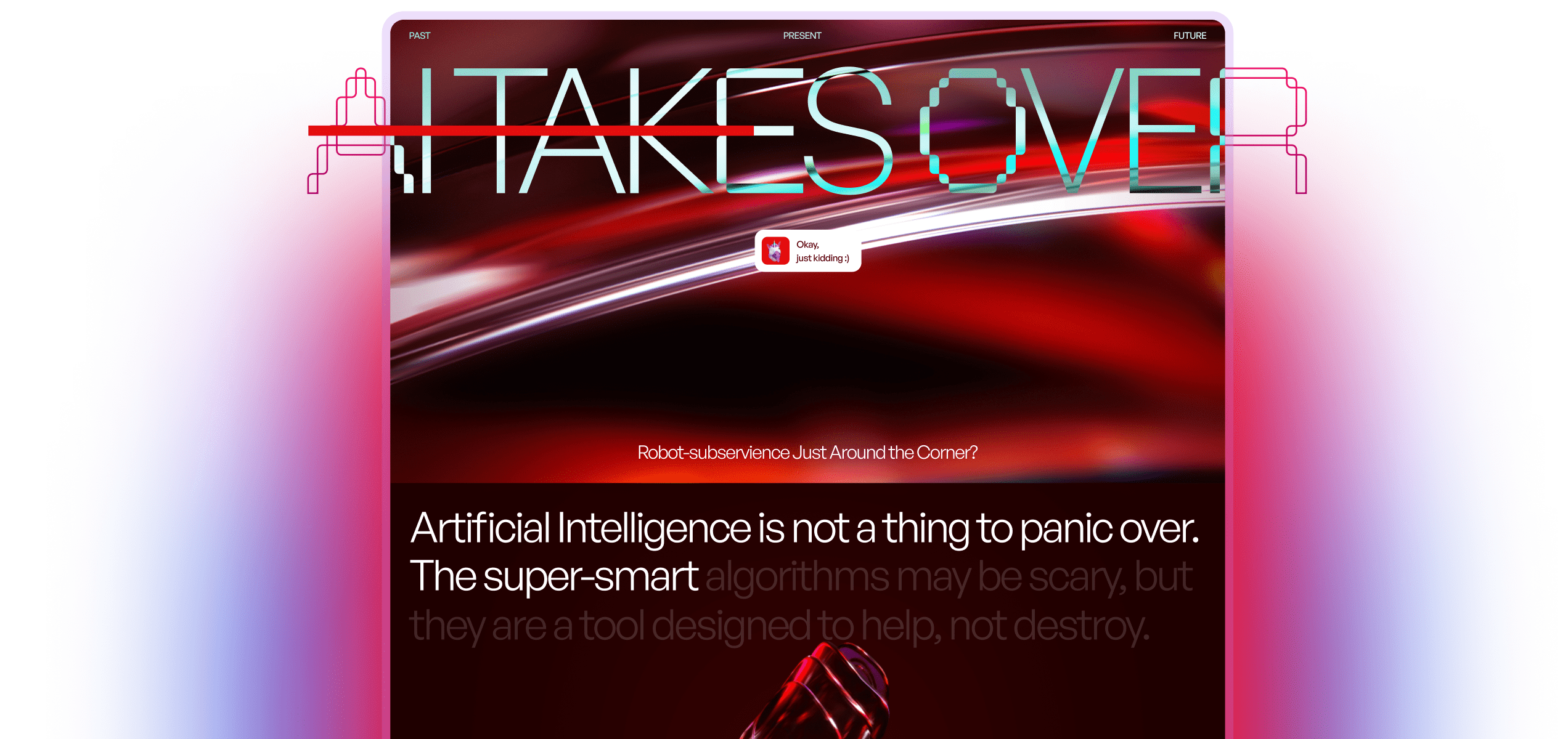
We told the story of AI and explained why it's not something worth stressing over. What's more, we did so through the medium of an innovative no-code solution in the form of a Webflow-powered website. With fluild animations and eye-catching visuals, as well as absorbing storytelling, the AI Takes Over website offers an educational and engaging take on what AI really is.
VALUE DELIVERED
Our team created an educational website that quells people's fears of AI in an interactive and visually stimulating way. We’ve also proven that we're more than capable of getting the most out of Webflow in our day-to-day processes.
Artificial fear?
Artificial intelligence has been talked about and studied for many years now. However, the recent emergence of user-friendly and accessible large language models and image-generating tools thrust it into the limelight. With the public expressing a wide range of emotions, from fear and doubt to hope and optimism, little was said about where artificial intelligence came from. That's when we came up with the idea for the entire project.
Test of skill
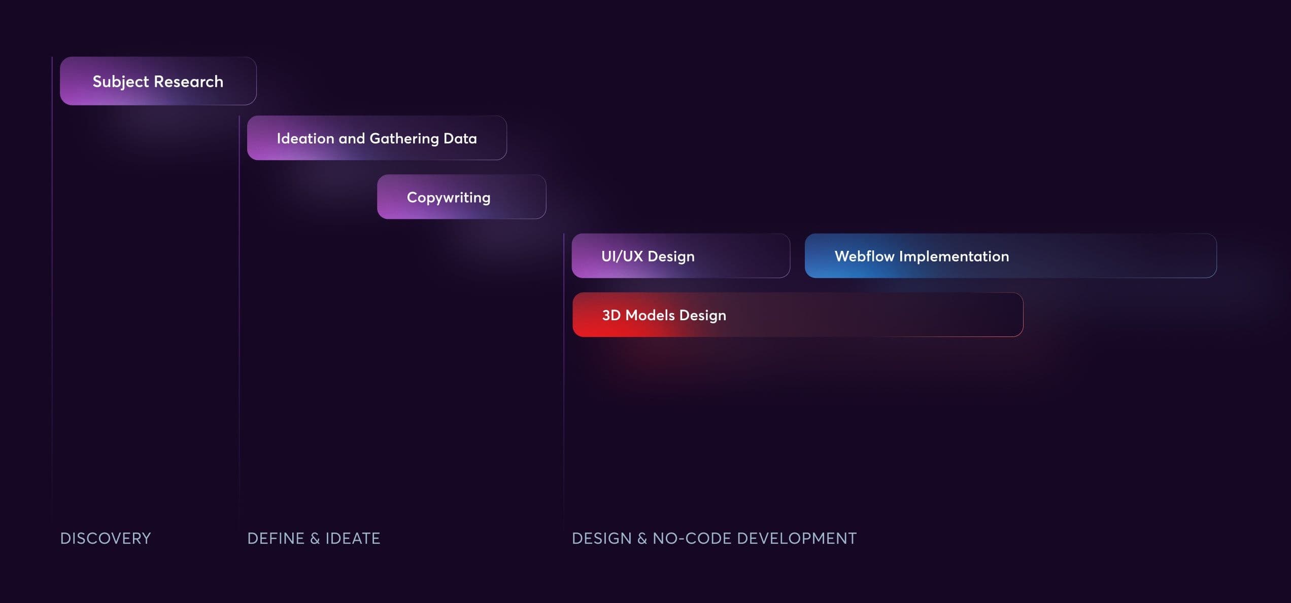
Our projects often force us to do things for the very first time. The AI Takes Over project was no exception. After brainstorming ideas and researching the topic, we had to craft some unique copy. At the same time, the designers crafted user experience and user interface designs in Figma. Additionally, they sculpted several visually appealing 3D models with Blender. Finally, the developers put everything together using Webflow.
No code, no problem
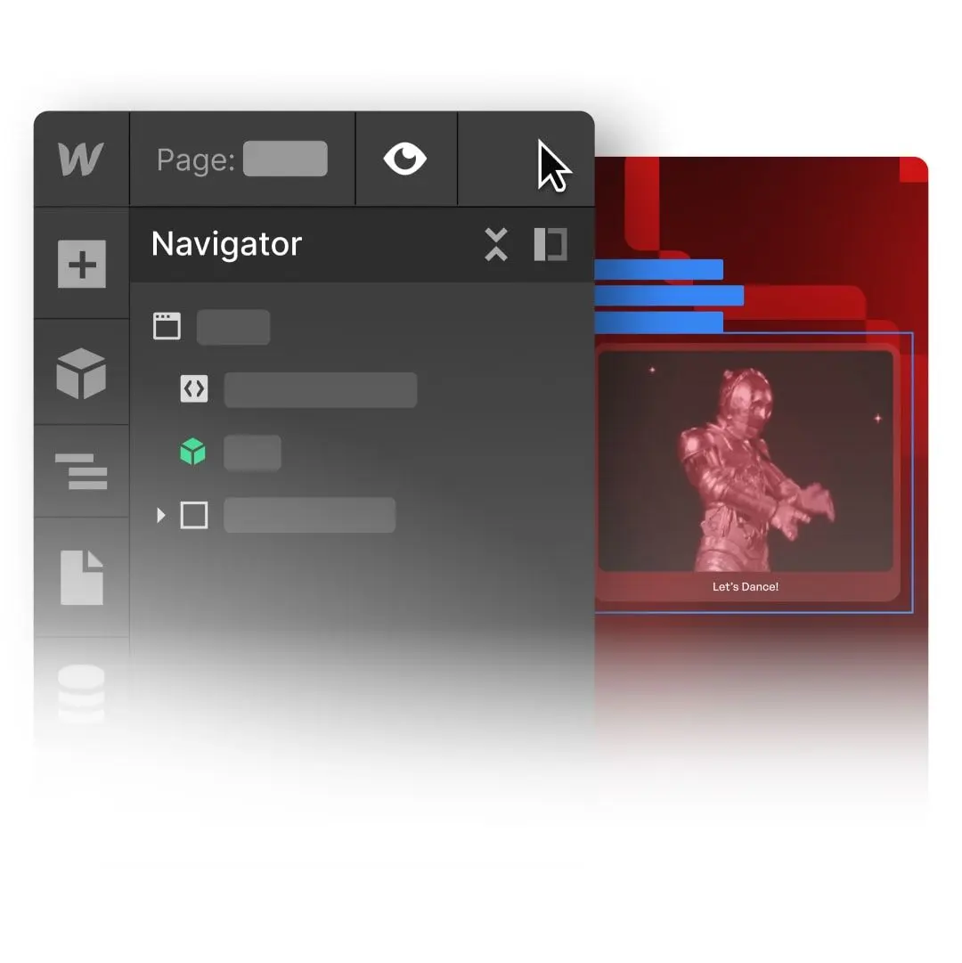
One of our goals was to showcase our proficiency in using Webflow. In short, it's a no-code web design platform that's great when it comes to ensuring design cohesiveness and crafting low-budget solutions.
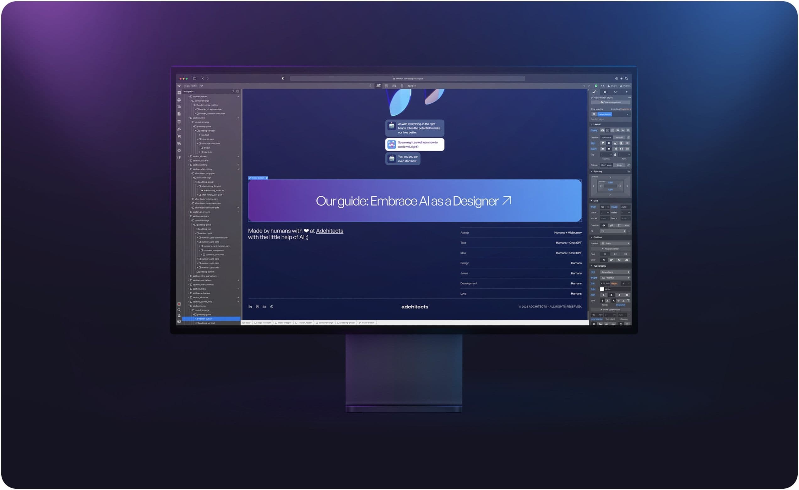
Meet our host, the Rainbow Unicorn!
We decided to make the unicorn emoji the main protagonist of the project. Combining curiosity, adorableness, and quirkiness, it helped make some of the more serious parts of the AI Takes Over website more engaging and easier to digest.
Human-machine interaction
The unicorn’s conversation with the robot that goes on as the user scrolls down the page is meant to symbolize the messages we use to communicate with language models like GPT-3. The idea here was to present human-machine interaction engagingly and positively. Because of that, the entire conversation resembles regular conversations we all have in messaging applications every day.
Eye-catching, unique
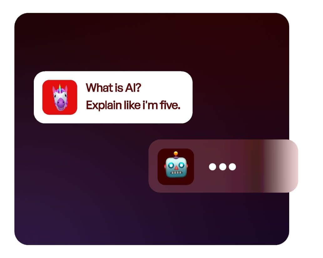
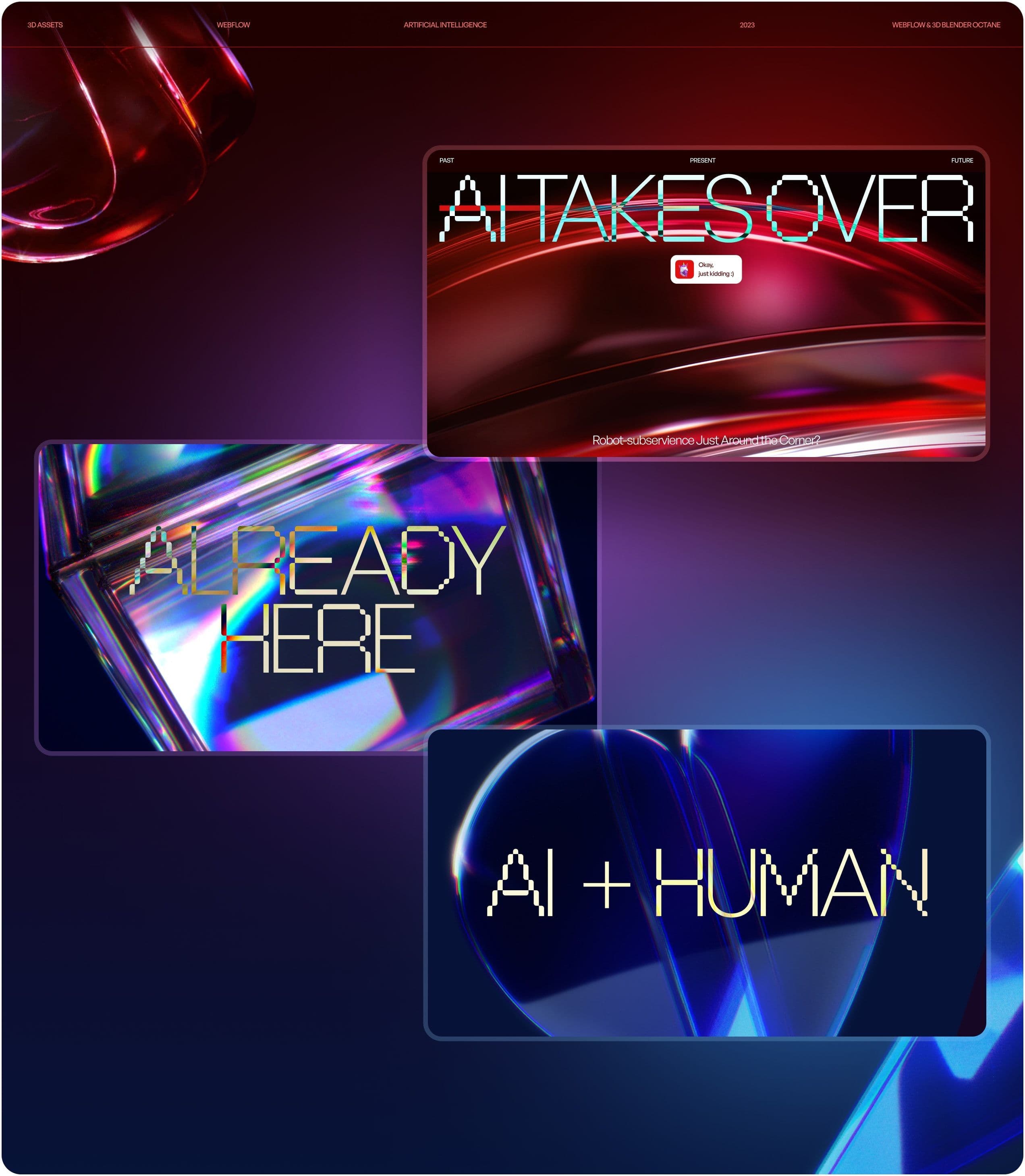
Our visual direction for the website was to make the project appear innovative both when it comes to the technology that powers it and its visual side. For the first time ever, we used our in-house resources to create 3D visual assets. We also took advantage of Blender's model-building features. The Octane Renderer helped us improve the shading and get the final look of our assets just right.

Going back
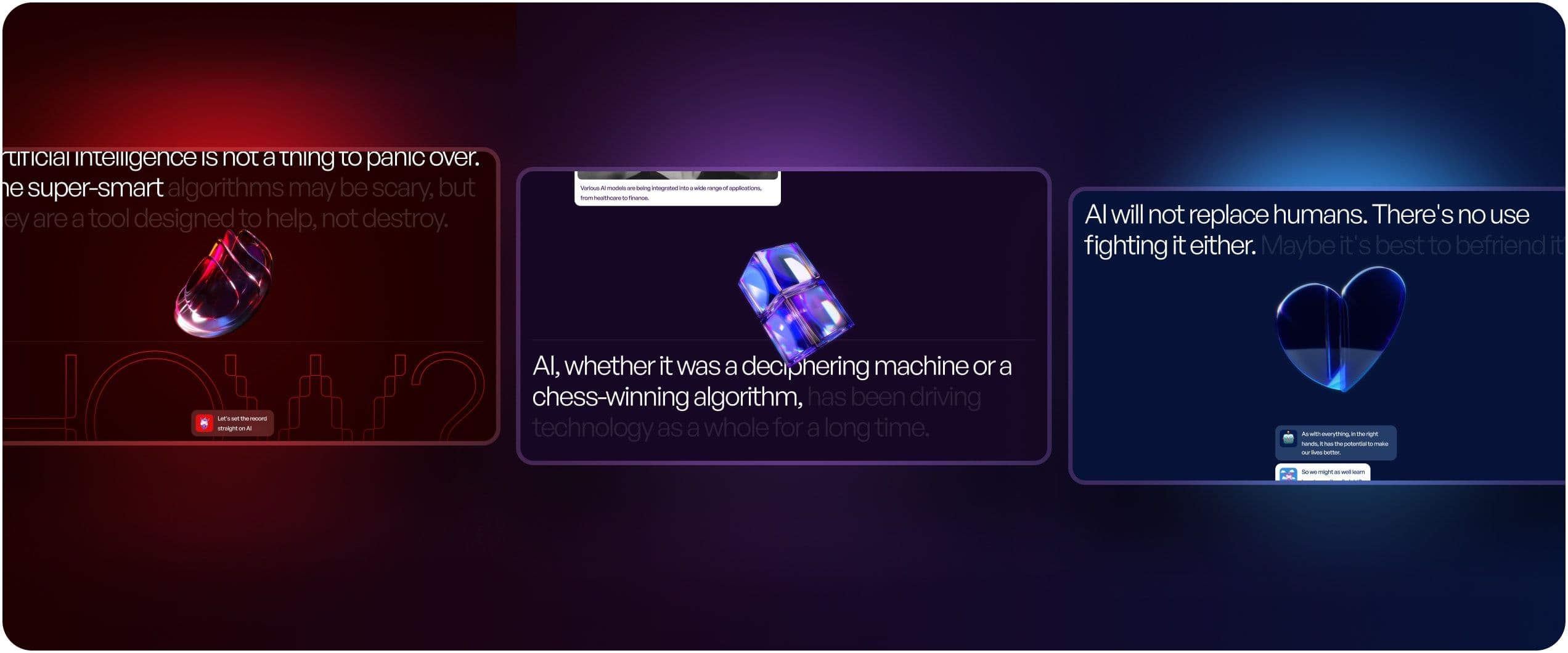
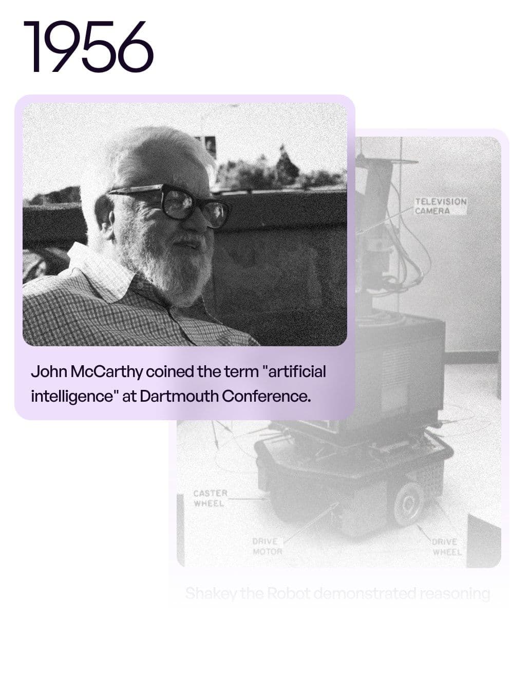
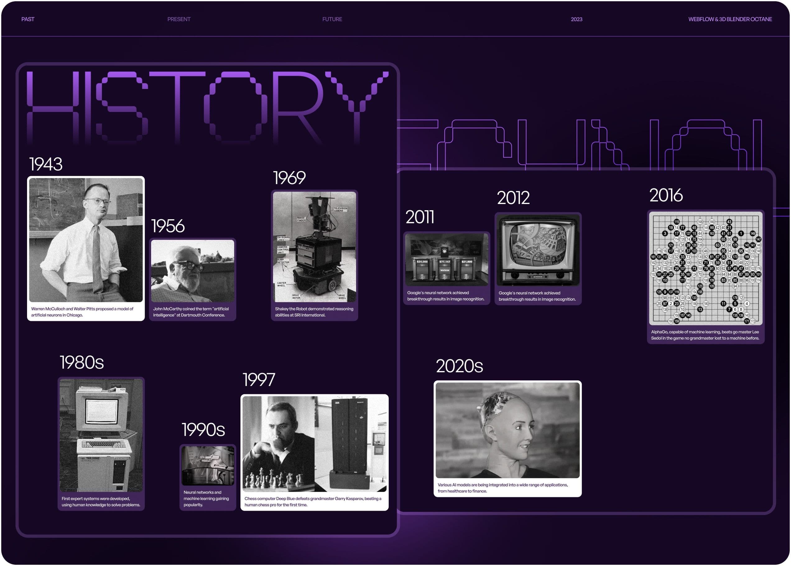
We start by outlining the history of artificial intelligence and how it has evolved over the years. We touch upon how it was perceived by the public, as well as what scientists had to say about it. GPT-3 helped us make the entire section more engaging and to the point.
It's already here!
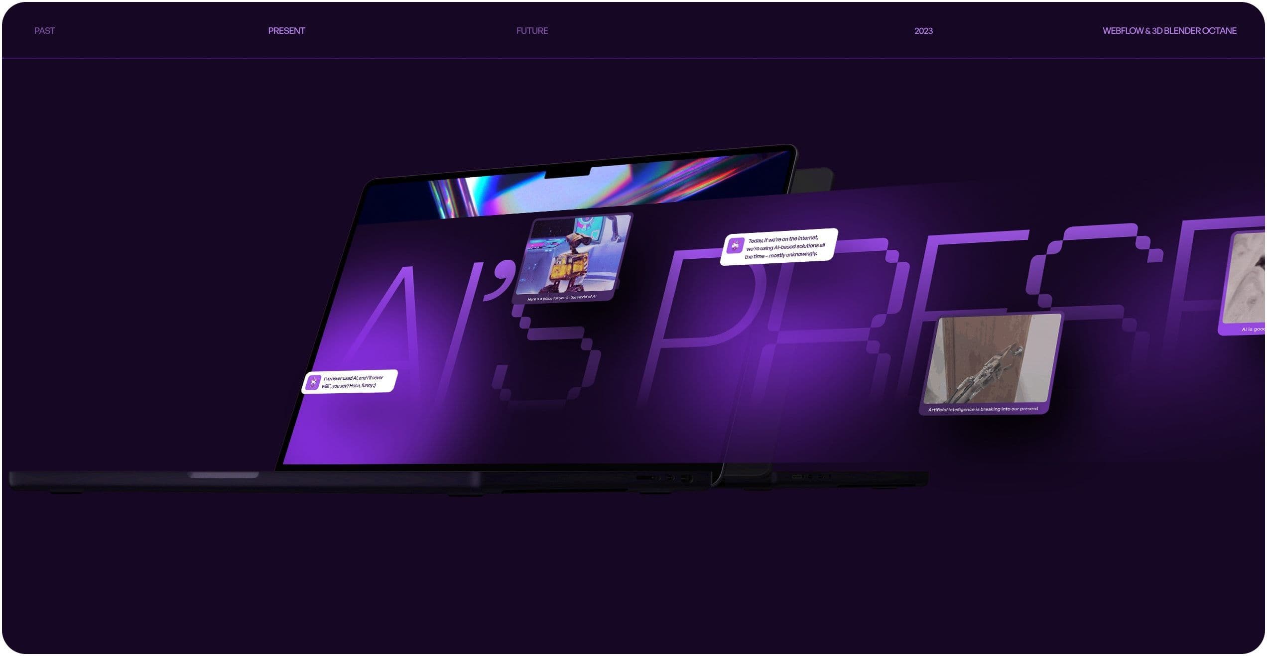
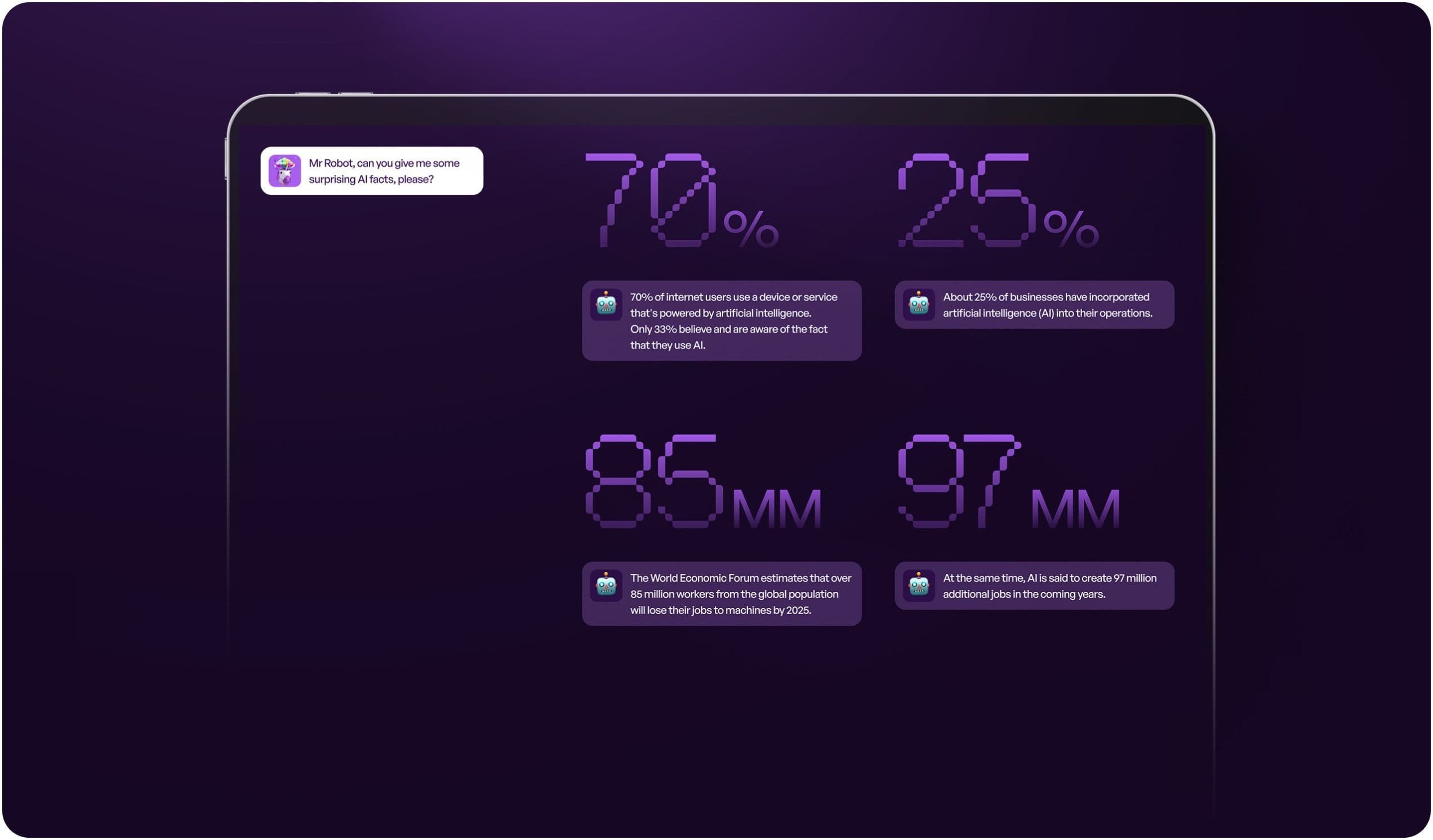
The next section is about the current state of artificial intelligence. It's supposed to make the website visitor reflect on how it's developing and how it can be used in a variety of different industries. It's also a response to popular misconceptions related to artificial intelligence that can be found throughout the internet.

A force for good
With the past and present already explained, there had to be a chapter with predictions regarding what’s in store for artificial intelligence. We’ve gone with an encouraging, positive message of embracing the changes it brings. Instead of being a threat, it can be viewed as a tool that could make our lives better.
Color coding in action
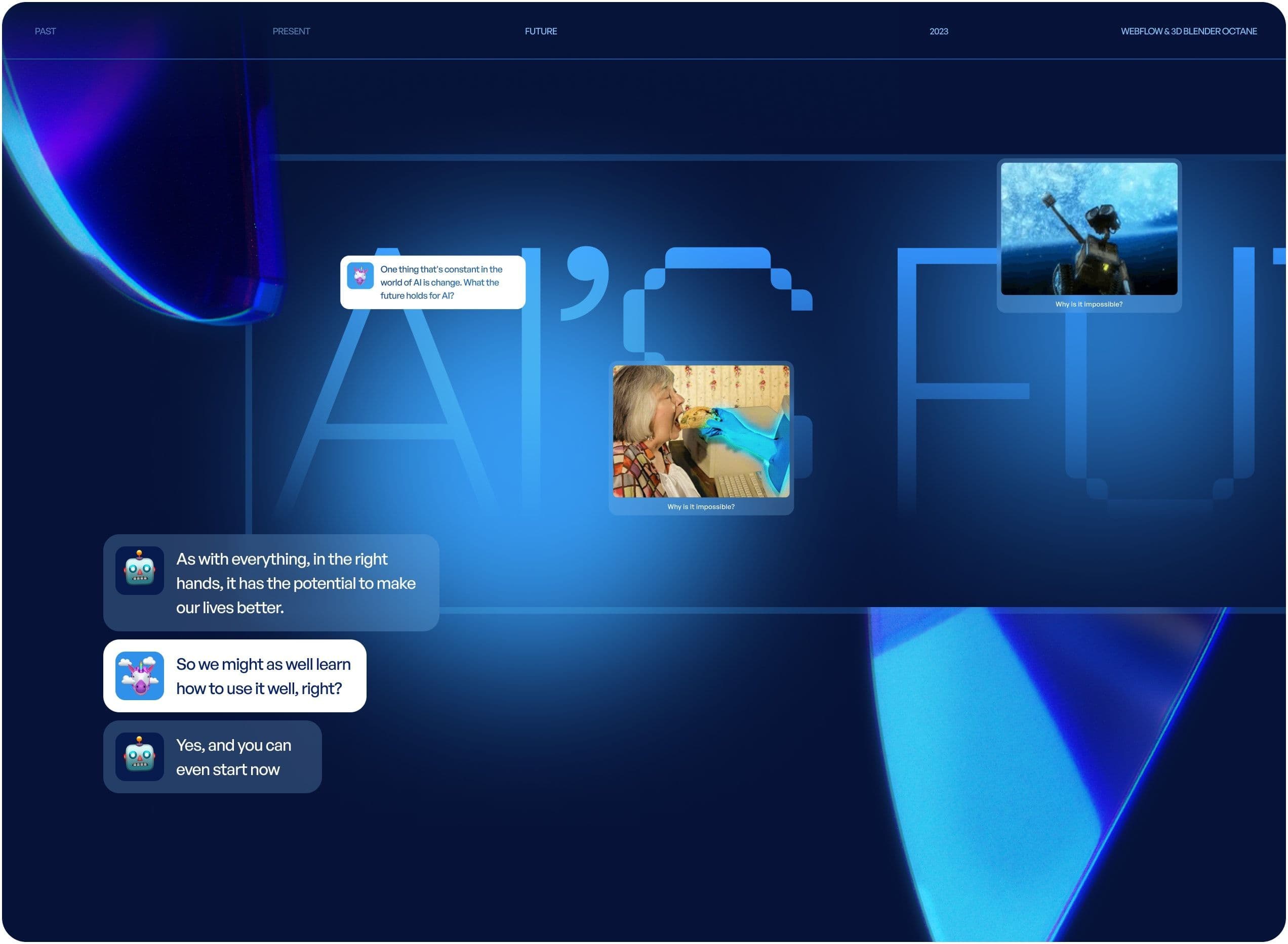
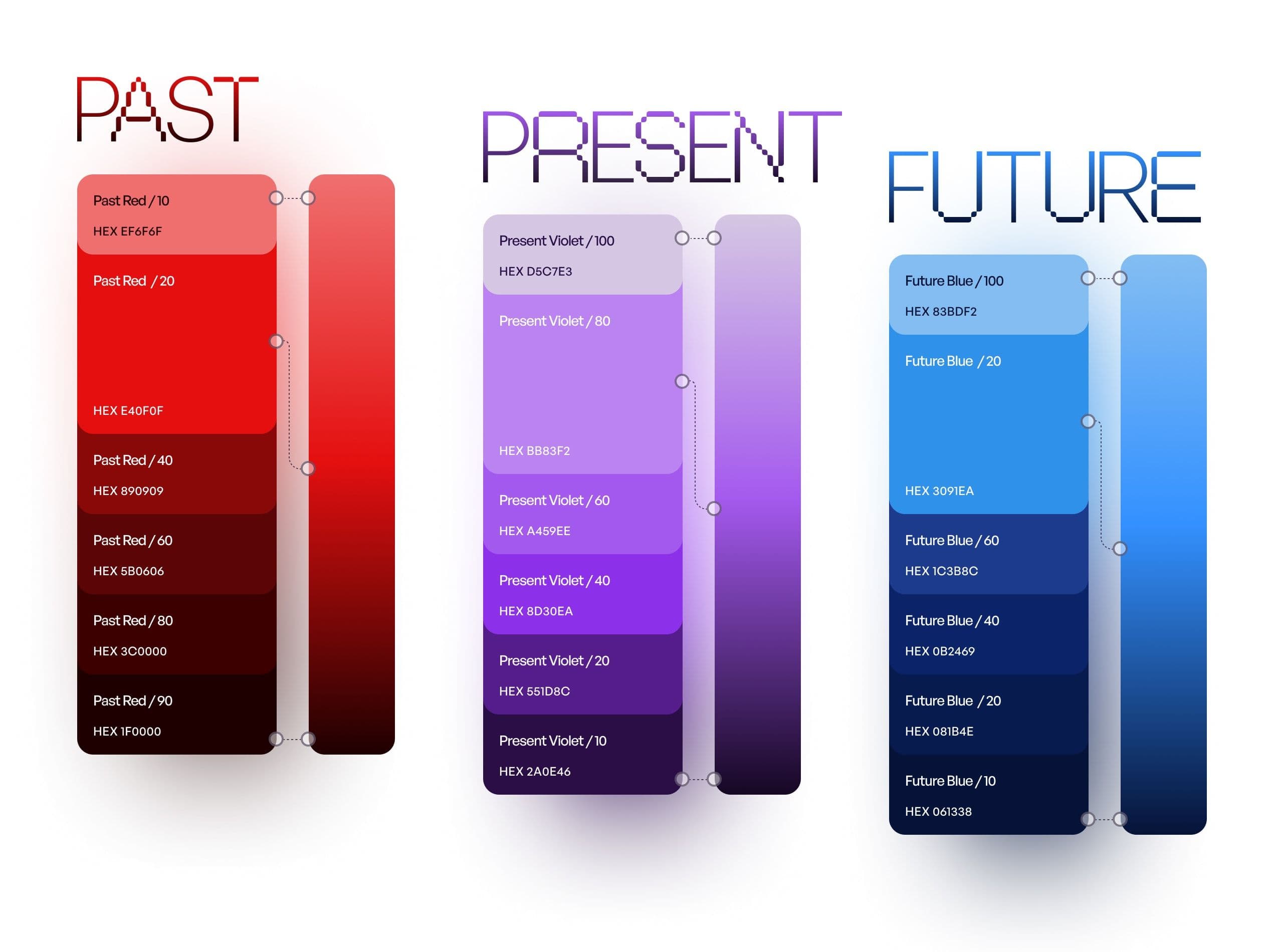
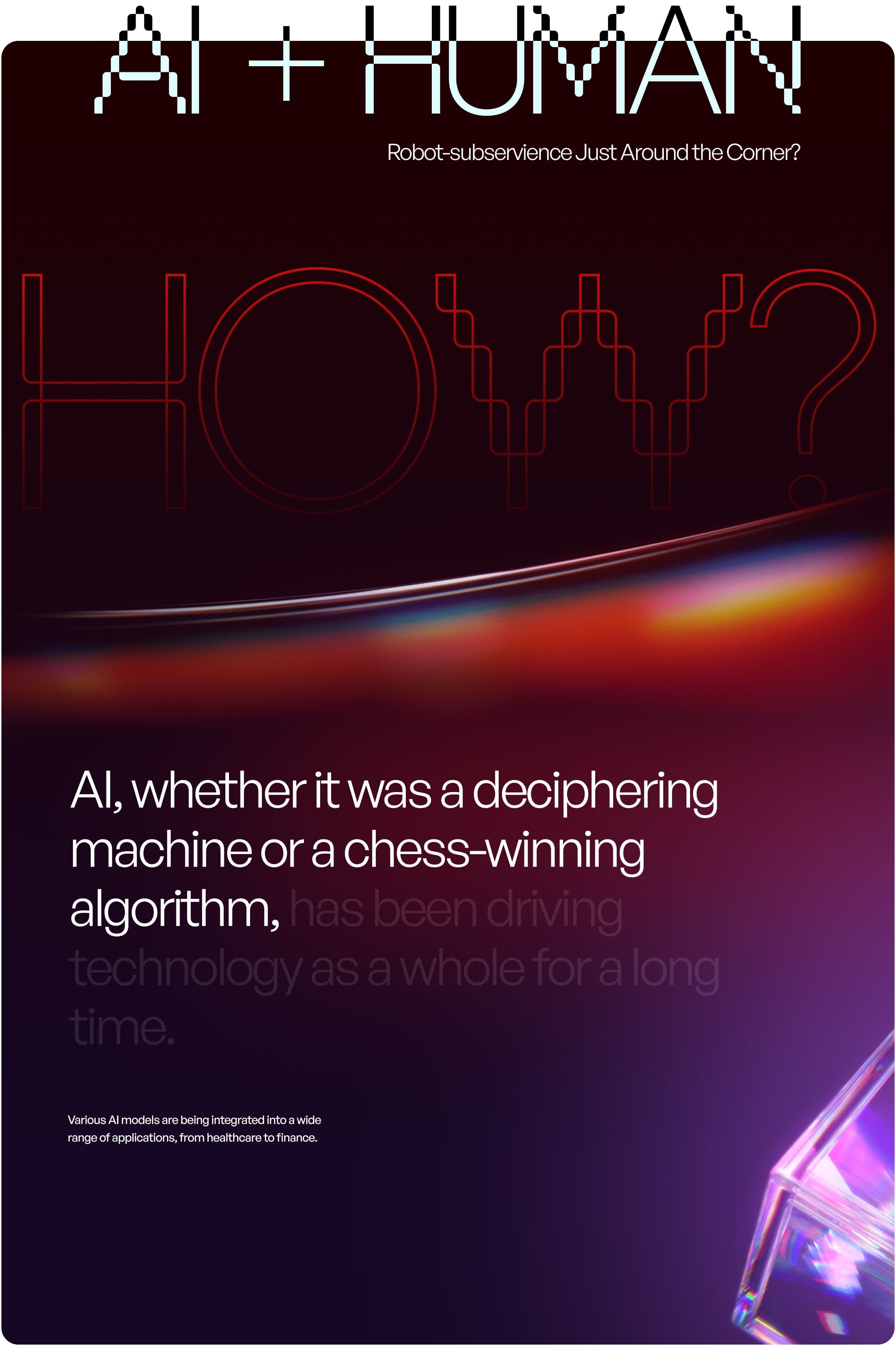
The visual side of the project is centered around how the entire website changes colors depending on which chapter we're currently viewing. The color change helps signal a change in tone and the overall vibe of the section we're reading.
Reds symbolize fear of the unknown. Next, there are violets, which represent the present. They are at the intersection of the past and the future. Last but not least, blues illustrate progress and change. Each of these colors stands in contrast with the dark background colors, making the entire website even more visually striking.
Futuristic and legible
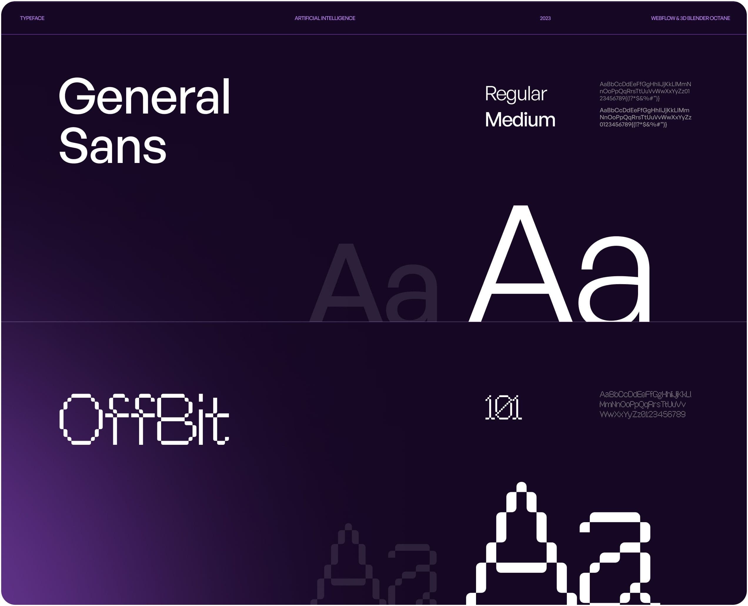
The bitmap typeface Offbit 101 does a great job of setting the tone for the whole project. Visibly associated with programming and computers, it helps establish a connection with the digital world. To balance it out, we used the General Sans typeface for sections in which the font size is smaller. Consequently, the website text looks great and is fairly easy to read.
Own the product like never before
For all things technical, we utilized Client-First by Finsweet, a user-friendly and highly-accessible add-on for managing website content. What convinced us to use it is its ability to support real-time website changes. With additional features like user roles and permissions, it allows website managers to control their site’s contents with ease and confidence.
