Exquisite web design for a high-end furniture brand
Brand
Location
Client
Budget
Industry
- Retail
- Interior Design
Environment
- WooCommerce (WordPress)
Release
Live
Check livePROBLEM
SOLUTION
VALUE DELIVERED
First steps
Discovery phase
Our process began with a series of discovery workshops, which were instrumental in gaining a deep understanding of the client's mission. Through collaborative efforts in these workshops, we developed an effective and engaging customer journey tailored to their new website. This emphasis on user experience led us to identify key tools and frameworks, which were crucial in creating an intuitive and engaging online environment for potential customers.
Design heritage
Chierowski's legacy
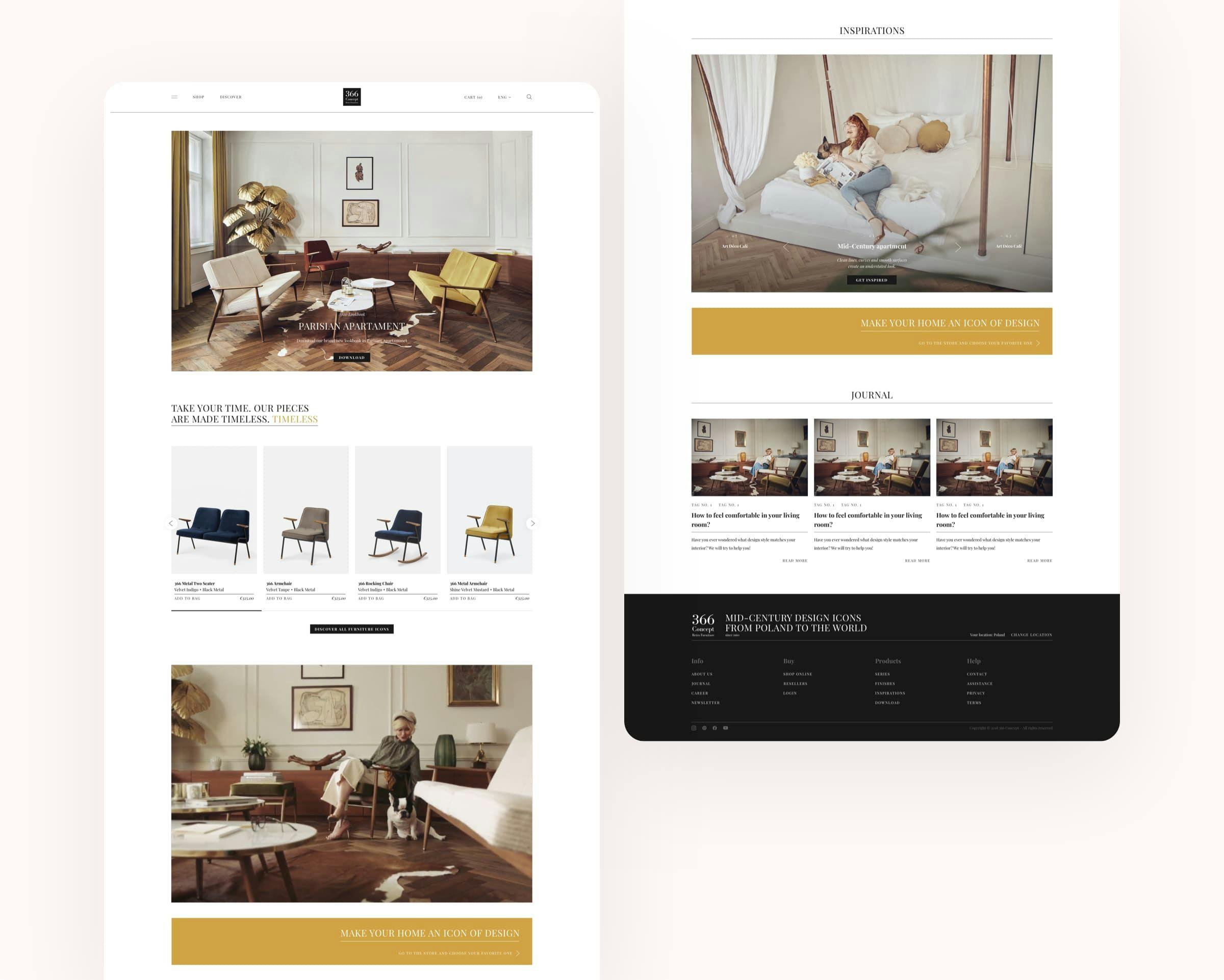
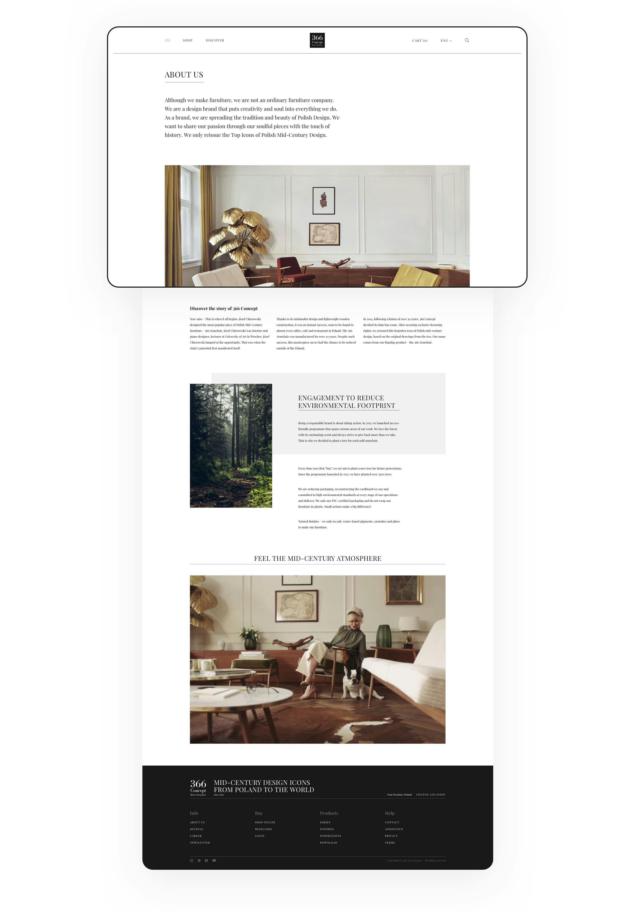
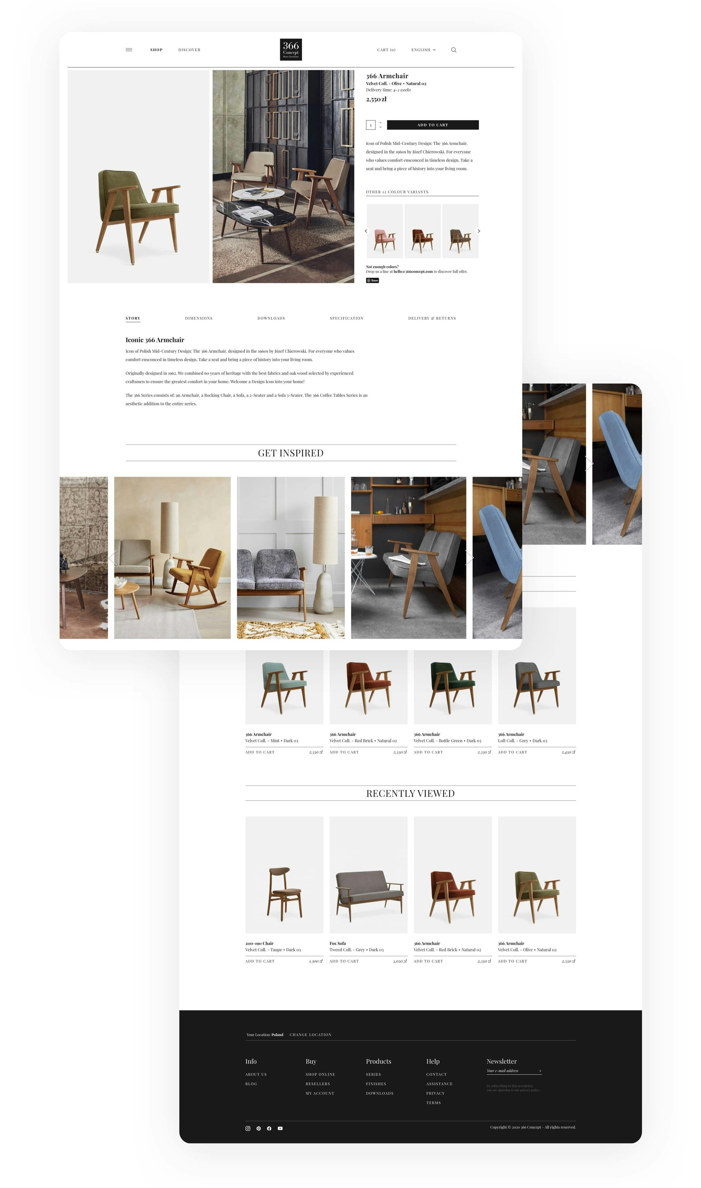
We highlighted the legacy of Józef Chierowski, an esteemed Polish designer renowned for his timeless furniture designs, particularly the 366 Armchair. Emulating the elegance and sophistication of interior design magazines, the layout introduces clients to Chierowski’s signature pieces, symbolizing style, luxury, and good taste.
We also delved into the rich history behind the furniture. The narrative journey begins over 50 years ago, marking the creation of the iconic 366 Armchair. This historical context was strategically used to cultivate a sense of authenticity and trust in the brand.
Furniture series
Endless variety
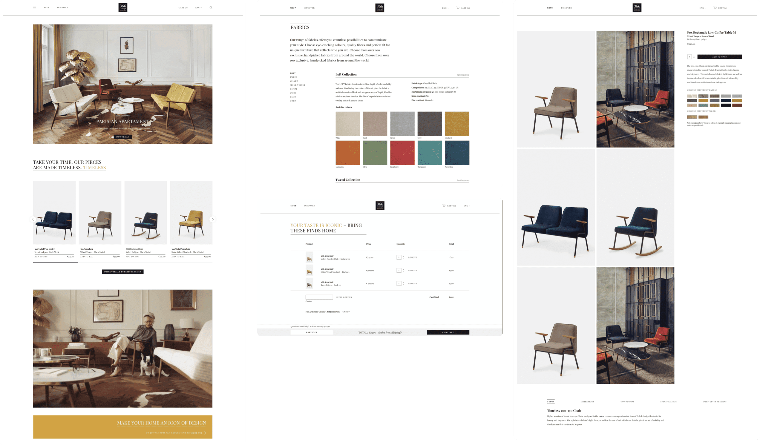
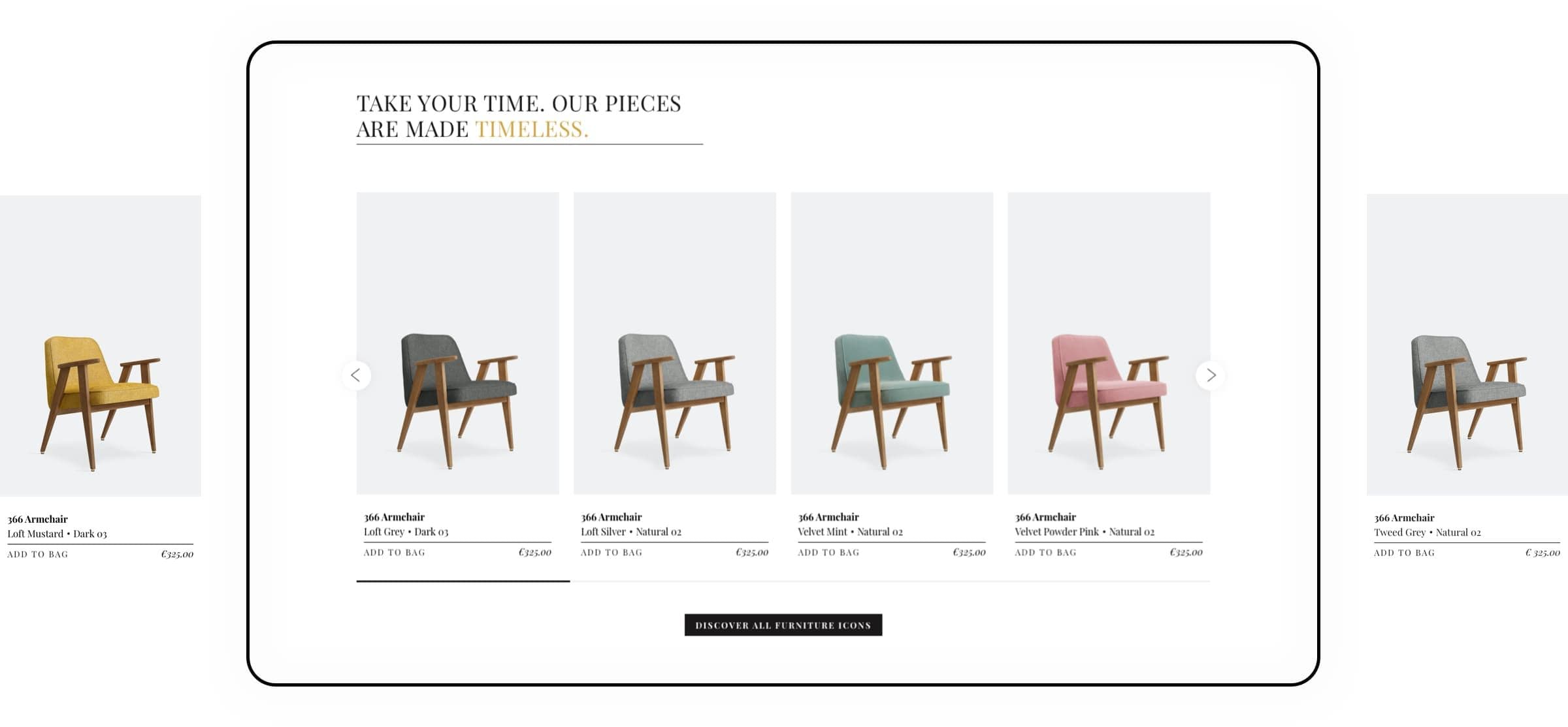
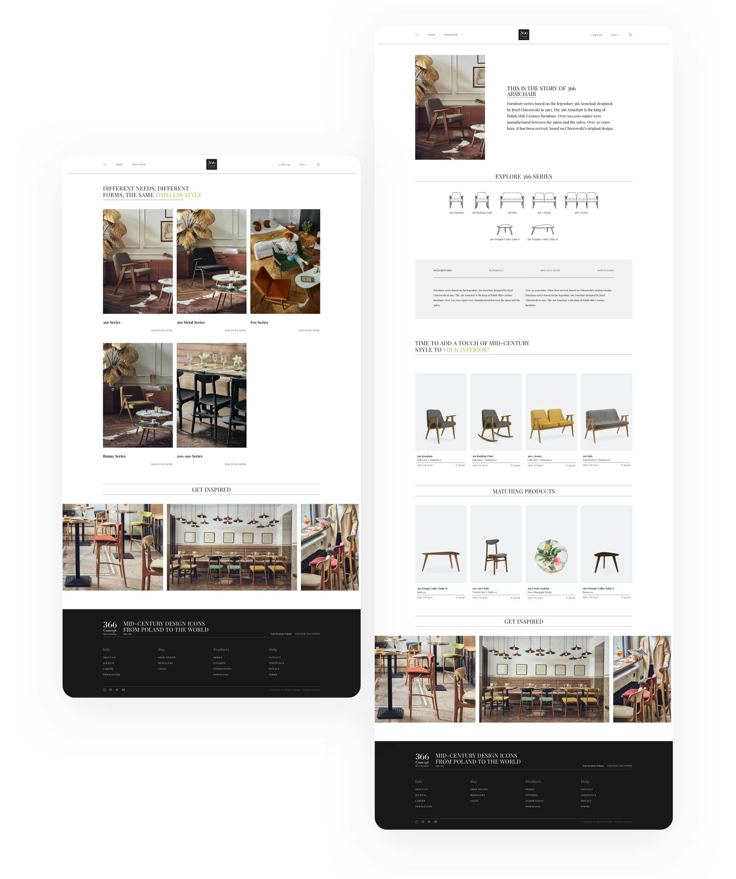
Though the 366 Armchair is the centerpiece, 366 Concept's collection spans a variety of products. On the dedicated furniture series page, users can explore the entire range, offering them the opportunity to mix and match different pieces. This feature enables customers to create their own unique set, tailored to their preferences and style.
Mix and match
Infinite choices
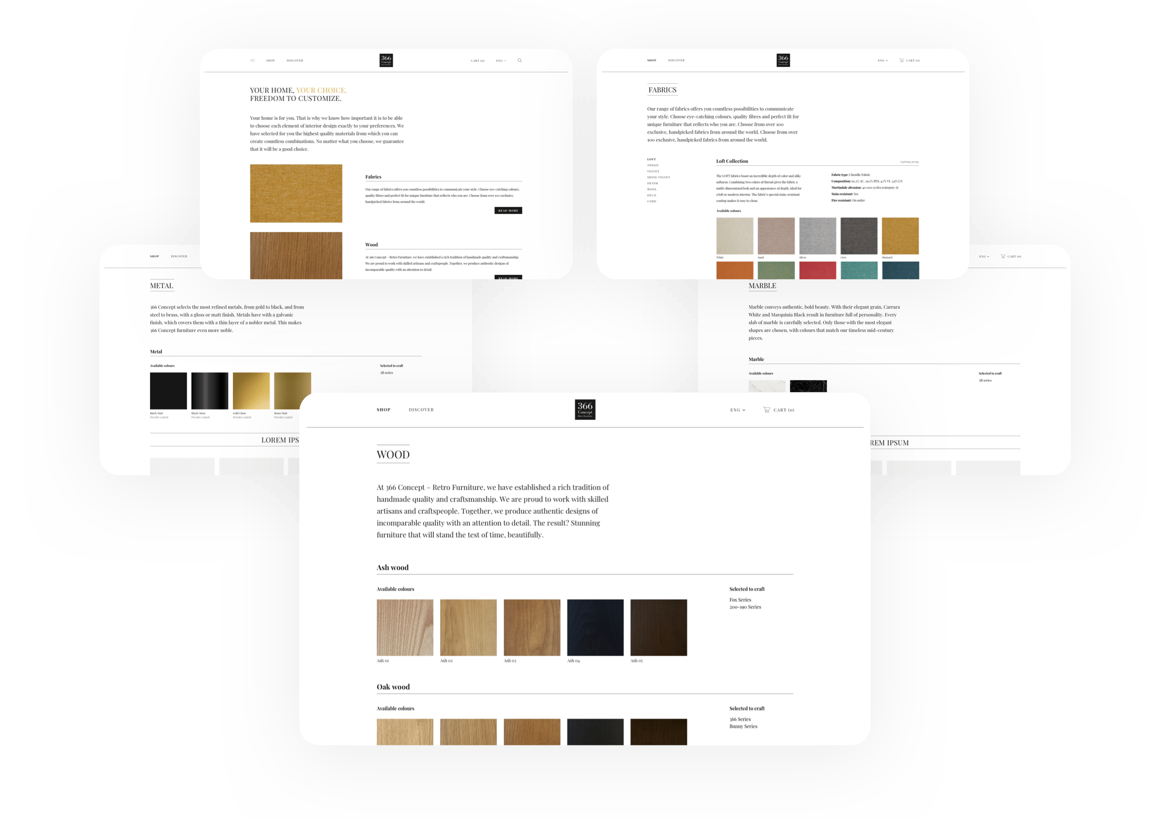
We created a separate page to cater to the modern consumer's need for choice. Here, users can easily customize their 366 Concept furniture with a wide range of fabrics and woods. They have more than one hundred unique options to choose from, offering a diverse palette to perfectly match any interior style or personal preference.
Refined browsing
Targeted search
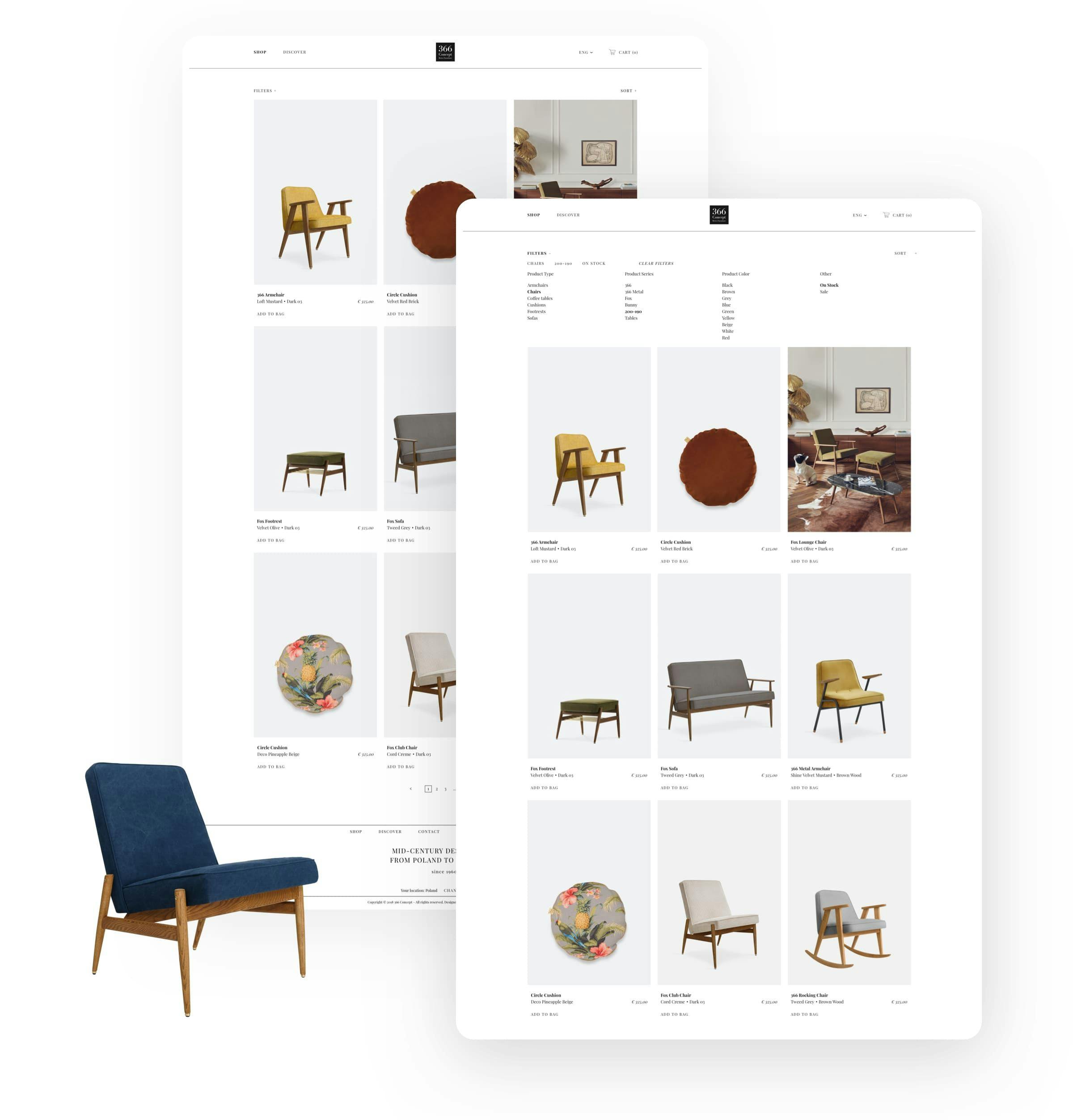
Knowing your audience is key to showcasing your products effectively. The discerning clients of 366 Concept have specific interior design tastes and preferences. To accommodate this, we've upgraded the product listing page with advanced filtering options. This allows clients to quickly find their desired items, eliminating the need for extensive browsing.
Elegant efficiency
Design meets function
Each product page serves a dual purpose. Firstly, its layout is designed to be visually appealing, reflecting the high quality of the furniture. Secondly, it's optimized for user efficiency, enabling swift changes to fabric and wood specifications by clients.
Seamless checkout
Quick and easy purchase
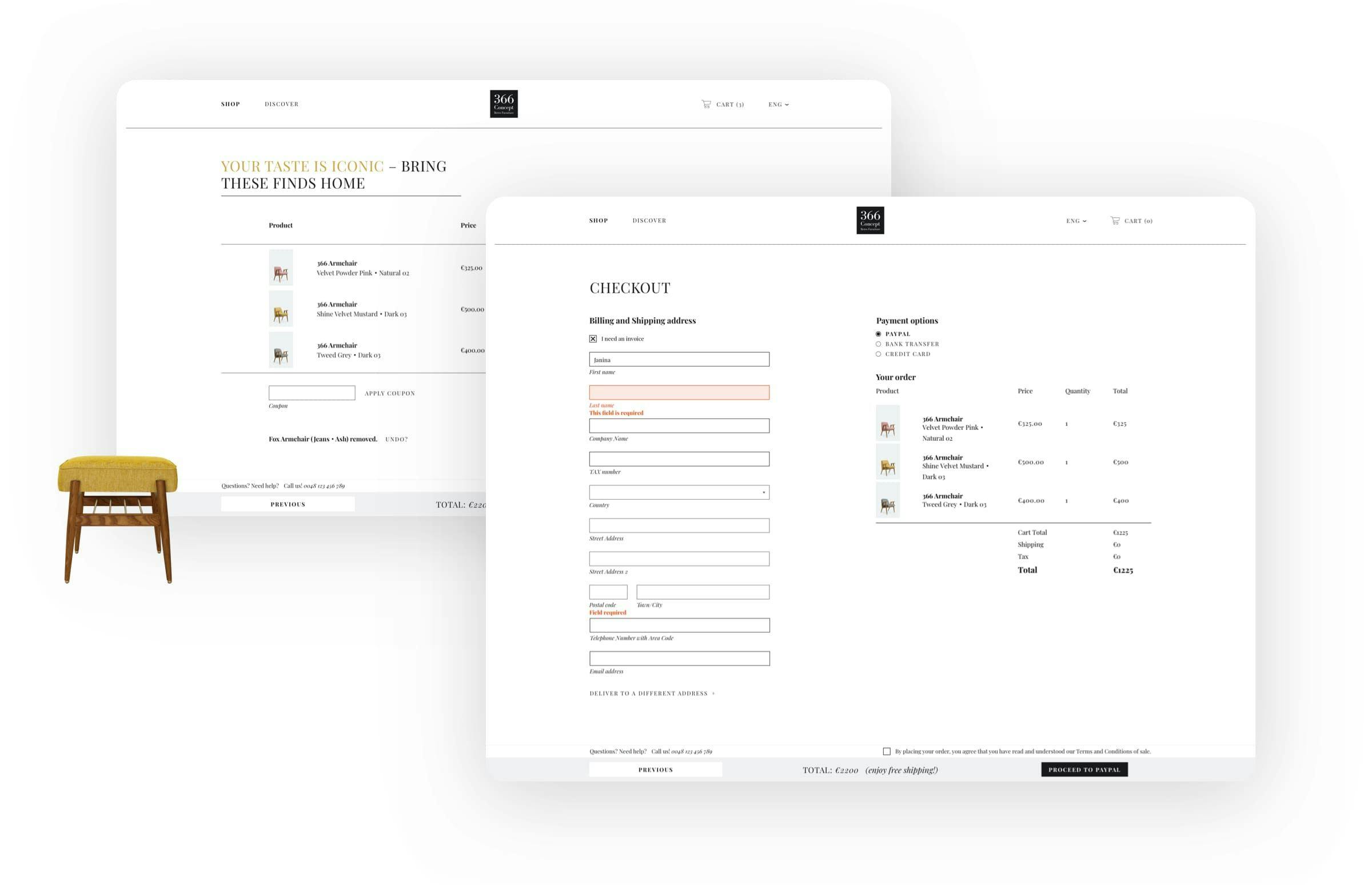
The checkout process, a pivotal stage in the customer journey, is streamlined to facilitate a smooth transaction and increase sales. Clients have the option to either register with 366 Concept or checkout as guests, with the entire transaction process consolidated onto a single page. Purchasing high-end designer furniture is now just a few clicks away!
Vintage charm
Elegant brand identity
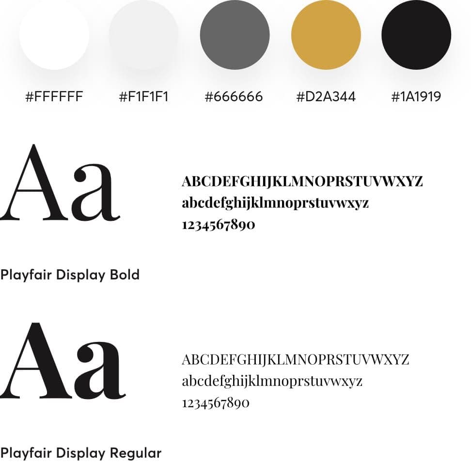
Mirroring its entire product range, Concept 366's branding exudes a sophisticated, retro, mid-century charm. The chosen color palette echoes natural elements like wood, metal, and fibers, reinforcing this classic style.
ARE YOU READY?
Let’s build your next digital product


