Web App for a Cross-Border Recruitment Platform
BRAND
Lingocruit
location
Karlstad, SE
Client
Lingocruit
Stack
WordPress
Budget
Confidential
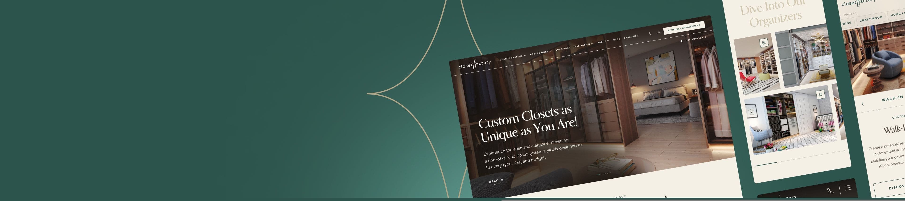
Work without borders
Lingocruit is committed to simplifying the pursuit of overseas employment opportunities for workers throughout Europe. Simultaneously, they provide employers with the opportunity to discover and hire the finest talent available on the European market, effortlessly overcoming any barriers related to borders or languages.
Empowering expats
Emigrating for work conjures up a mix of exhilarating inspiration and daunting challenges. The team at Lingocruit deeply understands this dynamic and aims for their platform to offer future expats not just assistance, but also encouragement and a positive perspective on the process of securing employment overseas.
Bright beginnings
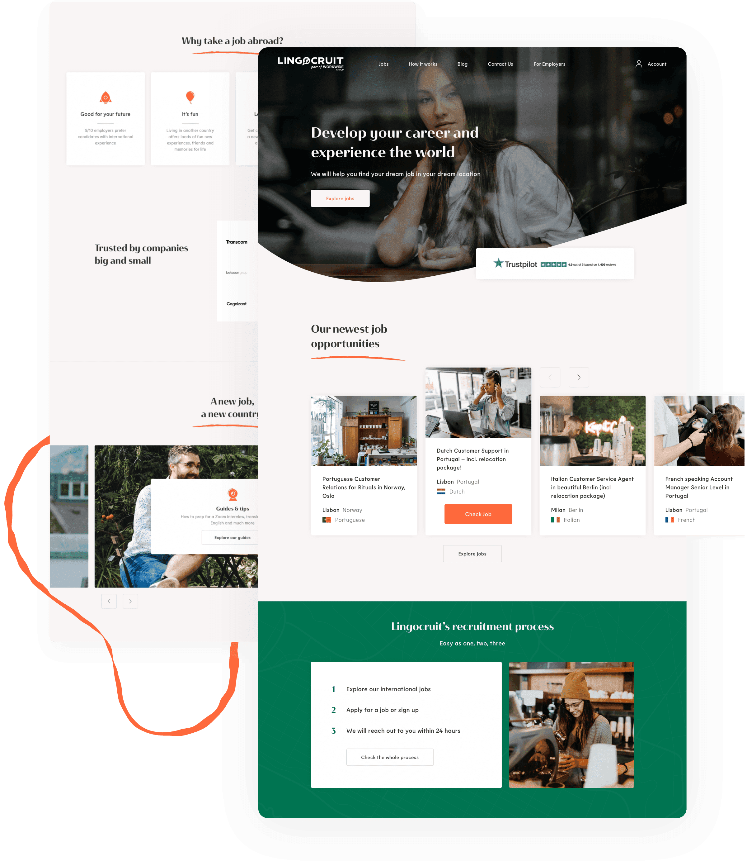
The website design employs a clean palette of plain white and subtle beige backgrounds, creating an aesthetically pleasing canvas that allows smaller design elements to stand out. Buttons, icons, and shapes harmonize in a contrasting color scheme, while the inclusion of human-centered photography adds a final, relatable touch to the design.
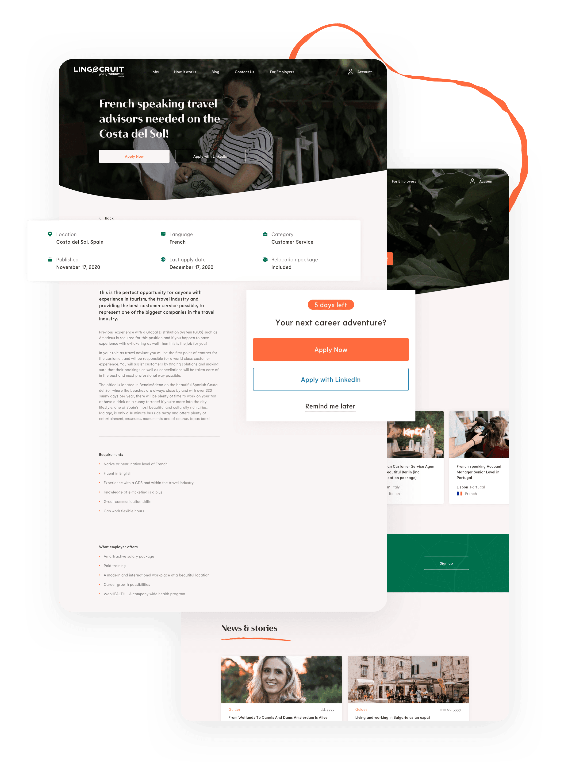
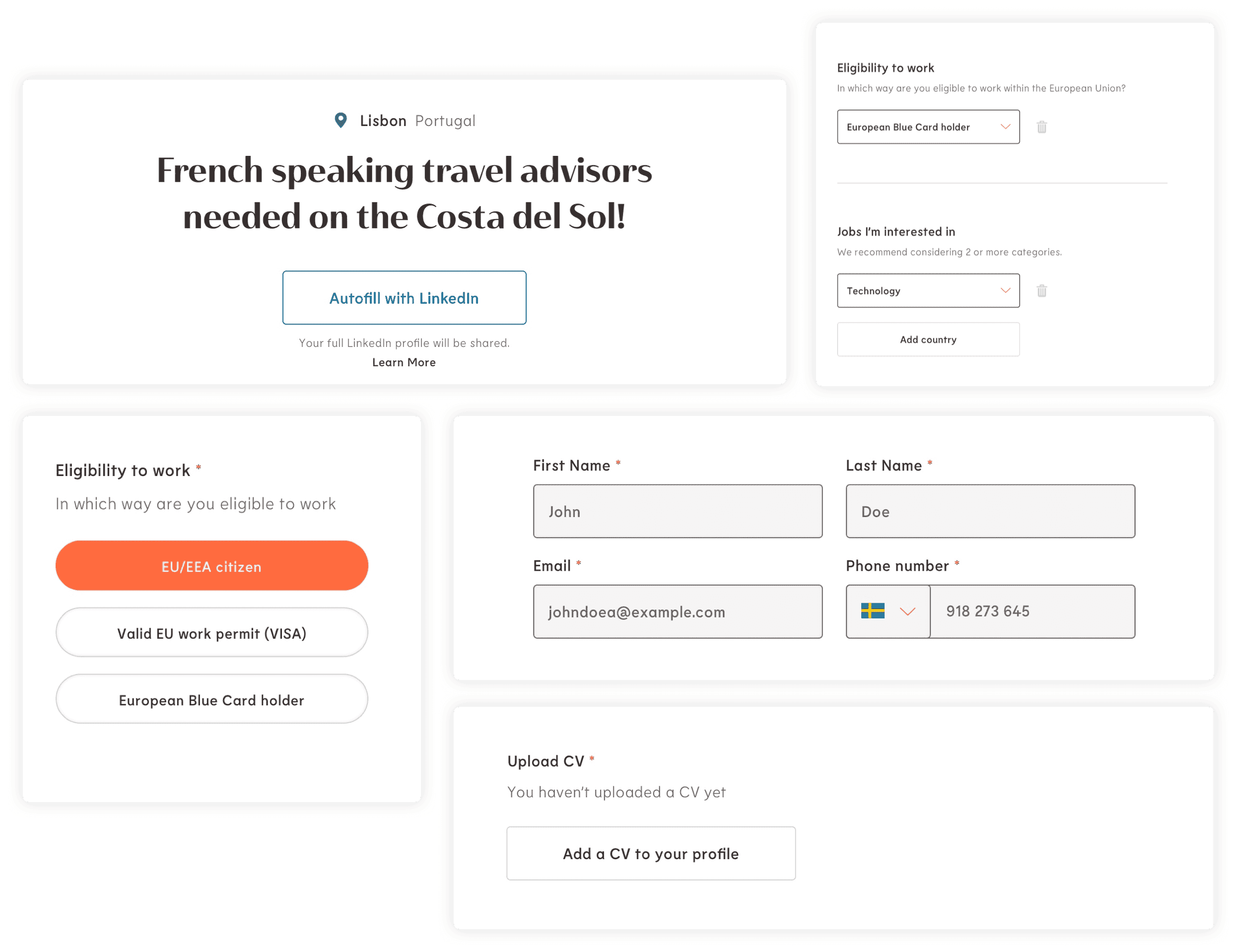
Clarity meets comfort
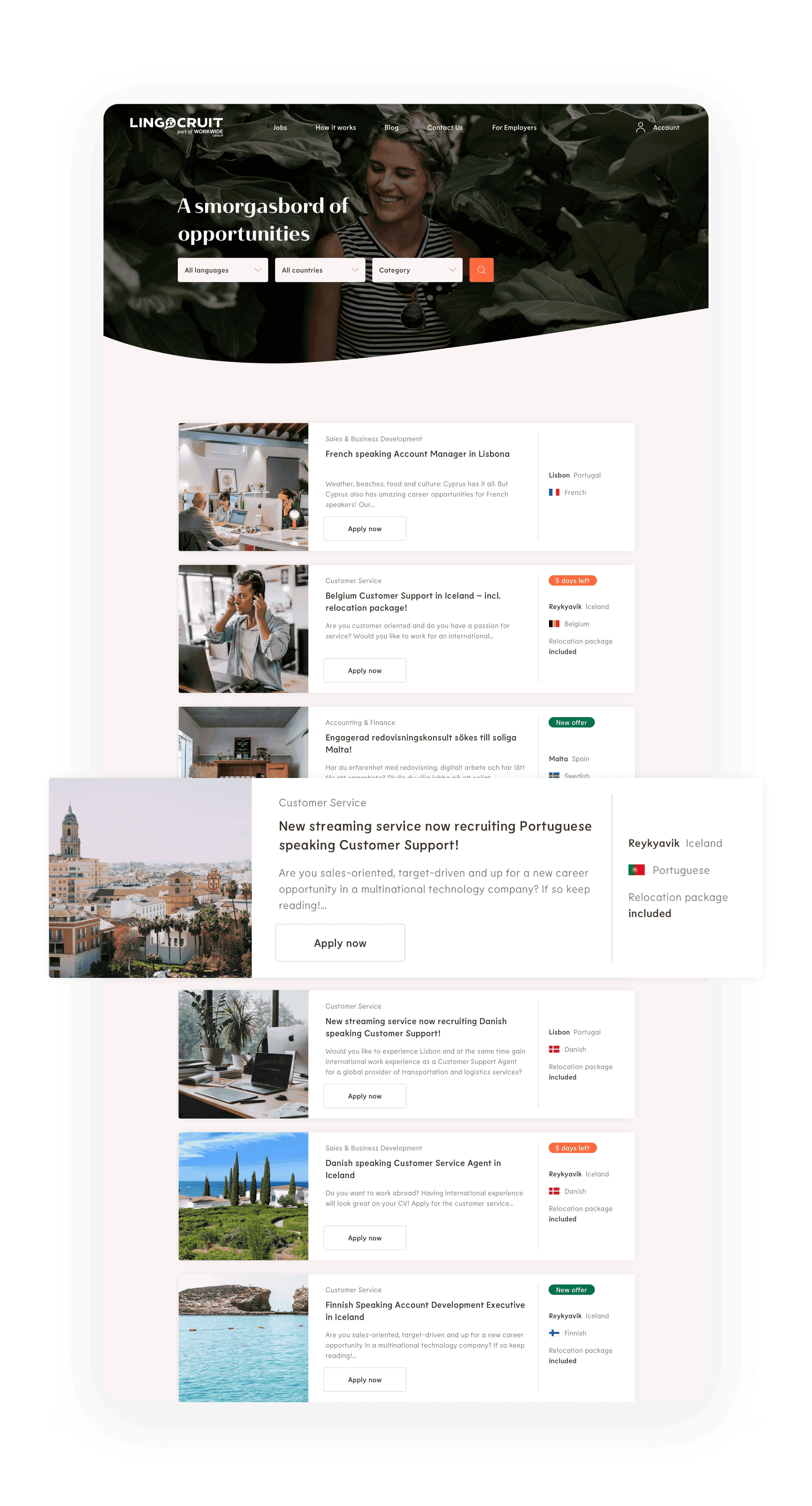
Given the inevitability of form-filling in job applications, we prioritized making this aspect of the website exceptionally user-friendly. Our focus was on clarity, approachability, and uniformity. To achieve this, we designed input fields that are slightly spaced out and rounded, eliminating sharp corners. We also selected matching typography to soften the overall appearance of the forms page, enhancing their visual appeal and ease of use.
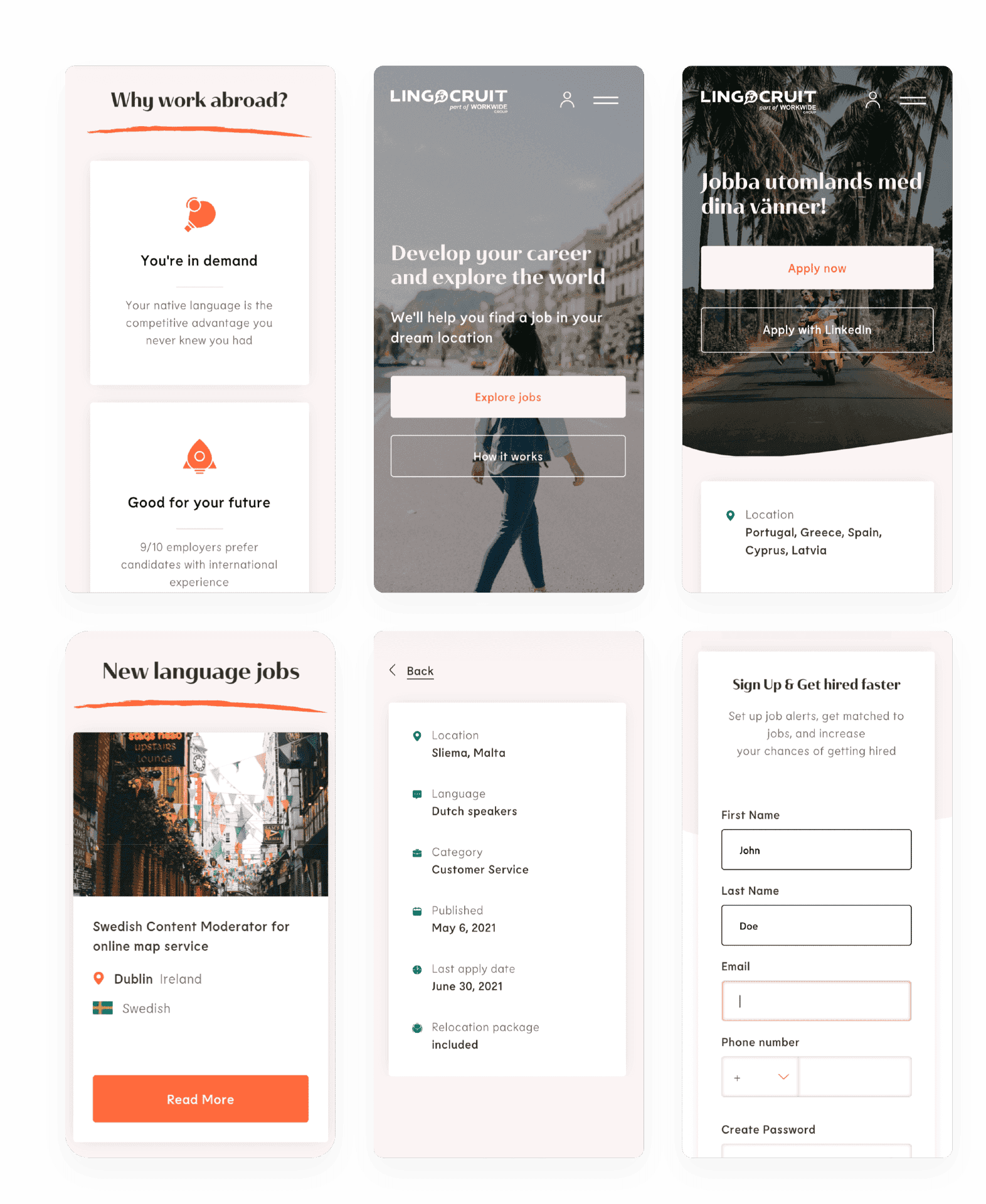
Adventure awaits
In collaboration with the Lingocruit team, we settled on a mobile design that's centered around a modern, minimalist, and readable interface. We wanted to make it as approachable as possible by adding in a few carefully chosen photographs. These images imbue the platform with the sense of adventure that lies ahead, making the experience more inviting and less daunting.
Squiggly signature style
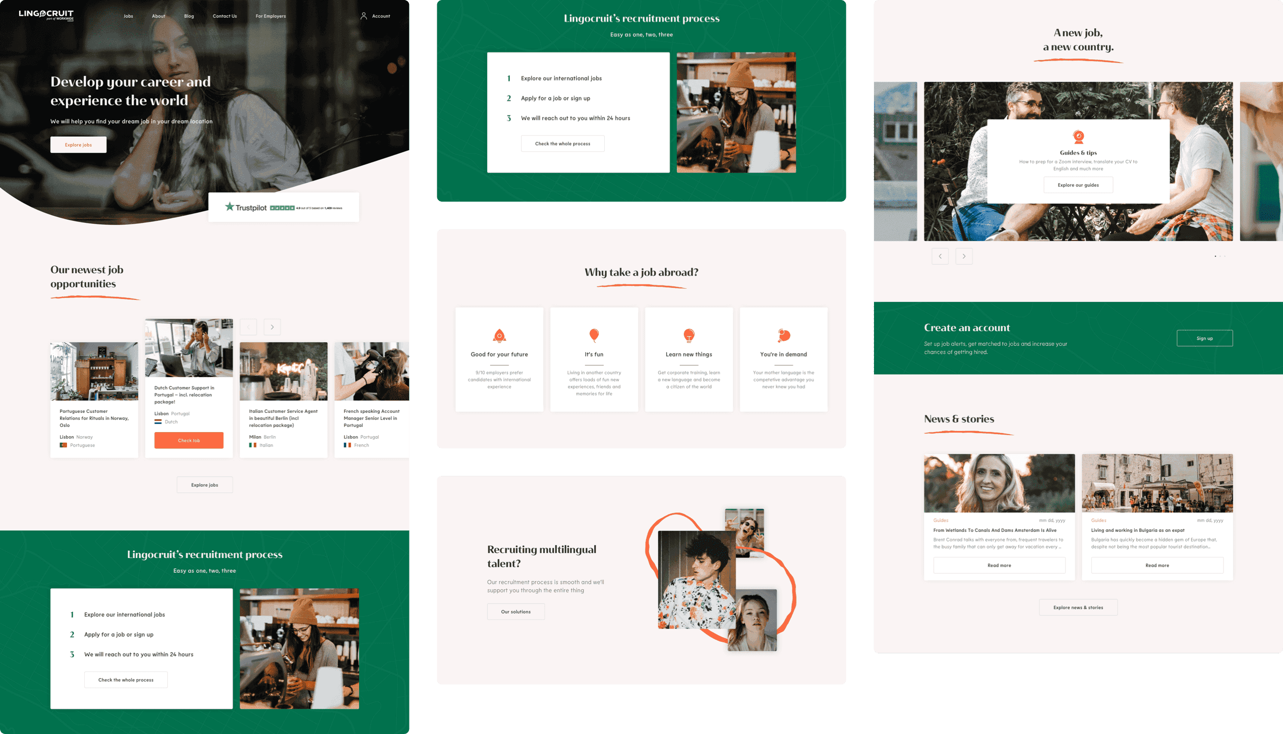
Lingocruit sought a distinctive brand identity that could become uniquely theirs. While we found harmony in choices of backgrounds, highlights, and contrasts, it was the incorporation of squiggly lines with rough edges that made Lingocruit's new branding work. These lines, reminiscent of stress-relieving doodles made in anticipation of job interviews, were introduced to soften the website's overall aesthetic, adding a relatable, human touch to the digital experience.

Soothing professionalism
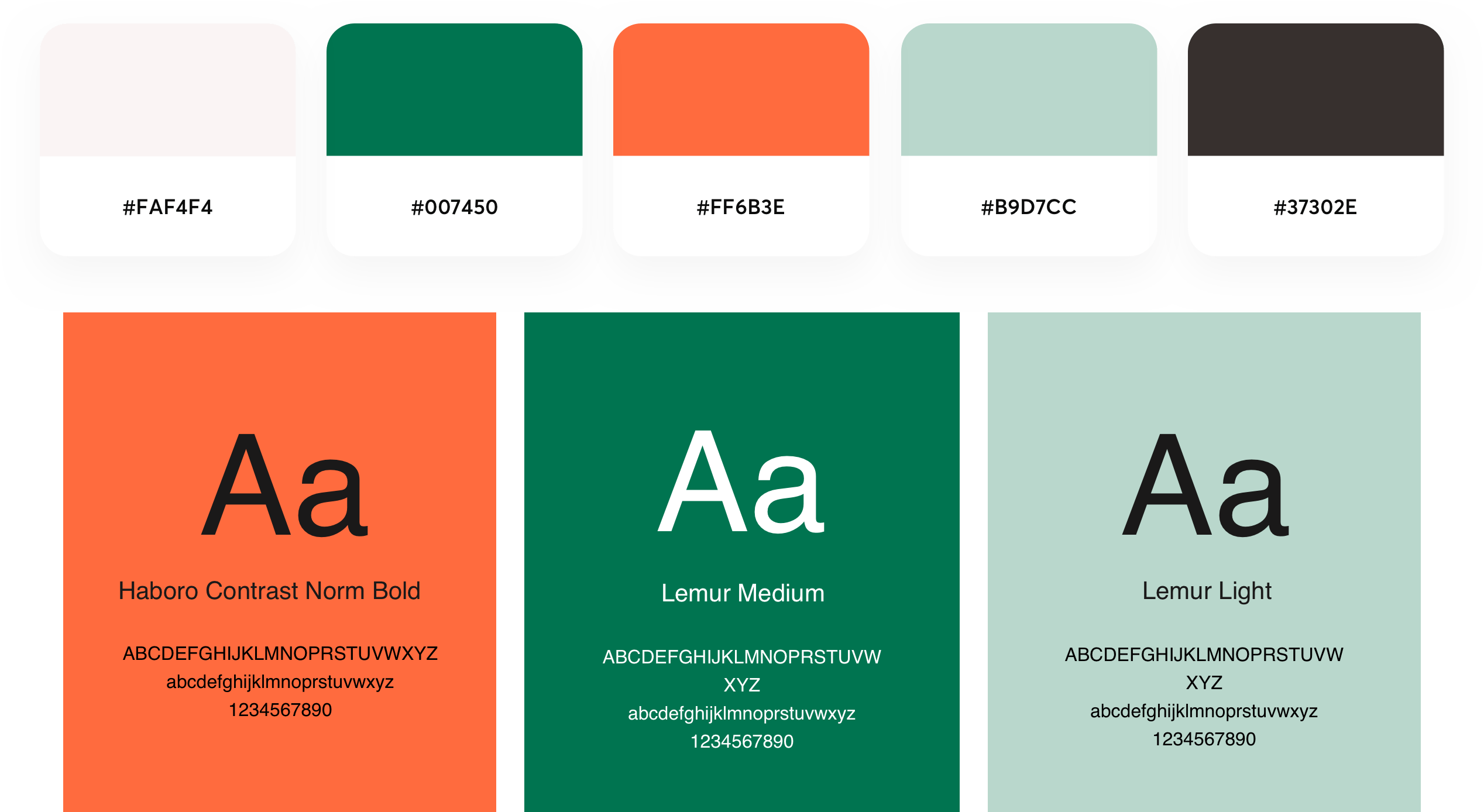
The design predominantly features a white background complemented by vibrant orange elements, with a contrasting yet cheerful deep green used primarily for icons, brief sections, and the site's footer. This deliberate color palette merges the soothing with the energetic, encapsulating a blend of optimism and professionalism. In terms of typography, the elegant sans serif pair of Haboro Contrast Norm and Lemur was chosen. They proved to be highly effective when used together, striking the perfect balance between beauty and readability.
Lingocruit
We have heard great feedback from our clients
Recruitment Manager